Note: This project is no longer maintained. We suggest using Storybook as your component explorer. The creators of this project now build Chromatic QA an automated visual testing tool for UI components and component libraries.
Chromatic
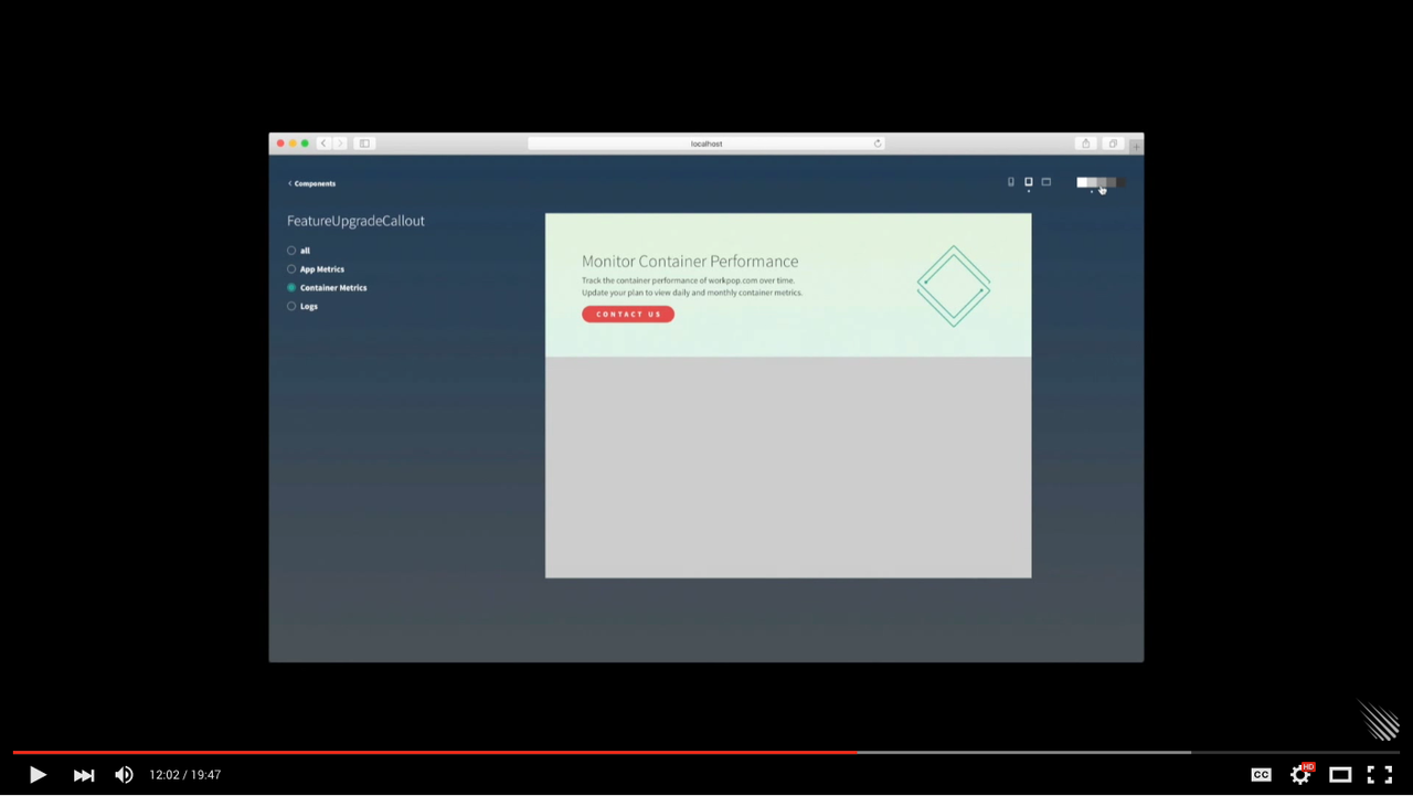
Explore, visualize, and prototype your UI components.
Demo
Usage
meteor add mdg:chromatic
Make Chromatic available at /styleguide in your app in development mode:
const {ChromaticExplorer} = Package['mdg:chromatic-explorer'] || {};
Importing Chromatic
Versions 0.0.x of these packages are compatible with Meteor 1.2
const { Chromatic } = Package['mdg:chromatic-api'] || {};
Versions 0.1.x are compatible with Meteor 1.3
import { Chromatic } from 'meteor/mdg:chromatic';
Installing Component Explorer
Configure the URL:
import { ChromaticExplorer } from 'meteor/mdg:chromatic';

if (ChromaticExplorer) {
  ChromaticExplorer.configure({ basePath: '/styleguide' });
}
Write Component Specs
=======
import { Chromatic } from 'meteor/mdg:chromatic';

ComponentName = React.createClass({
  // code
});

if (Chromatic) {
  Chromatic.add(ComponentName, {
    specs: [
      new Chromatic.Spec('specName1', {
        props: {
          // props used by your component
        }
      }),
      new Chromatic.Spec('specName2', {
        props: {
          // props used by your component
        }
      })
    ]
  });
}
Component packages
mdg:animations
mdg:buttons
mdg:callout
mdg:code-block
mdg:color-grid
mdg:date-components
mdg:form-components
mdg:list
mdg:loading-spinner
mdg:overlays
mdg:sortable
mdg:tooltips
mdg:outlines
NPM Dependencies
Some of these UI components have NPM dependencies, here is the full list that you may need (taken from Chromatic's package.json)
  "dependencies": {
    "autosize": "3.0.15",
    "classnames": "^2.2.5",
    "react": "^15.1.0",
    "react": "^15.2.1",
    "react-addons-create-fragment": "^15.2.1",
    "react-addons-css-transition-group": "^15.2.1",
    "react-addons-linked-state-mixin": "^15.2.1",
    "react-addons-perf": "^15.2.1",
    "react-addons-pure-render-mixin": "^15.2.1",
    "react-addons-test-utils": "^15.2.1",
    "react-addons-transition-group": "^15.2.1",
    "react-addons-update": "^15.2.1",
    "react-dom": "^15.2.1",
    "react-input-autosize": "^1.1.0",
    "react-input-mask": "^0.7.2",
    "velocity-animate": "^1.2.3",
    "velocity-react": ">=1.1.4"
  }
Circular references
When extending Chromatic itself you may need to import the API directly to avoid circular references:
import { Chromatic } from 'meteor/mdg:chromatic-api';