RSCSS
Reasonable Standard for CSS Stylesheet Structure.*
🚧 This document is a work in progress. See the changelog for summaries of revisions.
(*: or S can also stand for "suggestions")
Problem
Any CSS greater than 1000 lines will get unwieldy. You'll eventually run into these common pitfalls:
- "What does this class mean?"
- "Is this class still being used?"
- "If I make a new class
green, will there be a clash?"
Structure
Think in components
Think of each piece of your UI is an individual "component." Components will be named with at least two words, separated by a dash. Examples of a component:
- A like button (
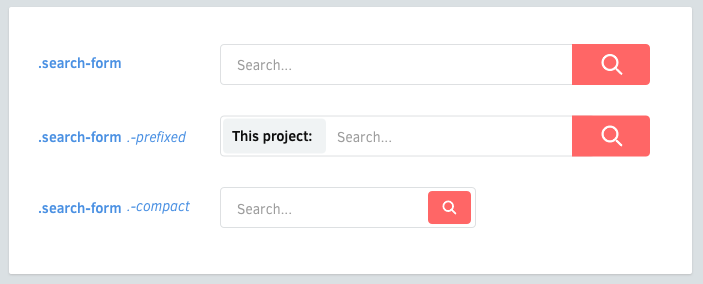
.like-button) - A search form (
.search-form) - A news article card (
.article-card)
Elements
Naming: Each component may have elements. They should have classes that are only one word.
.search-form {
  > .field { /* ... */ }
  > .label { /* ... */ }
}
Selectors: Prefer to use the > child selector whenever possible. This prevents bleeding through nested components, and performs better than descendant selectors.
.article-card {
  .title     { /* okay */ }
  > .author  { /* ✓ better */ }
}
On multiple words: For those that need two or more words, concatenate them without dashes or underscores.
.profile-box {
  > .firstname { /* ... */ }
  > .lastname { /* ... */ }
  > .avatar { /* ... */ }
}
Avoid tag selectors: use classnames whenever possible. Tag selectors are fine, but they may come at a small performance penalty and may not be as descriptive.
.article-card {
  > h3    { /* ... */ }
  > .name { /* ✓ better */ }
}
Variants
Components may have variants. Their classes will be prefixed by a dash (-).
.like-button {
  &.-wide { /* ... */ }
  &.-short { /* ... */ }
  &.-disabled { /* ... */ }
}
Elements may also have variants.
.shopping-card {
  > .title { /* ... */ }
  > .title.-small { /* ... */ }
}
Why a dash? Because:
- it prevents ambiguity with elements
- a CSS class can only start with a letter,
_or- - dashes are easier to type than underscores
- it kind of resembles switches in UNIX commands (
gcc -O2 -Wall -emit-last)
Nested components
Sometimes it's necessary to nest components.
<div class='article-link'>
  <div class='vote-box'>
    ...
  </div>
  <h3 class='title'>...</h3>
  <p class='meta'>...</p>
</div>
Simplifying nested components
Sometimes, when nesting components, your markup can get dirty:
<div class='search-form'>
  <input class='input' type='text'>
  <button class='search-button -red -large'></button>
</div>
You can simplify this by using your CSS preprocessor's @extend mechanism:
<div class='search-form'>
  <input class='input' type='text'>
  <button class='submit'></button>
</div>
// sass
.search-form {
> .submit {
@extend .search-button;
@extend .search-button.-red;
@extend .search-button.-large;
}
}Layout
Avoid positioning properties: Components should be made in a way that they're reusable in different contexts. Avoid putting these properties in components:
- Positioning (
position,top,left,right,bottom) - Floats (
float,clear) - Margins (
margin) - Dimensions (
width,height) *
Fixed dimensions: Exception to these would be elements that have fixed width/heights, such as avatars and logos.
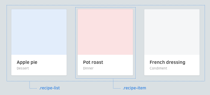
Define positioning in parents: If you need to define these, try to define them in whatever context whey will be in. In this example below, notice that the widths and floats are applied on the list component, not the component itself.
.article-list {
  & {
    @include clearfix;
  }

  > .article-card {
    width: 33.3%;
    float: left;
  }
}

.article-card {
  & { /* ... */ }
  > .image { /* ... */ }
  > .title { /* ... */ }
  > .category { /* ... */ }
}
CSS structure
One component per file
/* css/components/search-form.scss */
.search-form {
  > .button { /* ... */ }
  > .field { /* ... */ }
  > .label { /* ... */ }

  // variants
  &.-small { /* ... */ }
  &.-wide { /* ... */ }
}
In sass-rails and stylus, this makes including all of them easy:
@import 'components/*';Avoid over-nesting
Use no more than 1 level of nesting. It's easy to get lost with too much nesting.
/* bad */
.image-frame {
  > .description {
    /* ... */

    > .icon {
      /* ... */
    }
  }
}
Consider instead:
.image-frame {
  > .description { /* ... */ }
  > .description > .icon { /* ... */ }
}
Pitfalls
Bleeding through nested components
Be careful about nested components where the nested component has an element of the same name.
<article class='article-link'>
  <div class='vote-box'>
    <button class='up'></button>
    <button class='down'></button>
    <span class='count'>4</span>
  </div>

  <h3 class='title'>Article title</h3>
  <p class='count'>3 votes</p>
</article>
.article-link {
> .title { /* ... */ }
> .count { /* ... (!!!) */ }
}
.vote-button {
> .up { /* ... */ }
> .down { /* ... */ }
> .count { /* ... */ }
}In this case, if .article-link > .count did not have the > (child) selector, it will also apply to the .vote-button .count element. This is one of the reasons why child selectors are preferred.
But...
Some people may have apprehensions to these convention, such as:
But dashes suck
You're free to omit it and just use regular words, but keep the rest of the ideas in place (components, elements, variants).
But I can't think of 2 words
Some components will only need one word to express their purpose, such as alert. In these cases, consider that using some suffixes will make it clearer that it's a block-level element:
.alert-box.alert-card.alert-block
Or for inlines:
.link-button.link-span
Other solutions
BEM
BEM in nice, but some may be irked at its unconventional syntax. RSCSS pretty much follows BEM conventions, only with a different syntax.
<!-- BEM -->
<form class='site-search site-search--full'>
  <input  class='site-search__field' type='text'>
  <button class='site-search__button'></button>
</form>
<!-- rscss -->
<form class='site-search -full'>
<input class='field' type='text'>
<button class='button'></button>
</form>Terminologies
The same concepts exist in similar ways in other CSS structuring ideologies.
| RSCSS | BEM | SMACSS |
|---|---|---|
| Component | Block | Module |
| Element | Element | ? |
| Layout | ? | Layout |
| Variant | Modifier | Theme & State |
Summary
- Think in components, named with 2 words (
.screenshot-image) - Components have elements, named with 1 word (
.blog-post .title) - Name variants with a dash prefix (
.shop-banner.-with-icon) - Components can nest
- Remember you can extend to make things simple


