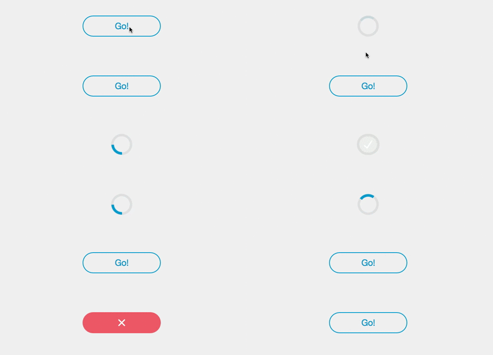
react-progress-button
Simple React component for a circular Progress Button.
Demo
Install
npm install react-progress-button --saveExample
Controlled usage:
import ProgressButton from 'react-progress-button'

const App = React.createClass({
  getInitialState () {
    return {
      buttonState: ''
    }
  },

  render () {
    return (
      <div>
        <ProgressButton onClick={this.handleClick} state={this.state.buttonState}>
          Go!
        </ProgressButton>
      </div>
    )
  },

  handleClick () {
    this.setState({buttonState: 'loading'})
    // make asynchronous call
    setTimeout(() => {
      this.setState({buttonState: 'success'})
    }, 3000)
  }
})Using Promises:
If the function passed in via the onClick prop return a Promise or if a promise
is passed as an argument of the loading method,
the component will automatically transition to its success or error
states based on the outcome of the Promise without the need for
external manipulation of state using a ref.
import ProgressButton from 'react-progress-button'

const App = React.createClass({
  render () {
    return (
      <div>
        <ProgressButton onClick={this.handleClick}>
          Go!
        </ProgressButton>
      </div>
    )
  },

  handleClick() {
    return new Promise(function(resolve, reject) {
      setTimeout(resolve, 3000)
    })
  }
});API
Props
All props are optional. All props other than that will be passed to the top element.
classNamespace
Namespace for CSS classes, default is pb- i.e CSS classes are pb-button.
durationError
Duration (ms) before going back to normal state when an error occurs, default is 1200
durationSuccess
Duration (ms) before going back to normal state when an success occurs, default is 500
onClick
Function to call when the button is clicked; if it returns a Promise then the component will transition to the success/error state based on the outcome of the Promise
onError
Function to call when going back to the normal state after an error
onSuccess
Function to call when going back to the normal state after a success
state
State of the button if you do not want to use the functions. Can be '', loading, success, error or disabled.
type
Type of the button (can be 'submit' for example).
form
Id of the form to submit (useful if the button is not directly inside the form).
shouldAllowClickOnLoading
Whether click event should bubble when in loading state
Methods
loading()
Put the button in the loading state.
disable()
Put the button in the disabled state.
notLoading(), enable()
Put the button in the normal state.
success([callback, dontGoBackToNormal])
Put the button in the success state. Call the callback or the onSuccess prop when going back to the normal state.
error([callback])
Put the button in the error state. Call the callback or the onError prop when going back to the normal state.
Styles
Look at react-progress-button.css for an idea on how to style this component.
If you are using webpack, you'll need to have css-loader installed and include
 {
   test: /\.css$/,
   loader: "style!css"
 }
in your webpack config. In your jsx file you can then import the CSS with import "../node_modules/react-progress-button/react-progress-button.css"; although the path depends on how deeply nested your jsx is. If you wish to theme it yourself, copy the CSS to a convenient location and point the import path at the copy, which is part of your repo, unlike the original in node_modules.
License
MIT


