Update Progress Ring to follow Win 10 Design Guide; add Determinate, Error, and Paused states so that it aligns with Progress Bar.
| Before | After |
|---|---|
 |
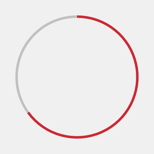 |
Current Progress Ring only has Indeterminate state (IsActive Property).
The proposal is for ProgressRing to also have the same properties as ProgressBar; specifically, Determinate, Error, Paused states. This feature update will allow for more flexibility where it makes more sense visually to use ProgressRing rather than ProgressBar.
This also updates the Progress Ring visuals to be similar to Progress Bar and up to date with Windows Design Guidance.
Progress Indicators in Mobile UX Design by Nick Babich
Determinate progress indicator "offer a reason to wait and reduce users' perception of time". Furthermore, inifintely loading spinners tend to have negative connotations, as "people don't like to stare at loading spinner with no indication of progress or time."
Microsoft
Current styling for Xbox - Fabric - Fluent/Win10

External
Current styling for iOS Mobile

| States | Indeterminate | Determinate |
|---|---|---|
| Running |  |
 |
| Paused |  |
 |
| Error |  |
 |
| Property | Type | Controls Mapping |
|---|---|---|
IsIndeterminate |
Boolean | Toggles Determinate / Indeterminate state |
ShowPaused |
Boolean | Toggles Paused state |
ShowError |
Boolean | Toggles Error state |
Foreground |
Color | Ring indicator |
Background |
Color | Ring gray track |
Stroke |
Double | Ring thickness |
Margin |
Double | Ring Margin |
Padding |
n/a |
