

A minimalistic yet customizable media player card for Home Assistant Lovelace UI.
Inspired by Custom UI: Mini media player and custom-lovelace.

This card is available in HACS (Home Assistant Community Store).
- Install HACS if you don't have it already
- Open HACS in Home Assistant
- Go to "Frontend" section
- Click button with "+" icon
- Search for "Mini Media Player"
- Download and copy
mini-media-player-bundle.jsfrom the latest release into yourconfig/wwwdirectory. - Go to Sidebar -> Settings -> Dashboards -> Menu (top right corner) -> Resources.
- Click on
+ ADD RESOURCE. - Type
/local/mini-media-player-bundle.js?v=1.16.9below URL. - Choose
JavaScript Modulebelow Resource Type. - Accept.
- Download and copy
mini-media-player-bundle.jsfrom the latest release into yourconfig/wwwdirectory. - Add a reference to
mini-media-player-bundle.jsinside yourconfiguration.yamlor through the Home Assistant UI from the resource tab.
lovelace:
  resources:
    - url: /local/mini-media-player-bundle.js?v=1.16.9
      type: module
To update the card to a new version after manual installation, update mini-media-player-bundle.js file from latest release and edit version of the card in your resources. You may need to empty the browsers cache if you have problems loading the updated card.
| Name | Type | Default | Since | Description |
|---|---|---|---|---|
| type | string | required | v0.1 | custom:mini-media-player |
| entity | string | required | v0.1 | An entity_id from an entity within the media_player domain. |
| name | string | optional | v0.6 | Override the entities friendly name. |
| icon | string | optional | v0.1 | Specify a custom icon from any of the available mdi icons. |
| icon_image | string | optional | v1.16.2 | Override icon with an image url |
| tap_action | action object | true | v0.7.0 | Action on click/tap. |
| group | boolean | optional | v0.1 | Removes paddings, background color and box-shadow. |
| hide | object | optional | v1.0.0 | Manage visible UI elements, see hide object for available options. |
| artwork | string | default | v0.4 | cover to display current artwork in the card background, full-cover to display full artwork, material for alternate artwork display with dynamic colors, none to hide artwork, full-cover-fit for full cover without cropping. |
| tts | object | optional | v1.0.0 | Show Text-To-Speech input, see TTS object for available options. |
| source | string | optional | v0.7 | Change source select appearance, icon for just an icon, full for the full source name. |
| sound_mode | string | optional | v1.1.2 | Change sound mode select appearance, icon for just an icon, full for the full sound mode name. |
| info | string | optional | v1.0.0 | Change how the media information is displayed, short to limit media information to one row, scroll to scroll overflowing media info. |
| volume_stateless | boolean | false | v0.6 | Swap out the volume slider for volume up & down buttons. |
| volume_step | number | optional | v1.9.0 | Change the volume step size of the volume buttons and the volume slider (number between 1 - 100)1. |
| max_volume | number | optional | v0.8.2 | Specify the max vol limit of the volume slider (number between 1 - 100). |
| min_volume | number | optional | v1.1.2 | Specify the min vol limit of the volume slider (number between 1 - 100). |
| replace_mute | string | optional | v0.9.8 | Replace the mute button, available options are play_pause (previously play), stop, play_stop, next. |
| jump_amount | number | 10 | v0.14.0 | Configure amount of seconds to skip/rewind for jump buttons. |
| toggle_power | boolean | true | v0.8.9 | Set to false to change the power button behaviour to media_player.turn_on/media_player.turn_off. |
| idle_view | object | optional | v1.0.0 | Display a less cluttered view when idle, See Idle object for available options. |
| background | string | optional | v0.8.6 | Background image, specify the image url "/local/background-img.png" e.g. |
| speaker_group | object | optional | v1.0.0 | Speaker group management/multiroom, see Speaker group object for available options. |
| shortcuts | object | optional | v1.0.0 | Media shortcuts in a list or as buttons, see Shortcut object for available options. |
| scale | number | optional | v1.5.0 | UI scale modifier, default is 1. |
1 Only supported on entities with volume_level attribute.
| Name | Type | Default | Description |
|---|---|---|---|
| when_idle | boolean | optional | Render the idle view when player state is idle. |
| when_paused | boolean | optional | Render the idle view when player state is paused |
| when_standby | boolean | optional | Render the idle view when player state is standby |
| after | string | optional | Specify a number (minutes) after which the card renders as idle (only supported on platforms exposing media_position_updated_at). |
| Name | Type | Default | Description |
|---|---|---|---|
| platform | string | required | Specify TTS platform, e.g. google_translate or amazon_polly, cloud for Nabu Casa, alexa1 for "Alexa as Media Player", ga23 for use with Google Assistant Webserver or Assistant Relay, sonos2 for use with modified sonos_say script, webos4, service5. |
| language | string | optional | The output language. |
| entity_id | string/list | optional | The entity_id of the desired output entity or a list of entity_id's, can also be all to broadcast to all entities or group to target currently grouped speakers. |
| volume | float | optional | Volume level of tts output (0 - 1), only supported by platform sonos. |
| type | string | optional | tts, announce or push, defaults to tts, only supported by platform alexa, more info here. |
| data | object | optional | Any additional data to pass with the notify command. |
1 Does not support the language option.
2 Does not support language & entity_id options.
3 Requires a custom notify service named ga_broadcast, see example below.
# configuration.yaml
notify:
  - name: ga_broadcast
    platform: rest
    resource: http://[xxx.x.x.xxx]:5000/broadcast_message
4 Requires the card entity name to match the notify service name, if they don't match please specify the notify service name in the entity_id option.
5 Specify service & service_data under the data option, specify message_field to use message for the service.
type: custom:mini-media-player
entity: media_player.xiaoai_speaker
tts:
  platform: service
  data:
    service: xiaomi_miot.intelligent_speaker
    service_data:
      execute: true
      silent: true
message_field: textSee Speaker group management for example usage.
Supported platforms
| Name | Type | Default | Description |
|---|---|---|---|
| entities | list | required | A list containing speaker entities of one of supported platforms, to enable group management of those speakers. |
| platform | string | 'sonos' | Any supported multiroom platform e.g. sonos, soundtouch, bluesound, see supported platforms above. |
| sync_volume | boolean | optional | Keep volume Synchronize between grouped speakers. |
| expanded | boolean | optional | Make the speaker group list expanded by default. |
| show_group_count | boolean | true | Have the number of grouped speakers displayed (if any) in the card name. |
| icon | string | optional | Override default group button icon (any mdi icon). |
| group_mgmt_entity | string | optional | Override the player entity for the group management (Useful if you use a universal media_player as your entity but still want to use the grouping feature) |
| supports_master | boolean | optional | Set to false if your multiroom system does not define one of the media players as master. Defaults to true and has not to be set to false for squeezebox for backward compatibility. |
1 All features are not yet supported.
2 Requires custom component for sound devices based on Linkplay chipset, available in HACS.
3 HomeAssistant added join/unjoin services to the media_player. Future official integrations will implement these services (which are slightly different from the ones, which are already supported by this card) instead of implementing them in their own domain.
| Name | Type | Default | Description |
|---|---|---|---|
| entity_id | string | required | The entity_id for the speaker entity. |
| name | string | required | A display name. |
| volume_offset | number | optional | Volume offset (0-100) when used with sync_volume. |
See card with media shortcuts for example usage.
| Name | Type | Default | Description |
|---|---|---|---|
| list | list | optional | A list of shortcut items to be presented as a list, see shortcut item object. |
| buttons | list | optional | A list of shortcut items to be presented as buttons. |
| hide_when_off | boolean | false | Hide the shortcuts while the entity is off. |
| columns | integer (1-6) | 2 | Specify the max number of buttons per row. |
| column_height | number | optional | Specify the column height in pixels. |
| label | string | shortcuts... |
Specify a custom default label for the shortcut dropdown. |
| attribute | string | optional | Specify any attribute exposed by the media player entity. The attribute value (if exists) is compared with shortcut id's to distinguish selected/active shortcut1. |
| align_text | string | optional | Specify alignment of button icon/text left, right, center. |
1 Examples, source for active source or sound_mode for active sound mode.
| Name | Type | Default | Description |
|---|---|---|---|
| name | string | optional | A display name. |
| icon | string | optional | A display icon (any mdi icon). |
| image | string | optional | A display image. |
| cover | string | optional | A cover image (only supported for button shortcuts). |
| type | string | required | Type of shortcut. A media type: music, tvshow, video, episode, channel, playlist e.g. or an action type: source, sound_mode, script or service. |
| id | string | required | The media identifier. The format of this is component dependent. For example, you can provide URLs to Sonos & Cast but only a playlist ID to iTunes & Spotify. A source/(sound mode) name can also be specified to change source/(sound mode), use together with type source/sound_mode. If type script specify the script name here or service specify the <domain>.<service>. |
| data | list | optional | Extra service payload1. |
1 Only compatible with script & service shortcuts, useful for sending variables to script.
| Name | Type | Default | Options | Description |
|---|---|---|---|---|
| action | string | more-info |
more-info / navigate / call-service / url / fire-dom-event / none |
Action to perform. |
| entity | string | Any entity id | Override default entity of more-info, when action is defined as more-info. |
|
| service | string | Any service | Service to call (e.g. media_player.toggle) when action is defined as call-service. |
|
| service_data | object | Any service data | Service data to include with the service call (e.g. entity_id: media_player.office). |
|
| navigation_path | string | Any path | Path to navigate to (e.g. /lovelace/0/) when action is defined as navigate. |
|
| url | string | Any URL | URL to open when action is defined as url. |
|
| new_tab | boolean | false |
true / false |
Open URL in new tab when action is defined as url. |
| haptic | string | success, warning, failure, light, medium, heavy, selection |
Haptic feedback for the IOS app. |
| Name | Type | Default | Description |
|---|---|---|---|
| name | boolean | false | The name. |
| icon | boolean | false | The entity icon. |
| info | boolean | false | The media information. |
| power | boolean | false | The power button. |
| source | boolean | false | The source select. |
| sound_mode | boolean | true | The sound_mode select. |
| group_button | boolean | false | The group button. |
| controls | boolean | false | The media playback controls. |
| prev | boolean | false | The "previous" playback control button. |
| next | boolean | false | The "next" playback control button. |
| play_pause | boolean | false | The play/pause button in media playback controls. |
| play_stop | boolean | true | The play/stop button in media playback controls. |
| jump | boolean | true | The jump backwards/forwards buttons (entity needs to support progress). |
| volume | boolean | false | The volume controls. |
| volume_level | boolean | true | The current volume level in percentage. |
| mute | boolean | false | The mute button. |
| progress | boolean | false | The progress bar. |
| runtime | boolean | true | The media runtime indicators. |
| runtime_remaining | boolean | true | The media remaining runtime (requires runtime option to be visible). |
| artwork_border | boolean | true | The border of the default artwork picture. |
| power_state | boolean | true | Dynamic color of the power button to indicate on/off. |
| icon_state | boolean | true | Dynamic color of the entity icon to indicate entity state. |
| shuffle | boolean | true | The shuffle button (only for players with shuffle_set support). |
| repeat | boolean | true | The repeat button (only for players with repeat_set support). |
| state_label | boolean | false | State labels such as Unavailable & Idle. |
The following variables are available and can be set in your theme to change the appearence of the card. Can be specified by color name, hexadecimal, rgb, rgba, hsl, hsla, basically anything supported by CSS.
| name | Default | Description |
|---|---|---|
| mini-media-player-base-color | var(--primary-text-color) & var(--paper-item-icon-color) | The color of base text & buttons |
| mini-media-player-accent-color | var(--accent-color) | The accent color of UI elements |
| mini-media-player-icon-color | --mini-media-player-base-color, var(--paper-item-icon-color, #44739e) | The color for icons |
| mini-media-player-button-color | rgba(255,255,255,0.25) | The background color of shortcut and group buttons. |
| mini-media-player-overlay-color | rgba(0,0,0,0.5) | The color of the background overlay |
| mini-media-player-overlay-color-stop | 25% | The gradient stop of the background overlay |
| mini-media-player-overlay-base-color | white | The color of base text, icons & buttons while artwork cover is present |
| mini-media-player-overlay-accent-color | white | The accent color of UI elements while artwork cover is present |
| mini-media-player-media-cover-info-color | white | Color of the media information text while artwork cover is present |
| mini-media-player-background-opacity | 1 | Opacity of the background |
| mini-media-player-artwork-opacity | 1 | Opacity of cover artwork |
| mini-media-player-progress-height | 6px | Progressbar height |
| mini-media-player-scale | 1 | Scale of the card |
| mini-media-player-name-font-weight | 400 | Font weight of the entity name |
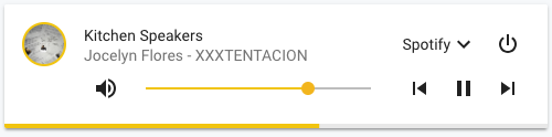
type: custom:mini-media-player
entity: media_player.kitchen_speakersSetting either volume and/or controls to true in the hide option object will render the player as a single row.
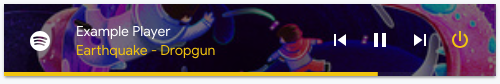
type: custom:mini-media-player
entity: media_player.example
icon: mdi:spotify
artwork: cover
hide:
  volume: true
  source: true
power_state: falseYou can specify media shortcuts through the shortcuts option, either as a list or as buttons or why not both?
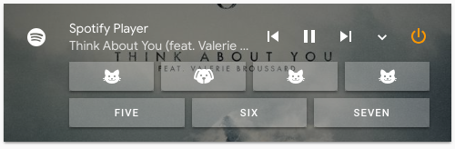
- entity: media_player.spotify
  type: custom:mini-media-player
  artwork: cover
  source: icon
  hide:
    volume: true
  shortcuts:
    columns: 4 # Max buttons per row
    buttons:
      # Start predefined playlist
      - icon: mdi:cat
        type: playlist
        id: spotify:user:XXXXXXX:playlist:37i9dQZF1DZ06evO2O09Hg # Where XXXXXXX is your User ID
      # Change the source to bathroom
      - icon: mdi:dog
        type: source
        id: Bathroom
      # Trigger script
      - icon: mdi:dog
        type: script
        id: script.script_name
      # Trigger custom service
      - name: Crooners Playlist
        type: service
        id: spotcast.start
        data:
          entity_id: media_player.googlehome1234
          uri: spotify:playlist:37i9dQZF1DX9XiAcF7t1s5

... # etc.Tip:
If you don't have Sonos, but want just a bit more control over playlists and so, a simple solution is to use the type: service-option, to trigger thespotcast.start-service.
Remember to add the required data, for spotcast to work. Also, kindly note that the spotcast custom component is required, for this to work. It's available in HACS.
Set the group option to true when nesting mini media player cards inside other cards that already have margins/paddings.
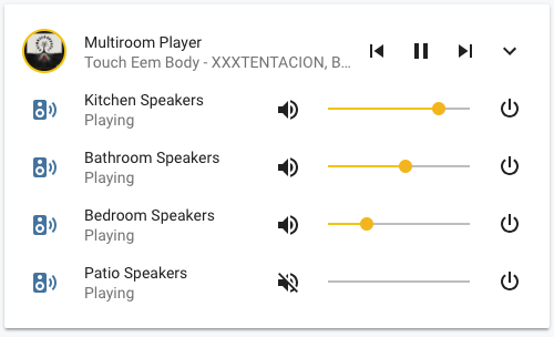
type: entities
entities:
  - type: custom:mini-media-player
    entity: media_player.multiroom_player
    group: true
    source: icon
    info: short
    hide:
      volume: true
      power: true
  - type: custom:mini-media-player
    entity: media_player.kitchen_speakers
    group: true
    hide:
      controls: true
  - type: custom:mini-media-player
    entity: media_player.bathroom_speakers
    group: true
    hide:
      controls: true
  - type: custom:mini-media-player
    entity: media_player.bedroom_speakers
    group: true
    hide:
      controls: true
  - type: custom:mini-media-player
    entity: media_player.patio_speakers
    group: true
    hide:
controls: trueBy using vertical and horizontal stacks, you can achieve many different setups.
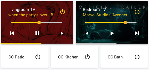
- type: horizontal-stack
  cards:
    - entity: media_player.tv_livingroom
      type: custom:mini-media-player
      info: short
      artwork: cover
      hide:
        mute: true
        icon: true
        power_state: false
    - entity: media_player.tv_bedroom
      type: custom:mini-media-player
      info: short
      artwork: cover
      hide:
        mute: true
        icon: true
        power_state: false
- type: horizontal-stack
  cards:
    - entity: media_player.cc_patio
      type: custom:mini-media-player
      hide:
        icon: true
    - entity: media_player.cc_kitchen
      type: custom:mini-media-player
      hide:
        icon: true
    - entity: media_player.cc_bath
      type: custom:mini-media-player
      hide:
icon: trueSpecify all your speaker entities in a list under the option speaker_group -> entities. They obviously need to be of the same platform.
- The card does only allow changes to be made to groups where the entity of the card is the coordinator/master speaker.
- Checking a speakers in the list will make it join the group of the card entity. (
media_player.sonos_officein the example below). - Unchecking a speaker in the list will remove it from any group it's a part of.
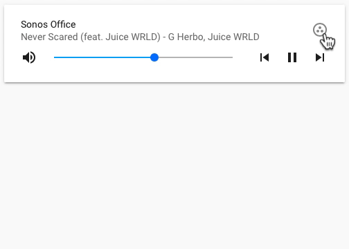
type: custom:mini-media-player
entity: media_player.sonos_office
hide:
  power: true
  icon: true
  source: true
speaker_group:
  platform: sonos
  show_group_count: true
  entities:
    - entity_id: media_player.sonos_office
      name: Sonos Office
    - entity_id: media_player.sonos_livingroom
      name: Sonos Livingroom
    - entity_id: media_player.sonos_kitchen
      name: Sonos Kitchen
    - entity_id: media_player.sonos_bathroom
      name: Sonos Bathroom
    - entity_id: media_player.sonos_bedroom
      name: Sonos Bedroom
If you are planning to use the speaker_group option in several cards, creating a separate yaml file for the list is highly recommended, this will result in a less cluttered ui-lovelace.yaml and also make the list easier to manage and maintain.
You then simply reference the file containing the list using entities: !include filename.yaml for every occurrence of entities in your ui-lovelace.yaml.
This is however only possible when you have lovelace mode set to yaml in your HA configuration, see Lovelace YAML mode for more info.
If you plan to contribute back to this repo, please fork & create the PR against the dev branch.
Clone this repository into your config/www folder using git.
$ git clone https://github.com/kalkih/mini-media-player.gitAdd a reference to the card in your ui-lovelace.yaml.
resources:
  - url: /local/mini-media-player/dist/mini-media-player-bundle.js
type: moduleRequires nodejs & npm
- Move into the
mini-media-playerrepo, checkout the dev branch & install dependencies.
$ cd mini-media-player && git checkout dev && npm install-
Make changes to the source
-
Build the source by running
$ npm run build-
Refresh the browser to see changes
Make sure cache is cleared or disabled
-
(Optional) Watch the source and automatically rebuild on save
$ npm run watchThe new mini-media-player-bundle.js will be build and ready inside /dist.
Make sure you have javascript_version: latest in your configuration.yaml under frontend:.
Make sure you have the latest version of mini-media-player-bundle.js.
If you have issues after updating the card, try clearing your browsers cache or restart Home Assistant.
If you are getting "Custom element doesn't exist: mini-media-player" or running older browsers try replacing type: module with type: js in your resource reference, like below.
resources:
  - url: ...
type: jsThis project is under the MIT license.