RadialMenu
A custom control to create radial-menu into your WPF application.
How to use
Import the RadialMenu.dll into your project (do not forget to reference it), then into your Xaml View, import the custom control
xmlns:Controls="clr-namespace:RadialMenu.Controls;assembly=RadialMenu"
To create the main component of the RadialMenu, simply type
<Controls:RadialMenu>
    ...
</Controls:RadialMenu>
To create the central menu item of the RadialMenu, simply type
<Controls:RadialMenuCentralItem>
    ...
</Controls:RadialMenuCentralItem>
To create a menu item of the RadialMenu, simply type
<Controls:RadialMenuItem>
...
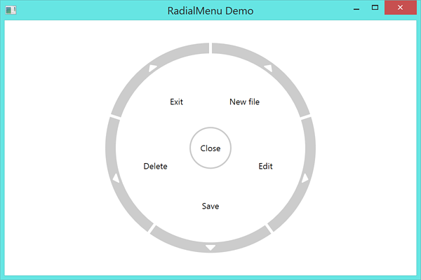
</Controls:RadialMenuItem>Full example
A tipical example of what can be done
<RadialMenu:RadialMenu IsOpen="{Binding IsOpen}">

    <!-- CentralMenuItem -->

    <RadialMenu:RadialMenu.CentralItem>
        <RadialMenu:RadialMenuCentralItem Command="{Binding CloseRadialMenuCommand}">
            <TextBlock>Close</TextBlock>
        </RadialMenu:RadialMenuCentralItem>
    </RadialMenu:RadialMenu.CentralItem>

    <!-- MenuItems Around -->

    <RadialMenu:RadialMenuItem Command="{Binding NewFileCommand}">
        <TextBlock>New file</TextBlock>
    </RadialMenu:RadialMenuItem>

    <RadialMenu:RadialMenuItem Command="{Binding EditCommand}">
        <TextBlock>Edit</TextBlock>
    </RadialMenu:RadialMenuItem>

    <RadialMenu:RadialMenuItem Command="{Binding SaveCommand}">
        <TextBlock>Save</TextBlock>
    </RadialMenu:RadialMenuItem>

    <RadialMenu:RadialMenuItem Command="{Binding DeleteCommand}">
        <TextBlock>Delete</TextBlock>
    </RadialMenu:RadialMenuItem>

    <RadialMenu:RadialMenuItem Command="{Binding ExitCommand}">
        <TextBlock>Exit</TextBlock>
    </RadialMenu:RadialMenuItem>

    <!-- Add items as you want... -->

</RadialMenu:RadialMenu>
which results in
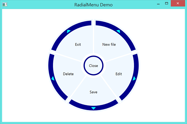
Customization
You can even create your own style of RadialMenu (do not forget to add style for disabled, hovered and pressed item states if desired)
<Style x:Key="FancyRadialMenuCentralItem" TargetType="Controls:RadialMenuCentralItem" BasedOn="{StaticResource {x:Type Controls:RadialMenuCentralItem}}">

    <Setter Property="Background" Value="AliceBlue"/>
    <Setter Property="BorderBrush" Value="DarkBlue"/>
    <Setter Property="BorderThickness" Value="4"/>
    <Setter Property="Width" Value="64"/>
    <Setter Property="Height" Value="64"/>

</Style>

<Style x:Key="FancyRadialMenuItem" TargetType="Controls:RadialMenuItem" BasedOn="{StaticResource {x:Type Controls:RadialMenuItem}}">

    <Setter Property="Background" Value="AliceBlue"/>
    <Setter Property="Padding" Value="2"/>
    <Setter Property="InnerRadius" Value="40"/>
    <Setter Property="OuterRadius" Value="150"/>
    <Setter Property="ContentRadius" Value="85"/>

    <Setter Property="EdgeBackground" Value="DarkBlue"/>
    <Setter Property="EdgePadding" Value="7"/>
    <Setter Property="EdgeInnerRadius" Value="130"/>
    <Setter Property="EdgeOuterRadius" Value="145"/>

    <Setter Property="ArrowBackground" Value="Cyan"/>
    <Setter Property="ArrowRadius" Value="138"/>

</Style>
which results in
Advanced Usage
- The radial menu will not scale by default (and transform controls will break it). To modify the size you want to adjust the Radius properties on the style. You will most likely need to adjust OuterRadius, ContentRadius, EdgeInnerRadius, EdgeOuterRadius, and ArrowRadius to resize the control
- When creating RadialMenuItems try to stick the text in a TextBlock for the best formatting results
- You can hide the arrow on a RadialMenuItem by setting its ArrowBackground to Transparent
- To update the control from code behind after creation you cannot simply update the radialMenu.Items list, you must replace it with a new collection. For example:
MyRadialMenu.Items = new List<RadialMenuItem>
{
    new RadialMenuItem
    {
        Content = new TextBlock { Text = "Hello" }
    },
    new RadialMenuItem
    {
        Content = new TextBlock { Text = "World" }
    }
};
Multi-level menu
You can easily create multi-level radial menus by using the arrow as a visual queue and then replacing the items with an updated set. For example:
<RadialMenu:RadialMenu x:Name="MyRadialMenu" IsOpen="{Binding IsOpen}">
    ...
</RadialMenu:RadialMenu>
// Main menu
var MainMenuItems = new List<RadialMenuItem>
{
new RadialMenuItem
{
Content = new TextBlock { Text = "Item 1" },
ArrowBackground = Brushes.Transparent
},
new RadialMenuItem
{
Content = new TextBlock { Text = "Item 2" },
ArrowBackground = Brushes.Transparent
},
new RadialMenuItem
{
Content = new TextBlock { Text = "Sub Menu" }
}
};
// Sub menu
var SubMenuItems = new List<RadialMenuItem>
{
new RadialMenuItem
{
Content = new TextBlock { Text = "Sub Item 1" },
ArrowBackground = Brushes.Transparent
},
new RadialMenuItem
{
Content = new TextBlock { Text = "Sub Item 2" },
ArrowBackground = Brushes.Transparent
},
new RadialMenuItem
{
Content = new TextBlock { Text = "Sub Item 3" },
ArrowBackground = Brushes.Transparent
}
};
// Go to Sub menu when clicking on the third item
MainMenuItems[2].Click += async (sender, args) =>
{
IsOpen = false;
await Task.Delay(400);
MyRadialMenu.Items = SubMenuItems;
IsOpen = true;
};
// Set default menu to Main menu
MyRadialMenu.Items = MainMenuItems;Which results in