Is there a way to highlight a desktop icon blue when clicked once?
tetron432 opened this issue · comments

I am trying to make a desktop icon using this library, and this snippet of code:
  <div class="desktop-icons">
      <div class="recycle-bin ui-icon">
         <div class="ui-icon-container">
            <img width="32" height="32" src="https://i.imgur.com/EvJUWPq.png">
            <span style="color:white;">My Computer</span>
         </div>
      </div>
   </div>
However, this piece of HTML code doesn't highlight the whole icon blue like this:
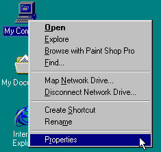
Does 98.css support this particular feature, and if so, what would I need to do?

As far as I know (not a contributor/maintainer) 98.css doesn't support this feature out of the box.
Thinking off the top of my head here:
Perhaps you could achieve it with the CSS filter property.
In any case, you would most likely have to use a bit of JavaScript to add some sort of modifier to the image element unless you want to make some sort of checkbox hack (which I'm not sure is semantically sound).

I think a checkbox hack might be semantically sound since the icons are elements that are either selected or unselected, like a checkbox would be. So there is a semantic correspondence to a checkbox.

I tried doing this in a number of ways for 98.js.org, so I'll go ahead and outline them here in detail.
- Simple CSS filter: Can only approximate. Of potential interest, there's a tool to generate CSS filters for solid colors, but it doesn't support simulating a translucent color overlay. It's hard to support themes with this approach since it needs a crafted (or non-trivially generated) filter. Example:
sepia() brightness(50%) saturate(2) hue-rotate(0.5turn) - Canvas: Requires JavaScript. May be slow initially, but should be faster than other approaches once the modified images are generated. Canvases may be unloaded if available memory is low. Could use ImageBitmapRenderingContext for lower overhead, theoretically. With a canvas approach it would be trivial to get the desired effect, but there'd be a bit of bookkeeping if you want to update icons or support animated icons.
- SVG filter: may be slow; caused clipping and blurring in Firefox (this bug is closed so it may no longer be a problem). This took a lot to get working, and there were other gotchas. See code for SVG filter. I'm not sure why I used
<foreignObject>but it was probably to work around something annoying. - Drop shadow filter on a translated overlaid element:
The
 filter: drop-shadow(32px 0 0 #000080);
 transform: translateX(-32px);
 clip-path: polygon(100% 0, 200% 0, 200% 100%, 100% 100%);
clip-paththere is to hide the image, leaving only its shadow, to prevent "seeing double" — you don't want the icon to appear duplicated beside itself. Sometimes it would show up though, like while the page was loading, and I believe there were some cross-browser problems as well. - Mask image on an overlaid element: placing an element over top of the
imgelement and giving it the highlight color as a background, and half opacity, and amask-imagepointing to the same file as theimg. This works well with theming, it's fast, fairly simple, and relatively artifact-free. It does require duplicating thesrc, but this was not a problem for me, and with a CSS variable it can be defined in a style attribute in the HTML, right near the imgsrc.
This is the approach I'd recommend, with an SVG filter potentially being a better option if browser bugs are fixed and the approach can be simplified.

How about using the color blend mode instead of chained filters?
@waldyrious the "color" blend mode is not particularly related to how Windows renders the highlight. You could only get an approximation with it, like with the Simple CSS filter solution, except it would require an extra element.
The final color has the hue and saturation of the top color, while using the luminosity of the bottom color. The effect preserves gray levels and can be used to colorize the foreground.
Windows 98 doesn't doesn't do anything fancy in HSL space for the effect, just a simple 50% blend with the highlight color.