Easily add significance bars to your ggplots
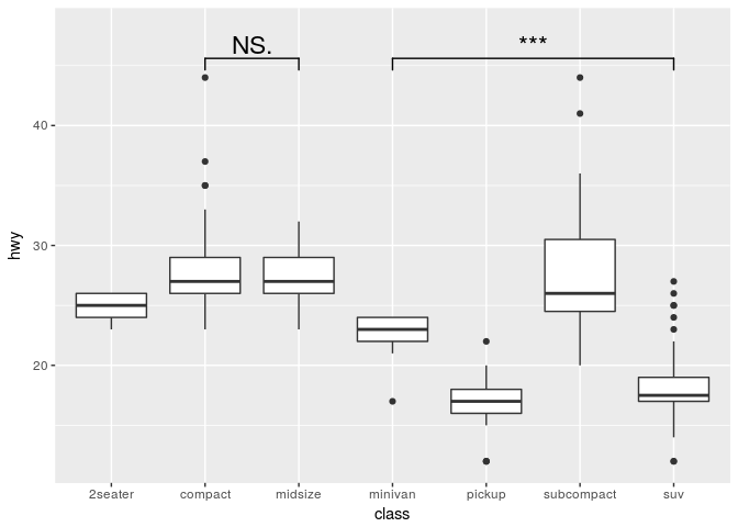
This package provides an easy way to indicate if two groups are significantly different. Commonly this is shown by a bar on top connecting the groups of interest which itself is annoted with the level of significance (NS, *, **, ***). The package provides a single layer (geom_signif) that takes the groups for comparison and the test (t.test, wilcox etc.) and adds the annotation to the plot.
Install package
install.packages("ggsignif")

# Or for the latest development version
devtools::install_github("const-ae/ggsignif")
Plot significance
library(ggplot2)
library(ggsignif)
ggplot(mpg, aes(class, hwy)) +
   geom_boxplot() +
   geom_signif(comparisons = list(c("compact", "midsize"), c("minivan", "suv")),
               map_signif_level = TRUE, textsize=6) +
  ylim(NA, 48)
Setting the precise location
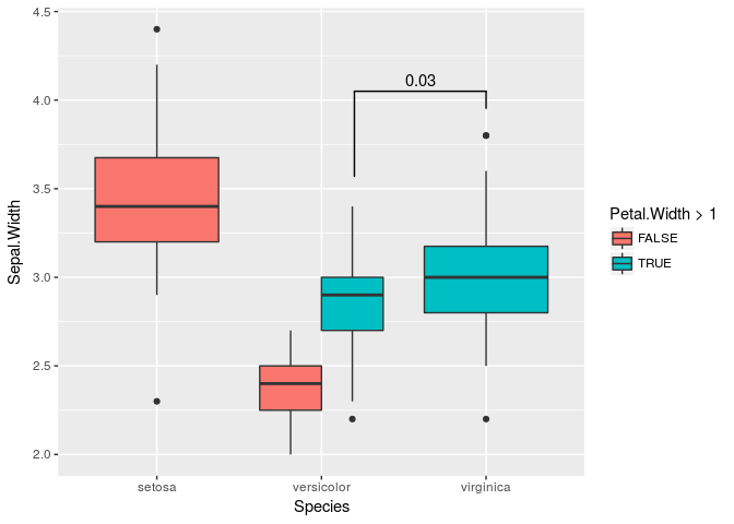
This is important if you use position="dodge", because in that case I cannot calculate the correct position of the bars automatically.
# Calculate annotation
anno <- t.test(iris[iris$Petal.Width > 1 & iris$Species == "versicolor", "Sepal.Width"],
               iris[iris$Species == "virginica", "Sepal.Width"])$p.value

# Make plot with custom x and y position of the bracket
ggplot(iris, aes(x=Species, y=Sepal.Width, fill=Petal.Width > 1)) +
  geom_boxplot(position="dodge") +
  geom_signif(annotation=formatC(anno, digits=1),
              y_position=4.05, xmin=2.2, xmax=3,
              tip_length = c(0.2, 0.04))
Advanced Example
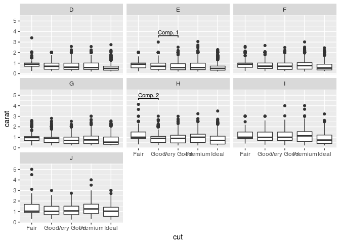
Sometimes one needs to have a very fine tuned ability to set the location of the the significance bars in combination with facet_wrap or facet_grid. In those cases it you can set the flag manual=TRUE and provide the annotations as a data.frame:
annotation_df <- data.frame(color=c("E", "H"),
                            start=c("Good", "Fair"),
                            end=c("Very Good", "Good"),
                            y=c(3.6, 4.7),
                            label=c("Comp. 1", "Comp. 2"))

annotation_df
#>   color start       end   y   label
#> 1     E  Good Very Good 3.6 Comp. 1
#> 2     H  Fair      Good 4.7 Comp. 2

ggplot(diamonds, aes(x=cut, y=carat)) +
  geom_boxplot() +
  geom_signif(data=annotation_df,
              aes(xmin=start, xmax=end, annotations=label, y_position=y),
              textsize = 3, vjust = -0.2,
              manual=TRUE) +
  facet_wrap(~ color) +
  ylim(NA, 5.3)
You can ignore the warning about the missing aesthetics.
For further details go the CRAN page and check the examples in the vignette.


