Tutorials about animations in Android such as ObjectAnimators, ValueAnimators, translations, gradient animations, AnimationDrawables, AnimatedVectorDrawables with states, physics animations, fragment transitions, image to ViewPager transitions and more.
- Tutorial1-1Basics
Tutorials about animators, animation basics and using coroutine based SurfaceView to create a counter up down motion
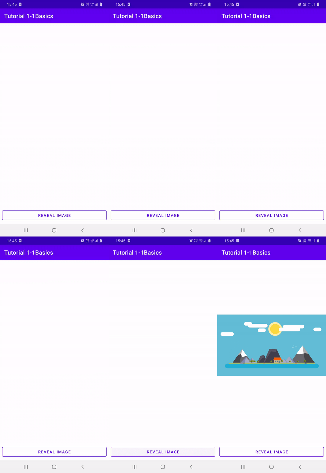
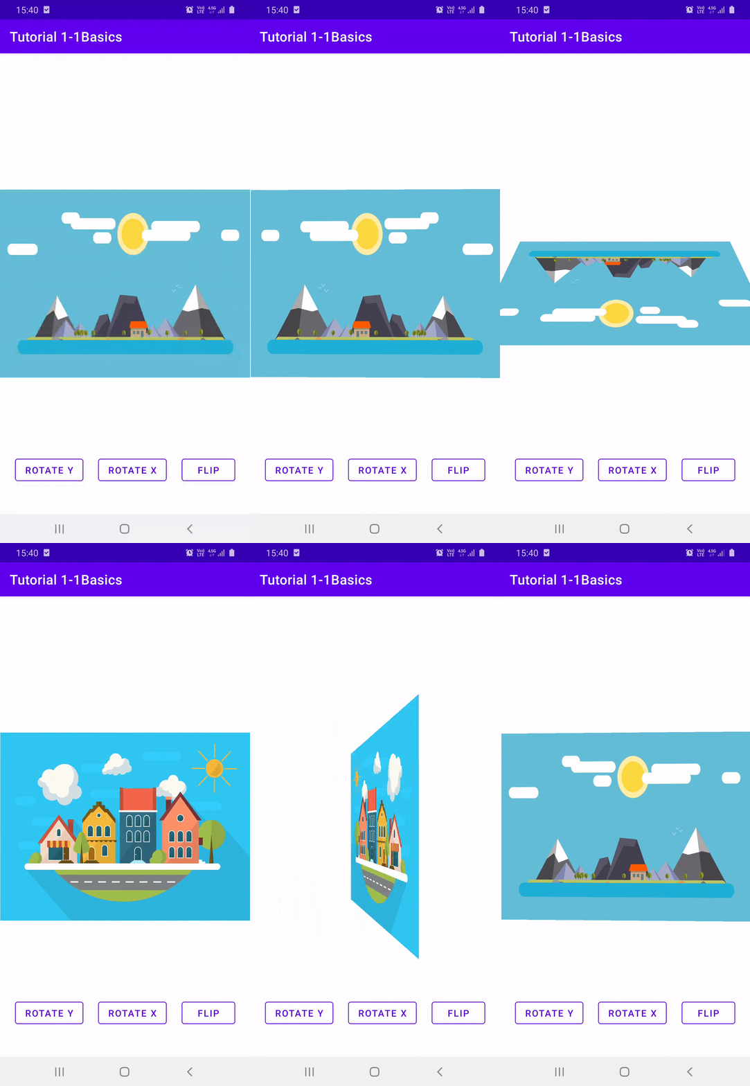
| Ch2-3 Circular Reveal | Ch2-4 Rotate X/Y Flip | Ch2-6 Zoom |
|---|---|---|
 |
 |
 |
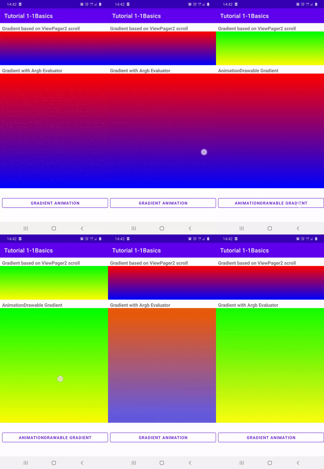
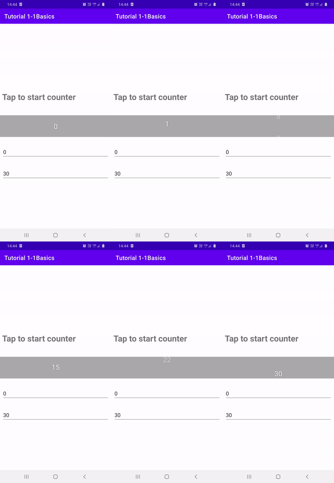
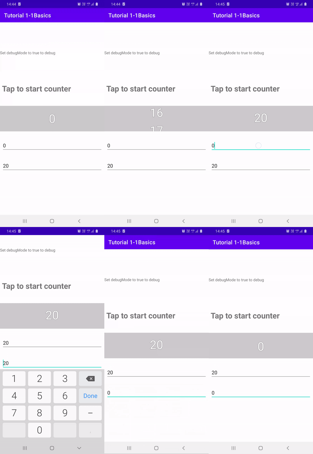
| Ch2-7 Gradient | Ch2-8 Counter TextViews | Ch2-9 Counter SurfaceView |
|---|---|---|
 |
 |
 |
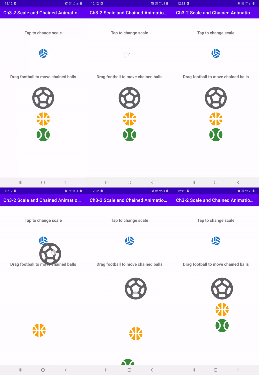
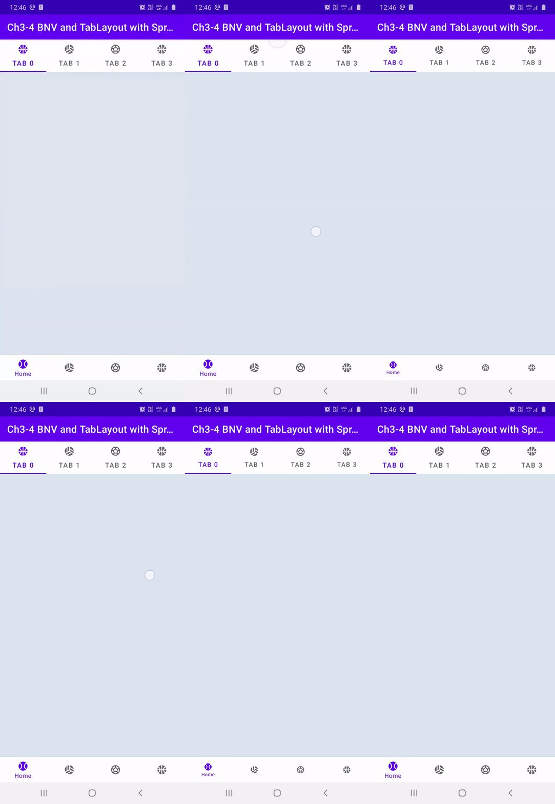
| Ch3-1 Physics | Ch3-2 Scale and Chained | Ch3-3 Fling | Ch3-4 BNV+TabLayout Physics |
|---|---|---|---|
 |
 |
 |
 |
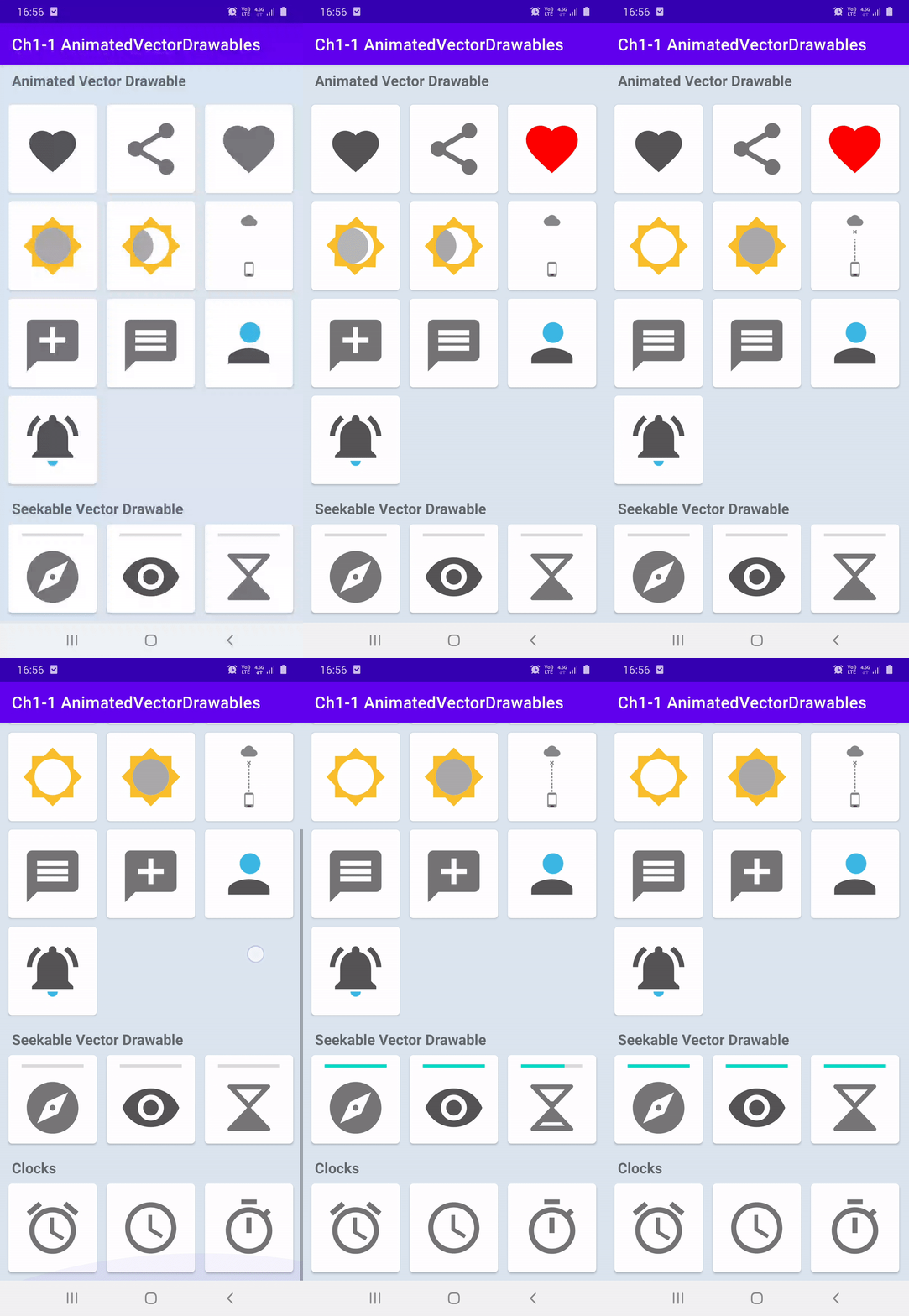
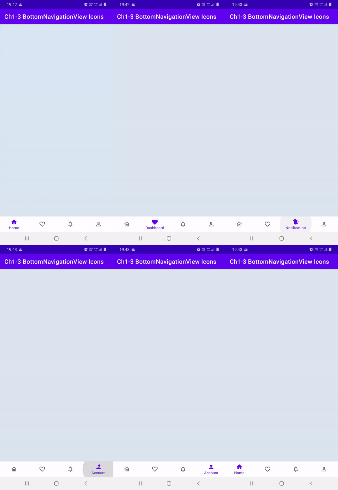
- Tutorial2-1Animated Vector Drawables
Tutorials about Vector drawables, AnimatedVectorDrawables, and animation transitions for Animated Drawables
| Ch1-1 Animated VDs | Ch1-2 State Change | Ch1-3 BNV Icons |
|---|---|---|
 |
 |
 |
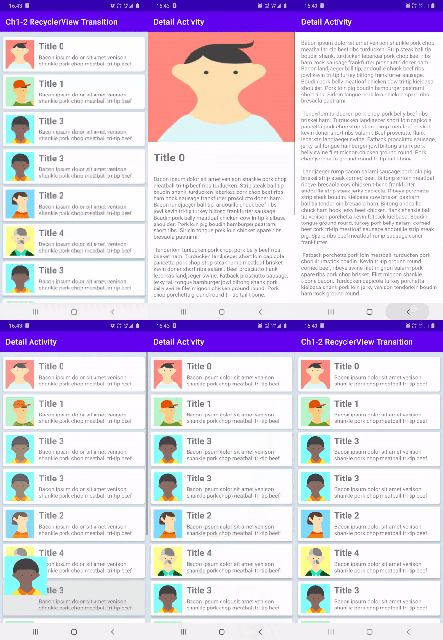
- Tutorial3-1Shared Transitions Tutorials about Shared Transitions from Activity to Activity, and from Fragment to Fragment
| Ch1-2 RV Transition | Ch1-4 RV to VP2 Transition | Ch2-3 Nav Components |
|---|---|---|
 |
 |
 |
Physics-based motion is driven by force. Spring force is one such force that guides interactivity and motion. A spring force has the following properties: damping and stiffness. In a spring-based animation, the value and the velocity are calculated based on the spring force that are applied on each frame.
If you'd like your app's animations to slow down in only one direction, consider using a friction-based fling animation instead.
The general steps for building a spring animation for your application are as follows:
- Add the support library You must add the support library to your project to use the spring animation classes.
- Create a spring animation: The primary step is to create an instance of the SpringAnimation class and set the motion behavior parameters.
- (Optional) Register listeners: Register listeners to watch for animation lifecycle changes and animation value updates.
Note: Update listener should be registered only if you need per-frame update on the animation value changes. An update listener prevents the animation from potentially running on a separate thread.
- (Optional) Remove listeners: Remove listeners that are no longer in use.
- (Optional) Set a start value: Customize the animation start value.
- (Optional) Set a value range: Set the animation value range to restrain values within the minimum and the maximum range.
- (Optional) Set start velocity: Set the start velocity for the animation.
- (Optional) Set spring properties: Set the damping ratio and the stiffness on the spring.
- (Optional) Create a custom spring: Create a custom spring in case you do not intend to use the default spring or want to use a common spring throughout the animation.
- Start animation: Start the spring animation.
- (Optional) Cancel animation: Cancel the animation in case the user abruptly exits the app or the view becomes invisble.
A VectorDrawable can be represented in xml with
<vector xmlns:android="http://schemas.android.com/apk/res/android"
      android:height="64dp"
      android:width="64dp"
      android:viewportHeight="600"
      android:viewportWidth="600" >
      <group
          android:name="rotationGroup"
          android:pivotX="300.0"
          android:pivotY="300.0"
          android:rotation="45.0" >
          <path
              android:name="v"
              android:fillColor="#000000"
              android:pathData="M300,70 l 0,-70 70,70 0,0 -70,70z" />
      </group>
  </vector>
where width and height are the actual dimensions of while viewportWidth, and viewportHeight are used for drawing coordinates.
M(x,y) Begin a new subpath by moving to (x,y).
L(x,y) Draw a line to (x,y).
C (x1,y1 x2,y2 x,y) Draw a cubic bezier curve to (x,y) using control points (x1,y1) and (x2,y2).
Z Close the path by drawing a line back to the beginning of the current subpath
group tag is used for grouping sections of drawable to be able to be animated together. And some animations such as rotation, and translation can only be applied to groups.
Animations can be performed on the animatable attributes in android.graphics.drawable.VectorDrawable. These attributes will be animated by android.animation.ObjectAnimator. The ObjectAnimator's target can be the root element, a group element or a path element. The targeted elements need to be named uniquely within the same VectorDrawable. Elements without animation do not need to be named.
For more details you can check out here
An AnimatedVectorDrawable element has a VectorDrawable attribute, and one or more target element(s). The target element can specify its target by android:name attribute, and link the target with the proper ObjectAnimator or AnimatorSet by android:animation attribute.
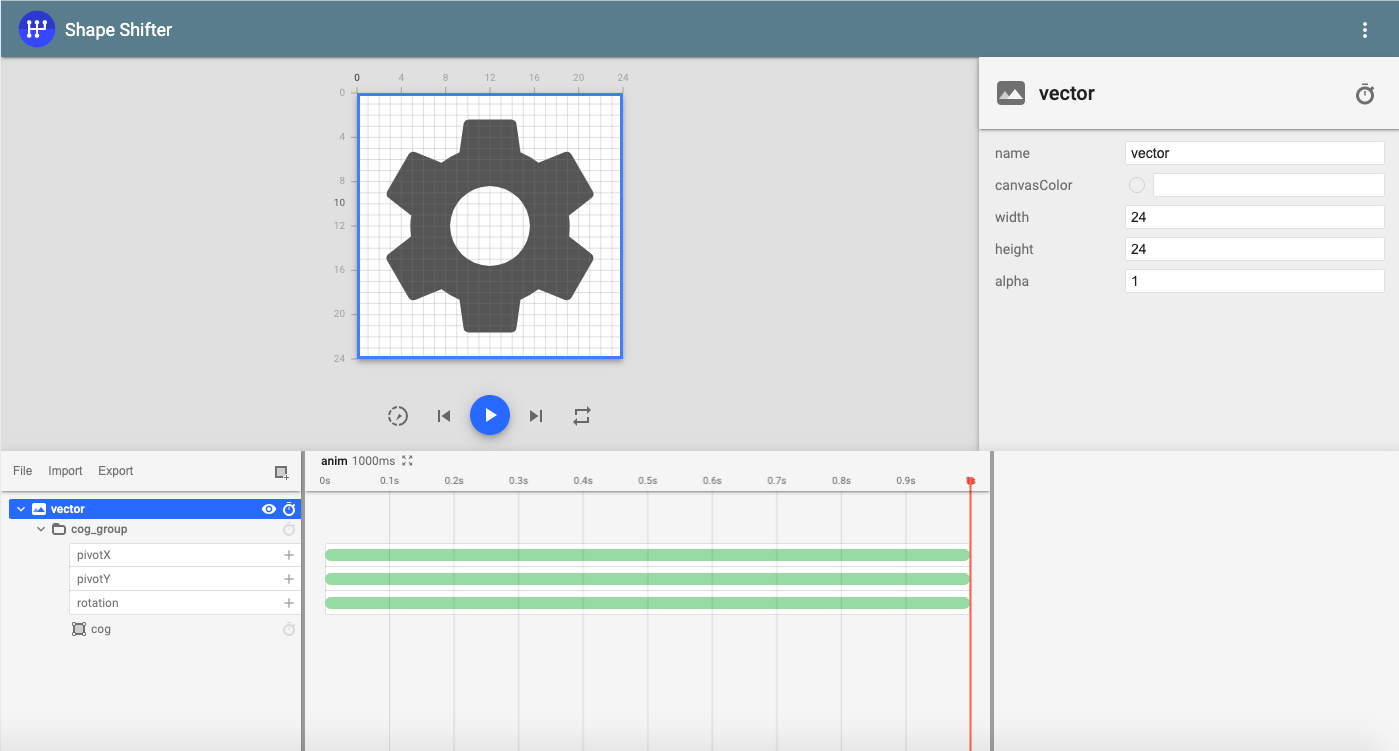
🔥😍 ShapeShifter by Alex Lockwood makes it so easy to create animations for Vector Drawables. Wonderful and very easy to use tool to create Animated Vector Drawables.
<set xmlns:android="http://schemas.android.com/apk/res/android">
      <objectAnimator
          android:duration="3000"
          android:propertyName="pathData"
          android:valueFrom="M300,70 l 0,-70 70,70 0,0 -70,70z"
          android:valueTo="M300,70 l 0,-70 70,0  0,140 -70,0 z"
          android:valueType="pathType"/>
</set>
Since the AAPT tool supports a new format that bundles several related XML files together, we can merge the XML files from the previous examples into one XML file:
<animated-vector xmlns:android="http://schemas.android.com/apk/res/android"
xmlns:aapt="http://schemas.android.com/aapt" >
<aapt:attr name="android:drawable">
<vector
android:height="64dp"
android:width="64dp"
android:viewportHeight="600"
android:viewportWidth="600" >
<group
android:name="rotationGroup"
android:pivotX="300.0"
android:pivotY="300.0"
android:rotation="45.0" >
<path
android:name="v"
android:fillColor="#000000"
android:pathData="M300,70 l 0,-70 70,70 0,0 -70,70z" />
</group>
</vector>
</aapt:attr>
<target android:name="rotationGroup"> *
<aapt:attr name="android:animation">
<objectAnimator
android:duration="6000"
android:propertyName="rotation"
android:valueFrom="0"
android:valueTo="360" />
</aapt:attr>
</target>
<target android:name="v" >
<aapt:attr name="android:animation">
<set>
<objectAnimator
android:duration="3000"
android:propertyName="pathData"
android:valueFrom="M300,70 l 0,-70 70,70 0,0 -70,70z"
android:valueTo="M300,70 l 0,-70 70,0 0,140 -70,0 z"
android:valueType="pathType"/>
</set>
</aapt:attr>
</target>
</animated-vector>
To create transition between views set transition name in xml with android:transitionName
 <androidx.appcompat.widget.AppCompatImageView
            // Rest of the imageView properties
            android:transitionName="ivAvatar"/>
or in Kotlin/Java with
iv.setTransitionName("SOME_TRANSITION_NAME")
these names should match for both Activities. To start transition after a click
 val intent = Intent(this, Activity1_1DetailActivity::class.java)
        intent.putExtra("imageRes", imageRes)

        // create the transition animation - the images in the layouts
        // of both activities are defined with android:transitionName="robot"
        val options = ActivityOptions
            .makeSceneTransitionAnimation(
                this,
                ivAvatar,
                ViewCompat.getTransitionName(ivAvatar)
            )
        // start the new activity
        startActivity(intent, options.toBundle())
For custom transitions create transition folder inside res folder and add
<slide xmlns:android="http://schemas.android.com/apk/res/android"
    android:slideEdge="left"
    android:duration="1500">

    <targets>
        <!-- Specify the status bar ID if it needs to be excluded -->
        <target android:excludeId="@android:id/statusBarBackground"/>
        <!-- Specify the navigation bar ID if it needs to be excluded -->
        <target android:excludeId="@android:id/navigationBarBackground"/>
    </targets>

</slide>
default transition for Android system is
<transitionSet xmlns:android="http://schemas.android.com/apk/res/android">
    <!-- This is the systems default transition -->
    <changeBounds />
    <changeTransform />
    <changeClipBounds />
    <changeImageTransform />
</transitionSet>
Use <item name="android:windowContentTransitions">true</item> to enable Activity transitions
Use <item name="android:windowSharedElementsUseOverlay">false</item> for shared transition items not to be drawn
over NavigationBar, or Toolbar
- Note Exit-ReEnter transitions, and ReEnter-Return transitions for Activity are same transition by default.
- Exit, Enter, ReEnter and Return transitions are NULL for fragments by default
- setExitSharedElementCallback, and sharedElementExitTransition useful for changing shared transition elements that are mapped with String and View. For instance, after transition from RecyclerView to ViewPager or another RecyclerView, user changes the selected page/element and we remap the shared element for the next imageView in ViewPager's current page.
ExitSharedElementCallback is triggered in first Activity, in second Activity EnterSharedElementCallback is triggered
        Activity1 ---> Activity2
        Exit    ----> Enter
        SharedElementCallback Order: Activity1 Exit -> Activity2 Enter

        I: 🌽 Activity1_1Basics: setExitSharedElementCallback() names:[transition_image_view], sharedElements: {transition_image_view=androidx.appcompat.widget.AppCompatImageView{b3a80cf V.ED..... ...P.... 21,21-231,231 #7f0800c5 app:id/ivPhoto}}
        I: 🔥 Activity1_1Basics: sharedElementExitTransition onTransitionStart()

        I: 🍒 Activity1_1Details: setEnterSharedElementCallback() names:[transition_image_view], sharedElements: {transition_image_view=androidx.appcompat.widget.AppCompatImageView{11b033f V.ED..... ......ID 0,0-1080,810 #7f0800c4 app:id/ivPhoto}}
        I: 🚌 Activity1_1Details: sharedElementEnterTransition onTransitionStart()

        Activity1 <-- Activity2
        ReEnter <--- Return
        SharedElementCallback Order: Activity2 Exit -> Activity1 Enter
        I: 🍒 Activity1_1Details: setEnterSharedElementCallback() names:[transition_image_view], sharedElements: {transition_image_view=androidx.appcompat.widget.AppCompatImageView{11b033f V.ED..... ........ 0,0-1080,810 #7f0800c4 app:id/ivPhoto}}
        I: 🌽 Activity1_1Basics: setExitSharedElementCallback() names:[transition_image_view], sharedElements: {transition_image_view=androidx.appcompat.widget.AppCompatImageView{b3a80cf V.ED..... ......ID 21,21-231,231 #7f0800c5 app:id/ivPhoto}}

        I: 🚕 Activity1_1Details: sharedElementReturnTransition onTransitionStart()
        I: 🍏 Activity1_1Basics: sharedElementReenterTransition onTransitionStart()


        onMapSharedElements() does exact same thing in makeSceneTransitionAnimation
        mapping string to view or with Pair<View, String>
-
🔥🔥🔥 Make sure that you are importing
androidx.transition, do NOT import android.transition components, mixing different import packages causes Wrong Transition Exception -
exitTransition, enterTransition, returnTransition and reEnterTransitions are null for fragments by default.
-
🔥🔥 Setting allowReturnTransitionOverlap to false lets this fragment's reenterTransition to wait previous fragment's returnTransition to finish
-
add sharedElement to fragments with
addSharedElement(ivPhoto, ivPhoto.transitionName)and usesetReorderingAllowed(true)to optimize for shared element transition -
With Navigation Components set shared elements as
val direction: NavDirections =
    Fragment2_3MagazineListDirections.actionFragment23MagazineListToFragment23MagazineDetail(
        magazineModel
    )

val extras = FragmentNavigatorExtras(
    binding.ivMagazineCover to binding.ivMagazineCover.transitionName,
)

findNavController().navigate(direction, extras)
- 🔥🔥🔥 With transitions, it's required for start and end values to be different from each other to call
createAnimatormethod.
- To make sure that ENTER or REENTER transitions start, either set captureStartValues and captureEndValues manually, or in fragment transitioned to, create setEnterSharedElementCallback and override onSharedElementStart and onSharedElementEnd methods and set properties of objects that are not shared in both fragments.
Without doing this enter or exit might not work because of Transition start and end point to same value.
🔥🔥🔥 In tutorial 2-4 and 2-5, having same background color for both fragments causing second fragment's ENTER TRANSITION(CircularReveal and Slide.BOTTOM) to not work.
So when using Transitions that extend Visiblity class such as Slide, or Fade be careful about background color. This is only for enterTransition for destination and reEnterTransition for source fragments. exitTransition and returnTransition do not need visibility change.
To prevent this use one of the solutions below:
1- Set callback and set start and end properties for starting and ending scenes with
        setEnterSharedElementCallback(object : SharedElementCallback() {

            override fun onSharedElementStart(
                sharedElementNames: MutableList<String>?,
                sharedElements: MutableList<View>?,
                sharedElementSnapshots: MutableList<View>?
            ) {
                super.onSharedElementStart(
                    sharedElementNames,
                    sharedElements,
                    sharedElementSnapshots
                )
                viewImageBackground.visibility = View.INVISIBLE
                recyclerView.visibility = View.INVISIBLE
            }

            override fun onSharedElementEnd(
                sharedElementNames: MutableList<String>?,
                sharedElements: MutableList<View>?,
                sharedElementSnapshots: MutableList<View>?
            ) {
                super.onSharedElementEnd(sharedElementNames, sharedElements, sharedElementSnapshots)
                viewImageBackground.visibility = View.VISIBLE
                recyclerView.visibility = View.VISIBLE
            }

        })
    }
2- Use custom transitions that extend either Transition or Visibility and force value changes.
-
⚠️ Transitions that extendVisibilitysuch asSlide,Fade, orExplodedepends on visibility of the view. If visibility is changed fromView.INVISIBLEtoView.VISIBLEonAppearmethod ofVisibilityclass is called, if visibility changesView.VISIBLEtoView.INVISIBLEonDisappearmethod is called. With difference between visibility of starting and ending scenes, or manual visibility change it's possible to play transitions from backwards. -
⚠️ When current transition is EXIT or RETURN transitioncaptureEndValuesis not called, because of this use a transition that extendsVisibilityforexitTransitionandreturnTransitionto start, and be aware that Animator fromonDisAppearis called while current transition is exit or return.
By default all views under a parent/ancestor with a background set (even transparent ones) will be automatically deemed a group. If you need to break them up like we here with a RecyclerView as the shared-root-white-backgrounded layout with transparent child Item views. You’ll need to set the layout with the background to transitionGroup=false. But on the other hand, since the Items are “background-less” themselves, to prevent an out-of-body experience you’ll need to do the opposite and set transitionGroup=true on the Item layouts for all the child views in that Item to move together.
CodeLab Property Animation
Android Design Patterns
android/animation-samples: Multiple samples showing the best practices in animation on Android
Playing with Material Design Transitions ✨ | by Philippe BOISNEY | ProAndroidDev
Meaningful Motion: Circular Reveal & Shared Elements | by Jossi Wolf | Snapp Mobile | Medium
Custom Transitions in Android. Since Android API 19 Google provides a… | by Roman Bielokon | Medium
Propagating Transitions in Android | by Nick Cruz | ProAndroidDev
Shared Element Transition using fragments Android | Developers Breach
Fragment Transitions
Circular reveal animation between Fragments | by Gabor Novak | Medium
Reveal Transition
Android — Inbox Material Transitions for RecyclerView
Plaid App
- Add RecyclerView, ViewPager animations
- Add custom Views with animations


