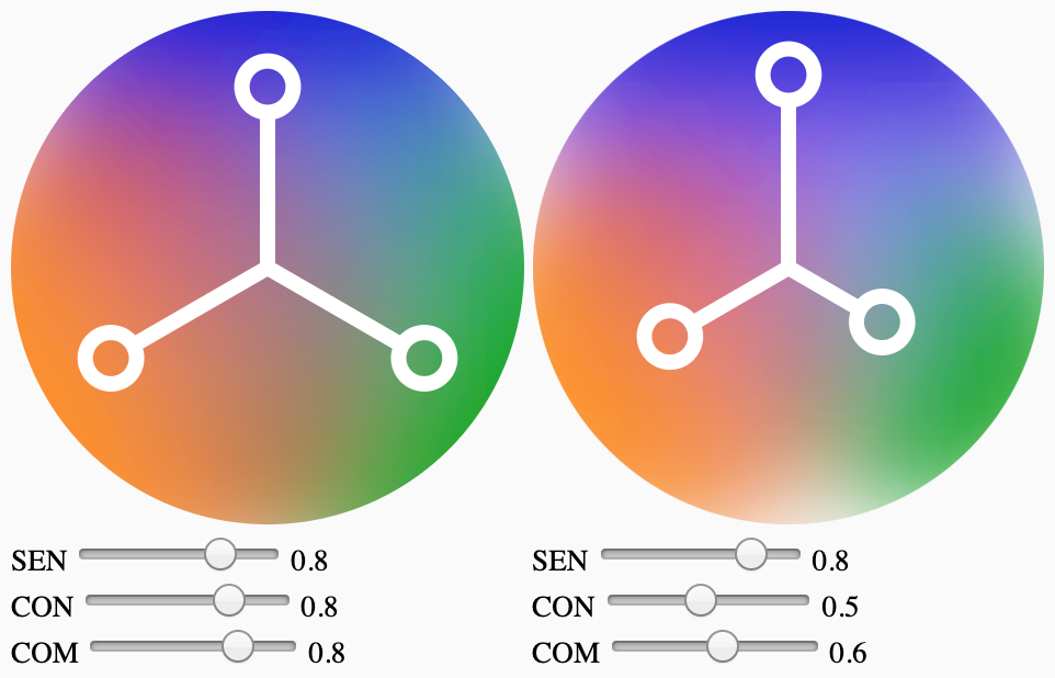
WebComponent ‹Sentir—Comprendre—Connaître›, following Enrique Pardo's requirements and concept (described at https://happui.org/app/).
<happ-ui-exp01 title="Color Wheel 1"
  sentir="0.8" connaitre="0.8" comprendre="0.8"></happ-ui-exp01>
<happ-ui-exp01 title="Color Wheel 2"
sentir="0.8" connaitre="0.5" comprendre="0.6"></happ-ui-exp01>This webcomponent follows the open-wc recommendation.
npm install happ-ui<script type="module">
import { HappUiExp01 } from './src/HappUiExp01.js';
window.customElements.define('happ-ui-exp01', HappUiExp01);
import { HappUiExp02 } from './src/HappUiExp02.js';
window.customElements.define('happ-ui-exp02', HappUiExp02);
</script>
<happ-ui-exp01 title="Color Wheel Exp 01"
sentir="0.65" connaitre="0.65" comprendre="0.65"></happ-ui-exp01>
<happ-ui-exp02 title="Color Wheel Exp 02"
sentir="0.65" connaitre="0.65" comprendre="0.65"></happ-ui-exp02>To run a local instance of Storybook for your component, run
npm run storybookTo build a production version of Storybook, run
npm run storybook:buildFor most of the tools, the configuration is in the package.json to reduce the amount of files in your project.
If you customize the configuration a lot, you can consider moving them to individual files.
npm run watchTo run a local development server that serves the basic demo located in index.html.
