A pure vue responsive masonry implementation without direct dom manipulation, ssr friendly with lazy appending. I created this because other libraries has no SSR support, and I needed a pure vue implementation.
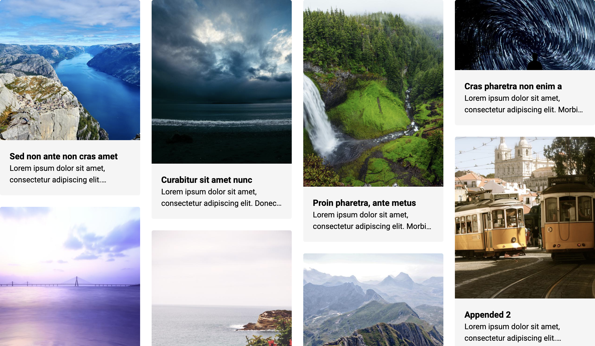
- Live Demo: Image and the Source
- Live Demo: Text and the Source
npm i vue-masonry-wall
# or yarn
yarn add vue-masonry-wall- No Direct DOM Manipulation
- SSR friendly, able to load and re hydrate later
- 1 dependency only, no legacy dependencies
- Auto lazy appending, scroll to auto load more
- Auto item placement, will find best column
- Responsive design
<vue-masonry-wall :items="items" :options="options" @append="append"/>const items = []
const options = {
width: 300,
padding: {
default: 12,
1: 6,
2: 8
}
}
const append = () => {
// API call and add items
this.items.push(...[])
}<template>
<div id="app">
<h2>Masonry: append endlessly</h2>
<vue-masonry-wall :items="items" :options="{width: 300, padding: 12}" @append="append">
<template v-slot:default="{item}">
<div class="item">
<h5>{{item.title}}</h5>
<p>{{item.content}}</p>
</div>
</template>
</vue-masonry-wall>
</div>
</template>
<script>
import VueMasonryWall from "vue-masonry-wall";
export default {
name: 'app',
components: {VueMasonryWall},
data() {
return {
items: [
{title: 'Item 0', content: 'Content'},
{title: 'Item 1', content: 'Content'},
]
}
},
methods: {
/**
* I am mocking a API call that load 20 objects at a time.
*/
append() {
for (let i = 0; i < 20; i++) {
this.items.push({title: `Item ${this.items.length}`, content: 'Content'})
}
}
}
}
</script>Add :ssr="{columns: 2}" to masonry so that during SSR, it will be load in 2 columns.
SSR has no clue what is the size of your height of your element or width of the browser. You can however guess based on user-agent: https://github.com/nuxt-community/device-module This param allow you to preload a config for SSR rendering, it will distribute your items into all columns evenly.
<vue-masonry-wall :items="items" :options="{width: 300, padding: 12}" :ssr="{columns: 2}" @append="append">
  <template v-slot:default="{item}">
    <div class="item">
      <h5>{{item.title}}</h5>
      <p>{{item.content}}</p>
    </div>
  </template>
</vue-masonry-wall>For any question or feature request please feel free to create an issue or pull request.
These were features from my original project that I removed for brevity of this package.
- nuxt-community/device-module to detect the browser for better SSR support.
- vue-scrollto to scroll to an item in masonry.
I also maintain another project called Vue Horizontal.
At its core, Vue Horizontal is an ultra simple pure vue horizontal layout for modern responsive web with zero dependencies. Vue Horizontal is also an ultra complex code snippet dossier with over 100 SPA/SSR/SSG friendly recipes for your design needs. Do check it out, might be useful for you!