Remember the Documentation:
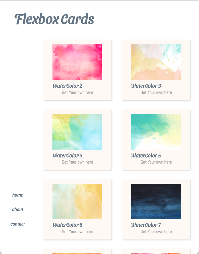
We will use flexbox to build a simple watercolor swatch site.
Let's open our code and see what is there
-
complete
index.html -
Web page structure:
- all elements are wrapped in a div with a class of wrapper.
- Within the wrapper:
- h1 tag
- main with a class of container
- main has two elements
- aside (that has a navigation and unordered list)
- section (that contains our 'cards')
- main has two elements
-
code-along.css: this is where we will do all our work
Note: the nav display is set to none. We are going to style it later, so we can just hide it for now. We can confirm our CSS is linked by checking that the nav HTML elements do not appear on our page.
Firstly, the images are massive. Let's write a temporary rule to keep them small
img {
  max-width: 175px;
  height: 125px;
}
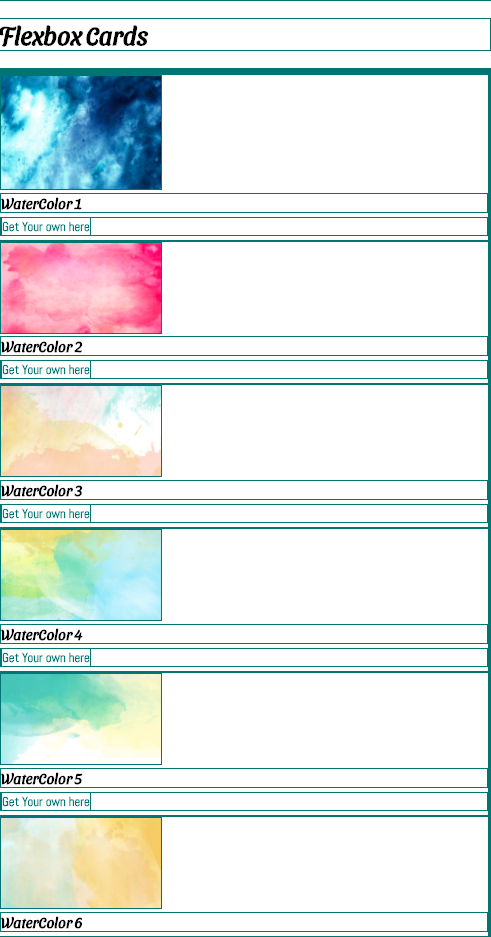
Add a universal rule to draw a gold (easier to remember 1px solid gold) or teal (easier to see) border around every element.
* {
  border: 1px solid teal;
}
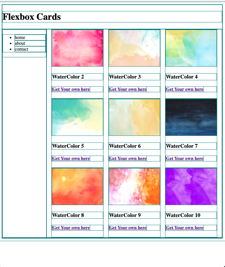
Our page should look (more or less) like this. There might be some minor differences based on your browser & size of your browser.
We will see that each of our cards that has an image, an h3 tag and an anchor tag inside an h4 tag and they are block elements.
There are two styling elements in flex - parents and containers
Unlike other CSS declarations, display flex only targets the immediate children
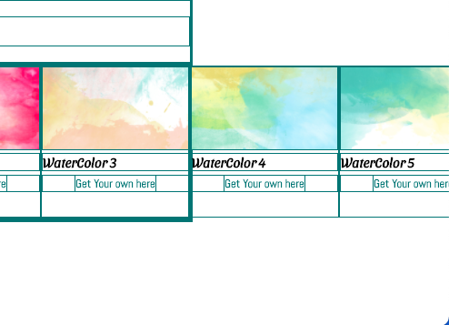
section  {
  display:flex;
}
We now have all of our cards as flex items, but they extend past their container.
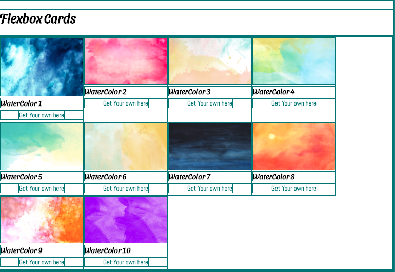
Let's add a declaration so that the items wrap to the next line
section  {
  display:flex;
  flex-wrap: wrap;
}Note: different amounts of cards may be on each row, depending on the width of your browser
How do we space out our cards evenly?
We can justify the content and there are a few options - let's try a few
section  {
  display:flex;
  flex-wrap: wrap;
  justify-content: center;
}
Once we are done trying out a few options, let's add and keep space-evenly
section  {
  display: flex;
  flex-wrap: wrap;
  /* justify-content: center; */
  /* justify-content: space-around; */
  /* justify-content: space-between; */
  justify-content: space-evenly;
}Comment out display:none on the nav element.
Let's make the parent container that holds our main and aside display flex:
.container {
  display: flex;
  justify-content: space-around;
}
Very little space is given to our nav/aside; So let's make the aside be 20%
aside {
  min-width: 20%;
}Make aside flex container
aside {
  min-width: 20%;
  display: flex;
}
and let's center that nav!
aside {
  min-width: 20%;
  display: flex;
  align-items:center;
  justify-content: center;
}
Let's polish our site a little more. Sometimes a bit of polishing helps us visually understand what is going on:
Comment out our border rule, and go into the index.html and link our main.css

