Rendering Issue with Outlook mail app in iOS
yagamikira88 opened this issue · comments

I'm using Fluid-type template untouched.
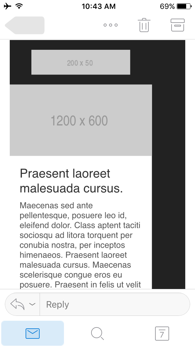
Please find herein the screenshot for a rendering issue I discovered for Outlook mail app that affects iOS only.
Any workaround?

@yagamikira88 Good catch, I'll look. It's an issue with all three templates, not just Fluid.
@yagamikira88 made a small change ^^ that seems to fix the alignment in mobile Outlook. Mind grabbing a fresh copy and retesting?
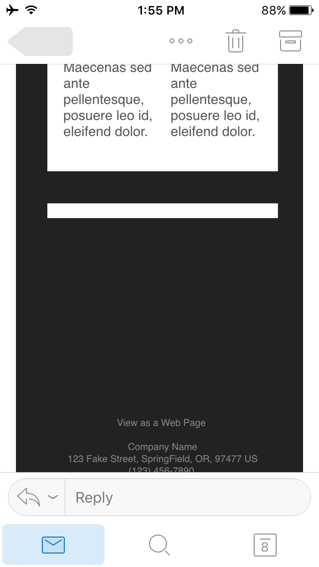
There's still an issue. Black borders are still there and now they can be seen on both sides , so it looks like the contents just centered. Also some rendering issue at bottom of the page. See attached screenshots.

Upon checking it further, if I put the phone on landscape mode all this rendering issue disappears.

Just wanted to add some more detail on the bug in iOS Outlook app (portrait mode only...landscape mode looks fine).
-
Using the the Hybrid template untouched, the layout looks fine
-
after swapping out content and rearranging some table rows, the email does not stretch to fill width of screen and aligns left
-
layout shows the full email on first load. if you go back then click back in to the email you just opened, the bottom of the email gets cut off. each time you do this, more and more of the email gets cut off

Hi,
I'm experiencing the same strange (and incredibly inconsistent) bottom-of-email-getting-cut-off effect when testing in the Outlook Android app.
Everything looks totally fine elsewhere, as far as I've tested thus far -- including in the Gmail Android app and in Outlook on the web -- but in the Outlook Android app, parts of the email toward the bottom frequently get cut off. In my experience, the footer usually remains in place and some (a seemingly random and varying amount) of the content above it gets cropped out.
Sometimes this happens the first time I open an email. Sometimes it's the second, the third, or the fifth. I haven't been able to find any rhyme or reason to it, and I've tried testing dozens of different things to see if I can find the culprit. Every time I think I've found it, I realize it's just the inconsistency that's getting me -- and sure enough, if I open the email enough times, the cropping starts occurring again.
I've tried testing it with the latest clean source code (Cerberus-responsive), too, and it happens with that as well.
It's the exact same issue described and illustrated here. I also found a thread at Litmus discussing the same thing from several months ago, which certainly seems to suggest it's a broader issue. Maybe just a flaw with the app? But there's clearly something that's triggering it, as it doesn't seem to happen with all emails.
Glad to have stumbled onto these threads, at least, as I was about to go insane thinking it was just me and trying to troubleshoot it myself!
@yagamikira88 this ☝️ should remove the excess borders on the left and right sides in Android:
It seems iOS Outlook adds padding to all emails. The white background around the email doesn't seem to be coming from the templates. 😕 Not sure if we can do anything about that one.

@yagamikira88 @thegreygoose11 @jayarr100 @andyroblesr Thanks everyone for helping troubleshoot this Outlook clipping bug. It’s possible this is an issue with these particular templates, but I’m scratching my head since I don’t remember this being a problem in the past. This part of the template code hasn’t changed much in the past few years and doesn’t seem to be doing anything weird or “clever.”
At this point, considering how sporadically this seems to happen, my best guess is it's a bug with the Outlook Apps themselves. I've submitted this issue directly to the Outlook Team via the Litmus Partnership. 🤞
In the meantime, I'm happy to keep discussing this.
@TedGoas I agree, and think the issue might be with Outlook apps themselves as I never encountered these issues until recently. The biggest problem for me is the inability to consistently recreate the problem in the iOS app.
Probably a bug with iOS Outlook in handling emails that contain tables. Using the fluid template, I tried converting the regular table tags (but without removing the tables in MSO Outlook conditional) into simple divs and this issue disappears. This way, should be OK for simple 1-column email.
It makes me wonder, what is the reason we should still use tables since the majority of email clients (except Outlook, but conditional tags can be used) support divs?
@yagamikira88 Many email clients do have decent support for <div> based layouts. At this point it's mainly Windows Outlook and Windows 10 Mail, as well as a few non-U.S. clients like GMX.de, Web.de, and SFR.fr.

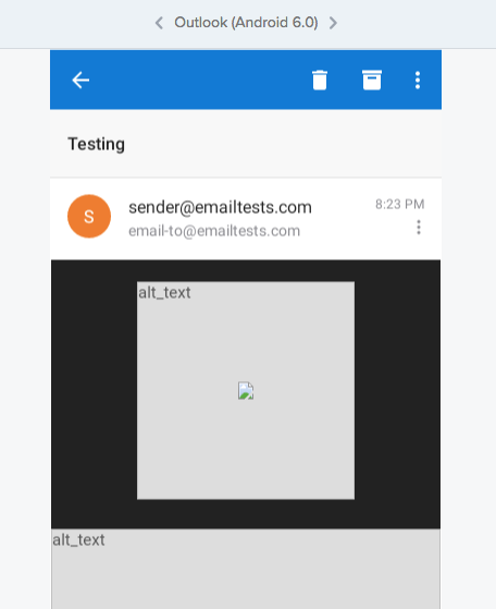
I'm facing same issue with Outlook app in iPhone. It's working fine in Android and iOS Mail App. Can someone help me fixing the issue?
I haven't forgotten about this and will take a look, not sure when though.

I've found what's causing the issue! Removing this part from the css in head resolves the issue and extra padding to outlook app completely:
` /* What it does: Removes right gutter in Gmail iOS app: #89 /
/ Create one of these media queries for each additional viewport size you'd like to fix */
    /* iPhone 4, 4S, 5, 5S, 5C, and 5SE */
    @media only screen and (min-device-width: 320px) and (max-device-width: 374px) {
        .email-container {
            min-width: 320px !important;
        }
    }
    /* iPhone 6, 6S, 7, 8, and X */
    @media only screen and (min-device-width: 375px) and (max-device-width: 413px) {
        .email-container {
            min-width: 375px !important;
        }
    }
    /* iPhone 6+, 7+, and 8+ */
    @media only screen and (min-device-width: 414px) {
        .email-container {
            min-width: 414px !important;
        }
    }`
@ollebsson Hey thanks for doing some digging. We can't outright remove that CSS because it will break alignment on mobile Gmail. However this code is the troublemaker, alright (thanks for pointing that out).
I edited these media queries to target only Gmail (so mobile Outlook will ignore them):
/* iPhone 4, 4S, 5, 5S, 5C, and 5SE */
        @media only screen and (min-device-width: 320px) and (max-device-width: 374px) {
            u ~ div .email-container {
                min-width: 320px !important;
            }
        }
        /* iPhone 6, 6S, 7, 8, and X */
        @media only screen and (min-device-width: 375px) and (max-device-width: 413px) {
            u ~ div .email-container {
                min-width: 375px !important;
            }
        }
        /* iPhone 6+, 7+, and 8+ */
        @media only screen and (min-device-width: 414px) {
            u ~ div .email-container {
                min-width: 414px !important;
            }
        }
This code ☝️ seems to work in my testing (both in Litmus and on actual iOS Gmail and Outlook). I will update them templates shortly.
🙌 Thanks for helping!


Thank you for awesome templates and making under-developed relic systems easier to work with. Just glad i could help! :)