Redesign system-file-manager
danirabbit opened this issue · comments
Problem
- The icon indicates
home, but Files doesn't necessarily always open to~/ - The shape conflates it with a folder instead of an app
- The size is much shorter on the canvas than other app icons
Proposal
- Avoid the
homemethaphor - Consider a rounded square base like most other app icons
Prior Art (Optional)
- It seems like blue is a pretty dominant color here in other file manager icons
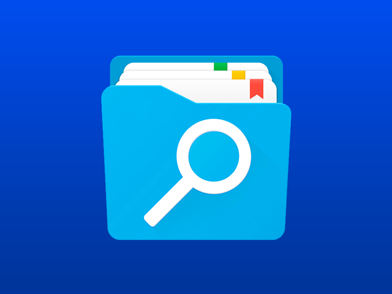
- Including the spyglass metaphor is kind of interesting, but I'm not sure it's any more relevant than other apps that have search
Chrome OS
GNOME
iOS
Windows
Other
The first "Other" example is interesting - nice and square and also suggests the ability to color tag folders.
I find the first "other" to be the most meaningful.
A flattened version, as the last "other", with a big well-centered magnifying glass would do the job.
Alternatively, the icon on top of the folder could be a cursor (hand or arrow), since it's arguably more common to navigate by clicking around than by searching.
Another option could be a tree representation, like this:
either in front of the folder, something like this:
...or below it:
...or instead of it altogether:
I made this to explain myself hehe
I think removing "home" icon from th icon is correct.
But I think we have to change the color of the icon for the default color of the files that are displayed for the first time when you open the File Manager. Elementary starts with this browny-yellowish folders color, so the user can quickly understand the reference between what the icon and how the files should look.
I personally think adding more elements is unnecessary. The magnifying glass element i think is unnecessary too.
@danielarrazola I like the middle icons with the greyish and blue background:

The elementary logo makes the icons look too busy and complicated. Search icon is fine, but plain folder is more universal.
There is a file manager for Android called Solid Explorer which has a pretty nice icon: https://play.google.com/store/apps/details?id=pl.solidexplorer2
It's blue, resembles a folder and it's a rounded square. Elementary could have something similar. The branding could be either removed or replaced with something (like a 🔎).
On the other hand, having a brownish icon could make more sense in elementary as highlighted by others, since that's how folders really do look like here - unless having a different color is a way to differentiate it from real folders.
mixed feelings on this one tbh... it doesn't really fit the way folders look in eOS, and there wasn't any need making in blue
i think these concepte looks more eye-pleasant and consistent with the previous icon #1101 (comment) #1101 (comment)
just make the folder gray and maybe put the search icon on it (although not necessary)


