Make more use of color in cursors
danirabbit opened this issue · comments
Problem
Colors are historically very monochrome, but we could be a lot more expressive with color
Proposal
Find ways to integrate color into cursors, maybe even accent colors?
Prior Art (Optional)
Hey! First-time contributor here, decided to dip my toes in the water and take a crack at this.
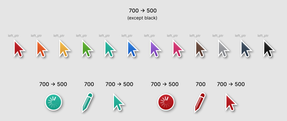
Straying away from the proposal a bit, I focused on applying accent colours to the cursors. First, I tried applying a gradient fill on the left pointer (accent 700 -> 500). They look okay but I'm not too sure how they'll behave in terms of contrast/accessibility so further testing is needed.
I also mirrored the 700 -> 500 gradient on some of the other cursors. For the pencil cursor, I didn't apply a gradient for the base colour (keeping it in line with the original). Instead, I opted for the 700 accent variant over the 500 as the highlight added some brightness.
The shadows might be a good place to add an accent colour but once again, I'm not too sure how that might play out contrast-wise.
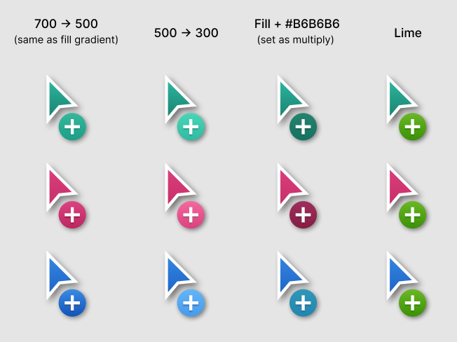
I've also noticed that if accent colours are used for the modifier then a problem arises with symbols such as "copy" and "no-drop". By using the same accent colour for the fill of the small circle, we lose the effect of the original colour but in return gain a more visually cohesive style. In the image above, I've presented four different combinations of the "copy" cursor in three different colours. The text above shows the fill of the circle for the entire column.
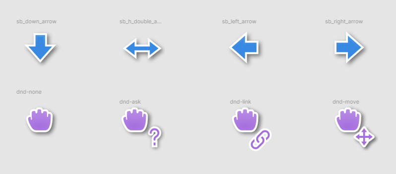
Going back to the proposal, I added some more features to the pencil cursor and gave it colours that represented its real-world counterpart. More abstract cursors like the arrows/grab could potentially share one colour in a set (see below).
If you have any questions/feedback, let me know. Hope this could help!
Hey @nakotami thanks for exploring this! I think I'm more in favor of the direction of using consistent colors for like cursor families or modifiers or things like what you've done with the pencil icon, rather than focusing on recoloring the cursor body itself.
I'd like to get away from cursors being a single color, and like you saw with modifiers it's more useful for those things to be a different color from the body of the cursor so they can convey meaning through their color
Did some explorations of watch, excluding any considerations for it's ptr variant.

The first row is just each accent color applied to the existing cursor from 500→300, bottom→top. Every other row is an exploration of a different direction that the icon could go in, primarily focused around a rainbow coloration. Almost all of the animations have only been keyframed, not inbetweened (Only exception is row 3).
I think row 4 is my favorite :)
Switching gears a little,
From #1248
What do you think about putting all the symbols for dnd-cursors on a colored circle like
dnd-copyis? Some of these symbols are a bit harder to see in these versions. For example this feels like a clear step back for legibility:
(I'm moving this here given a lot more design work is needed before that PR is ready for full review. Lmk if it would be better to move things like this back to the PR.)
I was running into some issue maintaining the legibility of shapes while squeezing them into such minuscule circles, so I fattened the circles a bit. I think it would be natural for modified pointers to follow suit (copy, link) with this circle enlargement and language change, but I don't know whether it would be appropriate for circle and no-drop to follow the language established here as well, i.e. for no-drop


