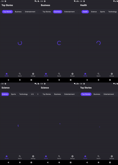
An input widget to handle selection of category like choices.
To use this widget simply add category_picker as a dependency to your project in the pubspec.yaml file and import it if needed.
(Barebone)
import 'package:category_picker/category_picker.dart';
import 'package:category_picker/category_picker_item.dart';
@override
Widget build(BuildContext context) {
return Scaffold(
body: Center(
child: CategoryPicker(
items: [
CategoryPickerItem(
value: "Test",
),
CategoryPickerItem(
value: "Test2",
),
CategoryPickerItem(
value: "Test3",
),
],
onValueChanged: (value) {
print(value.label);
},
),
),
);
}A more detailed example is available in the example folder
| PropName | Description | Default value |
|---|---|---|
| isSelected | Determines if the item is currently selected | false (not in constructor) |
| value | The value of the item | required |
| label | String to be displayed on the item itself | String value of value if null |
| PropName | Description | Default value |
|---|---|---|
| items | List of children to be displayed | required |
| defaultSelected | Default selected item in range of 0 - items.length |
0 |
| onValueChanged | Callback with entire item when user switches selection. | () => {} |
| backgroundColor | Background color of entire category picker | Colors.transparent |
| selectedItemColor | Background color of selected item | Theme.of(context).accentColor |
| unselectedItemColor | Background color of all items that are not selected | Colors.transparent |
| selectedItemBorderColor | Border color of the selected item | Colors.transparent |
| unselectedItemBorderColor | Border color of all unselected items | Colors.grey[800] |
| selectedItemTextDarkThemeColor | Text color of the text for light theme inside an item while selected | Colors.white |
| selectedItemTextLightThemeColor | Text color of the text for light theme inside an item while not selected | Colors.black |
| unselectedItemTextDarkThemeColor | Text color of the text for dark theme inside an item while selected | Colors.white |
| unselectedItemTextLightThemeColor | Text color of the text for dark theme inside an item while not selected | Colors.white |
| itemBorderRadius | Border radius for all items | BorderRadius.circular(30) |
| itemHeight | Height of all items | 32.0 |
| itemLabelFontSize | Font size of the text inside of all items | 16.0 |
| categoryPickerMargin | Margin of the entire category picker | EdgeInsets.symmetric(vertical: 11) |
| categoryPickerPadding | Padding of the entire category picker | EdgeInsets.symmetric(horizontal: 16, vertical: 8) |
| itemMargin | Margin applied to each individual item | EdgeInsets.symmetric(horizontal: 4) |
| itemPadding | Padding applied to each individual item | EdgeInsets.symmetric(horizontal: 12) |
