Button Component
nathanstilwell opened this issue · comments

Button
Cockroach Core Components Candidate
A UI element that a user can select to perform an action. While buttons can have intents to express intention, this component should be purely presentational and contain no state or perform no action of its own. This component will be composed into other components and so should remain completely naive.
Features
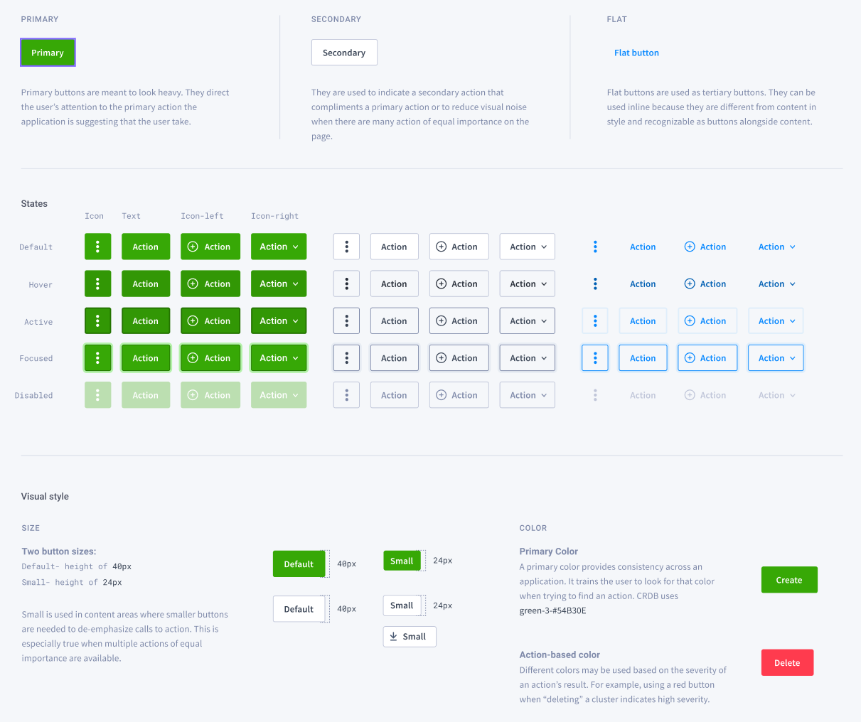
Intent
From designs it seems that we have three intents, Primary, Secondary, and Flat.


Tint
Inside of these intents, we occasionally have apply a color (or tint) to augment the meaning of the button, but this doesn't change it's intention. Some examples,


💭 I'm not sure if all of these are use cases, but the "danger" or "red" tint is certainly a use case that exists and I can image other cases where we may employ standard colors to alter primary or secondary buttons.
Size
There are two sizes defined that seemed be used pretty widely, "default" and "small".

This only seems to apply to height. In terms of width ...
Fluid Width
Button widths seem to fall into two categories, width based on content and width based on container.
Based on content


Based on container


💭 ❓ My initial thought was "Fluid" as it's a prop I've used before as a boolean prop, which is not my favorite. I'm open to ideas here for a prop names that we could use for two distinct values. Either "default" and "fluid" or "content" and "container".
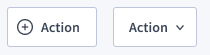
Icons
Buttons use icons in a few different ways. To highlight content or communicate functionality by having an icon to the right or the left of the text content,
or as the content,


💭 ❓ One thing we may need council from design on, is if the icons are always part of the content or if they will have a layout different from the content. In the first case we may not need to include knowledge of icons at all in the implementation of button and could get away with <Button><Icon /> Content</Button>. If the icon needs alignment apart from the content (as seen often when buttons are used as trigger for menus) we have need something like <Button iconLeft={Icon} iconRight={Icon}>Content</Button>. Even in this case an "IconButton" would just not use these props and provide an Icon as content, e.g. <Button>{Icon}</Button>
Existing Components
Button from AntD
export interface BaseButtonProps {
  type?: ButtonType;
  icon?: React.ReactNode;
  shape?: ButtonShape;
  size?: SizeType;
  loading?: boolean | { delay?: number };
  prefixCls?: string;
  className?: string;
  ghost?: boolean;
  danger?: boolean;
  block?: boolean;
  children?: React.ReactNode;
}
Button from `cockroachdb/cockroach
export interface ButtonProps {
  type?: "primary" | "secondary" | "flat";
  disabled?: boolean;
  size?: "default" | "small";
  children?: React.ReactNode;
  icon?: () => React.ReactNode;
  iconPosition?: "left" | "right";
  onClick?: (event: React.MouseEvent<HTMLElement>) => void;
  className?: string;
}
Button from CockroachCloud
interface ButtonProps {
  category: ButtonCategory;
  actionType?: ButtonActionType;
  id?: string;
  className?: string;
  text?: string;
  href?: string; // external link
  to?: string; // internal link
  download?: string;
  small?: boolean;
  icon?: React.ReactNode;
  iconPosition?: ButtonIconPosition;
  disabled?: boolean;
  fluid?: boolean;
  onClick?: (...params: any) => any;
}
For reference, below is a Figma link of the Button audit which demonstrates examples of where buttons appear across CockroachCloud and Admin UI: