Christopher Bryant | 2018-11-18
Suppose that you were not familiar with the Arabic numeral system. To teach it to you, I might neatly write an example of each of the digits 0 through 9, then ask you to identify a new example of one of the digits. If my handwriting stayed relatively consistent, you would probably be able to answer reasonably well simply by observing which of my 10 archetypal examples this new example looks most similar to. You might find this task challenging, however, if I instead messily scribbled the new example. In circumstances like this, after you make a guess, I would tell you what the numeral really was, and you would update the notion in your mind of what that numeral generally looks like. As we repeat this process, you would gradually change your understanding of what it means for an example to look like each particular digit. You would change your mental archetypes to match your experiences and compare each new example against those new archetypes.
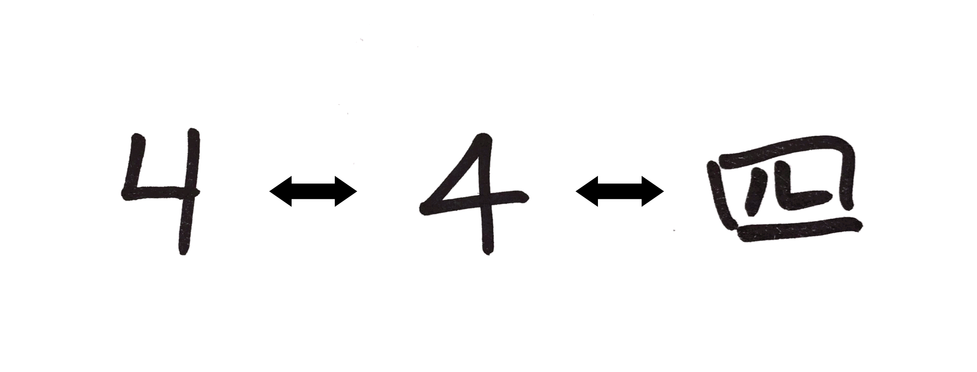
Sometimes, your experience necessitates that you expand your collection of archetypes to encapsulate dramatically different examples of the same idea. Maybe you've only ever seen the numeral 4 written with an open top, and you need to update your understanding to recognize that a 4 with a closed top is also a 4. Maybe you have to learn that the Chinese character for 4 also means 4, despite the fact that it looks nothing like the Arabic numeral 4. In this circumstance, to determine whether a new example is a 4, you may need to compare the example to your several distinct archetypes of 4, such that if the example looks like any of the numeral's archetypes, you identify the example with the numeral. This set of archetypes that you carry with you and modify over time through experience is what anchors you to the notion of 4.
In the following exploration, I will be developing an approach to machine learning that takes literally this idea of learning via repeated archetype comparison. We will begin with the simplified case of binary classification, i.e. distinguishing what something is from what it is not. After that, we will generalize our analysis to multi-class classification, using the identification of hand-written digits as a case study.
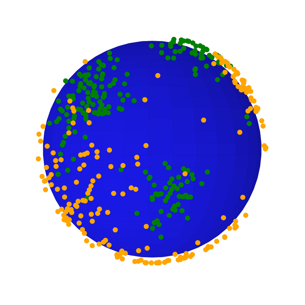
To begin translating our discussion of archetypes into a mathematical language compatible with machine learning, let us consider a toy problem of distinguishing two classes of points on a sphere. In fact, let us make this more concrete by imagining that we have discovered an alien planet inhabited by two major civilizations. After some exploration, we learn that members of only one of these civilizations is friendly, while members of the other will attack any human they encounter. The belligerent species has spread out over most of the planet, but the friendly one has clustered around a few central bases where it can maintain control of the local resources. If humans are to live safely on this alien planet, we need to have a way of staying close to the areas predominantly occupied by the friendly civilization.
Thankfully, a team of explorers have surveyed the planet for us, marking green or orange dots on their map any time they encountered a member of the friendly or hostile civilization. Using the data gathered, how can we shade the explorers' map according to where it is or isn't safe for a human to be?
| Globe | Map Projection |
|---|---|
 |
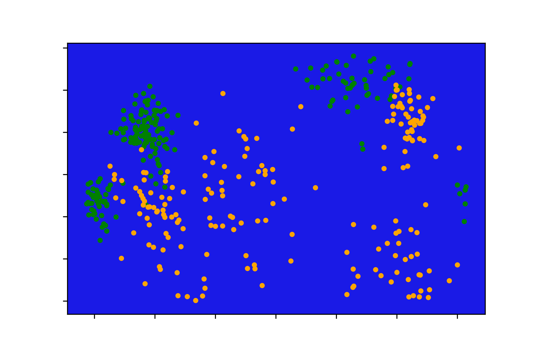 |
This map-shading task can be framed as a probabilistic binary classification problem if we consider each spot on the globe as having some probability between 0 and 1 of being safe. There are plenty of algorithms that we could employ to tackle this problem (e.g. k-nearest-neighbors, support vector machines, neural networks, etc.), but let's see if we can approach the problem from a different perspective. We think that the friendly civilization has some central bases, so we might guess that those bases have the strongest defenses against the hostile civilization. As long as we are close to any one of these bases, we can reason, no matter which base we choose, we will be safe. The farther away we get from any base, the weaker the defenses become, and the greater danger we place ourselves in.
Unfortunately, the explorers' expedition was limited, so we don't know for sure how many central bases there are or exactly where on the planet they are positioned. In the absence of such detailed information, we can start our mathematical inquiry by guessing that the friendly civilization has just a fixed number (e.g. 4) of central bases. The question now becomes: how can we best estimate the location of each of those central bases?
From here on, I will assume that the reader has a basic knowledge of linear algebra and some multivariable calculus. Since all our pieces of data correspond to locations on the surface of the alien planet, the data can be represented as a collection of vectors pointing from the origin to the surface of a sphere centered on that origin. Choosing the location of a central base location is equivalent to choosing a vector pointing from the origin in some new direction. We'll call this an anchor vector.
The measure known as cosine similarity provides us a good way of representing how far apart two locations on our planet are from each other. This similarity measure computes the cosine of the angle between the two vectors representing our locations, such that if the vectors exactly coincide, the cosine similarity equals 1, and if they point in opposite directions, the cosine similarity equals -1. To turn this into a distance measure, we can simply take 1 minus the cosine similarity so that the closest and farthest that two vectors can be from each other are a distance of 0 and 2, respectively. (Note: Cosine similarity is well-defined for vector pairs of any magnitude and in any number of dimensions, but since all our data lies on a sphere, there happens to be a one-to-one correspondence between cosine distance and Euclidean distance. Though this correspondence allows cosine distance to act as a true metric of our spherical space, in general, cosine distance cannot be considered a true distance metric since it does not obey the triangle inequality. This is not important for the current discussion, but it's good to know.)
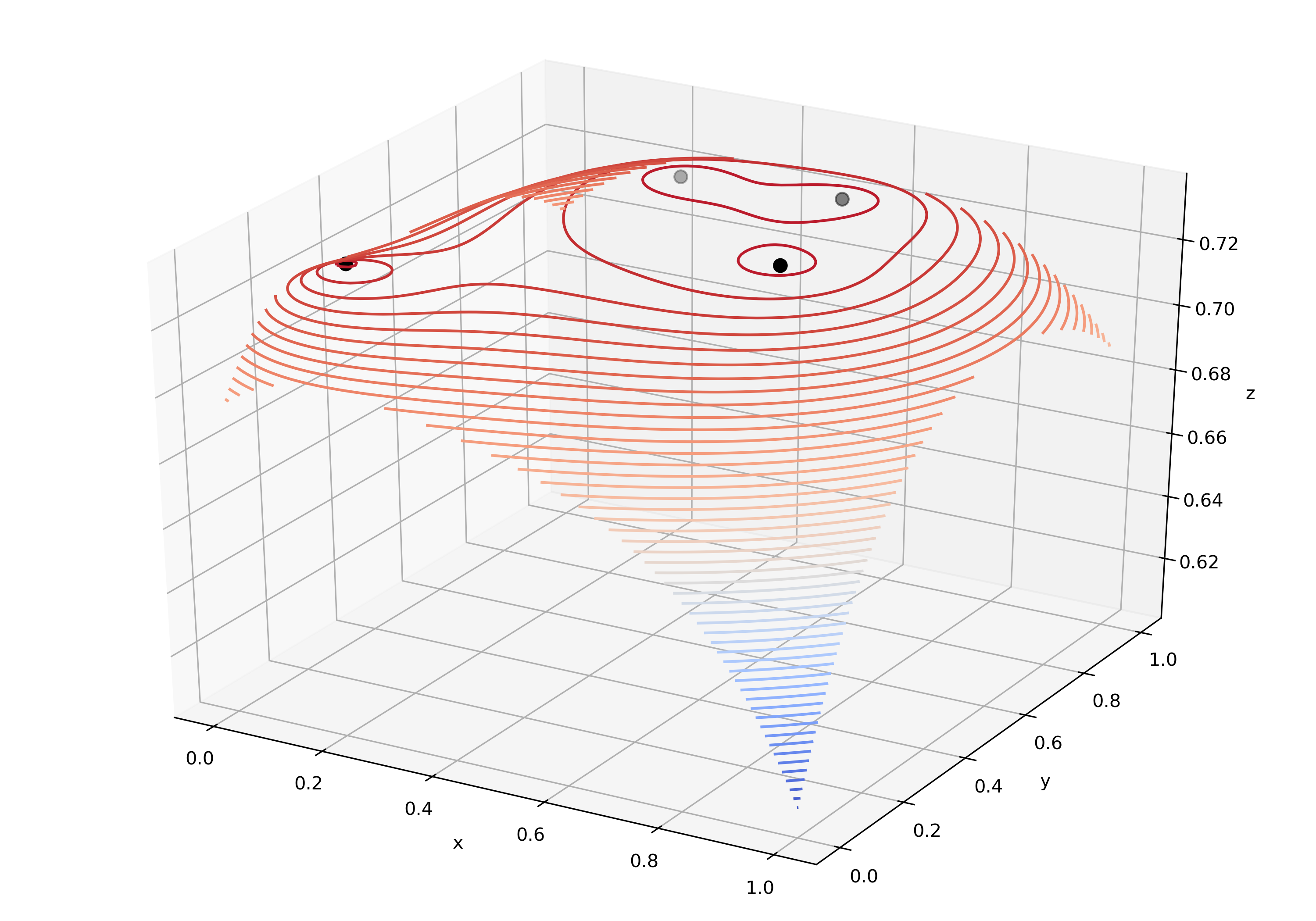
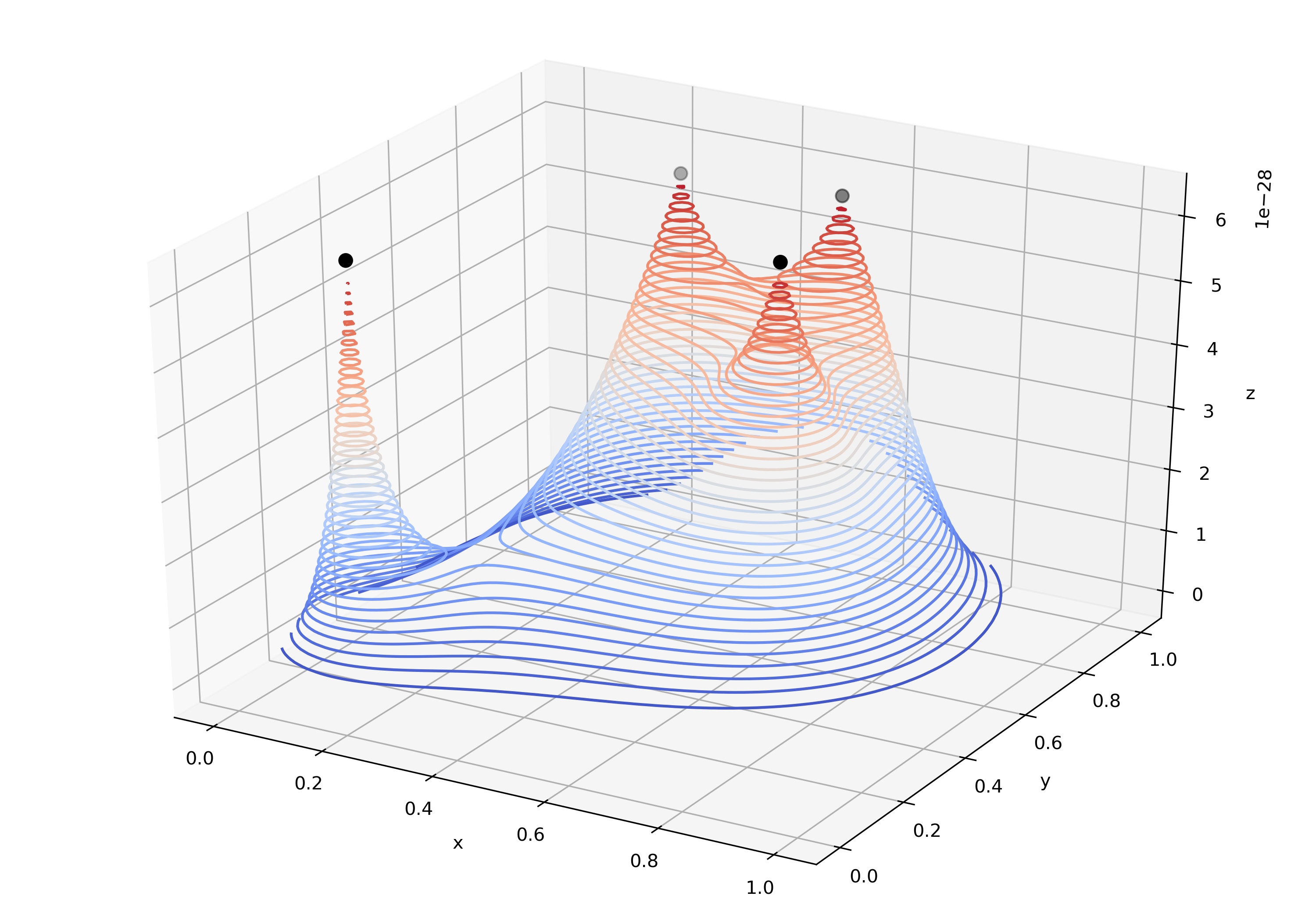
Cosine distance can tell us how far away we are from any single base on the alien planet, but to understand how far we are from safety, we need to create a new notion of distance that somehow represents how far away we are from all of the bases together. Remember that if we treat each base equally, we just need to be near any one of the bases to be safe. One simple way to encode this idea is to represent our effective distance from safety as the minimum distance between us and each of the bases. However, if two bases are near to each other, we might guess that being close to both of them is safer than being close to a single isolated base. To account for the contributions of all the bases, then, we can take the product of distances between us and each base. Notice that since the cosine distance goes to 0 as two vectors approach each other, as long as we are near any base, the product of distances will also be close to 0. Furthermore, if we're near multiple bases, the product of distances will be even smaller. Below I've plotted an example of the distance product function in action, along with a version with the contour lines pushed down away from the tips to emphasize visually what's going on.
| Distance Product | Distance Product (Pointy) |
|---|---|
 |
 |
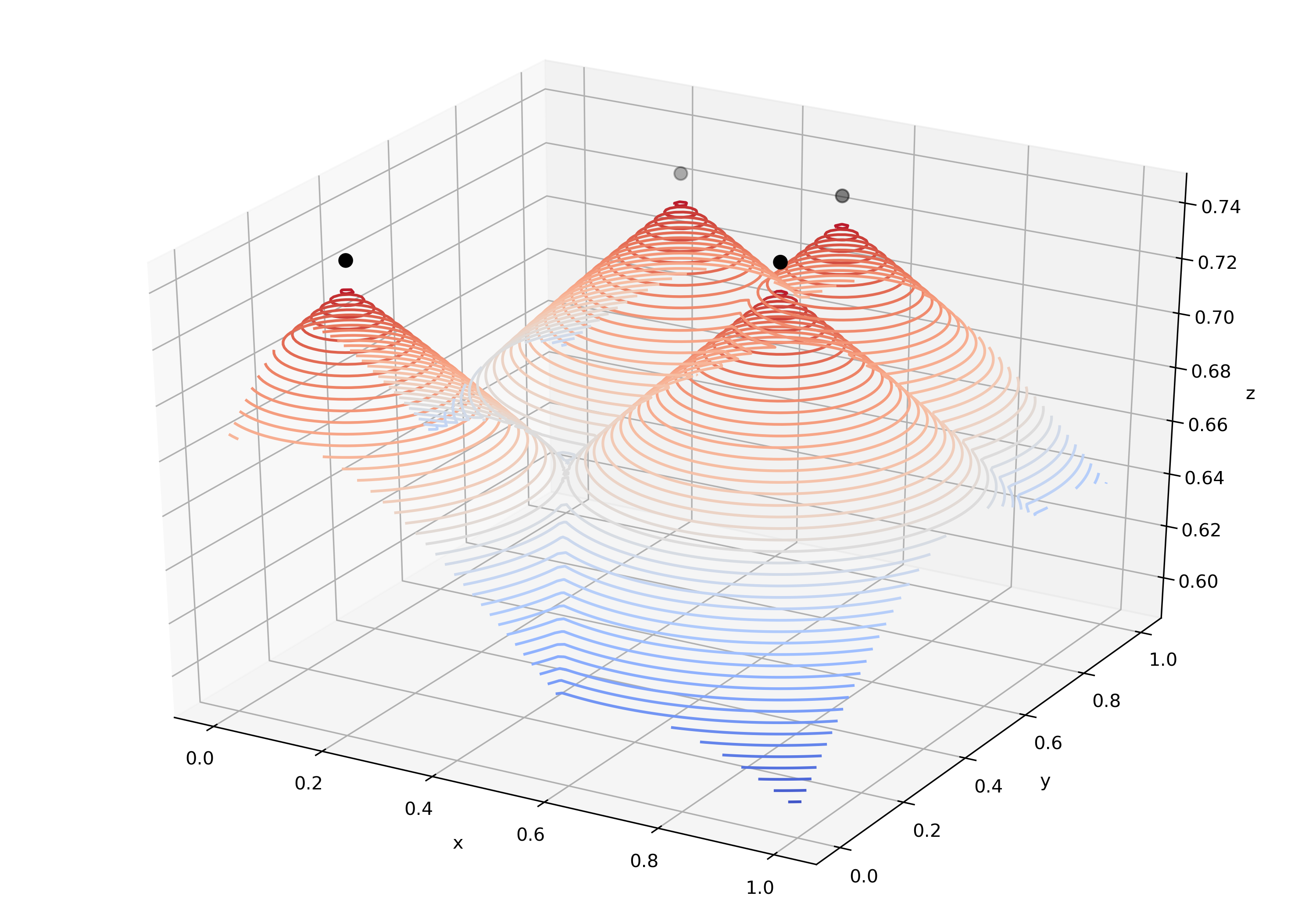
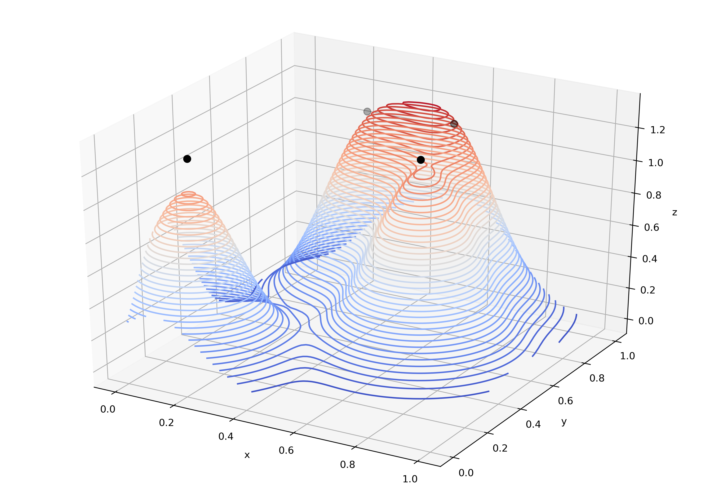
For reference, below are visualizations of two alternate distance functions: the minimum distance function (which we discussed earlier) and a Gaussian Kernel Density estimation. The latter simply places a Gaussian blip at each anchor, which has the effect of capturing the density of anchors distributed throughout a region. While this technique is commonly used to estimate data distributions, it does not satisfy the property we desire that has the distance be minimal at every anchor. Furthermore, it suffers from the fact that before constructing the density estimation, the width of the Gaussian blip must be chosen (if it's too big, not enough variation is captured, and if it's too small, the function is just a collection of equally shaped spikes).
| Minimum Distance | Gaussian Kernel Density |
|---|---|
 |
 |
Now that we have a distance function, generating a "probability" function is straightforward. If we treat the distance measure as some kind of log-odds quantity, or at least a linear transformation of log-odds, we can convert it into a probability by applying the sigmoid function. The sigmoid function squishes the real number line into the space between 0 and 1, so it will ensure that our output behaves like a probability (which must be non-negative and no greater than 1). Readers familiar with logistic regression will recognize this move of treating our data as log-odds, since that is exactly the tactic logistic regression uses to apply the method of linear regression to the problem of binary classification.
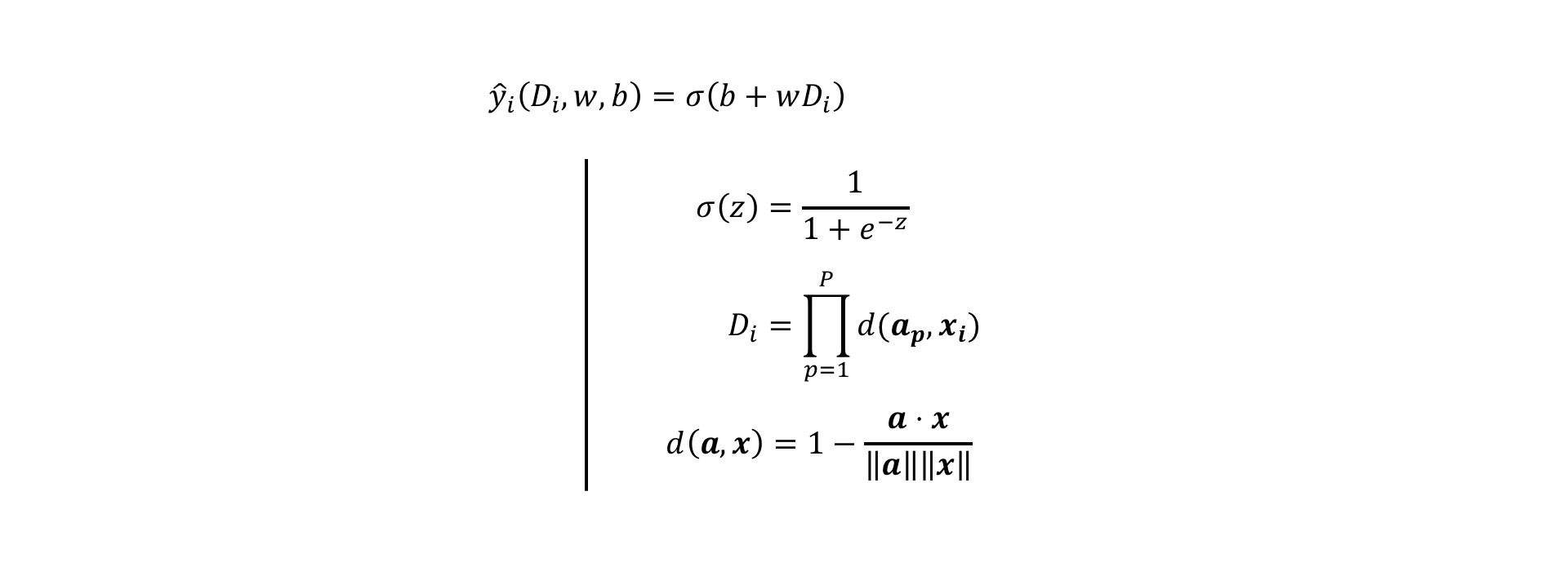
With the distance function in place, we can now write out an expression to represent the probability ("y-hat") of being safe in a certain location on the planet, given a collection of P home bases:
On the first line, we have the definition of our probability prediction y-hat. The index i on y-hat indicates that this prediction refers to a single example location on the planet. The variables b and w are unknown parameters that linearly transform the distance measure D into log-odds. The function σ is the sigmoid function which transforms log-odds into probabilities, as indicated in the second line. The distance measure D is a product of distances d between the example location x and each of the anchors a (indexed by a small p). The last line shows the formula for cosine distance between two vectors a and x. (Note: Technically, since our data lies on the full sphere, we should divide the cosine distance by 2 to make sure that each pairwise distance is scaled between 0 and 1. This has the advantage that the distance product is also forced to stay scaled between 0 and 1. But this detail isn't really that important since the values of D in each case end up just being off by a constant multiple of 2, which can be absorbed into the w parameter.)
With the problem statement transformed into this mathematical model, we now need to estimate the unknown parameters b, w, and the vectors ap which give us the most accurate predictions (y-hat) given the data we were provided and a choice of number of anchors (P). To do this, we must first create a cost function or loss function which penalizes our model when it fails to accurately predict whether a spot on the planet is inhabited by friendly or hostile aliens. We must then choose the model parameter values which minimize that cost.
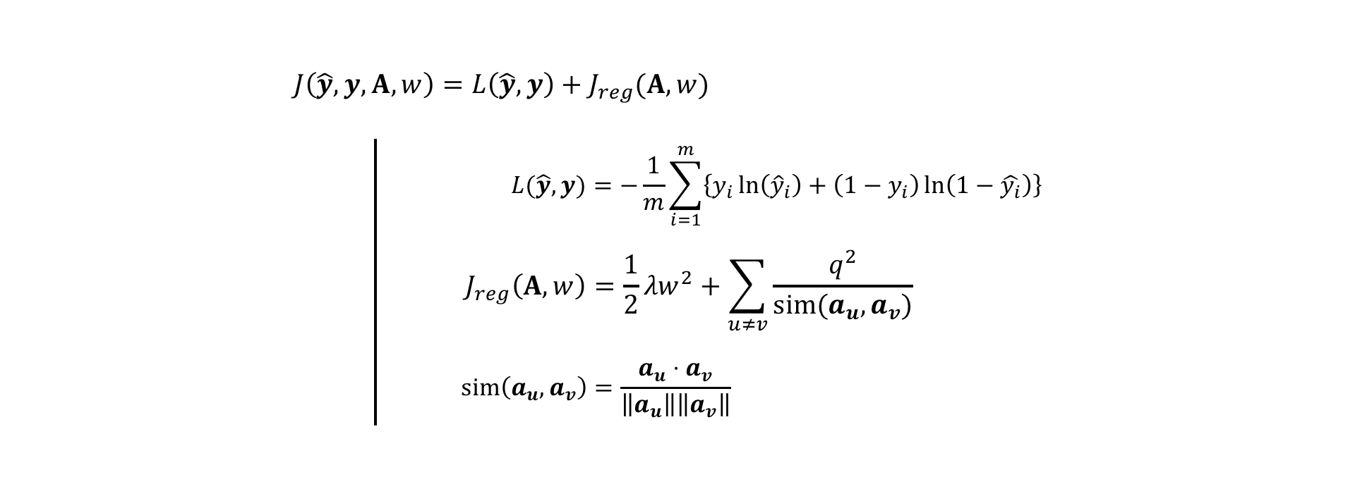
In the set of equations above, I've represented the total model cost J as a sum of average prediction loss L (i.e. how badly does y-hat predict y for each of our m training examples?) and regularization cost Jreg. The equation for L depicts the same cross entropy loss function that is used in logistic regression. To understand intuitively why this is a good loss function for our model output, we can plug in some numbers close to 0 and 1. If an example is truly labeled 0 (y = 0), but our model predicts a value close to 1 (y-hat = 0.99), the first term is 0, and the second term is large [ln(1 - 0.99) ~ -4.6]. If, on the other hand, our model predicts a value close to 0 (y-hat = 0.01) for that example, the second term is small [ln(1 - 0.01) ~ -0.01]. A similar observation can be made when the true label is 1. Thus, when the ground truth and the model prediction agree, the cost is low, and when they disagree, the cost is high.
Typically, when the number of model parameters becomes large, we like to introduce regularization to prevent overfitting. This regularization is coupled with "hyperparameters", whose values must be chosen to determine how much the regularization conditions should dominate the overall cost function. For logistic regression, we can introduce "L2 regularization" to penalize w when it becomes large. However, since we just have a single w parameter, such penalization is unnecessary, so I will set the regularization strength λ to 0.
The second term in Jreg is unique to this problem of anchor vectors, and its purpose is not exactly to reduce overfitting. Inspired by physics, this condition penalizes anchor vectors from being close to each other in the same way that equal electric charges are discouraged from being near each other. The electrostatic energy of two charges, each with charge q, is proportional to the product of their charges and inversely proportional to the distance between them. When a system of charged particles moves, it seeks to find the configuration of particles which minimizes the system's energy. Here, we include a "charge regularization" to push anchor vectors apart so that they try not to learn the same thing. The main difference between the physics formula and this regularization condition is that I use cosine similarity, here, to represent the distance between anchors rather than Euclidean distance.
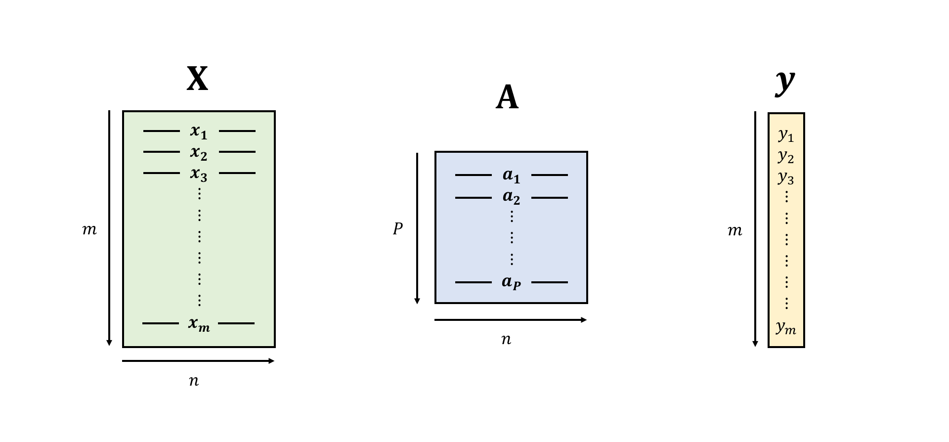
To understand the notation I used in the above formulas, it may be useful to see a visual representation of each of the vectorized objects referenced. Below, I've illustrated the objects X, A, and y as blocks of values. X is an m-by-n matrix of data points with one example vector in each row (m examples with n features per example). The vector y is a collection of m example labels which correspond to each of the m example feature vectors. A is a P-by-n matrix of anchor vectors, where each row is one anchor vector with n features.
What is really going on when the model learns its parameter values?
When trained on labeled examples, the anchor vector binary classification model tries to find optimal positions for its vectors that best represent the distribution of positive labels, subject to the constraint that the anchors shouldn't be very close together. The logistic regression portion of the model tries to find the best scaling of the distance function outputs which separates the two classes into regions of high probability and low probability for positive and negative examples, respectively.
Thinking back to the distance function contour plots shown above, we can imagine the training procedure as a two-step process. In one step, the shape of every 2D contour line is determined by the XY positions of all the anchors. In the other step, the contour lines are shifted up or down the Z dimension without changing their shape so that the redder/higher the contour's Z height, the higher the probability it represents, and the lower/bluer the height, the lower the probability it represents. The center-most contour in the Z dimension is the typical {probability = 0.5} decision boundary used to separate the positive from the negative class.
In terms of the alien planet, our model searches for the location of home bases which best correspond with the observed scattering of friendly and hostile aliens across the planet, informed by the additional piece of intuition that two home bases are not likely to be very close together.
With this theory in place, we can now implement the model and cost function relatively easily in Google's Python-based machine learning framework TensorFlow, and see what happens when we choose various hyperparameters (such as the number of anchors or the charge of each anchor). When we set up our model as a computation graph in TensorFlow, the partial derivatives of the cost function with respect to every parameter are automatically computed through backpropagation. This simplifies the model training process for us, since with a cost function and parameter partial derivatives we can use any pre-written optimization function (I've chosen the Adam optimizer) to search for the optimal parameters. In my analysis, I've performed an 80%/20% train/test split. [Note: In general, this optimization procedure is non-convex, so training may get stuck in local optima in our parameter space. In the current study, I have decided not to do a thorough convexity analysis since I do not want to compute the derivatives by hand right now.]
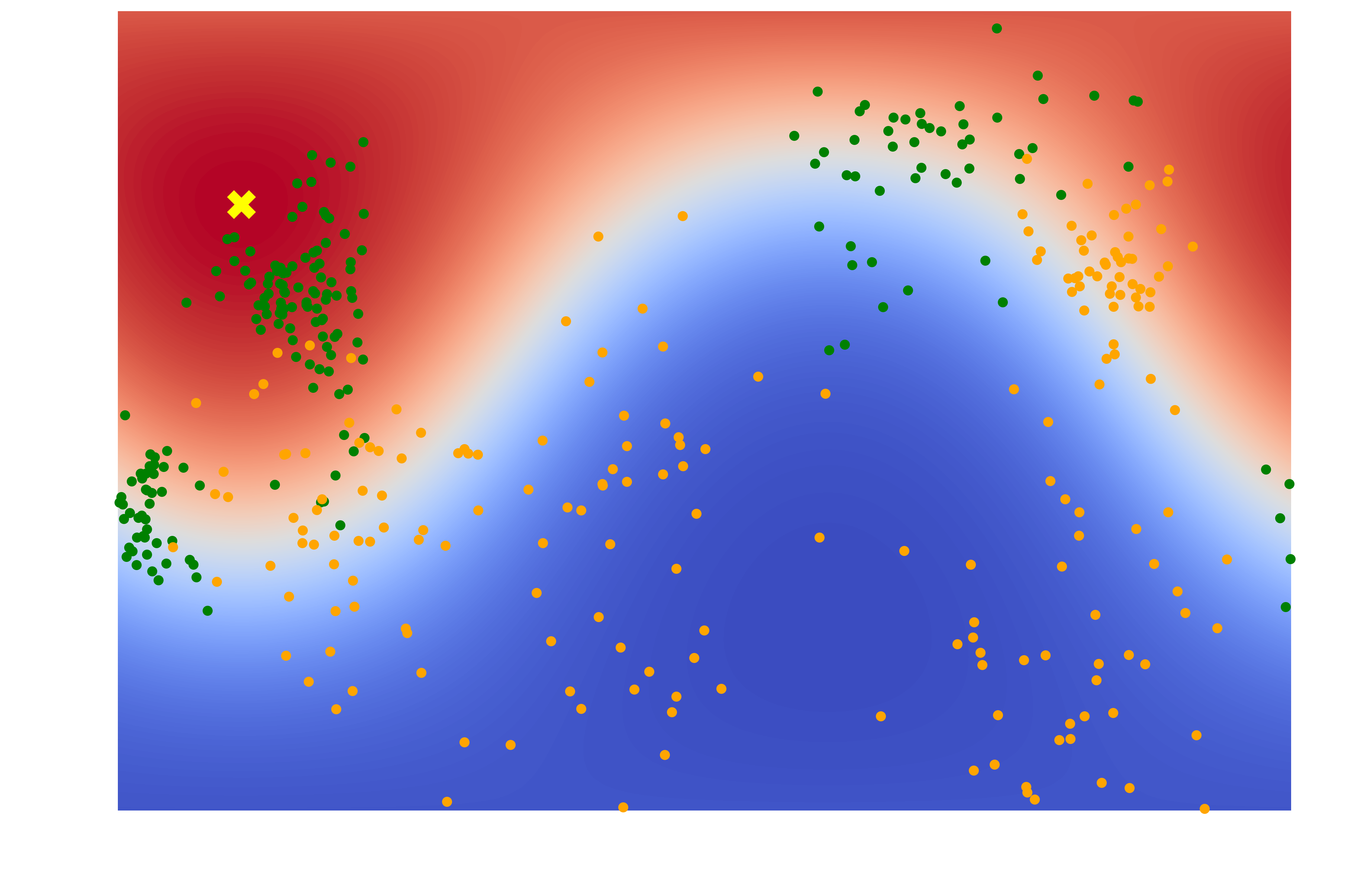
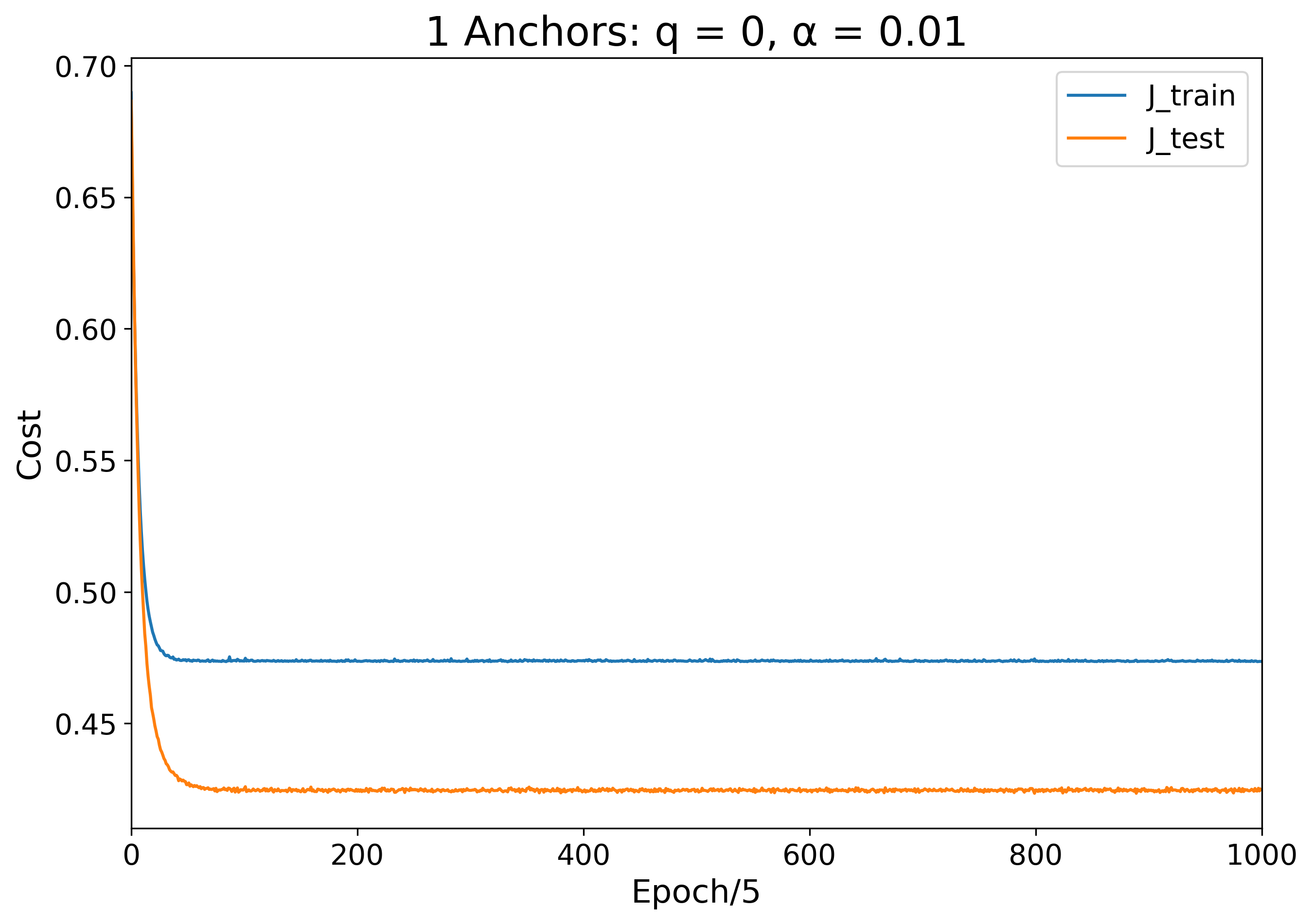
The simplest choice would be to guess that there is just a single home base. To train a single-anchor model, we initialize the anchor at a random position on the globe, and give the sigmoid weights random values. With each training iteration, the model moves the anchor to better fit the data distribution. Below, I've plotted a heat map of the final prediction distribution, where the yellow "X" marks the anchor position and the redder the heat map color, the safer the region. I have also plotted the error of the training and testing set over the course of the 5000-epoch model training period.
| Learned Color Map | Training and Testing Error Over Time |
|---|---|
 |
 |
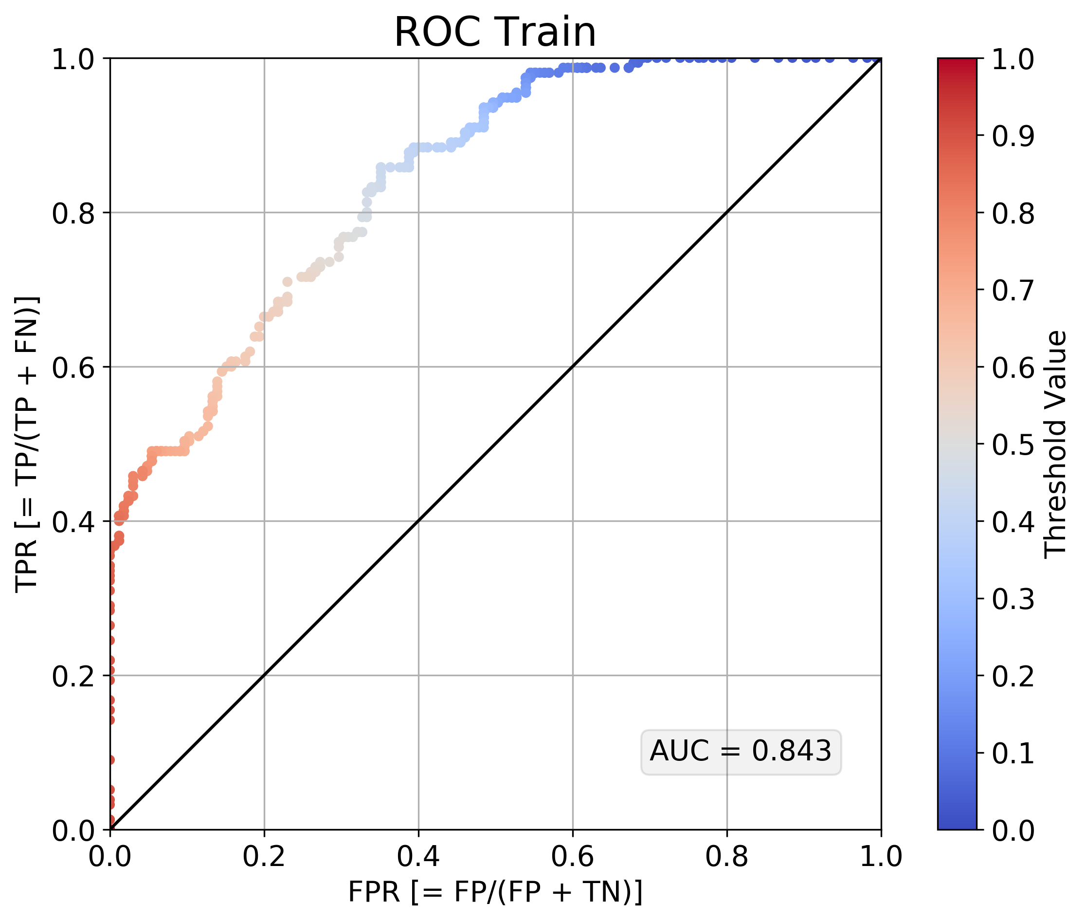
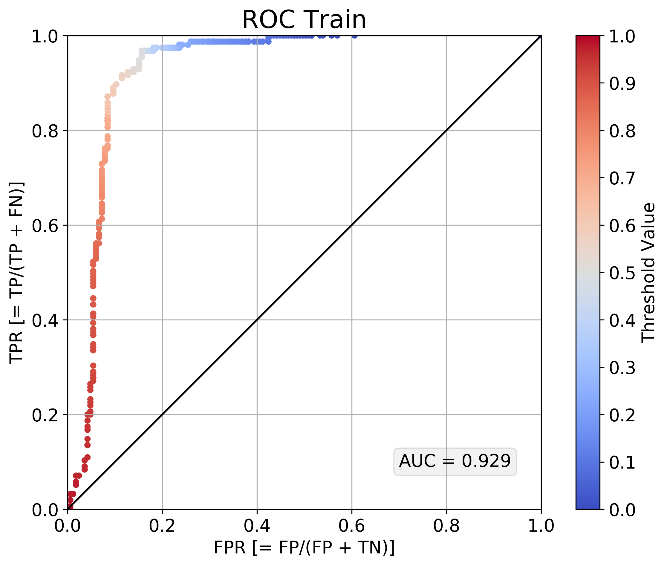
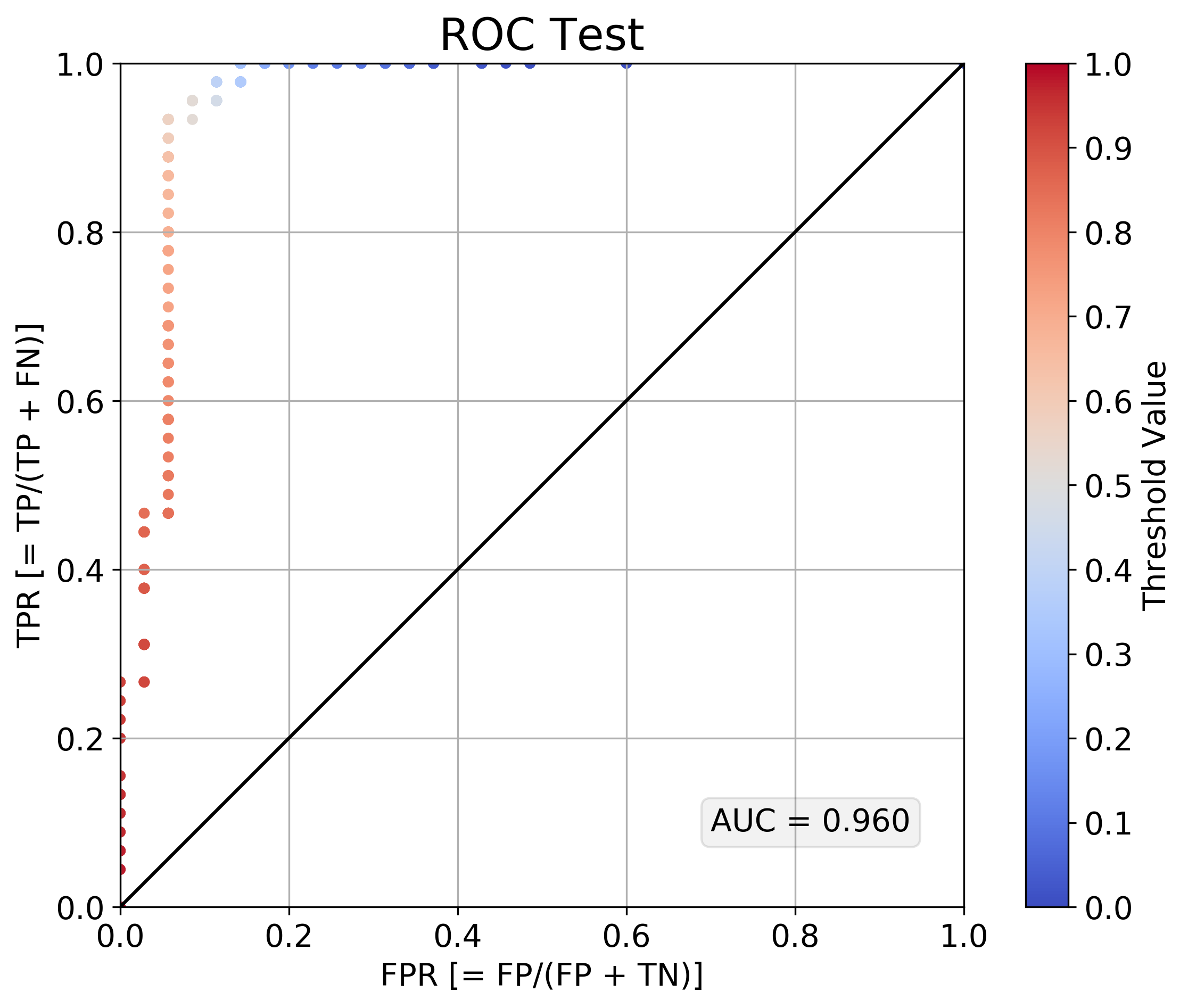
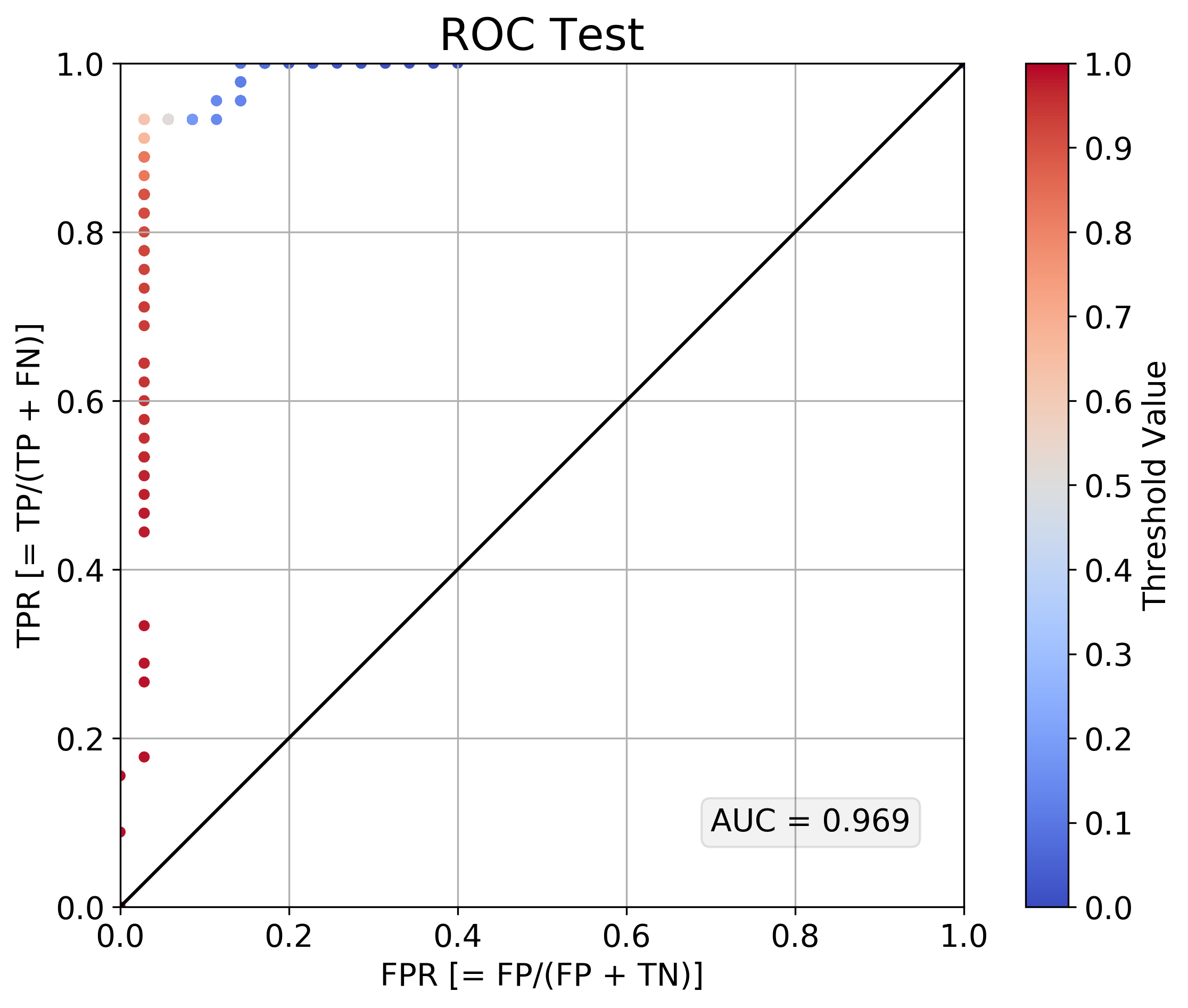
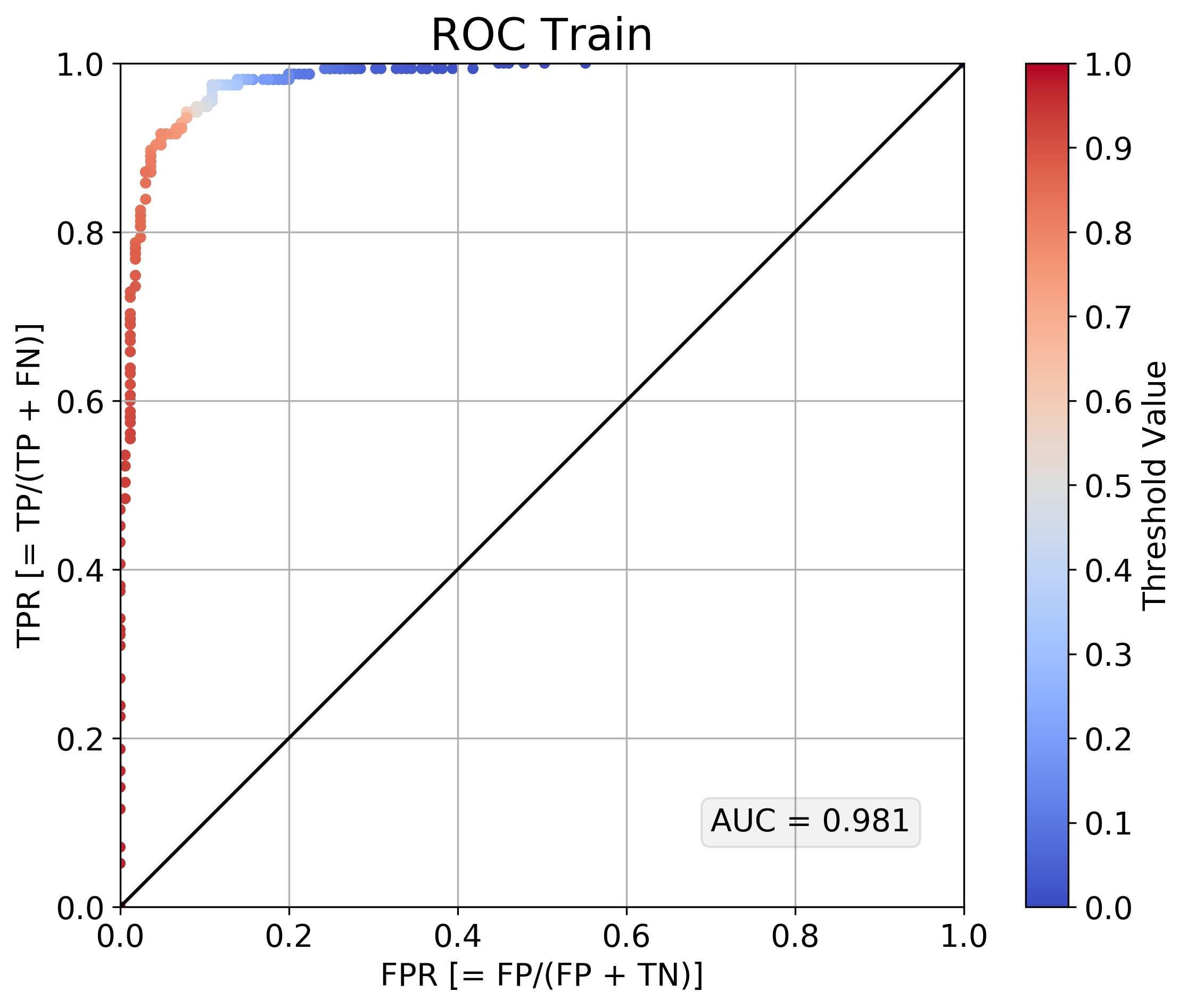
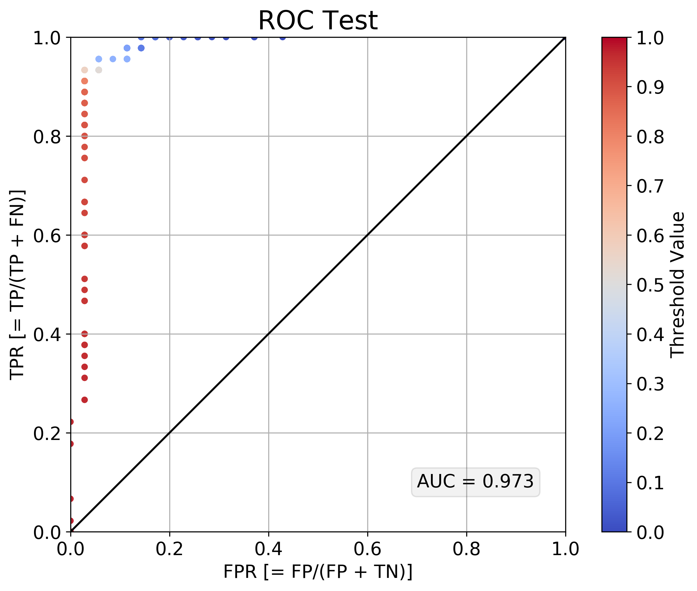
Since this is a binary classification problem, we can use ROC curves to measure the performance of the model. These plots show how the true positive rate (true positive / all positive) and false positive rate (false positive / all negative) change as we shift the probability threshold for determining what is and is not considered a "positive prediction". A completely non-discriminative model would like on the diagonal line connecting TPR = FPR = 0 to TPR = FPR = 1. A perfectly discriminative model woudl pull the ROC curve all the way up to the TPR = 1, FPR = 0 point. From the ROC curves below, plotted for both the training set and the test set, we can see that a single-anchor model isn't terrible, but it could be better.
| Performance on Training Set | Performance on Test Set |
|---|---|
 |
 |
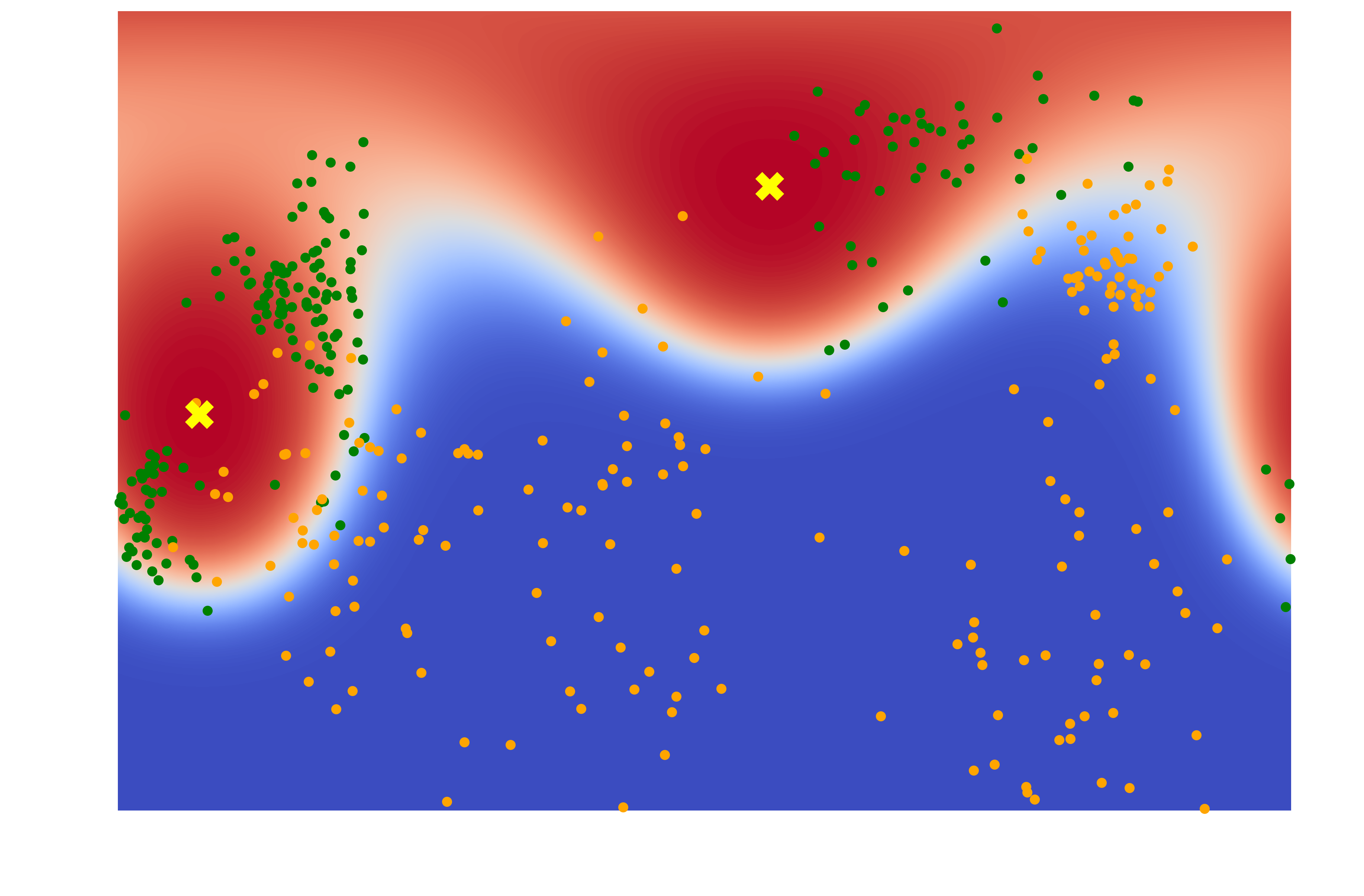
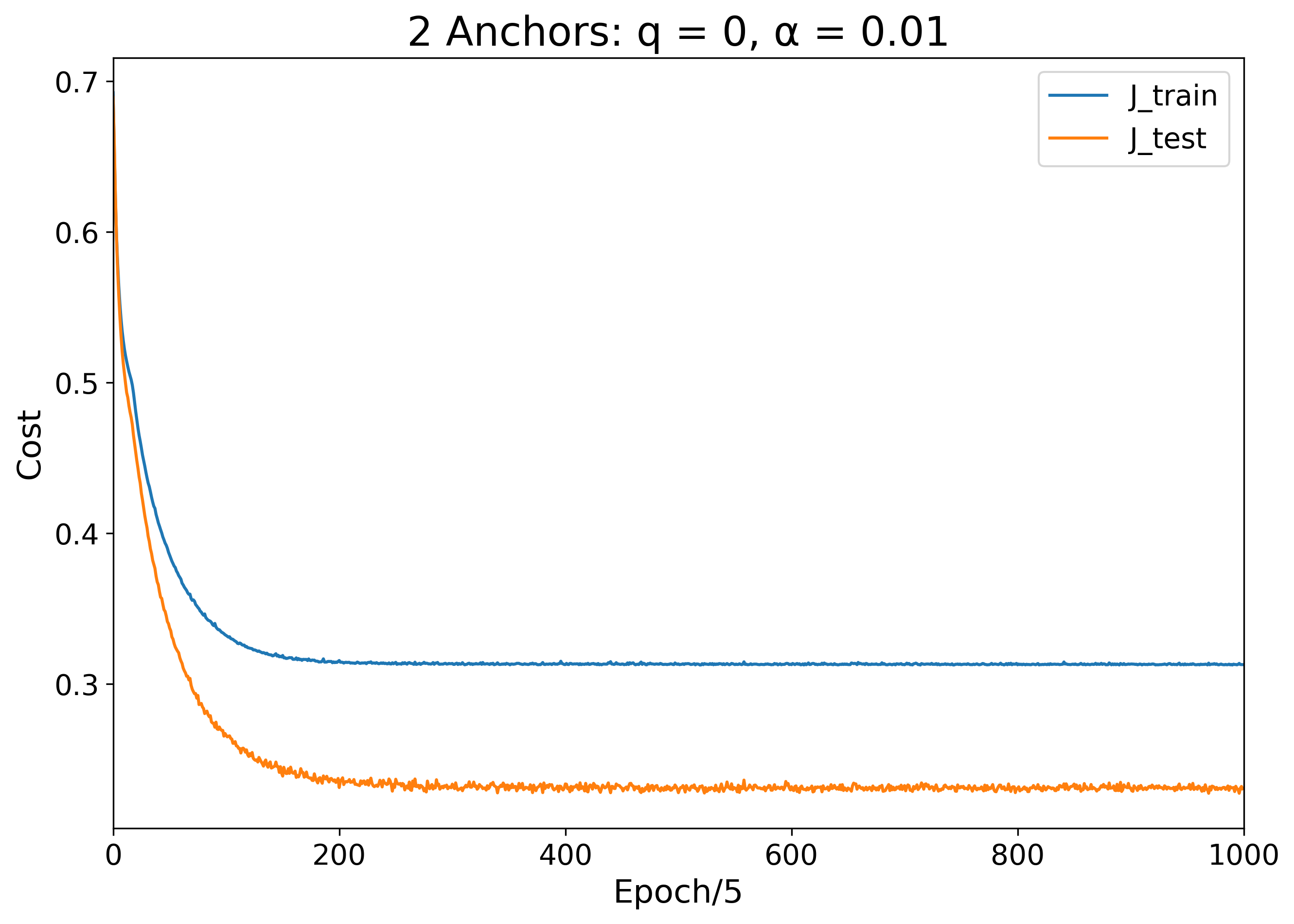
To improve the classification performance, we can try again with two anchors instead of just one. For now, let's ignore anchor "charge" and just consider the anchors as non-interacting. Immediately, with just one more anchor, we can see dramatic improvement in classification accuracy. There is a clear visible separation between the green and orange dots as traced out by the white 50% probability threshold decision boundary.
| Learned Color Map | Training and Testing Error Over Time |
|---|---|
 |
 |
When we plot ROC curves, we can confirm that the classification performance has dramatically improved from the single anchor case:
| Performance on Training Set | Performance on Test Set |
|---|---|
 |
 |
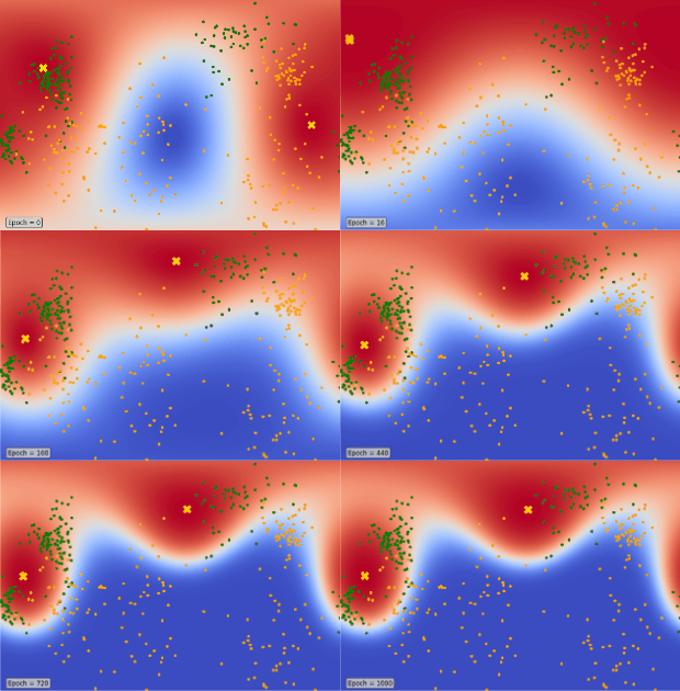
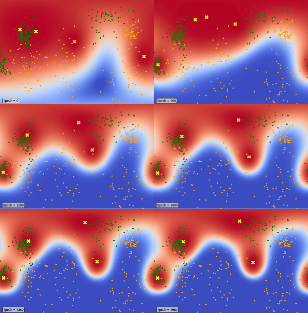
We can peer into the black box of our model training procedure by rendering a heat map for the parameter states at intermediate points throughout the training. For this two-anchor case, it looks like the anchors first converged quickly from their random initializations to the same position around epoch 10. After jittering around together for some time, the two anchors separated around epoch 80, heading toward their final resting locations, which they settled on around epoch 400:
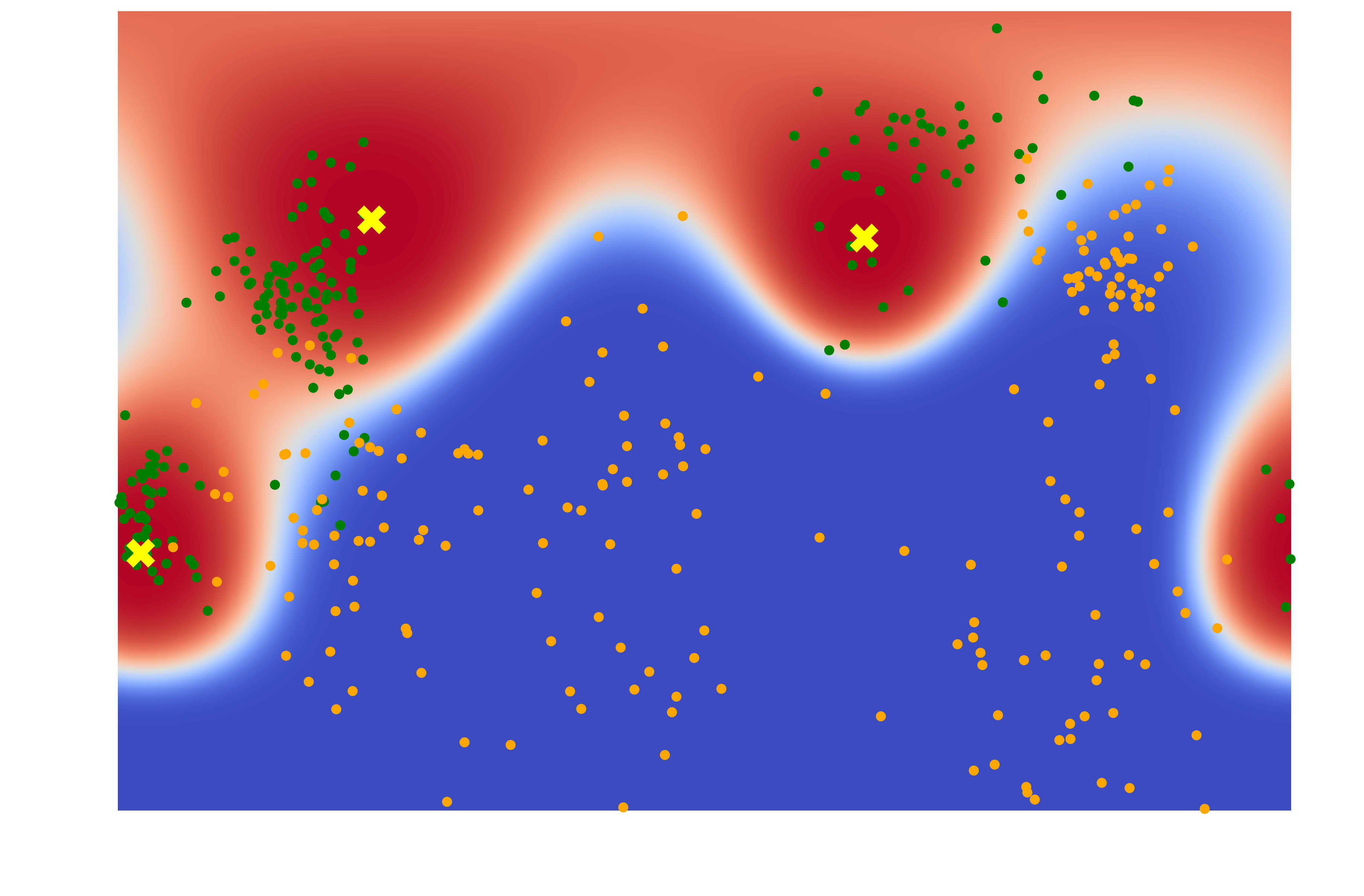
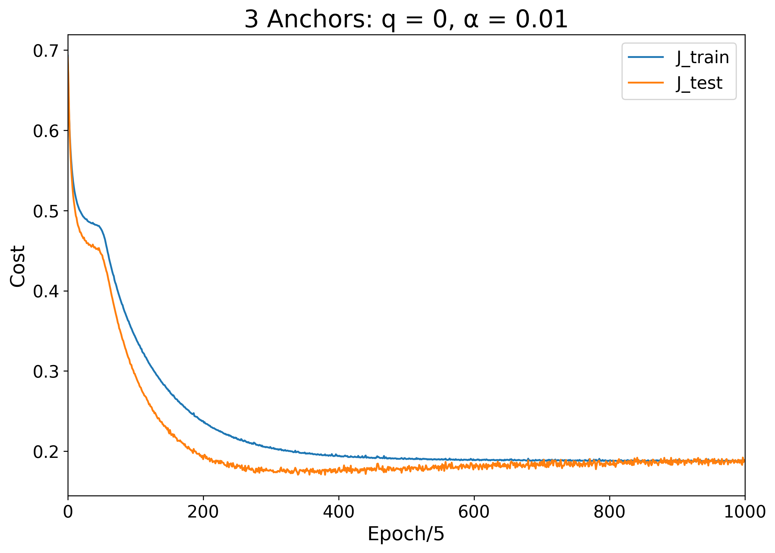
With 3 anchors, we again see improved performance:
| Learned Color Map | Training and Testing Error Over Time |
|---|---|
 |
 |
| Performance on Training Set | Performance on Test Set |
|---|---|
 |
 |
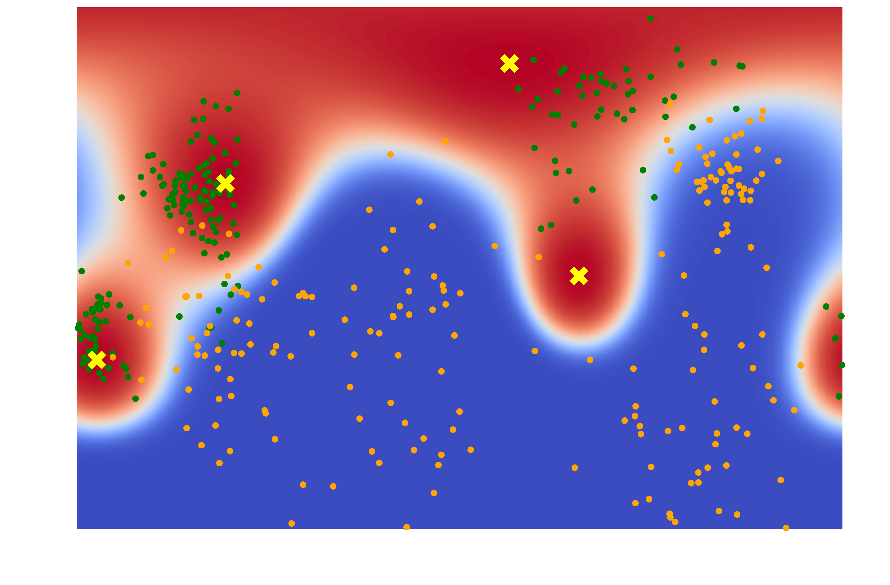
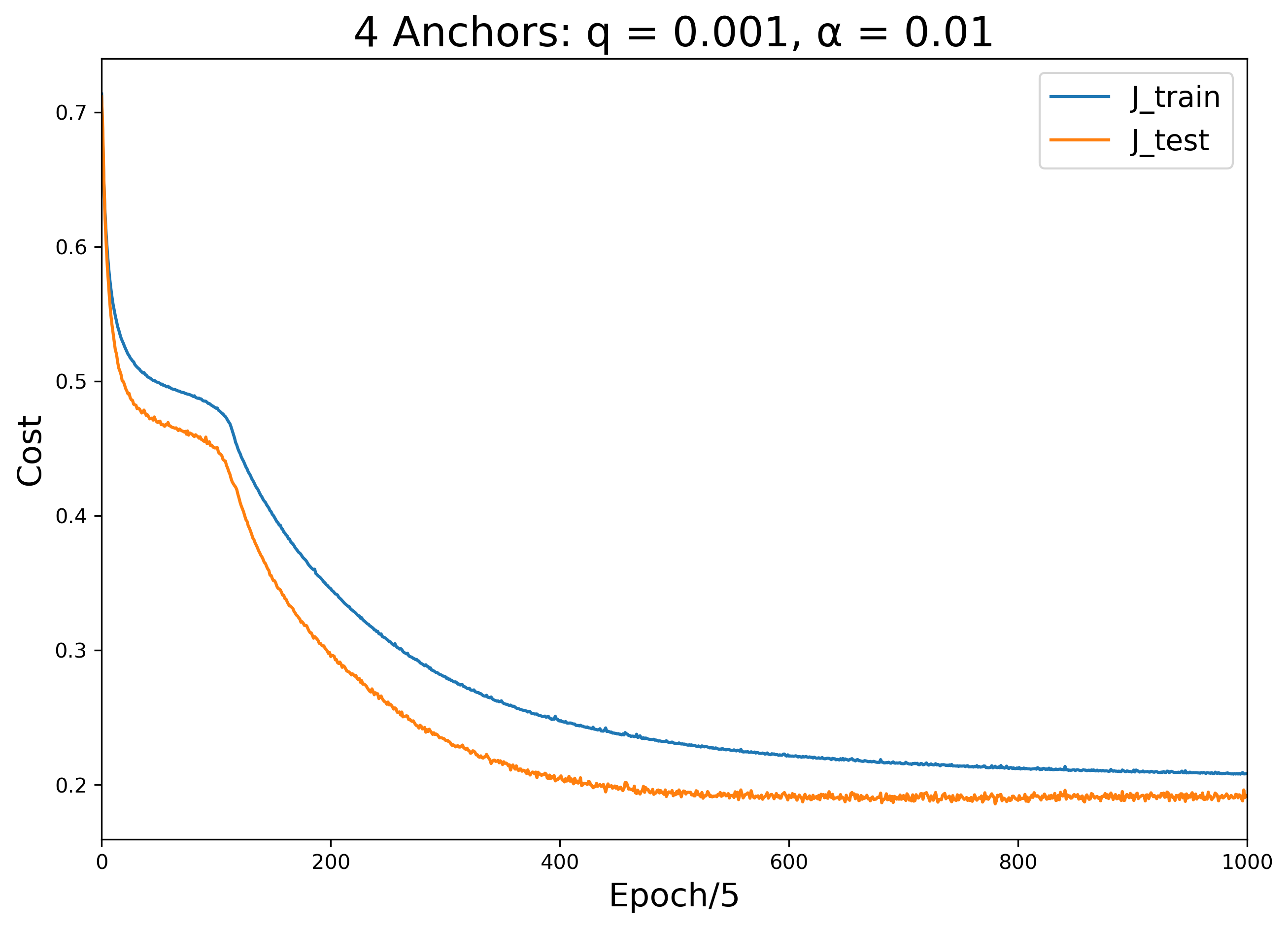
The 4-anchor model approaches limit at which this procedure can perform before we start seeing problems related to overfitting. To combat some crowding issues, I introduced a small amount of charge to these anchors:
| Learned Color Map | Training and Testing Error Over Time |
|---|---|
 |
 |
| Performance on Training Set | Performance on Test Set |
|---|---|
 |
 |
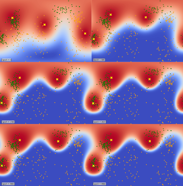
By watching the parameters change during training, we can see how the uncharged 3-anchor case differs from the charged 4-anchor case. Notice that, like in the 2-anchor case, the 3 anchors begin by quickly moving from their random initializations to the same location, then separate again to find their final resting locations. In the 4-anchor case, on the other hand, we see the anchors approach the same location, but never quite touch because of their mutual repulsion. As they get pushed back apart again, we see how this repulsion informs their movement until they reach an equilibrium:
| 3 anchors (q = 0) | 4 anchors (q = 0.001) |
|---|---|
 |
 |
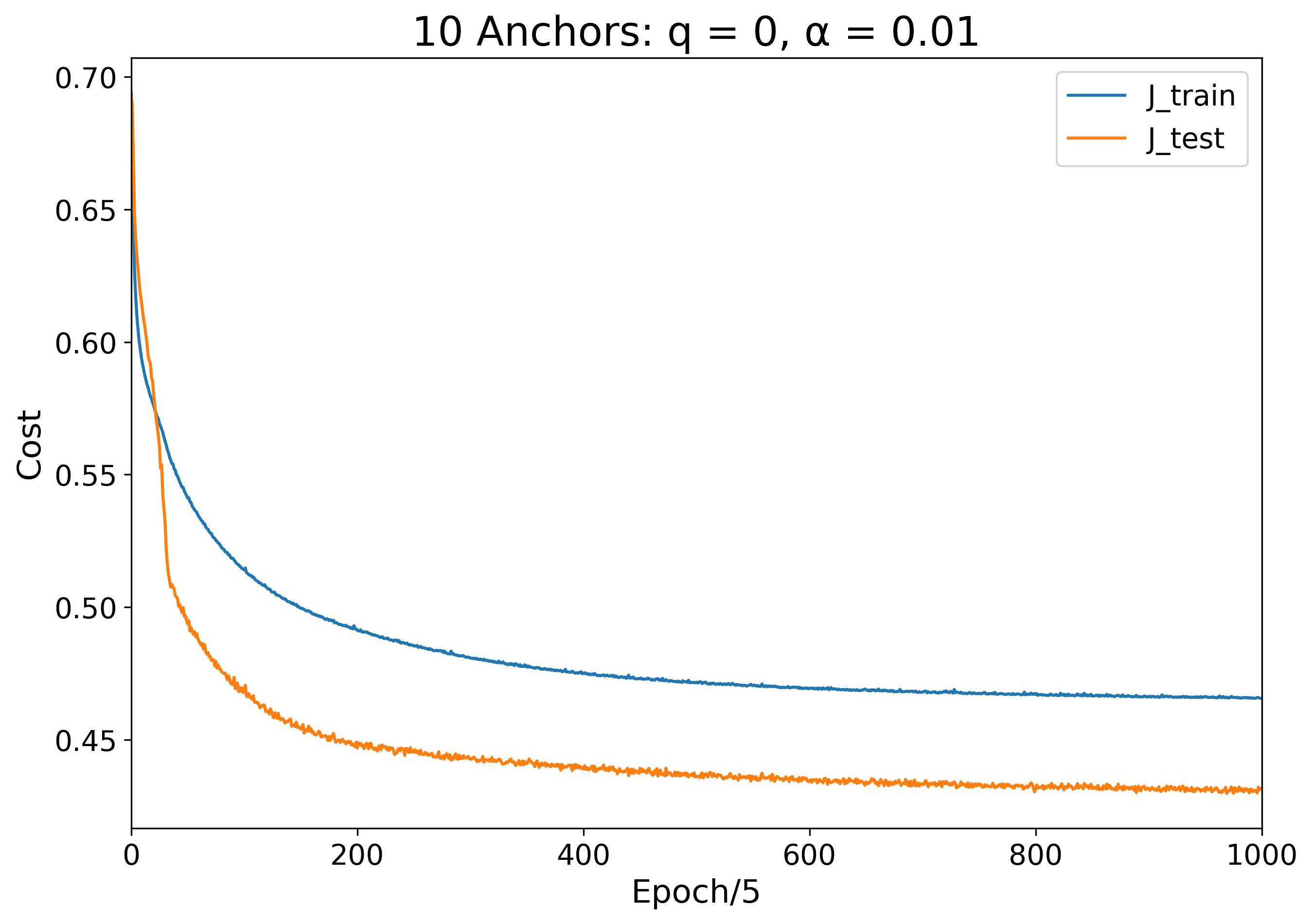
To better investigate the effect of anchor charge on the learning process, let us know examine the extreme case of 10 anchors. Since the data distribution has only 3 or 4 visible green clusters, 10 anchors is obviously too many. Rather than overfitting to the training set, however, this excessive number just appears to weaken the overall model performance.
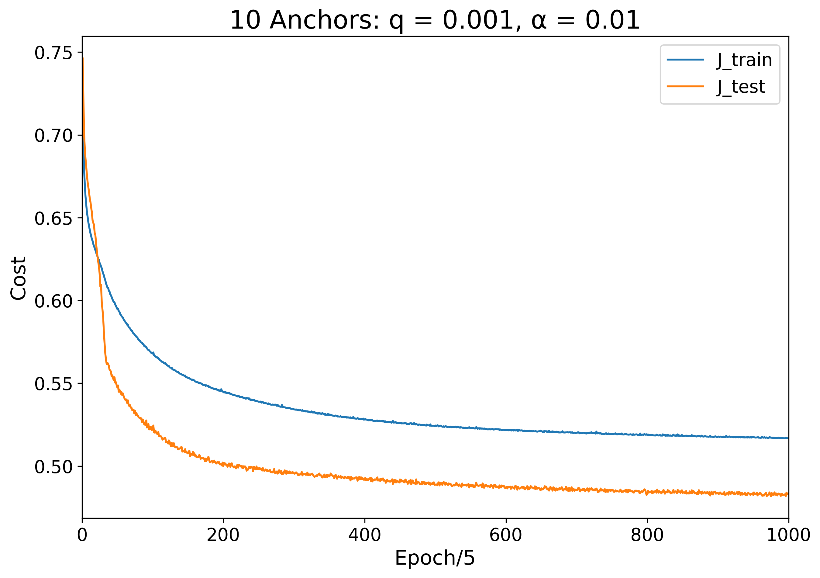
With no charge, the anchors have no option other than to merge and try their best to represent the data as one heavy anchor. Adding a small amount of charge (q = 0.001) results in similar behavior, just with the anchors resting a small distance apart.
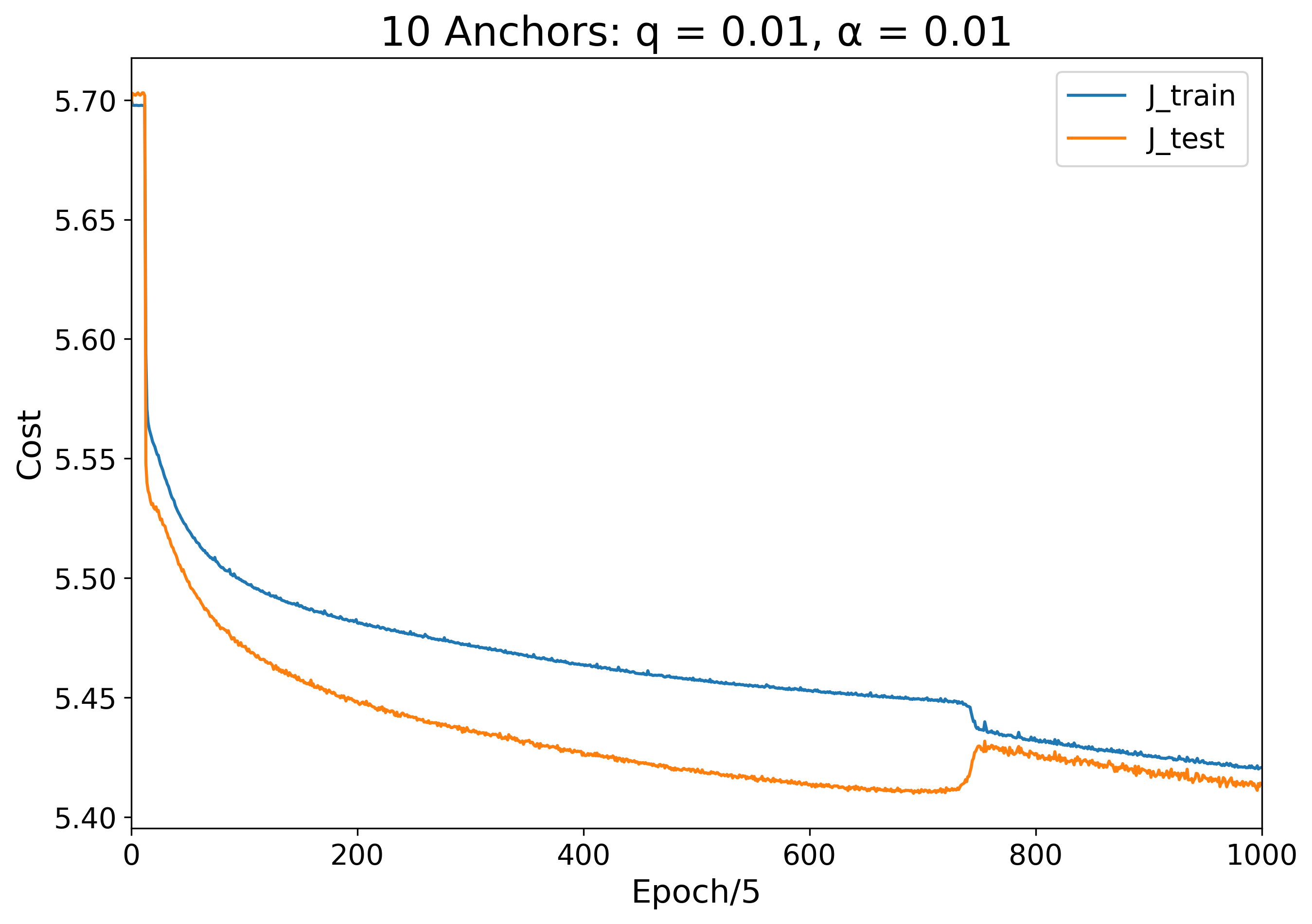
Setting q = 0.01 yields an interesting change in behavior of the system. Unlike in all previous cases, when the anchor charge exceeds a certain value, the model learns to have the anchors represent the negative class instead of the positive class. Initially, the anchors learn to spread out as far as possible across the globe, but when transitioning from epoch 7 to epoch 8, the anchors flip sign to reduce the training cost in a manner almost akin to a phase transition. The anchors remain mostly evenly distributed in this local minimum until they learn that they can minimize the error better by clustering together toward the bottom of the globe around epoch 80. For the next few thousand epochs, 9 of the anchors wander slowly around the south pole while one straggler ventures upward to capture a particularly dense region of orange points. At epoch 3,740, the anchor configuration snaps into its final configuration.
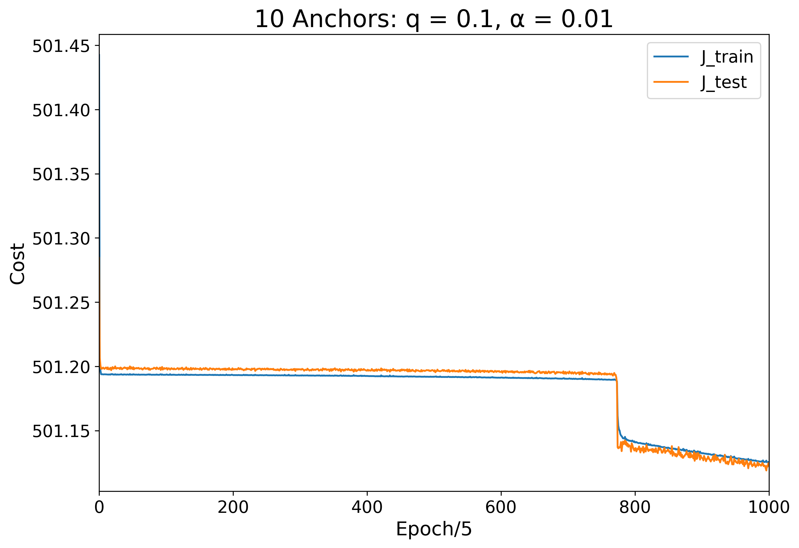
The q = 0.1 scenario yields a similar result to the q = 0.01 case, but because the charge is now so large, the anchors have a harder time pushing out of the state that has them evenly distributed across the globe. For the first 3,000 epochs, we see the anchors fidget collectively between a few equivalent configurations. For the next roughly 1,000 epochs, the anchors remain steady as the sigmoid parameters shift the probability distribution making the landscape bluer and bluer until the anchors finally snap to their final steady configuration.
| Charge | Training Visualization | Training and Testing Error Over Time |
|---|---|---|
| q = 0 | 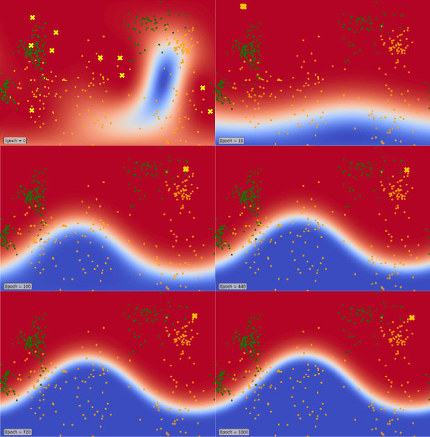 |
 |
| q = 0.001 | 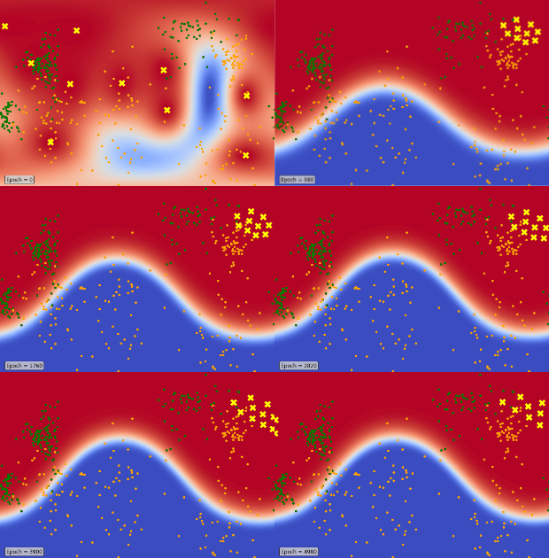 |
 |
| q = 0.01 |  |
 |
| q = 0.1 | 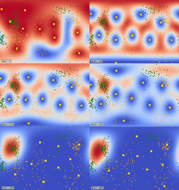 |
 |
Now that we've tried out the learning procedure on an easily-visualizable toy binary model, we are ready to generalize anchor-vector learning to the multiclass classification problem. To examine this concretely, we will consider the classic problem of handwritten digit recognition using the MNIST dataset. Here we tackle directly the question I referenced in the introduction to this investigation: can we create a machine learning model which reflects our intuitive understanding of the process of learning concepts through the refinement of archetypal ideals?
We can make use of the same "distance product" function we developed for the binary classification case if we represent each handwritten digit as an embedding in some vector space. One simple way to do this is to unroll each 28x28-pixel grayscale image into a 784-dimensional vector. In this representation, each dimension in the vector space corresponds to the pixel at one position in the image, and the value of the image's vector in that dimension is the brightness of that pixel, scaled between 0 and 1. We can measure the similarity between a pair of images by taking the cosine of the angle between their vector representations.
Like before, to create a measure of distance between a single image and a set of anchor images, we can take the product of cosine distances between the first image and each image in the anchor image set. Since all our brightness values are positive, our problem set-up has the nice property that every image representation lies in the positive orthant of the embedding space. This means that cosine distance between any two image vectors is bounded by 0 (most similar) and 1 (most different). This is good because the addition of a new very-different image to an already-existing anchor set won't affect the overall distance product: it's just another multiplication by 1.
The only difference between the distance function in the binary case and in the multiclass case is that for each sample in the multiclass case, we want to know how far away that sample is from each class it could possibly belong to. Instead of computing one distance product, we compute K distance products—one for each of the K classes.
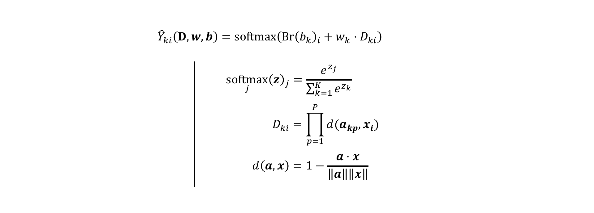
Like in generalizing from logistic regression to multinomial logistic regression, we can generalize our binary prediction model by promoting the probability output function from a sigmoid to a softmax function. While a sigmoid function maps from a real-valued scalar logit to a probability value between 0 and 1, the softmax function maps from a real-valued K-dimensional vector to a new K-dimensional vector where all the vector's components sum to 1 (the sigmoid function can be thought of as simply the first component of a 2D softmax). Readers familiar with statistical mechanics may recognize the softmax function from the canonical ensemble, which assigns a probability to each possible distinct microstate of a thermodynamic system.
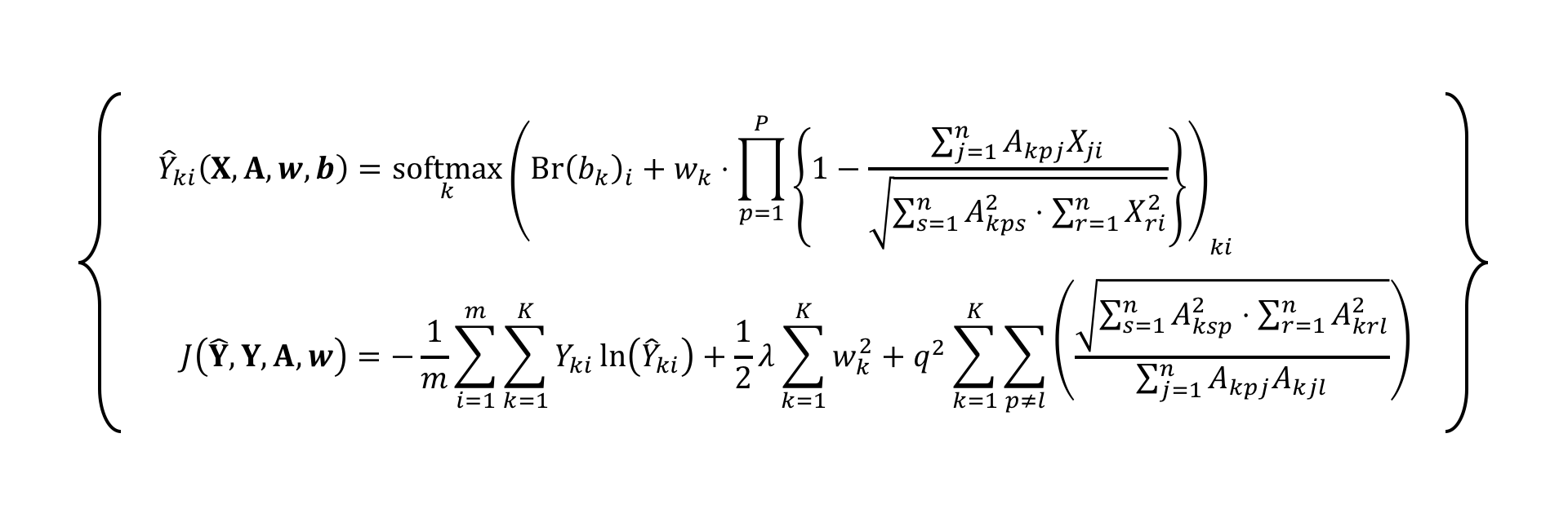
The above set of equations describes our new K-class prediction model. The first line shows how a prediction Y-hat assigns a K-dimensional vector of probabilities to each example vector xi. While the binary case had two scalar linear mapping parameters b and w, in the K-class case, here both b and w are K-dimensional vectors (the Br() notation simply indicates that the vector b is broadcast across all examples; this is mostly to keep the index notation consistent). The second line explicitly defines a softmax function acting on an arbitrary K-dimensional vector z. The third line shows the multiclass distance function, which is only different from the binary case in that the anchor vector collection is indexed with a new letter p, the number of anchors per class. While it would be possible to specify a different number of anchors for each class, for simplicity we will just assume the case where each class P anchors. The fourth line is exactly the same pairwise cosine distance defined for the binary case.
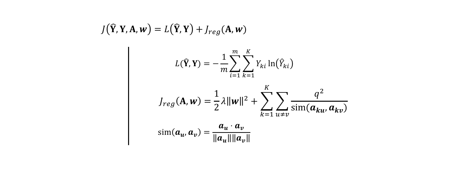
Like before, with the generalized prediction model now in place, we need to define a cost function so that we can estimate the values of all the unknown parameters b, w, and A.
Above, I define the cost function J as a sum of average prediction loss L and regularization loss Jreg). The prediction loss L defined on line 2 is just a generalized form of the same cross entropy loss I used in the binary case. The regularization loss again is just the same L2 parameter regularization and "charge regularization" I used before, but now with an added k index. The way to interpret the second term of this equation on line 3 is that the larger the charge q, the greater the repulsion between any two anchor vectors a belonging to the same class k. The way I have it written, anchors can only interact if they belong to the same class; there is no penalty associated with anchors of different classes being close together. Finally, the line 4 repeats the definition of cosine similarity between two vectors.
For fun, we can combine everything together into two big equations to see all the math that has gone into this multiclass model. Below, I give you the prediction model and loss function in full index notation:
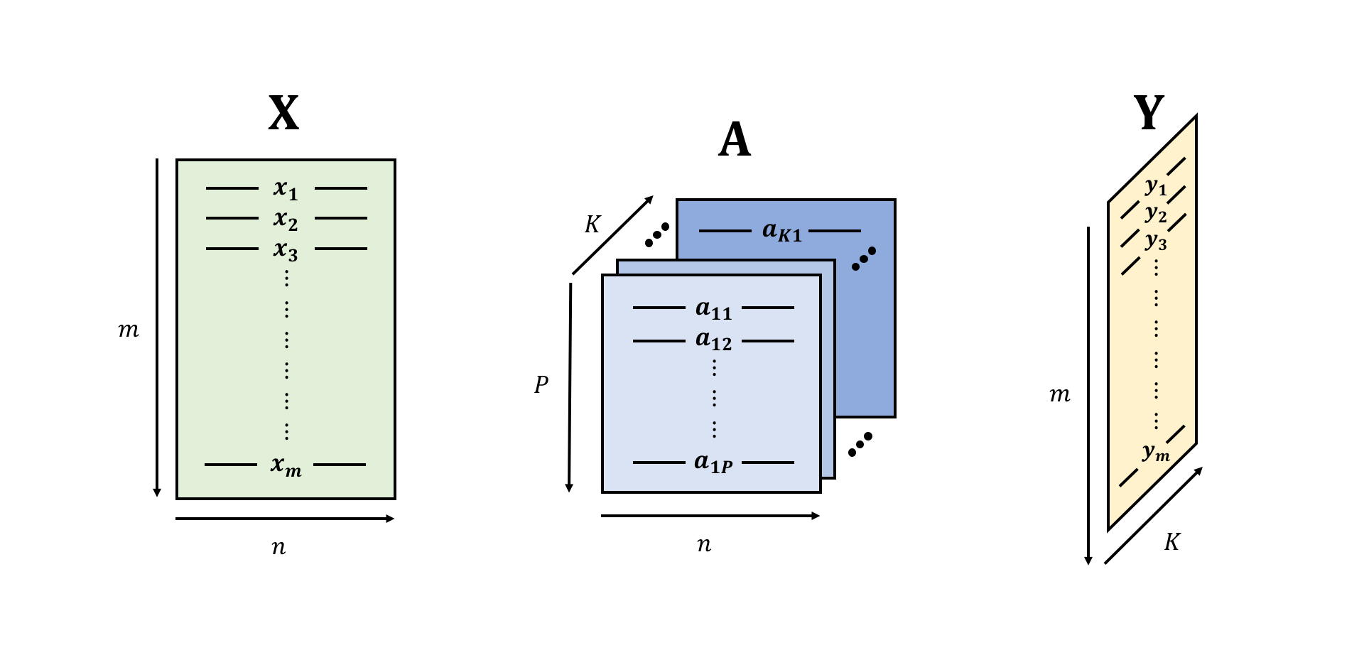
When we have to implement this all in code, it's useful to be able to see these low-level details so that we can better understand how to vectorize our code (i.e. write it in a fashion where we can apply operations to whole arrays of numbers at once). To make more obvious the relationship between each vectorized object and the indices I use to represent it, here is a visual representation of the major objects at play:
Notice that while the input X is the same as in the binary case, with m examples and n features (here, each example is an image and the features of each example are the 784-dimensional vector of pixel brightness values), both A and Y have gained an extra dimension. The collection output predictions is now a matrix Y because each of the m input examples has to get mapped to K prediction values, one for each class.
The anchor matrix A is now an array of depth K, where each of the K sheets contains P anchor vectors, each with n components. The way I have notated it, each anchor vector akp gets two indices, the first one indicating which class it belongs to, and the second one indicating which anchor vector in that class it is. When I refer to the brightness of a single pixel of one of these anchor vectors, I use the full 3-index array notation: Akpj is the brightness of the j-th pixel of the p-th anchor of the k-th class. The symbol A refers to the whole collection of anchor vector pixel values.
Remember that our model computes a distance function to each set of anchor vectors. Whichever anchor set an example is closest to is the assigned class of that example.
To start off, we can give each class just one anchor vector to work with. Before we even allow the anchor vectors to move, it may be interesting to see what happens if we train only learn the softmax parameters w and b given a fixed set of anchors.
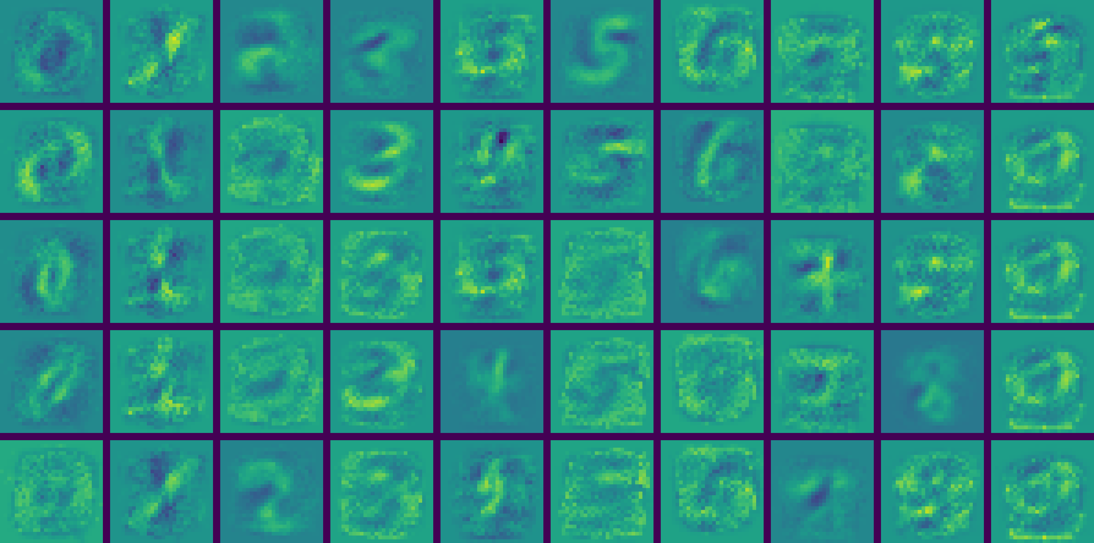
Using the above randomly drawn training samples as the anchor set, the learning procedure gets us about 51.5% test accuracy. This isn't terrible because a model working completely at random should give us about 10% accuracy, but it's still not great (or even good). To see how the same model performs when we allow the anchors to move throughout the training process, we can try both a randomly initialized anchor set as well as a "sample-initialized" anchor set. Below, I have displayed a visualization of the anchor vectors from training epochs 0 through 50. [Note: in all the digit images below, the colors have been scaled such that in each epoch frame, the minimum pixel value is mapped to the darkest blue and the maximum pixel value is mapped to the brightest yellow.]
Notice that even though the initializations are completely different, the final learned anchors look very similar. Notice also that the anchor images very quickly diverge from their initial state into shapes that are just barely recognizable as digits, as though all the possible variations of each digit have been smeared together. Perhaps surprisingly, with only one trainable anchor vector per class, we get about 92% test accuracy (93% training accuracy) with both initializations, already yielding a dramatic improvement over the fixed anchor scenario!
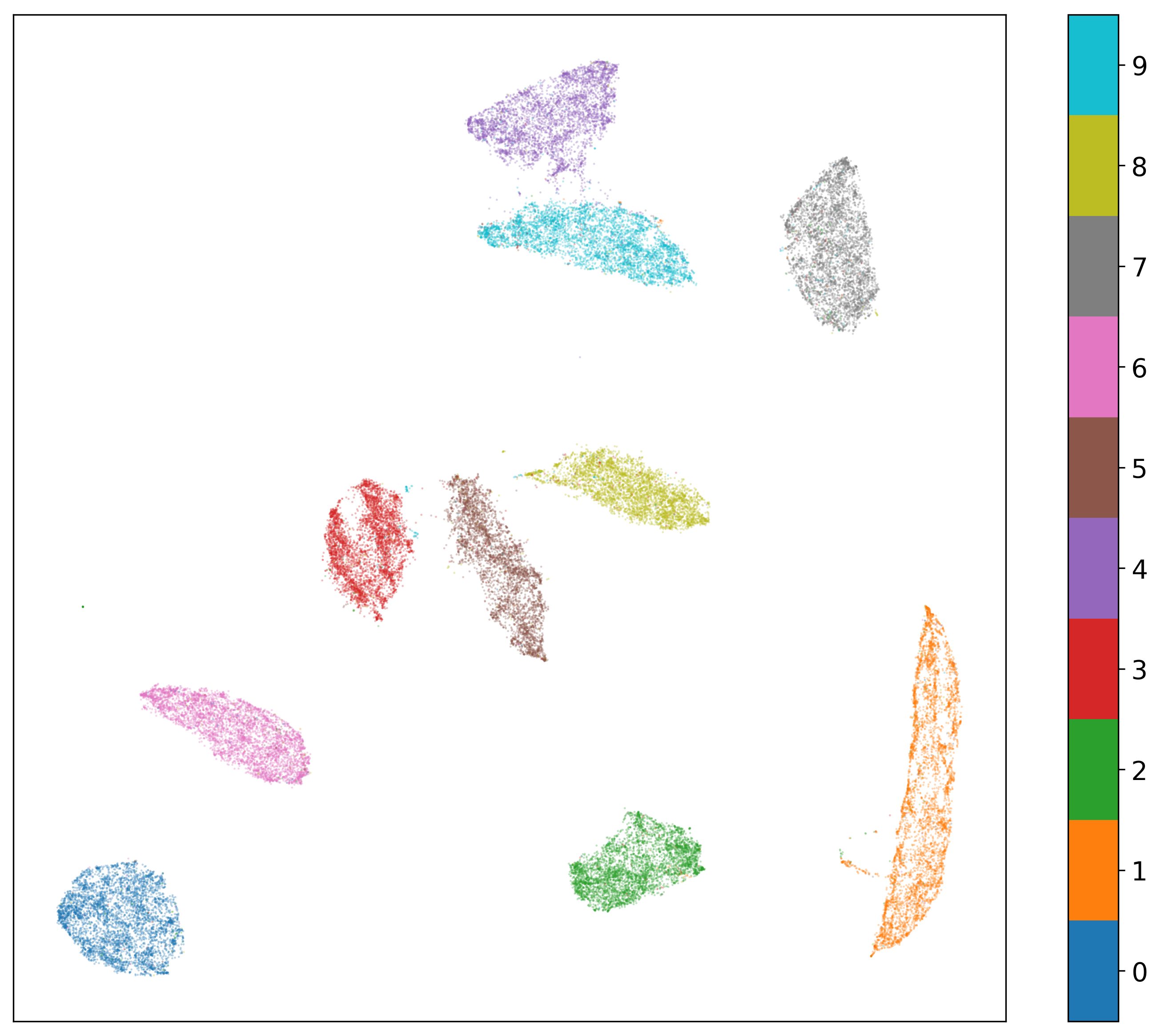
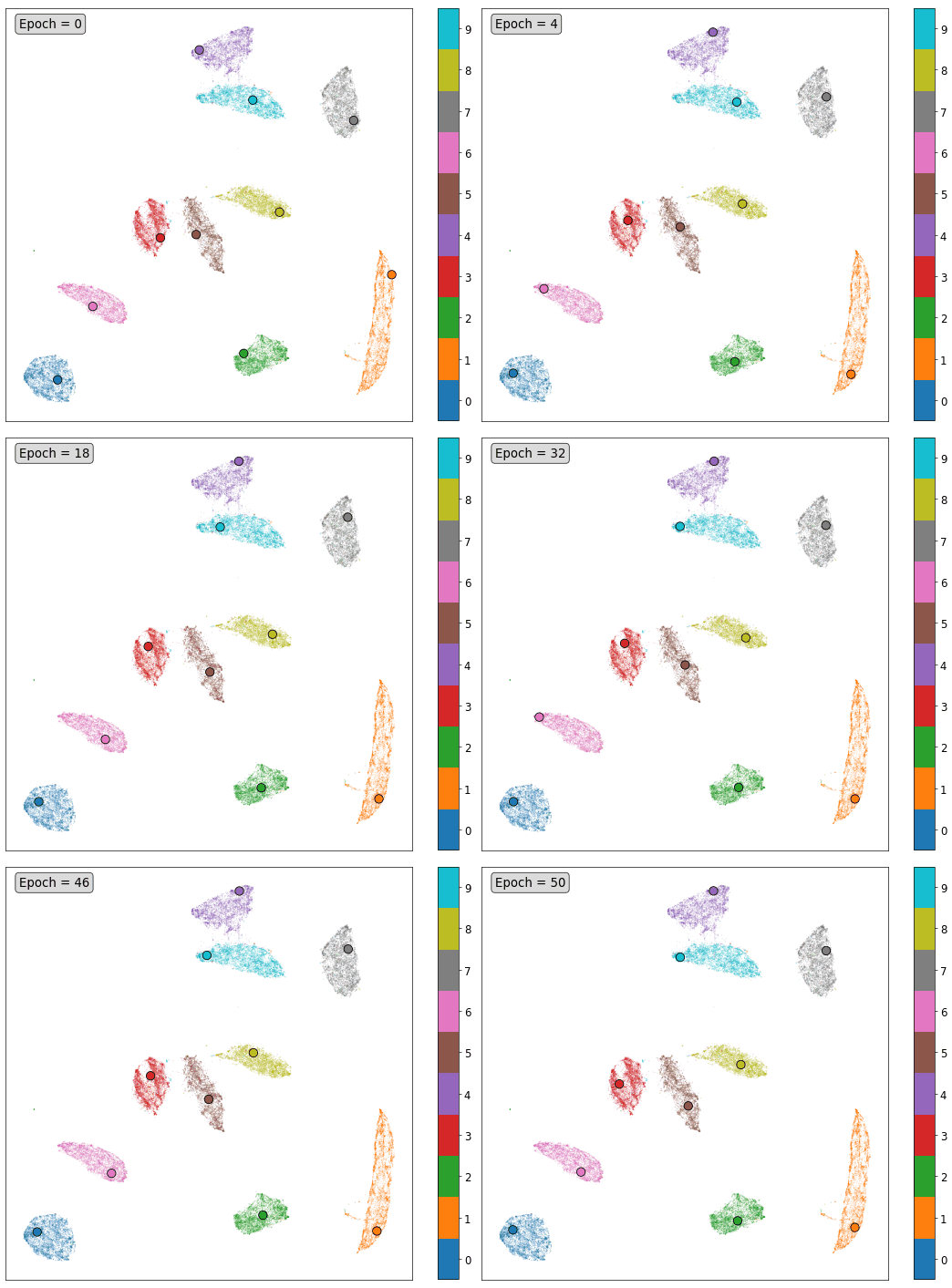
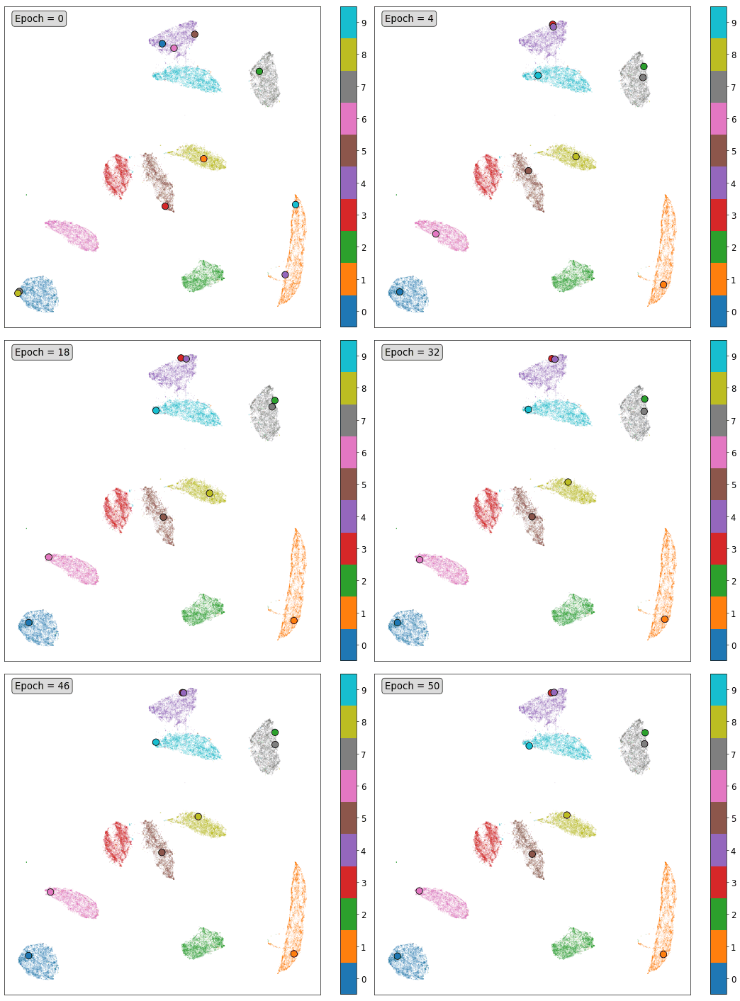
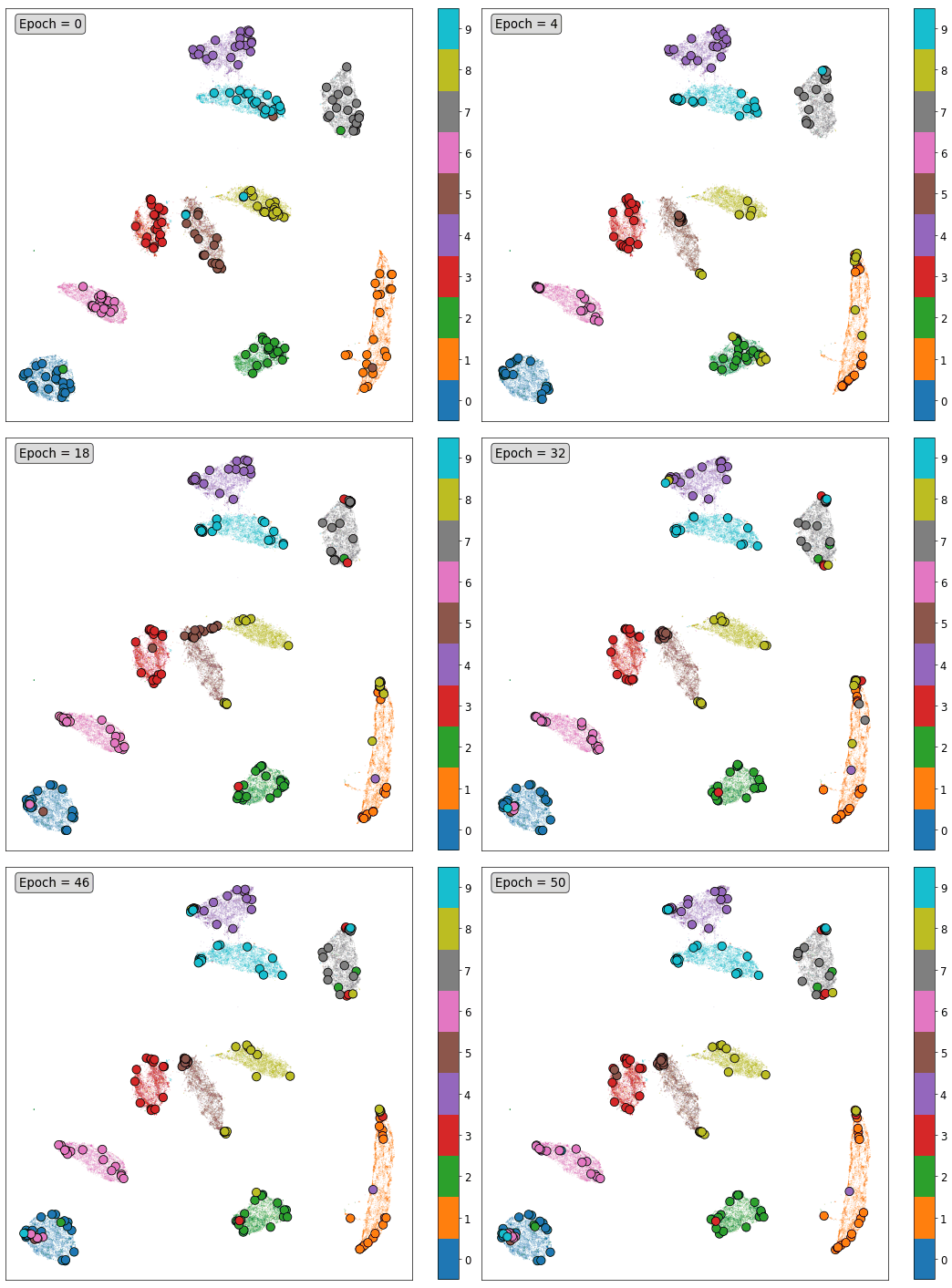
Diving a little deeper, we can try to visualize the anchor vector motion over time using the dimensionality-reduction technique called UMAP (as an aside, UMAP is, in my opinion, a groundbreaking new technique [Feb 2018] for nonlinear dimensionality reduction that anybody who uses t-SNE should try out; it's fast, mathematically well-motivated, easy to implement in Python, and looks great). When a UMAP model is fit, it learns a non-linear mapping that can be applied to examples that are not in the training set used to fit it. Using a random sample of 50,000 examples from the combined training and testing MNIST dataset, UMAP into 2D reveals this structure:
UMAP tries to preserve both the local and global structure of the original data, inferring the structure of the manifold on which the original data lies, and trying to best represent it when it maps the data to a lower-dimensional space. Similar examples should be close together and very different examples should be far apart in the final space. Notice that the orange cluster of 1s in the above plot is elongated while the blue cluster of 0s is round; this reflects the fact that 1s can be leftward or rightward leaning (and continuously deformed in between), while 0s have an approximate continuous rotational symmetry. The 1 and 0 clusters are also far apart, indicating that they probably don't have many pixel values in common. The cluster of 4s and 9s near the top, however, are very close together because those two digits look very similar (share many pixel values).
We can apply this trained UMAP mapping to visualize the intermediate anchor vector positions throughout training in a different way that is perhaps more akin to the training visualizations I created for the binary classification case earlier. Below I've displayed an animated GIF for each of the anchor vector models trained so far (with random initialization and without). Notice that for the model with anchors initialized as training examples, the anchor corresponding to each digit stayed mostly within its corresponding UMAP cluster through training. The randomly-initialized anchors, on the other hand, sometimes ended up in different clusters. In both cases, even though the training cost and visual appearance of the anchor images settled over time, the UMAP mappings of the anchors jitter incessantly. This may be because the anchors, with their appearance that is so unlike any real example, lie so far off the manifold on which the real data lives that the UMAP mapping is subject to a significant amount of noise. Small variations in anchor appearance when that far off the manifold could lead to large variations in projected representation when in the dimensionally-reduced space.
| Initialization | Training and Testing Error Over Time | UMAP Training Visualization |
|---|---|---|
| Sample | 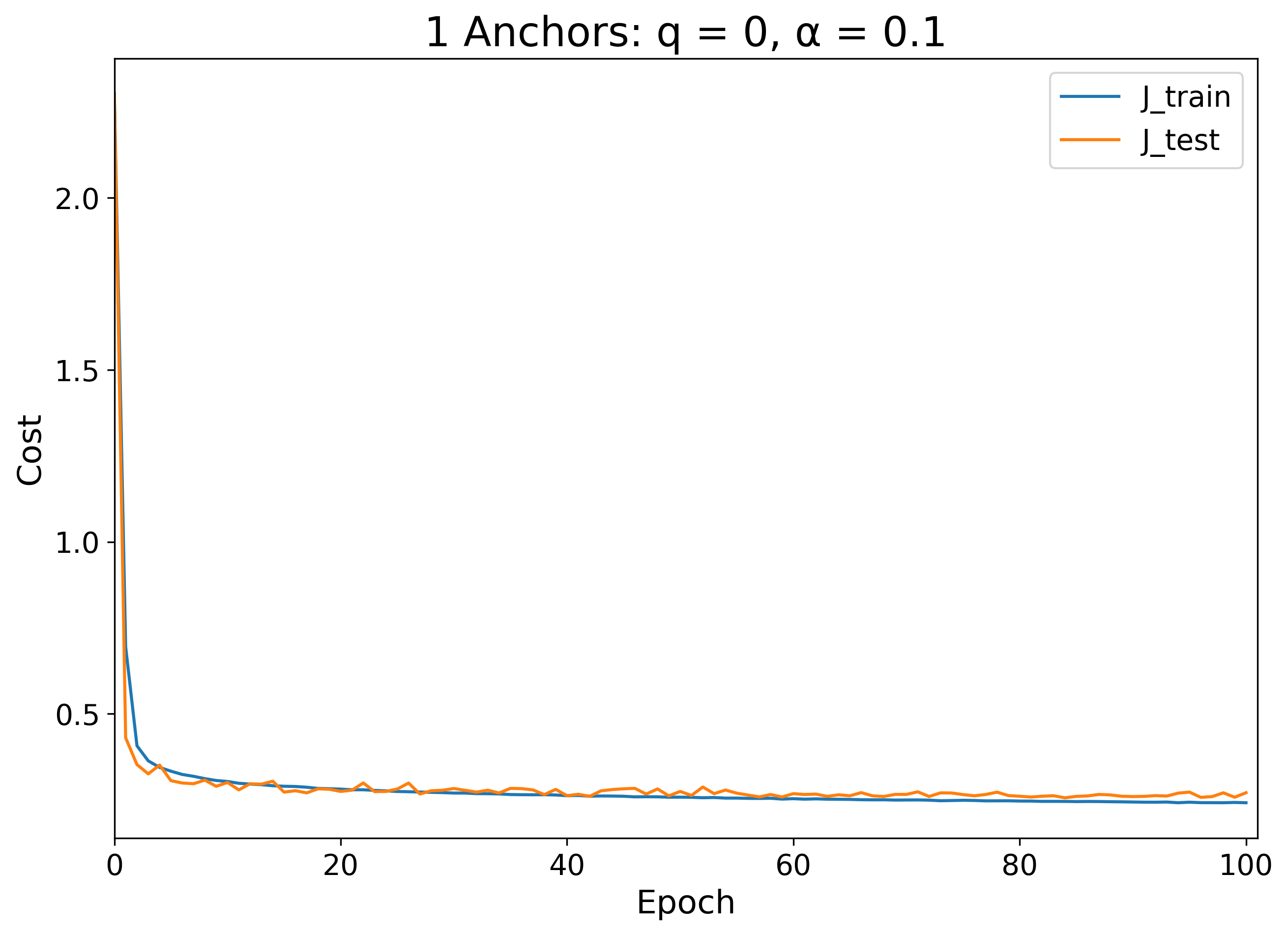 |
 |
| Random | 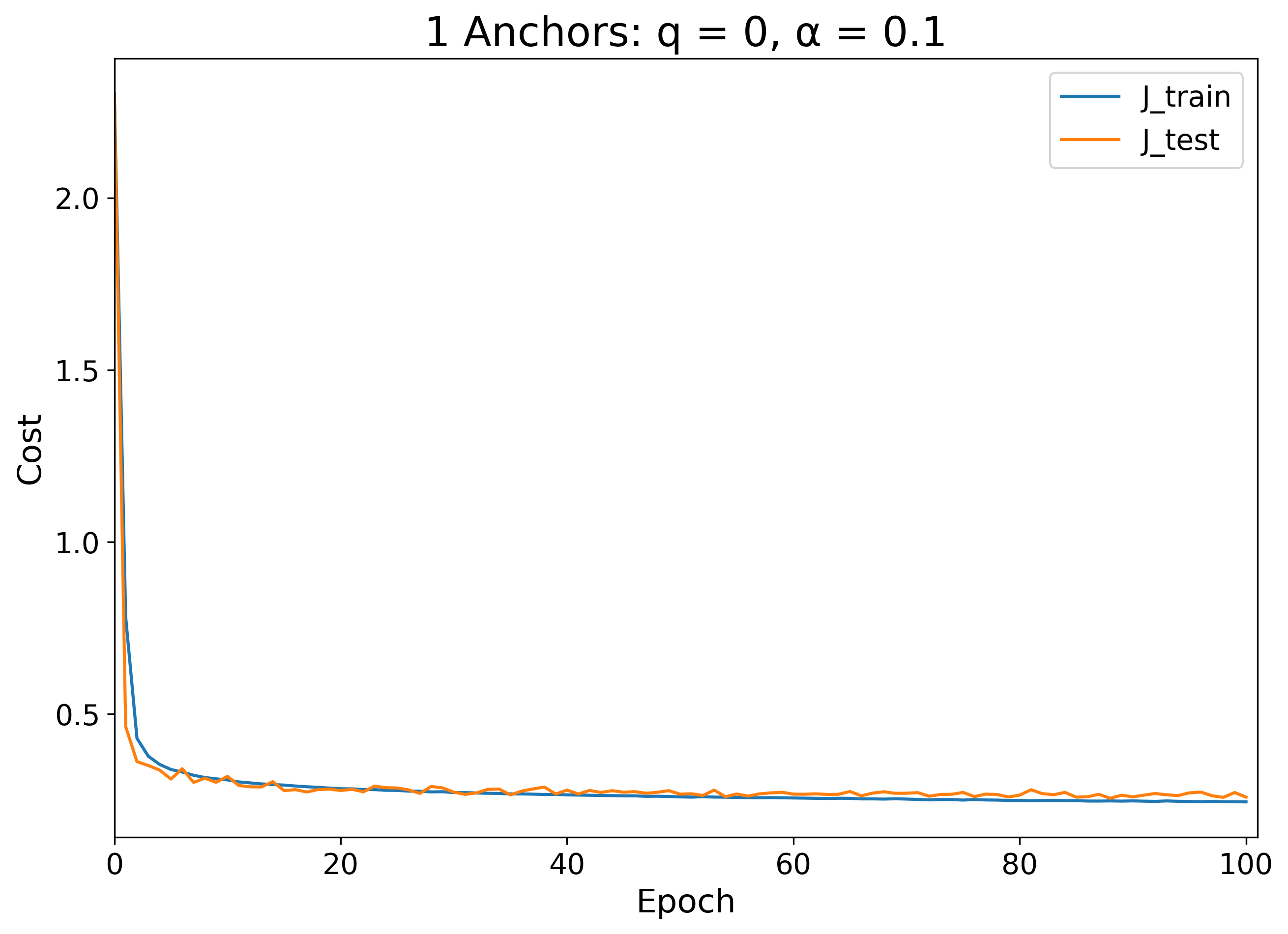 |
 |
Let's check to see how the naive fixed-anchor learning procedure behaves with 3 sample-initialized anchors per class:
After training the softmax parameters, this 3-anchor-per-class model get us 64.2% test accuracy, a good sign, since it's an improvement over the fixed 1-anchor-per-class model.
Again, let's see how random initialization vs. sample initialization changes the learning procedure when we allow the anchors to move:
What I find especially interesting about the above two visualizations is that, for some classes, the random initialization appears to have generated a set of learned anchors that are inverted with respect to those generated from the sample-initialization because of the flexibility of the softmax parameters (see the 0 anchors, for example). Note also that the random initialization case led to a higher degeneracy of anchors than in the sample initialization case (see the 1 anchors, for example), though there is still some diversity in representations resulting from the random initialization (see the 5 anchors, for example).
In both cases, despite the difference in learned anchor appearance, both 3-anchor-per-class initializations led to the same test accuracy of about 93.6% and training accuracy of 94.5%. At this stage, it is not clear whether sample initialization has any advantages over random initialization, through we are starting to see that there is slight overfitting regardless of the initialization. I won't show it here, but again we see similar behavior with the UMAP reduction, where the sample-initialized anchors tend to stay more in their own clusters than the randomly initialized anchors.
Now that we have multiple anchors, we can start to explore the effect that anchor charge has on the learning process.
With q = 0.1:
With the relatively large charge value of 0.1, the training process appears to essentially forget some of the anchors, removing their contrast until the anchor image no longer has strong features. After this training process, the model produced a test accuracy of 94.0% and training accuracy of 94.8%, again a slight improvement.
When we moved from 1 fixed anchor to 3 fixed anchors per class, we saw that the softmax training procedure generated an increase from about 52% to 64% test accuracy. I'm surprised to see that with 10 fixed anchors per class, the accuracy actually drops significantly to about 20% on both the training and testing set.
Performing sample- vs. random-initialization for the 10-anchor-per-class model also yields very different results from what we have seen before:
| With Sample Initialization | With Random Initialization |
|---|---|
 |
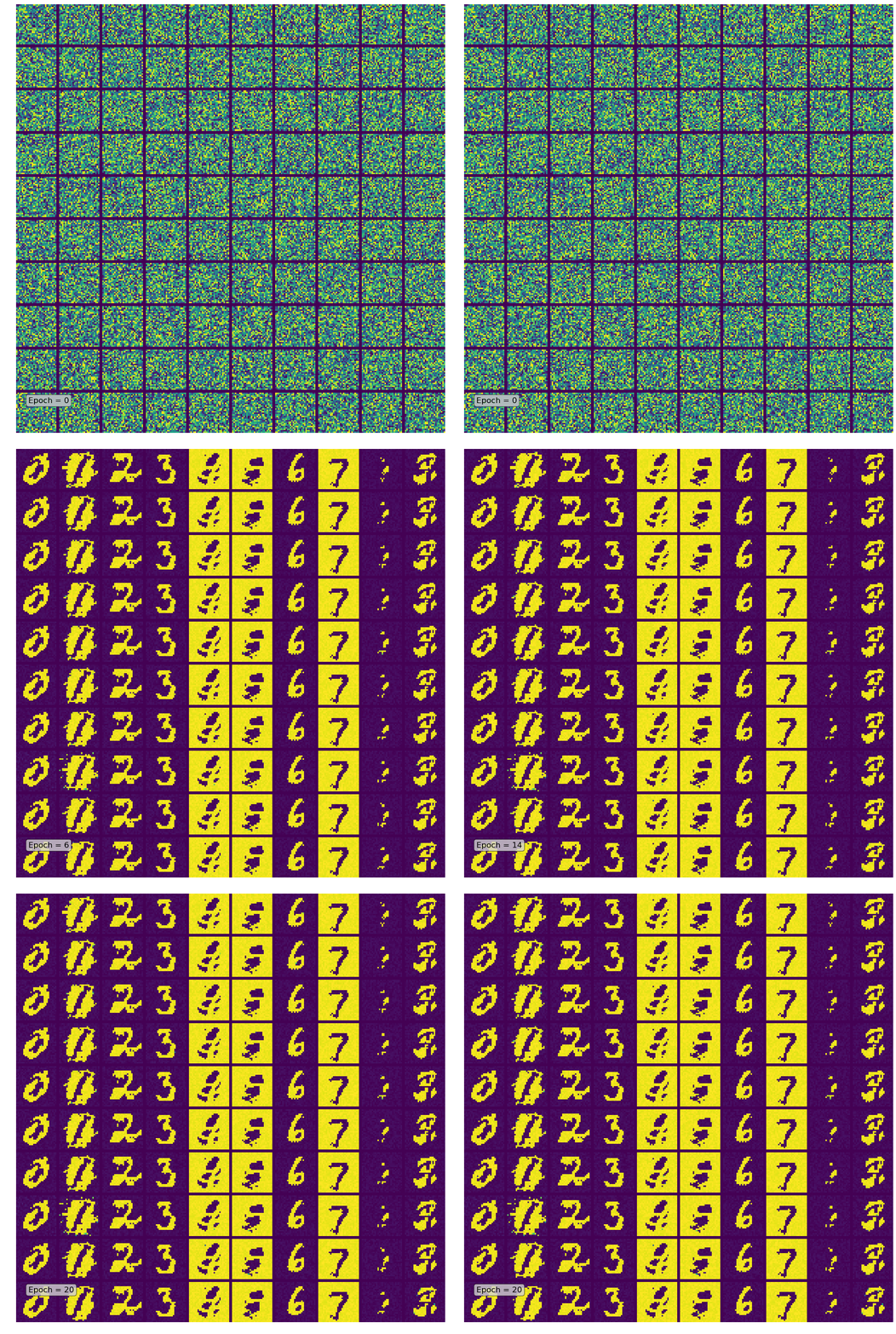 |
While the sample initialization generates the kind of smooth morphing effect we would expect, the random initialization immediately saturates at a distorted configuration that is nearly degenerate within each class. Here it is apparent that sample initialization is important for pointing the anchors in the right direction so they have some "idea" of where to go.
As we might have expected, the sample-initialized model yielded another improvement in accuracy, now 95.6% on the test set and 96.9% on the training set, whereas the randomly initialized model had random performance around 10%.
We saw improvement in classification accuracy when we added charge to the 3-anchor-per-class case, so will it have the same effect on the 10-anchor-per-class case?
With q = 0.1:
| With Sample Initialization | With Random Initialization |
|---|---|
 |
 |
Like in the 3-anchor-per-class case, we see some anchors fade away here and others increase in contrast. However, in this case, some anchors get pushed to very high contrast states (e.g. the 8 anchor near the top right and the 4 anchor on the bottom row of the "with sample initialization" visualization). Because of the way I've chosen to scale the colors (to the minimum and maximum pixel value in each epoch, rather than the minimum and maximum pixel value in each anchor), this has the effect of reducing the contrast in all the other anchor visualizations. Adding charge has also managed to push the randomly initialized case into a non-degenerate final state, since the model is penalized for pushing anchors too close together.
Though the visualizations look odd, adding charge actually slightly increased the performance yet again to 95.8% test accuracy (96.9% train) for the sample initialized model. It also allowed the randomly initialized model to reach nearly the same level of performance with 95.2% test accuracy (96.3% train).
With q = 0.001:
| With Sample Initialization | With Random Initialization |
|---|---|
 |
 |
For comparison, I've displayed above what happens when the anchor charge is 1/100 the size of the previous q = 0.1 case. For sample-initialization, the test and train accuracy were 95.2% and 96.4%, respectively, and for random-initialization, the test and train accuracy were 95.6% and 96.8%, respectively. It is clear that since the performance is relatively unchanged from the q = 0.1 case, only a small amount of charge needs to be added to gain the benefits of charge regularization.
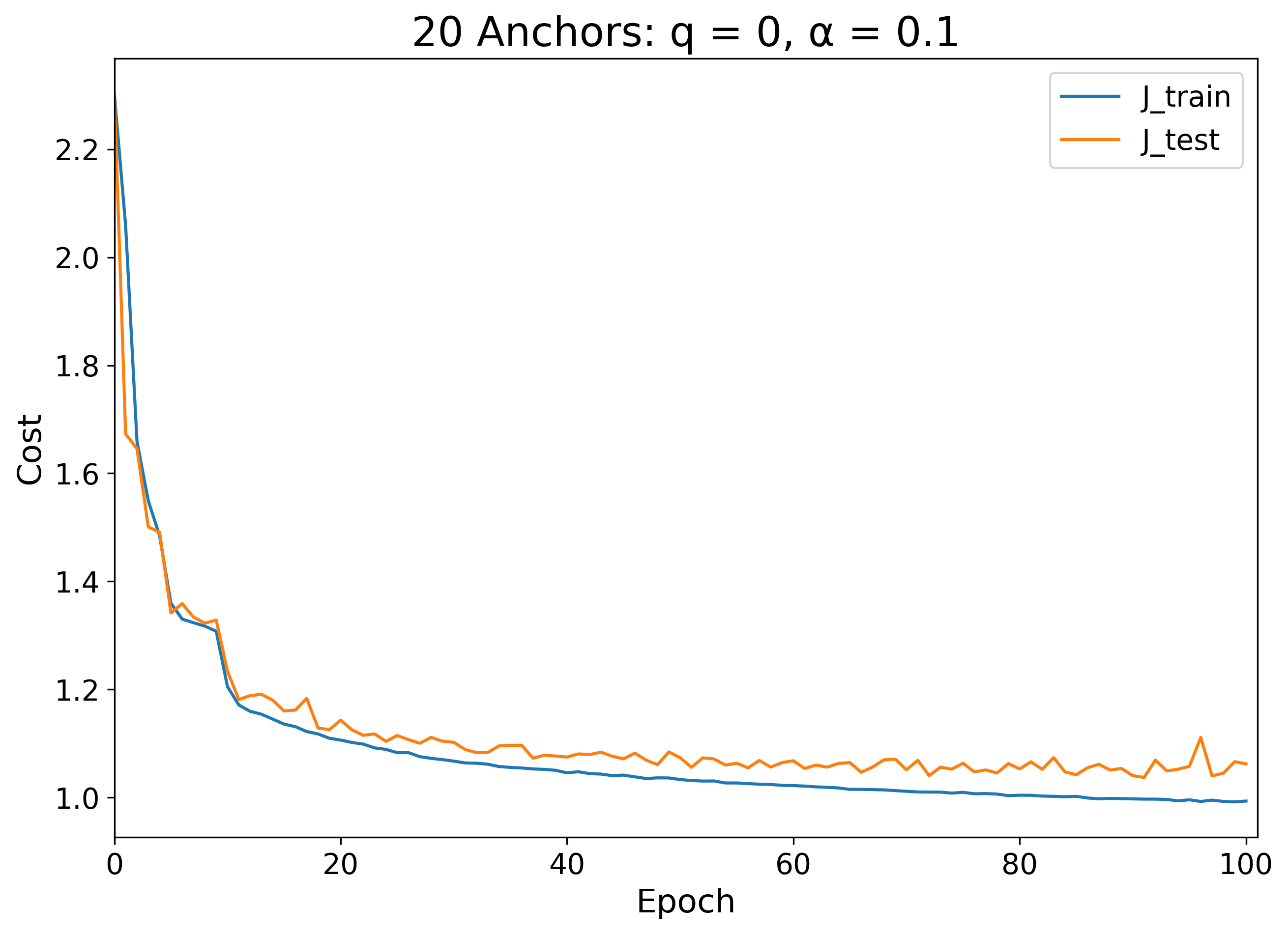
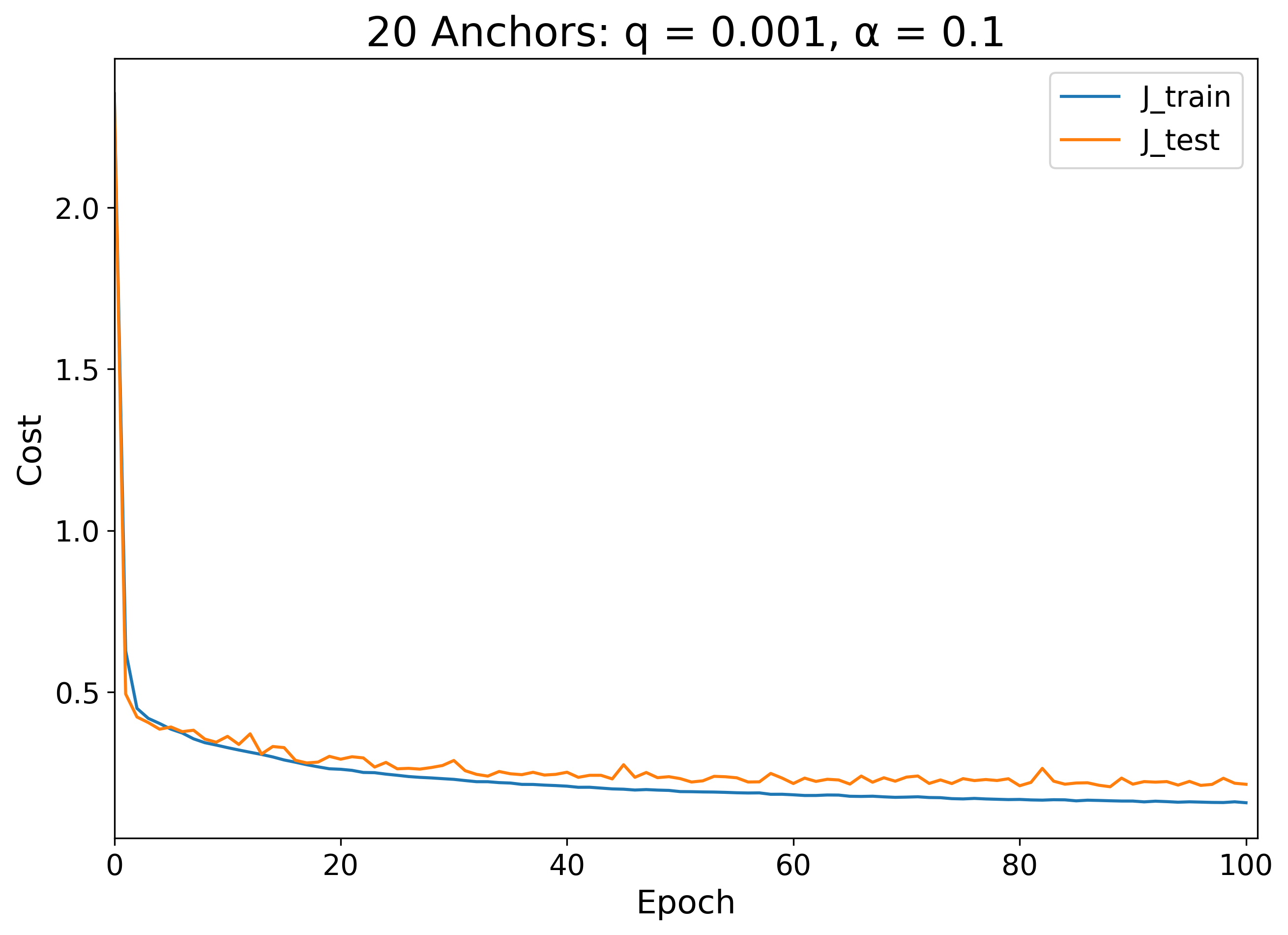
At 20 anchors per class, we now have double the number of anchors representing each class as there are number of classes. Below, I have displayed what the sample-initialized training procedure looks like in this situation with two different charge values:
| q = 0 | q = 0.001 |
|---|---|
 |
 |
 |
 |
 |
 |
The model with q = 0 has a few major bumps in its cost minimization procedure. At the start, digits 2 through 5 all have low contrast anchors, but within the first 20 epochs, digits 3, 5 and 2 appear in sequence. Each time a new digit appears with higher contrast, the training cost visibly drops. This is analogous to what we saw in the binary classification case earlier, where at the beginning of training, the anchors would stick together in a degenerate local minimum and only separate after some time to find a lower minimum. In this case, however, the 4 anchors never found their way out of the low-contrast degenerate state, so the model's test accuracy was only 85.7% (and 86.9% train accuracy).
On the other hand, when just a small amount of charge was added (q = 0.001), the training didn't suffer the same degeneracy problems. The 5 digit anchors had a low contrast phase at the very beginning, but were quickly pushed apart into more optimal non-degenerate states. As a result, the test accuracy was 95.7% (97.3% training accuracy). At this point, even though we can recover the same test performance we had with earlier models, with this number of anchors we are only increasing the degree to which we overfit the training set.
Lastly, if we try increasing the anchor charge further by a factor of 100 so that q = 0.1, we see the following:
The highly charged anchors above evolve naturally for some time before a single anchor apparently saturates. This the resulting coloration of the visualization darkens significantly probably because I have scaled the brightness values of each epoch frame such that the minimum value pixel is the darkest blue and the maximum value pixel is the brightest yellow. In other words, though the training images look strange, most of the anchors are probably evolving normally. In the end, this model yields a testing accuracy of 95.8% and a training accuracy of 97.2%, essentially identical to the q = 0.001 case. It appears that in the high-dimensional space of MNIST, anchors just need a small amount of charge to avoid degeneracy problems, and are mostly insensitive to increases in charge magnitude because crowding is not a problem when there are a large number of dimensions to inhabit.
The method of charged anchor vector optimization, though not state-of-the-art in model performance standards, can grant us insights into the way machine learning models can learn. We've seen how anchor vectors move in space when searching for the best data representations. We've applied this method to a simplistic binary classification task in low-dimensional space with toy data, as well as a more complex multiclass high-dimensional classification task with real-world image data. We've learned how overcrowding can limit the usefulness of charge regularization in low-dimensional space, but also how charge regularization can provide an easy solution to degenerate anchor sets. Where can we go from here?
Below are just a few ideas for future exploration:
-
Multi-label & hierarchical classification: If we change the softmax output of the multiclass classification model into a stack of sigmoids, we can assign each example to any number of classes. Rather than training a multiclass model, this is like training a collection of binary classification models. The resulting loss would be a sum of cross entropies over all the binary classifiers. Implementing such a model structure would allow us to represent multi-label problems as well as hierarchical problems where each category could be made of subcategories.
-
Weighted anchors: In our exploration of anchor vector distance functions, we considered only functions where each anchor was treated equally, but we could have formulated the distance measure differently. Instead of taking a distance product, we could have taken a geometric mean of distances, where a product of N factors is then taken to the N-th root. Under this metric, each factor could be weighted to a different fractional power to grant more influence to some anchors than others in determining the distance from an anchor set. If we promote those weights to model parameters, a model could be trained to learn the best possible weights that represent the data distribution.
-
Negative anchors: Our distance function only ever considered anchors as positive contributors to the function: the closer to any anchor, the better. This has the problem that if data lies in a hollow ring rather than a solid cluster, for example, many anchors would need to surround the ring's perimeter to get close to a good approximation of the data distribution. This comes down to the fact that all the work we have discussed so far applies well only when our data lives in a simply connected space or a union of several such spaces; in other words, blobs of data are good, but holes in those blobs cause problems. One way to tackle this problem is to introduce negative anchors to the anchor set of a given class, anchors from which distance is explicitly defined opposite of positive anchors: the farther away you are from a negative anchor, the better. The ring problem can be easily solved if an anchor set has 2 anchors, one positive and one negative, each with different sigmoid coefficients determining their relative contribution to the class probability.
-
Charge learning: Every anchor in our analysis had the same charge q, but we could have also made q specific to the class or particular anchor. We could even promote anchor charges to model parameters that need to be learned during training.
-
Interclass interaction: In our multiclass example, charged anchors only interacted with other anchors of the same class. Why not introduce charge that allows anchors of different class to interact with each other?
-
Variable anchor count: For simplicity, I enforced that every class have the same number of anchors, but we could also elect to have a different number of anchors for each class. We could even implement something akin to dropout regularization to enforce that during training some anchors have to be ignored sometimes. We could dynamically add or remove anchors during training to learn how many anchors a class really needs so that it doesn't overfit or underepresent the complexity of the inherent data distribution.
If you made it this far, congrats! Thanks for taking the time to read this. If you have any comments, questions, or suggestions, please feel free to contact me.
