Seasonal Trends
borntofrappe opened this issue · comments

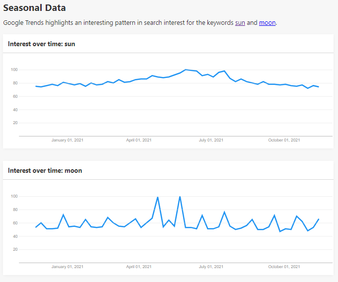
Google Trends highlights an interesting pattern in search interest for the keywords sun and moon. Try to create a visualization illustrating this trend.
First success: creating a line chart after the Google Trends UI.
It's missing interaction in the form of the mousemove event, but I wanted to highlight the progress to inspire the second portion of the issue, providing an alternative with a less conventional visualization.
I've completed the line chart after dedicating admittedly too much time on the mouse interaction. In place of a tooltip (I am growing weary of considering the external container) I've chosen to include the data inside of the <svg> element.

This closes the first part of the issues and illustrates how a line chart might be simple, but often the best type of visualization. The type is immediately understood and gives a clear sense of the overall trend.
Completed the redesign, and I'm proud of the end result.
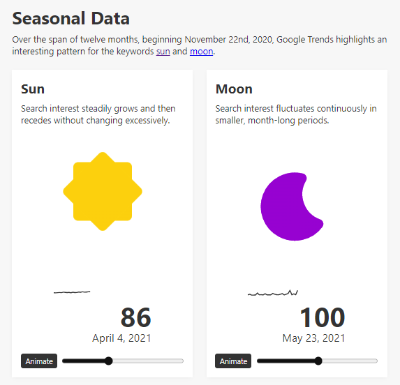
It is possible to animate the vertical position of the icon (which is exactly what I had in mind at the beginning of the issue) with a neat animation or even with a slider.
It is also possible to find the previous line chart, at a smaller scale and for the day leading up to the selected value.