This project contains scripts that collect and transform datasets of the COVID-19 pandemic for global and Mexican data. It also contains examples that explain the ETL and EDA process.
The following are the summaries of the included scripts:
-
step1_global.py - A Python script that downloads and merges datasets from the Johns Hopkins repository.
-
step1_mx.py - A Python script that downloads a Mexican government PDF file, cleans it and converts it to CSV.
-
step2_global.py - A Python script containing several functions to create plots and get insights from the global dataset.
-
step2_mx.py - A Python script containing several functions to create plots and get insights from the Mexican dataset.
This project uses the following Python libraries
- requests - For downloading PDF and CSV files.
- BeautifulSoup - For locating the Mexican government PDF file.
- PyPDF2 - For reading and parsing the Mexican government PDF file.
- pandas - For performing data analysis.
- NumPy - For fast matrix operations.
- Matplotlib - For creating plots.
- seaborn - Used to prettify Matplotlib plots.
Data is not always presented in the most optimal way, this is why we need to pass it through a transformation process.
I'm interested in both global and Mexican specific data (my country). Let's start with the global one.
The university of Johns Hopkins provides various datasets that contain global data of the COVID-19 pandemic that are daily updated.
Our goal is to merge the time series datasets into one CSV file.
The first thing to do is to define the CSV urls and their kind.
CSV_FILES = {
    "confirmed": "https://raw.githubusercontent.com/CSSEGISandData/COVID-19/master/csse_covid_19_data/csse_covid_19_time_series/time_series_covid19_confirmed_global.csv",
    "deaths": "https://raw.githubusercontent.com/CSSEGISandData/COVID-19/master/csse_covid_19_data/csse_covid_19_time_series/time_series_covid19_deaths_global.csv",
    "recovered": "https://raw.githubusercontent.com/CSSEGISandData/COVID-19/master/csse_covid_19_data/csse_covid_19_time_series/time_series_covid19_recovered_global.csv"
}
These CSV files have the same structure, the columns are the dates and the index are the countries/regions names.
In my experience it is better to have a datetime index than a string one. This is because pandas has a great support for time-series data.
We have a small problem though, we don't know how many columns we will have since they add a new one each day.
What we dill do is to first 'scout' one of the CSV files and create a skeleton list that will then be filled with the real data.
# Initialize the skeleton list with a header row.
data_list = [["isodate", "country", "confirmed", "deaths", "recovered"]]

# This dictionary will hold all our available dates.
dates_dict = dict()

# This set will hold all the countries/regions we find.
countries = set()

# We will load the first CSV url.
file = list(CSV_FILES.values())[0]

with requests.get(file) as response:

    # Pass the response text into a csv.DictReader object.
    reader = csv.DictReader(response.text.splitlines())

    # Extract the header row and select from the fifth column onwards.
    fields = reader.fieldnames[4:]

    # Convert the header row dates to datetime objects.
    for field in fields:
        dates_dict[field] = datetime.strptime(field, "%m/%d/%y")

    # Extract the countries/regions by iterating over all rows.
    for row in reader:
        countries.add(row["Country/Region"])

    # Convert the countries set to a list and sort it.
    countries = sorted(list(countries))

    # Combine every date with every country and fill it with zero values.
    for date in dates_dict.values():

        for country in countries:
            data_list.append([date, country, 0, 0, 0])
Once this code is run we end up having a list similar to this one.
["isodate", "country", "confirmed", "deaths", "recovered"]
[2020-01-22, 'Afghanistan', 0, 0, 0]
[2020-01-22, 'Albania', 0, 0, 0],
[2020-01-22, 'Algeria', 0, 0, 0]
Each country will have zero values for each date we find. The drawback is that we will end with several rows with zero values but that's really easy fo filter out with pandas.
Once we have our skeleton list ready we can start filling it with real data.
We will load the 3 CSV files and check each row to see if it matches with our skeleton list and then update the corresponding column.
# Iterate over our 3 urls.
for kind, url in CSV_FILES.items():

    with requests.get(url) as response:

        # Pass the response text into a csv.DictReader object.
        reader = csv.DictReader(response.text.splitlines())

        # Iterate over each row of the CSV file.
        for row in reader:

            # Iterate over our available dates.
            for k, v in dates_dict.items():

                # Iterate over our skeleton list.
                for index, item in enumerate(data_list):

                    # If the current skeleton list row matches our CSV row we update its values.
                    if v == item[0] and row["Country/Region"] == item[1]:

                        # Depending on the kind of the CSV data is the column to update.
                        if kind == "confirmed":
                            data_list[index][2] += int(row[k])
                        elif kind == "deaths":
                            data_list[index][3] += int(row[k])
                        elif kind == "recovered":
                            data_list[index][4] += int(row[k])

                        break

# Save our data to a CSV file.
with open("global_data.csv", "w", encoding="utf-8", newline="") as other_file:
    csv.writer(other_file).writerows(data_list)
Now we have our CSV file saved on our computer, ready to be analyzed.
This can be done more efficiently with other libraries but I wanted to provide a solution that used the less external dependencies as possible.
The Mexican government provides a tabular PDF file containing the information of the confirmed cases of COVID-19.
The goal is to convert that PDF to CSV. There's a library named tabula-py that does this really quickly but I found out I needed to install Java to use it.
Instead of that we will use PyPDF2 and a custom algorithm to identify patterns.
We will start by creating a function that will locate this PDF file and download it to our computer.
We will do a bit of web scraping, using the Requests and BeautifulSoup combo.
with requests.get(URL) as response:

    soup = BeautifulSoup(response.text, "html.parser")

    # Iterate over all the anchor tags.
    for link in soup.find_all("a"):

        # Once we find the one we are interested in, we download it and break the loop.
        if "casos_positivos" in link["href"]:
            print("Downloading PDF file...")

            with requests.get("https://www.gob.mx" + link["href"]) as pdf_response:

                with open("./casos_confirmados.pdf", "wb") as pdf_file:
                    pdf_file.write(pdf_response.content)
                    print("PDF file downloaded.")
With our PDF downloaded we now load it using PyPDF2 and initialize our data list with a header row.
reader = PyPDF2.PdfFileReader(open("./casos_confirmados.pdf", "rb"))

data_list = [["numero_caso", "estado", "sexo",
                  "edad", "fecha_inicio_sintomas", "estatus"]]

# Iterate over each page.
for i in range(reader.numPages):
    print("Processing page:", i+1, "of", reader.numPages)

    # Extract the raw text.
    page_data = reader.getPage(i).extractText()
We then start iterating over each page and extract the text. For the most part this PDF file is well formatted but I noticed the resulting CSV file kept having errors.
I found out that CIUDAD DE MEXICO was written in 3 different ways. It has a new line character where it shouldn't be.
With the following dictionary we can locate similar errors and fix them.
FIX_STRINGS = [
    ["CIUDAD DE\n \nMÉXICO", "CIUDAD DE MÉXICO"],
    ["CIUDAD\n \nDE MÉXICO", "CIUDAD DE MÉXICO"],
    ["BAJA\n \nCALIFORNIA", "BAJA CALIFORNIA"],
    ["SAN LUIS\n \nPOTOSÍ", "SAN LUIS POTOSÍ"],
    ["QUINTANA\n \nROO", "QUINTANA ROO"],
    ["Estados\n \nUnidos", "Estados Unidos"]
]

# Fix some small inconsistencies with the text.
for fixer in FIX_STRINGS:
    page_data = page_data.replace(fixer[0], fixer[1])

# Split the text into chunks and remove empty ones.
page_data = [item.replace("\n", "")
                     for item in page_data.split("\n") if item != " "]

page_data = [item for item in page_data if item != ""]
At this point we have a list of strings. We removed the blank ones and we only have valid data.
The first page of the PDF file has the header row data, we will add an if statement to ignore it on the first page only.
# Only on the first page the starting chunk is the 10th one.
if i == 0:
    start_index = 9
else:
    start_index = 0

# Iterate over our chunks, 7 at a time (7 columns).
for j in range(start_index, len(page_data), 6):

    # Create a list with the current chunk plus the next five.
    temp_list = page_data[j:j+6]

    # Add the previous list to the data list if it's not incomplete.
    if len(temp_list) == 6:

        # Fix for bad formatted dates.
        if len(temp_list[4]) == 5:
            temp_date = start_time + timedelta(days=int(temp_list[4]))
            temp_list[4] = "{:%d/%m/%Y}".format(temp_date)
We took 6 chunks of the PDF data at a time, passed them to our data list and saved that list to CSV using the csv.writer().writerows() method.
with open("casos_confirmados.csv", "w", encoding="utf-8", newline="") as csv_file:
    csv.writer(csv_file).writerows(data_list)
print("PDF converted.")Now we have 2 CSV files ready to be analyzed and plotted, global_data.csv and casos_confirmados.csv.
We are going to use pandas, NumPy, Matplotlib and seaborn. We will start by importing the required libraries and setting up the styles for our plots.
import matplotlib.dates as mdates
import matplotlib.pyplot as plt
import matplotlib.ticker as ticker
import numpy as np
import pandas as pd
import seaborn as sns


sns.set(style="ticks",
        rc={
            "figure.figsize": [15, 10],
            "text.color": "white",
            "legend.fontsize": "large",
            "xtick.labelsize": "x-large",
            "ytick.labelsize": "x-large",
            "axes.labelsize": "x-large",
            "axes.titlesize": "x-large",
            "axes.labelcolor": "white",
            "axes.edgecolor": "white",
            "xtick.color": "white",
            "ytick.color": "white",
            "axes.facecolor": "#111111",
            "figure.facecolor": "#232b2b"}
        )
These styles will apply an elegant dark gray palette to our plots.
Note: You will have different numbers on your results as I did this analysis on older datasets.
We start by loading our dataset and specifying the first column as our index, this will turn it into a datetimeindex which is very handy when working with time-series data.
df = pd.read_csv("global_data.csv", parse_dates=["isodate"], index_col=0)Let's take a look at our DataFrame using the head(), tail() and describe() methods.
df.head()| country | confirmed | deaths | recovered | |
|---|---|---|---|---|
| isodate | ||||
| 2020-01-22 | Afghanistan | 0 | 0 | 0 |
| 2020-01-22 | Albania | 0 | 0 | 0 |
| 2020-01-22 | Algeria | 0 | 0 | 0 |
| 2020-01-22 | Andorra | 0 | 0 | 0 |
| 2020-01-22 | Angola | 0 | 0 | 0 |
df.tail()| isodate | country | confirmed | deaths | recovered |
|---|---|---|---|---|
| 2020-04-14 | West Bank and Gaza | 308 | 2 | 62 |
| 2020-04-14 | Western Sahara | 6 | 0 | 0 |
| 2020-04-14 | Yemen | 1 | 0 | 0 |
| 2020-04-14 | Zambia | 45 | 2 | 30 |
| 2020-04-14 | Zimbabwe | 17 | 3 | 0 |
df.describe()| confirmed | deaths | recovered | |
|---|---|---|---|
| count | 15540 | 15540 | 15540 |
| mean | 2007.55 | 105.364 | 489.394 |
| std | 16754 | 998.927 | 4630.27 |
| min | 0 | 0 | 0 |
| 25% | 0 | 0 | 0 |
| 50% | 1 | 0 | 0 |
| 75% | 53 | 1 | 2 |
| max | 607670 | 25832 | 78200 |
We can observe the countries are alphabetically sorted and our datetimeindex worked correctly.
We can also observe all the first rows have zero values, as predicted from the ETL process. This caused an adverse effect on the describe() method, where the results are biased towards zero.
Let's fix this by removing all rows with zero values on their confirmed field.
df = df[df["confirmed"] > 0]
df.describe()| confirmed | deaths | recovered | |
|---|---|---|---|
| count | 7793 | 7793 | 7793 |
| mean | 4003.25 | 210.107 | 975.898 |
| std | 23490.1 | 1402.83 | 6502.32 |
| min | 1 | 0 | 0 |
| 25% | 7 | 0 | 0 |
| 50% | 52 | 1 | 2 |
| 75% | 541 | 7 | 32 |
| max | 607670 | 25832 | 78200 |
This looks better and more accurate. On the next sections we will start producing interesting insights.
To get the countries with the highest values we first need to group our DataFrame by the country field and select their max value which happens to be the latest one.
grouped_df = df.groupby("country").max()Once grouped we use the sort_values() method on the field we are interested in and sort by descending order. From there we print the first 10 rows from the field we previously defined.
# Confirmed cases
print(grouped_df.sort_values("confirmed", ascending=False)["confirmed"][:10])| country | confirmed |
|---|---|
| US | 607670 |
| Spain | 172541 |
| Italy | 162488 |
| France | 137875 |
| Germany | 131359 |
| United Kingdom | 94845 |
| China | 83306 |
| Iran | 74877 |
| Turkey | 65111 |
| Belgium | 31119 |
# Deaths
print(grouped_df.sort_values("deaths", ascending=False)["deaths"][:10])| country | deaths |
|---|---|
| US | 25832 |
| Italy | 21067 |
| Spain | 18056 |
| France | 15748 |
| United Kingdom | 12129 |
| Iran | 4683 |
| Belgium | 4157 |
| China | 3345 |
| Germany | 3294 |
| Netherlands | 2955 |
# Recoveries
print(grouped_df.sort_values("recovered", ascending=False)["recovered"][:10])| country | recovered |
|---|---|
| China | 78200 |
| Germany | 68200 |
| Spain | 67504 |
| Iran | 48129 |
| US | 47763 |
| Italy | 37130 |
| France | 29098 |
| Switzerland | 13700 |
| Canada | 8210 |
| Austria | 7633 |
Thanks fo the datetimeindex knowing the daily totals is really easy. We will only require to resample our DataFrame by 1 day intervals.
We will start by defining our field (confirmed, deaths or recovered) and resampling method.
field = "deaths"
resampled_df = df.resample("D").sum()
We add 2 new columns to know the daily field totals (difference) and their percent change (change).
resampled_df["difference"] = resampled_df[field].diff()
resampled_df["change"] = resampled_df["difference"].pct_change()
Now we drop NaN values, we do this so the next step doesn't crash the script.
resampled_df.dropna(inplace=True)This step is optional, the purpose of it is to display the results in a more human readable way.
The difference column gets converted from float to int and the change column gets some string formatting, which includes adding a percent sign and rounding up the numbers to the second decimal.
resampled_df["difference"] = resampled_df["difference"].apply(int)

resampled_df["change"] = resampled_df["change"].apply(
    lambda x: str(np.round(x * 100, 2)) + "%")
And finally, we print the latest 10 rows.
print(resampled_df[[field, "difference", "change"]][-10:])| isodate | deaths | difference | change |
|---|---|---|---|
| 2020-04-05 | 69374 | 4768 | -18.06% |
| 2020-04-06 | 74565 | 5191 | 8.87% |
| 2020-04-07 | 81865 | 7300 | 40.63% |
| 2020-04-08 | 88338 | 6473 | -11.33% |
| 2020-04-09 | 95455 | 7117 | 9.95% |
| 2020-04-10 | 102525 | 7070 | -0.66% |
| 2020-04-11 | 108503 | 5978 | -15.45% |
| 2020-04-12 | 114091 | 5588 | -6.52% |
| 2020-04-13 | 119482 | 5391 | -3.53% |
| 2020-04-14 | 125984 | 6502 | 20.61% |
Now we will know the daily confirmed cases, deaths or recoveries and their growth for any given country. We will use the US for this example.
We start by defining the country and which field we want (confirmed, deaths or recovered). Afterwards we filter our DataFrame so it only includes values of that country.
field = "deaths"
country = "US"
filtered_df = df[df["country"] == country].copy()
We add 2 new columns to know the daily field totals (difference) and their percent change (change).
filtered_df["difference"] = filtered_df[field].diff()
filtered_df["change"] = filtered_df["difference"].pct_change()
Now we drop NaN values, we do this so the next step doesn't crash the script.
filtered_df.dropna(inplace=True)This step is optional, the purpose of it is to display the results in a more human readable way.
The difference column gets converted from float to int and the change column gets some string formatting, which includes adding a percent sign and rounding up the numbers to the second decimal.
filtered_df["difference"] = filtered_df["difference"].apply(int)

filtered_df["change"] = filtered_df["change"].apply(
    lambda x: str(np.round(x * 100, 2)) + "%")
And finally, we print the latest 10 rows.
print(filtered_df[[field, "difference", "change"]][-10:])| isodate | deaths | difference | change |
|---|---|---|---|
| 2020-04-05 | 9619 | 1212 | -8.18% |
| 2020-04-06 | 10783 | 1164 | -3.96% |
| 2020-04-07 | 12722 | 1939 | 66.58% |
| 2020-04-08 | 14695 | 1973 | 1.75% |
| 2020-04-09 | 16478 | 1783 | -9.63% |
| 2020-04-10 | 18586 | 2108 | 18.23% |
| 2020-04-11 | 20463 | 1877 | -10.96% |
| 2020-04-12 | 22020 | 1557 | -17.05% |
| 2020-04-13 | 23529 | 1509 | -3.08% |
| 2020-04-14 | 25832 | 2303 | 52.62% |
Feel free to try this example with other country names, such as Italy, Spain or Iran.
This one is quite interesting, we will know how many days it took to reach from 100 to 3,200 confirmed cases.
For this exercise we will use custom bins for the exponential growth (100-199, 200-399, and so on).
We start by removing all rows lower than 100 confirmed cases.
df = df[df["confirmed"] >= 100]We define our bins and their labels.
bins = [(100, 199), (200, 399), (400, 799), (800, 1599), (1600, 3200)]
labels = ["100-199", "200-399", "400-799", "800-1599", "1600-3200"]
We extract all the available countries in the dataset.
all_countries = sorted(df["country"].unique().tolist())These lists will be filled with values in the next step.
valid_countries = list()
data_list = list()
We iterate over all the countries we have and create temporary DataFrames with them.
for country in all_countries:

    temp_df = df[df["country"] == country]

    # Only process countries if their confirmed cases are equal or greater than 3,200.
    if temp_df["confirmed"].max() >= 3200:
        temp_list = list()

        # We iterate over our bins and count how many days each one has.
        for item in bins:
            temp_list.append(temp_df[(temp_df["confirmed"] >= item[0]) & (
                temp_df["confirmed"] <= item[1])]["confirmed"].count())

        data_list.append(temp_list)
        valid_countries.append(country)
We create a final DataFrame with the results and add a new column with the total days from 100 to 3,200 confirmed cases.
final_df = pd.DataFrame(data_list, index=valid_countries, columns=labels)
final_df["total"] = final_df.sum(axis=1)
print(final_df)| 100-199 | 200-399 | 400-799 | 800-1599 | 1600-3200 | total | |
|---|---|---|---|---|---|---|
| Australia | 3 | 4 | 4 | 2 | 5 | 18 |
| Austria | 3 | 2 | 2 | 3 | 4 | 14 |
| Belarus | 3 | 2 | 3 | 3 | 4 | 15 |
| Belgium | 2 | 5 | 2 | 4 | 3 | 16 |
| Brazil | 3 | 3 | 2 | 2 | 4 | 14 |
| Canada | 4 | 1 | 3 | 4 | 2 | 14 |
| Chile | 1 | 3 | 4 | 3 | 6 | 17 |
| China | 0 | 0 | 2 | 2 | 2 | 6 |
| Czechia | 2 | 3 | 2 | 5 | 6 | 18 |
| Denmark | 0 | 1 | 2 | 11 | 8 | 22 |
| Dominican Republic | 1 | 4 | 3 | 7 | 9 | 24 |
| Ecuador | 2 | 1 | 2 | 5 | 6 | 16 |
| France | 3 | 3 | 1 | 3 | 3 | 13 |
| Germany | 3 | 1 | 3 | 3 | 2 | 12 |
| India | 6 | 3 | 4 | 5 | 4 | 22 |
| Indonesia | 3 | 3 | 5 | 6 | 8 | 25 |
| Iran | 1 | 2 | 1 | 2 | 2 | 8 |
| Ireland | 3 | 2 | 3 | 4 | 5 | 17 |
| Israel | 3 | 4 | 3 | 3 | 3 | 16 |
| Italy | 1 | 2 | 2 | 2 | 4 | 11 |
| Japan | 6 | 8 | 9 | 13 | 9 | 45 |
| Korea, South | 1 | 1 | 2 | 3 | 3 | 10 |
| Luxembourg | 1 | 2 | 3 | 4 | 14 | 24 |
| Malaysia | 5 | 1 | 4 | 5 | 10 | 25 |
| Mexico | 2 | 4 | 4 | 6 | 6 | 22 |
| Netherlands | 2 | 3 | 2 | 4 | 4 | 15 |
| Norway | 3 | 1 | 3 | 6 | 7 | 20 |
| Pakistan | 1 | 2 | 4 | 7 | 7 | 21 |
| Panama | 2 | 4 | 4 | 6 | 8 | 24 |
| Peru | 2 | 5 | 5 | 6 | 4 | 22 |
| Philippines | 4 | 5 | 4 | 4 | 5 | 22 |
| Poland | 3 | 3 | 4 | 4 | 6 | 20 |
| Portugal | 2 | 2 | 3 | 2 | 4 | 13 |
| Qatar | 0 | 4 | 17 | 4 | 8 | 33 |
| Romania | 4 | 4 | 3 | 4 | 6 | 21 |
| Russia | 3 | 3 | 3 | 4 | 3 | 16 |
| Saudi Arabia | 5 | 3 | 3 | 7 | 8 | 26 |
| Serbia | 3 | 5 | 4 | 4 | 7 | 23 |
| Singapore | 13 | 8 | 7 | 11 | 6 | 45 |
| Spain | 2 | 2 | 3 | 1 | 3 | 11 |
| Sweden | 2 | 3 | 2 | 7 | 8 | 22 |
| Switzerland | 1 | 4 | 3 | 2 | 4 | 14 |
| Turkey | 1 | 1 | 1 | 2 | 2 | 7 |
| US | 2 | 2 | 3 | 2 | 3 | 12 |
| Ukraine | 2 | 2 | 4 | 6 | 6 | 20 |
| United Arab Emirates | 6 | 3 | 5 | 4 | 5 | 23 |
| United Kingdom | 2 | 4 | 2 | 4 |
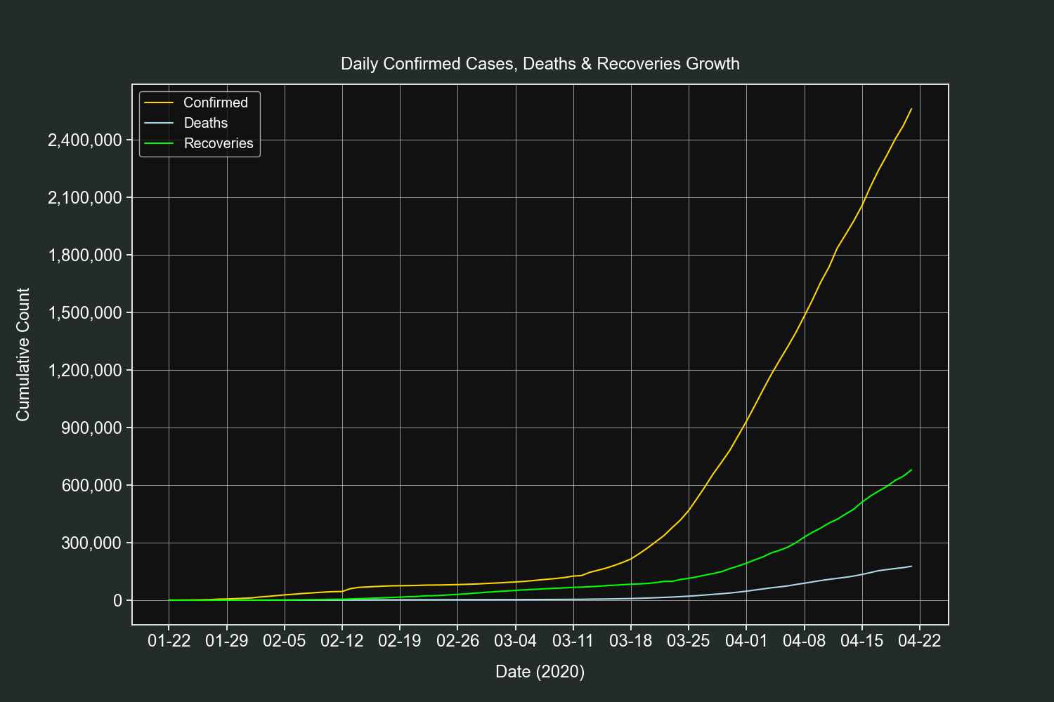
Let's start the plots section with a straightforward one. We will plot the daily growth of confirmed cases, deaths and recoveries of all countries combined.
We will filter out rows with zero confirmed cases.
df = df[df["confirmed"] > 0]Resample the data by 1 day intervals and sum the daily totals.
resampled_df = df.resample("D").sum()Create 3 line plots on the same axis, one for each field.
fig, ax = plt.subplots()

ax.plot(resampled_df.index,
        resampled_df["confirmed"], label="Confirmed", color="gold")

ax.plot(resampled_df.index,
        resampled_df["deaths"], label="Deaths", color="lightblue")

ax.plot(resampled_df.index,
        resampled_df["recovered"], label="Recoveries", color="lime")
Customize our tickers.
ax.xaxis.set_major_locator(mdates.DayLocator(interval=7))
ax.xaxis.set_major_formatter(mdates.DateFormatter("%m-%d"))
ax.yaxis.set_major_locator(ticker.MaxNLocator())
ax.yaxis.set_major_formatter(ticker.StrMethodFormatter("{x:,.0f}"))
Add final customizations.
plt.grid(linewidth=0.5)
plt.legend(loc=2)
plt.title("Daily Confirmed Cases, Deaths & Recoveries", pad=15)
plt.xlabel("Date (2020)", labelpad=15)
plt.ylabel("Cumulative Count", labelpad=15)

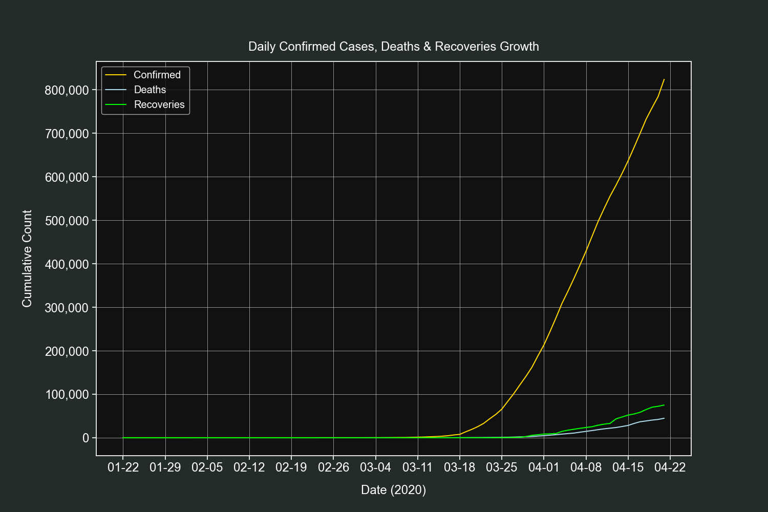
plt.show()This plot is very similar to the previous one, the only difference is that it shows the daily growth only for one country, in this example it will be the US.
We filter out rows with zero confirmed cases and only select rows that belong to the country we defined.
country = "US"
df = df[(df["confirmed"] > 0) & (df["country"] == country)]
Create 3 line plots on the same axis, one for each field.
fig, ax = plt.subplots()

ax.plot(df.index, df["confirmed"], label="Confirmed", color="gold")
ax.plot(df.index, df["deaths"], label="Deaths", color="lightblue")
ax.plot(df.index, df["recovered"], label="Recoveries", color="lime")
Customize our tickers.
ax.xaxis.set_major_locator(mdates.DayLocator(interval=7))
ax.xaxis.set_major_formatter(mdates.DateFormatter("%m-%d"))
ax.yaxis.set_major_locator(ticker.MaxNLocator())
ax.yaxis.set_major_formatter(ticker.StrMethodFormatter("{x:,.0f}"))
Add final customizations.
plt.grid(linewidth=0.5)
plt.legend(loc=2)
plt.title("Daily Confirmed Cases, Deaths & Recoveries", pad=15)
plt.xlabel("Date (2020)", labelpad=15)
plt.ylabel("Cumulative Count", labelpad=15)

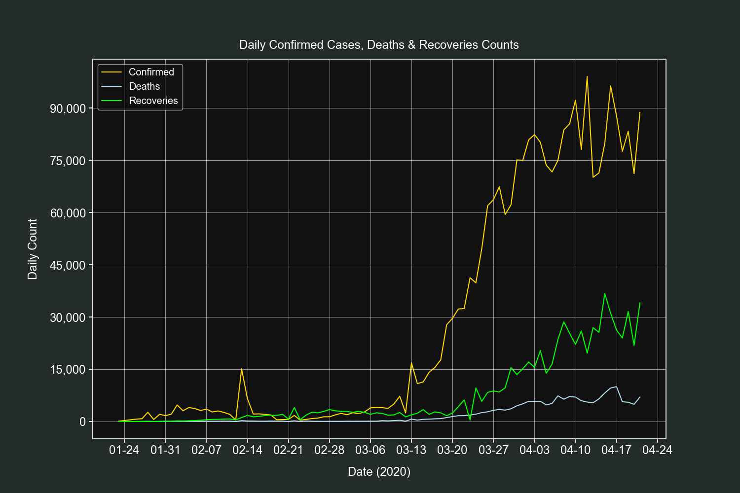
plt.show()This plot is simlar to the previous one, it will show us the daily counts of confirmed cases, deaths and recoveries for all the countries combined.
We filter out rows with zero confirmed cases.
df = df[df["confirmed"] > 0]Resample the data by 1 day intervals and sum the daily totals.
resampled_df = df.resample("D").sum()Add 3 new columns, one for each field counts.
resampled_df["confirmed_difference"] = resampled_df["confirmed"].diff()
resampled_df["deaths_difference"] = resampled_df["deaths"].diff()
resampled_df["recovered_difference"] = resampled_df["recovered"].diff()
Create 3 line plots on the same axis, one for each field counts.
fig, ax = plt.subplots()

ax.plot(resampled_df.index,
        resampled_df["confirmed_difference"], label="Confirmed", color="gold")

ax.plot(resampled_df.index,
        resampled_df["deaths_difference"], label="Deaths", color="lightblue")

ax.plot(resampled_df.index,
        resampled_df["recovered_difference"], label="Recoveries", color="lime")
Customize our tickers.
ax.xaxis.set_major_locator(mdates.DayLocator(interval=7))
ax.xaxis.set_major_formatter(mdates.DateFormatter("%m-%d"))
ax.yaxis.set_major_locator(ticker.MaxNLocator())
ax.yaxis.set_major_formatter(ticker.StrMethodFormatter("{x:,.0f}"))
Add final customizations.
plt.grid(linewidth=0.5)
plt.legend(loc=2)
plt.title("Daily Confirmed Cases, Deaths & Recoveries", pad=15)
plt.xlabel("Date (2020)", labelpad=15)
plt.ylabel("Daily Count", labelpad=15)

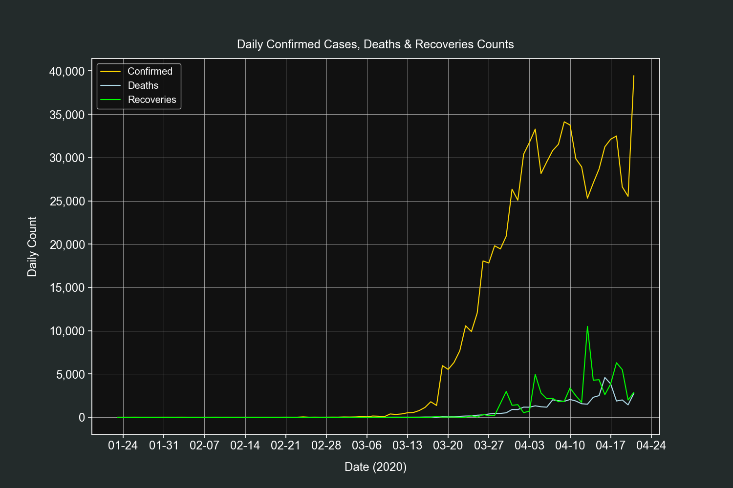
plt.show()This plot is very similar to the previous one, the only difference is that it shows the daily counts only for one country, in this example it will be the US.
We filter out rows with zero confirmed cases and only select rows that belong to the country we defined.
country = "US"
df = df[(df["confirmed"] > 0) & (df["country"] == country)].copy()
Add 3 new columns, one for each field counts.
df["confirmed_difference"] = df["confirmed"].diff()
df["deaths_difference"] = df["deaths"].diff()
df["recovered_difference"] = df["recovered"].diff()
Create 3 line plots on the same axis, one for each field counts.
fig, ax = plt.subplots()

ax.plot(df.index, df["confirmed_difference"],
        label="Confirmed", color="gold")
ax.plot(df.index, df["deaths_difference"],
        label="Deaths", color="lightblue")
ax.plot(df.index, df["recovered_difference"],
        label="Recoveries", color="lime")
Customize our tickers.
ax.xaxis.set_major_locator(mdates.DayLocator(interval=7))
ax.xaxis.set_major_formatter(mdates.DateFormatter("%m-%d"))
ax.yaxis.set_major_locator(ticker.MaxNLocator())
ax.yaxis.set_major_formatter(ticker.StrMethodFormatter("{x:,.0f}"))
Add final customizations.
plt.grid(linewidth=0.5)
plt.legend(loc=2)
plt.title("Daily Confirmed Cases, Deaths & Recoveries Counts", pad=15)
plt.xlabel("Date (2020)", labelpad=15)
plt.ylabel("Daily Count", labelpad=15)

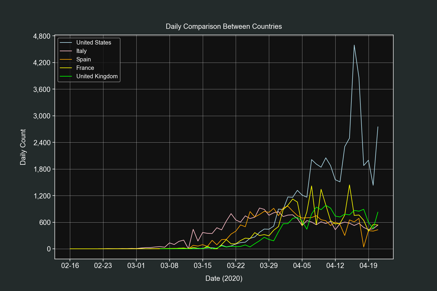
plt.show()This plot will compare the daily counts of the field we define between the countries we want.
We will start by defining a dictionary of countries, their labels and colors for their lines.
COUNTRIES = [
    ["US", "United States", "lightblue"],
    ["Italy", "Italy", "pink"],
    ["Spain", "Spain", "orange"],
    ["France", "France", "yellow"],
    ["United Kingdom", "United Kingdom", "lime"]
]
Then we will define the field and remove all 0 values from the DataFrame.
field = "deaths"
df = df[df[field] > 0]
Create a line plot for each country and add it to the same axis.
fig, ax = plt.subplots()

for country in COUNTRIES:
    temp_df = df[df["country"] == country[0]].copy()
    temp_df["difference"] = temp_df[field].diff()

    ax.plot(temp_df.index, temp_df["difference"],
            label=country[1], color=country[2])
Customize our tickers.
ax.xaxis.set_major_locator(mdates.DayLocator(interval=7))
ax.xaxis.set_major_formatter(mdates.DateFormatter("%m-%d"))
ax.yaxis.set_major_locator(ticker.MaxNLocator())
ax.yaxis.set_major_formatter(ticker.StrMethodFormatter("{x:,.0f}"))
Add final customizations.
ax.grid(linewidth=0.5)
ax.legend(loc=2)
plt.title("Daily Comparison Between Countries", pad=15)
plt.xlabel("Date (2020)", labelpad=15)
plt.ylabel("Daily Count", labelpad=15)

plt.show()
If's fascinating how much insights we got from only 5 fields (date, country, confirmed, deaths and recoveries).
This is the end for the global data section, coming next is the Mexican dataset.
We start by loading our dataset and specifying the fifth column (fecha_inicio_sintomas) as datetime.
df = pd.read_csv("casos_confirmados.csv", index_col=0, parse_dates=[
                          "fecha_inicio_sintomas"], dayfirst=True)
Let's take a look at our DataFrame using the head(), tail() and describe() methods.
df.head()| numero_caso | estado | sexo | edad | fecha_inicio_sintomas | estatus |
|---|---|---|---|---|---|
| 1 | MÉXICO | FEMENINO | 75 | 2020-03-28 00:00:00 | Confirmado |
| 2 | TAMAULIPAS | MASCULINO | 22 | 2020-04-04 00:00:00 | Confirmado |
| 3 | CIUDAD DE MÉXICO | MASCULINO | 40 | 2020-03-17 00:00:00 | Confirmado |
| 4 | CIUDAD DE MÉXICO | FEMENINO | 29 | 2020-03-26 00:00:00 | Confirmado |
| 5 | GUERRERO | FEMENINO | 61 | 2020-04-06 00:00:00 | Confirmado |
df.tail()| numero_caso | estado | sexo | edad | fecha_inicio_sintomas | estatus |
|---|---|---|---|---|---|
| 3840 | MÉXICO | MASCULINO | 61 | 2020-03-14 00:00:00 | Confirmado |
| 3841 | MÉXICO | FEMENINO | 28 | 2020-03-26 00:00:00 | Confirmado |
| 3842 | CIUDAD DE MÉXICO | FEMENINO | 62 | 2020-03-18 00:00:00 | Confirmado |
| 3843 | CAMPECHE | FEMENINO | 32 | 2020-03-31 00:00:00 | Confirmado |
| 3844 | PUEBLA | FEMENINO | 66 | 2020-03-15 00:00:00 | Confirmado |
df.describe()| edad | |
|---|---|
| count | 3844 |
| mean | 45.4389 |
| std | 15.8237 |
| min | 0 |
| 25% | 33 |
| 50% | 45 |
| 75% | 56 |
| max | 102 |
We have 5 columns, state, age, gender, date of initial symptoms and status. We will work with the first four and discard the last one since it has the same value for all rows.
It is very important to note that the column of date of initial symptoms is not a confirmed cases date. That data is not available in this dataset but it is available on the global one.
Mexico has 32 states and as of now all of them have confirmed cases.
To know how many cases each state has we will use the value_counts() method on the estado column.
print(df["estado"].value_counts())| estado | |
|---|---|
| CIUDAD DE MÉXICO | 1117 |
| MÉXICO | 498 |
| BAJA CALIFORNIA | 278 |
| PUEBLA | 243 |
| QUINTANA ROO | 216 |
| SINALOA | 214 |
| COAHUILA | 156 |
| JALISCO | 150 |
| TABASCO | 143 |
| NUEVO LEÓN | 119 |
| YUCATÁN | 103 |
| BAJA CALIFORNIA SUR | 102 |
| GUANAJUATO | 81 |
| VERACRUZ | 73 |
| SONORA | 65 |
| QUERETARO | 57 |
| GUERRERO | 56 |
| AGUASCALIENTES | 55 |
| CHIHUAHUA | 54 |
| HIDALGO | 53 |
| SAN LUIS POTOSÍ | 51 |
| MICHOACÁN | 50 |
| TAMAULIPAS | 49 |
| OAXACA | 43 |
| MORELOS | 40 |
| CHIAPAS | 39 |
| TLAXCALA | 38 |
| NAYARIT | 21 |
| CAMPECHE | 18 |
| DURANGO | 16 |
| ZACATECAS | 14 |
| COLIMA | 7 |
The state with most cases is the capital of the country (Mexico City).
That was really simple, let's up our game and do some table pivoting and MultiIndex calculations.
We will use this value to calculate the percentages.
total_cases = len(df)We will pivot the table, the gender will be our columns and the state wil be our index.
pivoted_df = df.pivot_table(
    index="estado", columns="sexo", aggfunc="count")
We will add two new columns to this DataFrame, one for each gender percentage. This way we will know the total percentage of gender by state.
Note: These new columns can be added to any other column. We choose the first one (edad).
pivoted_df["edad", "female_percentage"] = np.round(
    pivoted_df["edad", "FEMENINO"] / total_cases * 100, 2)

pivoted_df["edad", "male_percentage"] = np.round(
    pivoted_df["edad", "MASCULINO"] / total_cases * 100, 2)
We rename the columns so they are human readable.
pivoted_df.rename(columns={"MASCULINO": "Male",
                            "FEMENINO": "Female",
                            "male_percentage": "Male %",
                            "female_percentage": "Female %"}, level=1, inplace=True)

print(pivoted_df["edad"])| estado | Female | Male | Female % | Male % |
|---|---|---|---|---|
| AGUASCALIENTES | 29 | 26 | 0.69 | 0.62 |
| BAJA CALIFORNIA | 126 | 152 | 2.99 | 3.6 |
| BAJA CALIFORNIA SUR | 47 | 55 | 1.11 | 1.3 |
| CAMPECHE | 5 | 13 | 0.12 | 0.31 |
| CHIAPAS | 10 | 29 | 0.24 | 0.69 |
| CHIHUAHUA | 19 | 35 | 0.45 | 0.83 |
| CIUDAD DE MÉXICO | 436 | 681 | 10.33 | 16.14 |
| COAHUILA | 69 | 87 | 1.64 | 2.06 |
| COLIMA | 3 | 4 | 0.07 | 0.09 |
| DURANGO | 7 | 9 | 0.17 | 0.21 |
| GUANAJUATO | 43 | 38 | 1.02 | 0.9 |
| GUERRERO | 20 | 36 | 0.47 | 0.85 |
| HIDALGO | 19 | 34 | 0.45 | 0.81 |
| JALISCO | 58 | 92 | 1.37 | 2.18 |
| MICHOACÁN | 20 | 30 | 0.47 | 0.71 |
| MORELOS | 19 | 21 | 0.45 | 0.5 |
| MÉXICO | 214 | 284 | 5.07 | 6.73 |
| NAYARIT | 14 | 7 | 0.33 | 0.17 |
| NUEVO LEÓN | 38 | 81 | 0.9 | 1.92 |
| OAXACA | 22 | 21 | 0.52 | 0.5 |
| PUEBLA | 117 | 126 | 2.77 | 2.99 |
| QUERETARO | 26 | 31 | 0.62 | 0.73 |
| QUINTANA ROO | 71 | 145 | 1.68 | 3.44 |
| SAN LUIS POTOSÍ | 25 | 26 | 0.59 | 0.62 |
| SINALOA | 90 | 124 | 2.13 | 2.94 |
| SONORA | 33 | 32 | 0.78 | 0.76 |
| TABASCO | 73 | 70 | 1.73 | 1.66 |
| TAMAULIPAS | 22 | 27 | 0.52 | 0.64 |
| TLAXCALA | 17 | 21 | 0.4 | 0.5 |
| VERACRUZ | 33 | 40 | 0.78 | 0.95 |
| YUCATÁN | 47 | 56 | 1.11 | 1.33 |
| ZACATECAS | 5 | 9 | 0.12 | 0.21 |
And now we have a more complete and useful table of summaries.
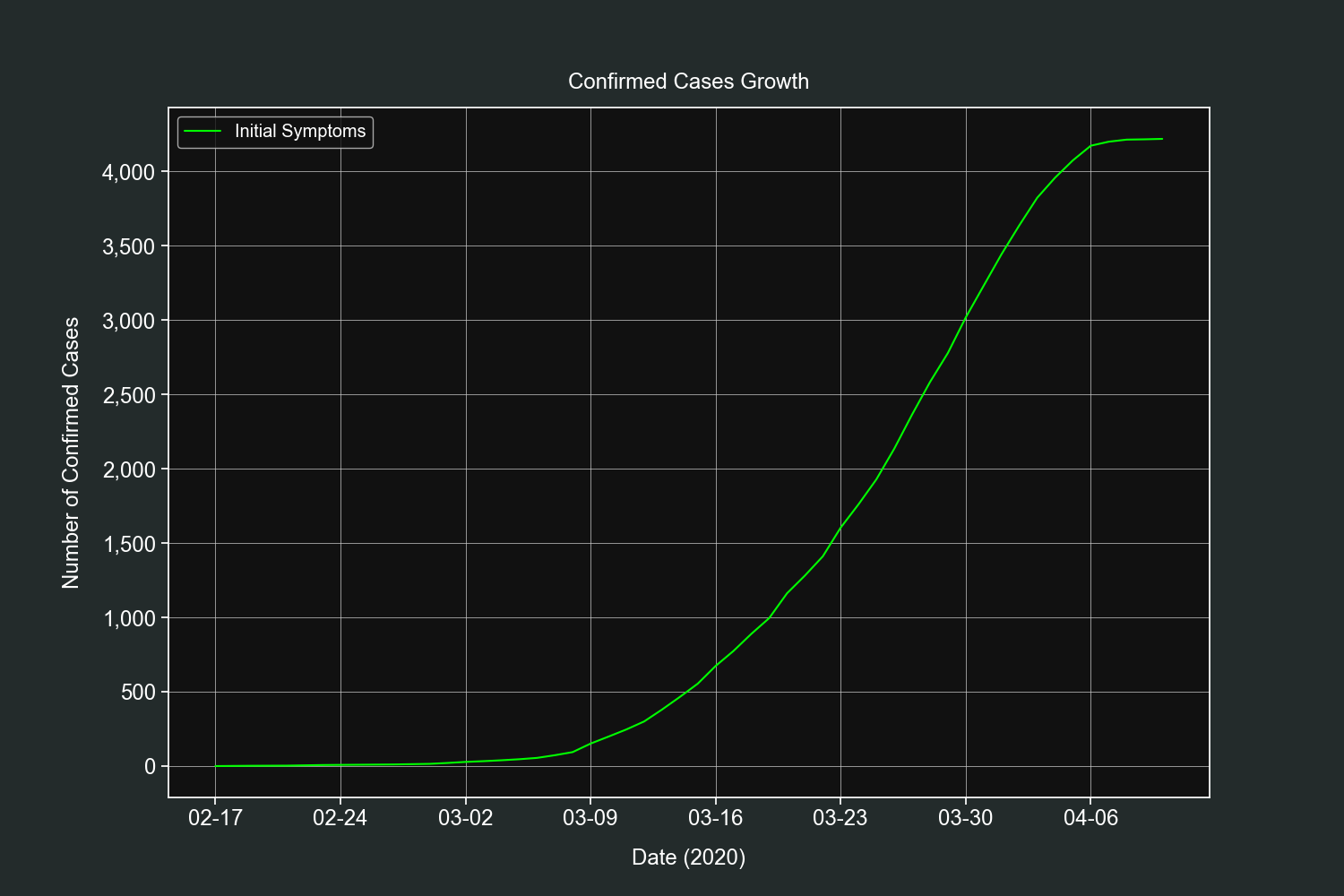
Let's start our plots section with a simple one. This plot will show us the daily progression of the pandemic in Mexico.
Remember that this dataset does not contain the dates when the cases were confirmed, it contains the date when the symptoms first appeared. Let's see what we will get.
We group our DataFrame by day of initial symptoms and aggregate them by number of ocurrences.
grouped_df = df.groupby("fecha_inicio_sintomas").count()We add a new column that will hold the cumulative sum of the previous counts.
grouped_df["cumsum"] = grouped_df["estado"].cumsum()We create a basic line plot with the previously created column.
fig, ax = plt.subplots()

ax.plot(grouped_df.index, grouped_df["cumsum"],
        label="Initial Symptoms", color="lime")
Customize our tickers. The y-axis will be formatted with date and month in 7 day intervals.
ax.xaxis.set_major_locator(mdates.DayLocator(interval=7))
ax.xaxis.set_major_formatter(mdates.DateFormatter("%m-%d"))
ax.yaxis.set_major_locator(ticker.MaxNLocator())
ax.yaxis.set_major_formatter(ticker.StrMethodFormatter("{x:,.0f}"))
Add final customizations.
plt.grid(linewidth=0.5)
plt.legend(loc=2)
plt.title("Confirmed Cases Growth", pad=15)
plt.xlabel("Date (2020)", labelpad=15)
plt.ylabel("Number of Confirmed Cases", labelpad=15)

plt.show()
For what it's worth it resembles the confirmed cases curve. Thankfully we have the data to plot the daily confirmed cases in the global dataset.
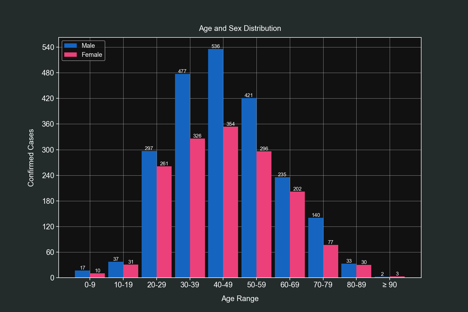
Knowing the age groups is very important and for this exercise we will bin our data and then group it by gender. We will use custom bins that wlil hold values in steps of 10 (0-9, 10-19, 20-29 and so on).
On the 90-99 bin we will make an exception and define it has 90-120 since that age group has the least values of them all.
We start by creating one DataFrame for each gender.
male_df = df[df["sexo"] == "MASCULINO"]
female_df = df[df["sexo"] == "FEMENINO"]
We then define 2 lists that will be used for our bins.
age_groups = list()
labels = list()
We start a loop from 0 to 100 with steps of 10. This will fill our previous 2 lists.
for i in range(0, 100, 10):

    # Our latest bin will be for ages >= 90.
    if i == 90:
        age_groups.append((i, i+30))
        labels.append("≥ 90")
    else:
        age_groups.append((i, i+9))
        labels.append("{}-{}".format(i, i+9))
We build our indexer and cut our DataFrames with it.
bins = pd.IntervalIndex.from_tuples(age_groups)

male_df = male_df.groupby(pd.cut(male_df["edad"], bins)).count()
female_df = female_df.groupby(pd.cut(female_df["edad"], bins)).count()
We create 2 bar plots in the same axis, each plot will have the values for their respective DataFrame.
fig, ax = plt.subplots()

bars = ax.bar(
    [i - 0.225 for i in range(len(labels))], height=male_df["edad"],  width=0.45,  color="#1565c0", linewidth=0)

# This loop creates small texts with the absolute values above each bar (first set of bars).
for bar in bars:
    height = bar.get_height()

    plt.text(bar.get_x() + bar.get_width()/2.0, height,
                "{:,}".format(height), ha="center", va="bottom")

bars2 = ax.bar(
    [i + 0.225 for i in range(len(labels))], height=female_df["edad"],  width=0.45,  color="#ec407a", linewidth=0)

# This loop creates small texts with the absolute values above each bar (second set of bars).
for bar2 in bars2:
    height2 = bar2.get_height()

    plt.text(bar2.get_x() + bar2.get_width()/2.0, height2,
                "{:,}".format(height2), ha="center", va="bottom")
Customize our tickers.
ax.yaxis.set_major_locator(ticker.MaxNLocator())
ax.yaxis.set_major_formatter(ticker.StrMethodFormatter("{x:,.0f}"))
Add final customizations.
plt.grid(linewidth=0.5)
plt.legend(["Male", "Female"], loc=2)
plt.xticks(range(len(labels)), labels)
plt.title("Age and Sex Distribution", pad=15)
plt.xlabel("Age Range", labelpad=15)
plt.ylabel("Confirmed Cases", labelpad=15)

plt.show()
We can observe that most cases fall within the 30-60 age range and men have most registered cases than women in almost all age groups.
And that's it for this dataset. We got as much information as we could from the four usable fields we had (state, age, gender and initial symptoms date).
This dataset used to have 2 other fields; country of procedence and arrival date but they were removed for no reason.
Getting clean data is not always easy and can discourage people from doing their own analysis. That's why I wanted to shore these scripts with you so you can accelerate your workflow and get interesting insights.
I hope you have enjoyed the examples for tahles and plots, you are always welcome to experiment and ask your questions in the issues tab.
