It's now time to put the responsive design content that you've learned, this week, together with event handling and selection that you have previously learned, to make a compelling and pleasing Web page! You're going to get to build this from the ground up with the same type of input that you'd get in a real job. On each step, talk with your pair, decide now you want to attack the problem, and get coding!
When working as a full-stack developer, you'll often collaborate with a designer. Most likely they will provide you with a sequence of screenshots and specifications for you to convert into neat, maintainable HTML and CSS.

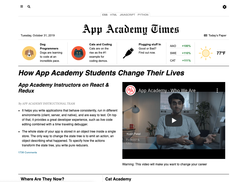
They will often provide you screenshots of what the website will look like at specific sizes as well. For example below is what the website should look like at 1020px:
Here is a screenshot of an even narrower version of the site for windows less than 1020px wide:

This practice is similar to that experience, in that you will receive requirements for each section of the page. Then, it's up to you and your pair to write the HTML, CSS, and smattering of JavaScript to make it do what you need it to do. Each step of the way will give you the requirements for the section that you'll work on. There will also be guidance and suggestions for you so that you can get some hints, if you need.
Though this is a big practice, you'll do it step-by-step. As a developer, that's what you do: take a big project and break them down into smaller pieces that you can accomplish piece-by-piece. There will be a lot of advice given during this practice so you can get a feel for how to go about doing each of the steps.
This practice is not about reproducing the mockups with each pixel perfectly matching the screenshots. It should be in the spirit of the specifications. So, don't stress out if it doesn't exactly match what you see. A little variation is ok.
On the job, your leads or managers will let you know whether or not you need to match the mockup exactly, or adapt it to make it work.
Clone the practice from the starter.
Each starter directory and file that contains content is noted in the following tree.
index.html
/images - Contains the images for the practice
/scripts
  └── event-handling.js - Event handling for the page
/specifications
  └── /text - Contains the text for the Web page
  └── /screenshots - Contains what each step looks like
/stylesheets
  └── global.css - Adds global styles
  └── main-styles.css - Puts together all the styles
  └── reset.css - Utility to "fix" browsers
  └── components - Separate files for each component
      ├── gear-dropdown.css
      ├── interest-links.css
      ├── main-content.css
      ├── main-nav.css
      ├── masthead.css
      └── search-modal.css
The following sections explain in more detail the purpose of each file.
This is where you will put the HTML that will define the content and structure
of the Web page. Right now, it's empty. In the first step, you'll start adding
to it. Right now, it's empty. In the first step, you'll use Emmet to add
standard HTML 5 structure to this file. Then, you'll add the most common
top-level structural elements, too: header, main, and footer.
This file will contain a JavaScript script that will drive some of the interactivity of the Web page. The script is filled out for you. You don't need to know how the script works. In later steps, you will be adding it to your HTML document to add interactivity to some of your HTML elements.
Do not make changes to this file.
Inside main-styles.css, there are a series of @import statements that load
the various CSS files in the practice. You do this so that you don't have to go
searching through a file that has thousands of lines of CSS in it. This way,
when you work on a section of content on your team, each person can work in
their own file, if need be, without causing a huge mess.
@import url("reset.css");
@import url("global.css");

@import url("components/gear-dropdown.css");
@import url("components/interest-links.css");
@import url("components/main-content.css");
@import url("components/main-nav.css");
@import url("components/masthead.css");
@import url("components/search-modal.css");
The order of the first two imports is very important. Those affect styles for the entire Web page and work in conjunction with one another, layering changes so you can have the correct basic palette with which to work.
You should be able to list the imports from the components subdirectory in any order that you like.
Quite often, you will want to use what's known as a "reset" file to remove all of the quirky, inconsistent default styles that browsers add to Web pages. If you performed a search for "CSS reset files", you will find many articles and versions of them. This practice already includes one for you.
Whenever you choose to use a CSS reset file, it is vitally important that you
include it as the first one of your @import statements. If you don't do that,
then all of the hard work that you put into making things look better can get
erased by the reset file if it comes after yours in the order of imports.
Remember that CSS specificity will always choose the last rule read for rules
that have the same specificity. So, it's important to have it first so that
your CSS comes after.
The specifications directory contains files similar to what you would get from a Web designer. Those files are organized into two subdirectories for you.
The screenshots subdirectory contains the screenshots of the entire practice that you saw at the beginning of this page. It also contains the screenshots that you will use in each of the steps of this practice so that you can have them locally.
The text subdirectory contains all of the text that you see on the Web page. This way, you can just copy and paste it into the HTML as you develop the page.
Also in the text directory is a Markdown file named styles.md. This file contains a list of the colors, external resources, font families, global styles, and measurements that you will use during this practice.
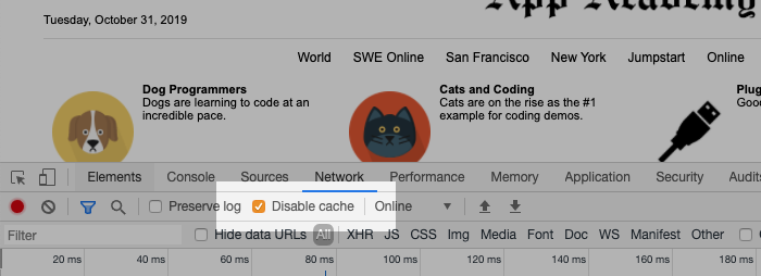
An important note: You may want to keep your DevTools open and the Disable Cache checkbox checked. This will guarantee that changes to your CSS files are loaded by the browser every time you refresh it. You can open your Chrome DevTools on Windows by pressing F12 or Control+Shift+I. You can open Chrome DevTools on macOS by pressing Command+Option+I. Then, go to the Network pane and make sure the "Disable cache" checkbox is checked. Keep your DevTools open!
Good luck! It's time to go to step 1!