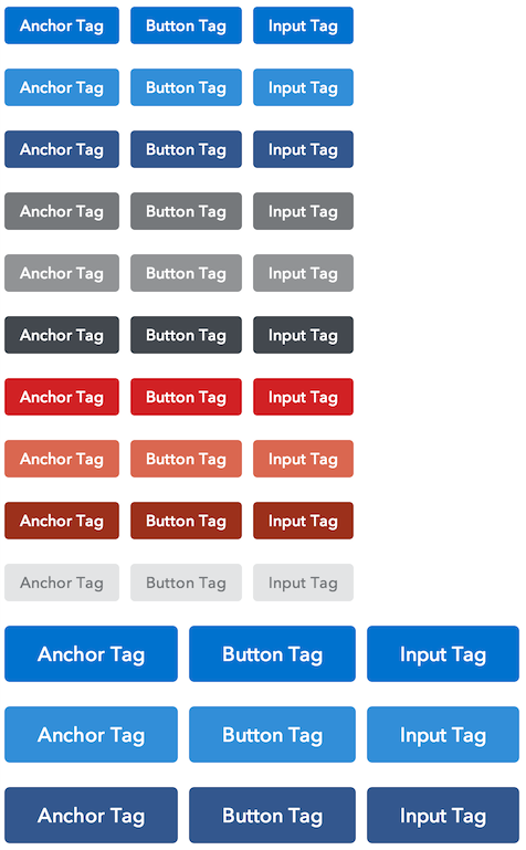
Button styles including default, secondary, destructive, disabled, super, and compound buttons, button links, buttons with icons, and button groups. This component can be used by itself, but it was made for Capital Framework, a new front end framework developed at the Consumer Financial Protection Bureau.
The current version number can be found in bower.json and follows Semantic Versioning 2.0. Release notes are recorded on the Releases page.
If you would like to take advantage of more components or if you're new to Capital Framework, we encourage you to start here.
Detailed instructions can be found in the Capital Framework documentation site.
We welcome your feedback and contributions.
- Find out about contributing
- File a bug using this handy template
Docs and demo built with the excellent Topdoc.

