Ant Design 5.0 is released!
zombieJ opened this issue · comments

Introduction
At the end of September, we released v5 alpha version. After 2 months of adjustment, API has gradually stabilized. Thanks to the community for the valuable suggestions and contributions, it is the power of the community that enables Ant Design to complete a lot of renovation work in a short period of time. Here we will explain some major updates of v5. Of course, you can also go directly to the changelog page to view the complete update content.
Same as the previous major version release. We will switch v4 from the master branch to the 4.x-stable branch into maintenance. v4 will continue to be maintained for 1 year, and patches will still be released for bugs, but no new Feature Requests will be accepted after that. The deadline is the end of 2023. Original official website was migrated to https://4x.ant.design/.
Design upgrade
In terms of design, we have added 4 types of new components and 4+ variant components according to our business practices and the voice of the community. These components have been scrutinized to ensure their versatility and extensibility. We hope they will bring you a good use experience. At the same time, we have opened up some heavy assets that have been used internally for a long time to help you serve more business scenarios.

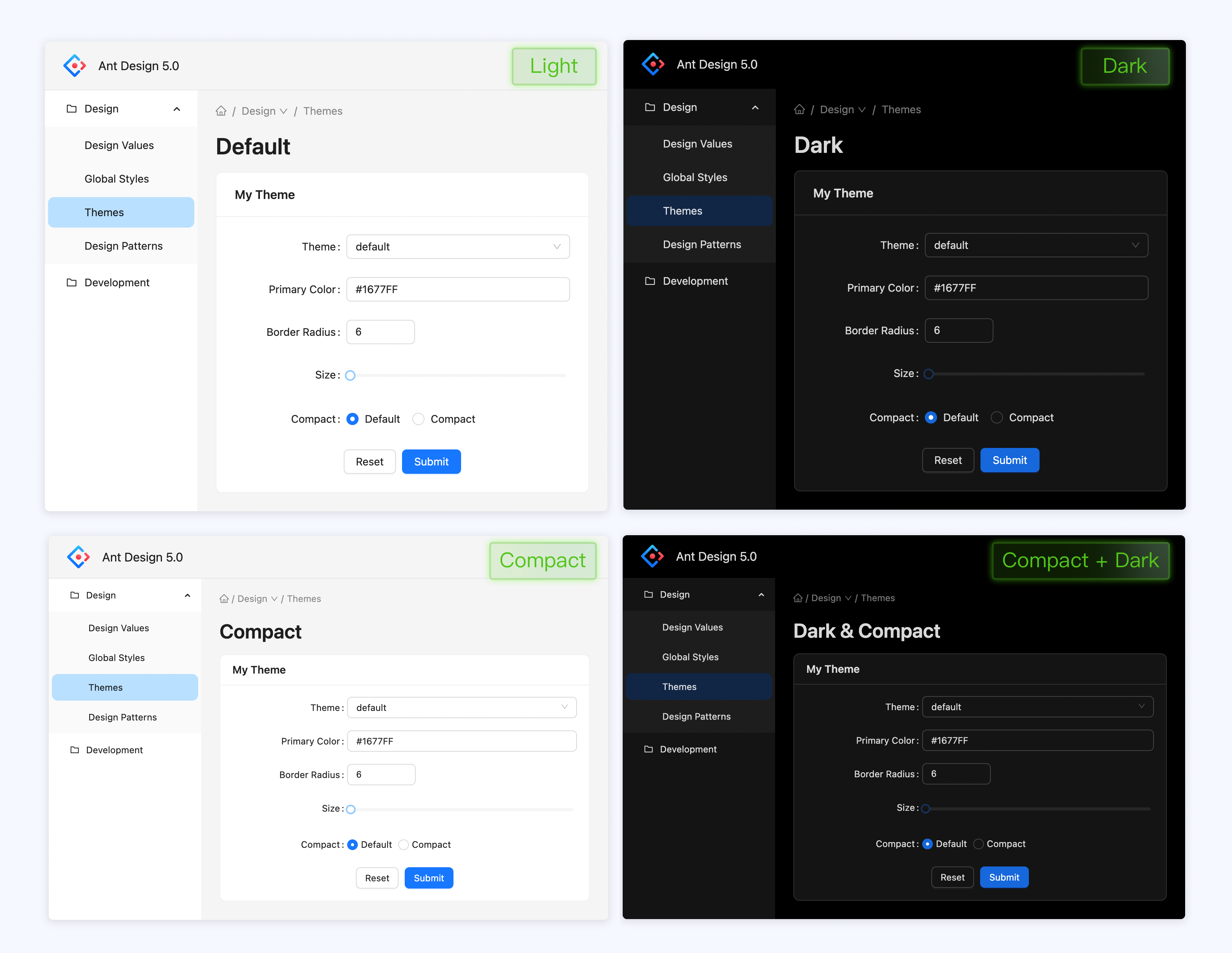
In addition we have fully upgraded the components with default styles. Adhering to the core of happy work, we have upgraded the system vision in three directions: "more focus", "distraction", and "relaxation". It involves the optimization and adjustment of multiple global styles such as main colors, rounded corners, text levels, and interactive feedback. In addition, we have also de-linearized the navigation framework and almost all components. These changes bring a brand-new feeling, and also easier to use in the specific use process. Of course you can easily customize your own theme with one click according to the style algorithm and configuration tools we provide in 5.0 if you have different aesthetics and demands for style themes.


Finally, we are experimenting with a theme package called "Happy Work", which contains emotional enhancement features. When users use it in a specific scenario, there will be rich but restrained animations, bringing users a little "happy feeling". We hope this is a start, calling on industry design to pay more attention to enterprise-level products, and inject more emotion into cold enterprise-level products to care for our users. The happy work theme pack will be launched after the press conference, so stay tuned~
Brand new Design Token Model

In v4, we create lots of less variables to support theme customization capabilities. However, expect color palettes, there is no corresponding algorithm for other fonts, line heights, and spacing. In v5, we transformed all tokens can be derived based on Seed + Algorithm. The new Design Token Model supports multi-algorithm pipelines, which greatly reduces developer expansion costs. You can choose an existing algorithm and add your own extended algorithm (of course, you can also write a complete set of algorithms) to generate a complete set of Design Tokens:
CSS-in-JS Dynamic Theme
In the past we have tried to provide dynamic theming capabilities through CSS Variables. After a period of exploration, we found that maintenance cost of the intermediate variables becomes non-negligible with the complexity of the design system increases. Therefore, CSS Variables in v4 stayed in the dynamic theme color and did not further provide the dynamic ability of dark colors and other tokens. In v5, we face dynamic themes again with the need of flexibility.
At the beginning of v5, we spent a few months comparing the popular dynamic theming solutions: CSS Variables and CSS-in-JS. CSS-in-JS doesn't need to maintain intermediate variables, but has more runtime overhead (if you're not familiar with this, please read Why We're Breaking Up with CSS-in-JS). We prefer the latter in terms of maintenance costs, but we don't want to compromise the user experience. So after a series of attempts, we developed a CSS-in-JS library @ant-design/cssinjs for the component level. It achieves higher cache efficiency by sacrificing dynamism, thus reducing the performance penalty at runtime.
With the dynamic theme capability, you can adjust and nest themes arbitrarily through ConfigProvider:
<ConfigProvider theme={{ token: { colorPrimary: 'red' }}}>
  <ConfigProvider theme={{ token: { colorPrimary: 'blue' }}}>
    <MyApp />
  </ConfigProvider>
</ConfigProvider>
Even adjusted for a single component:
<ConfigProvider theme={{
  components: {
    Button: { colorText: 'red' },
  },
}}>
  <MyApp />
</ConfigProvider>
Code is boring? You can experience examples directly on our homepage:

The new CSS-in-JS solution natively supports Tree Shaking, and in v5 you no longer need to use babel-plugin-import to remove unused styles. It will automatically load styles on demand.
More components
New FloatButton component is used for global functionality on the website, the original BackTop will be its child component:

New Tour component is added to guide users through product features:

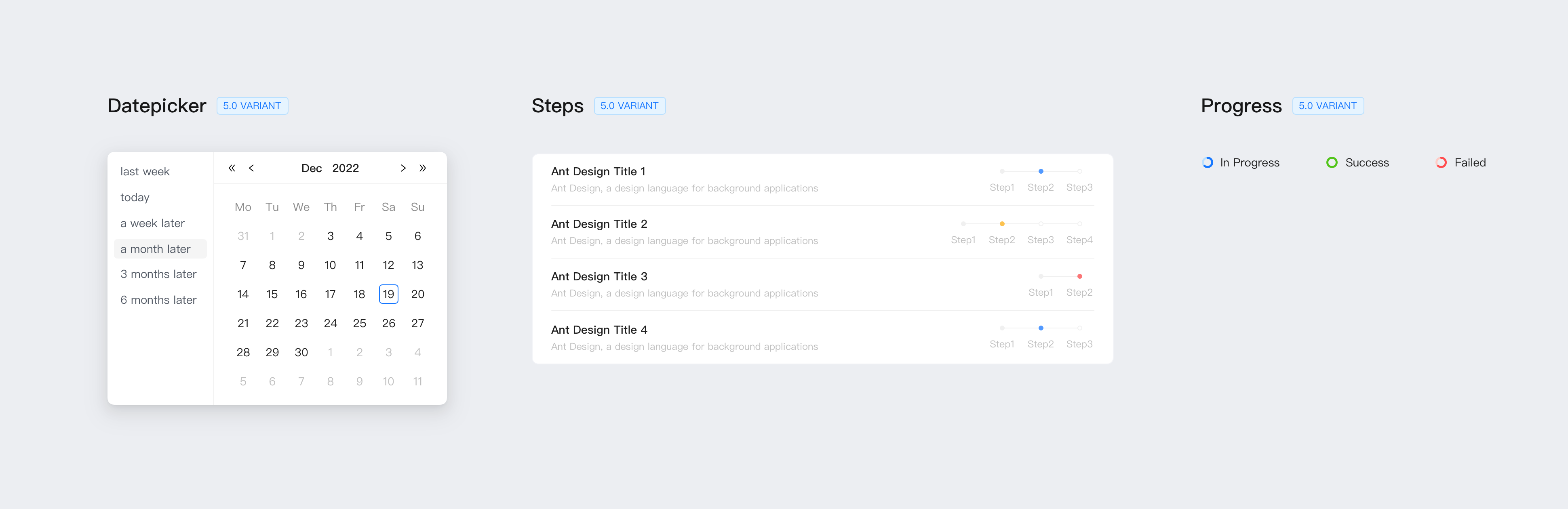
Additionally, we provide some variants of components for inline use:
Compatibility tweaks
Browser minimum version adjustment
In June of this year, IE announced that it would stop maintenance, so the compatibility adjustment of Ant Design v5 was upgraded from IE 11 to Edge, and the rest of the modern browsers remained unchanged. All IE compatibility style code will be removed. At this point, we can combine RTL and LTR styles through CSS Logical Properties to further reduce maintenance costs.
Replace Moment.js with Day.js
Moment.js transitioned to Legacy Project in 2020. Considering that switching the date library would lead to Break Change, we chose to continue using Moment.js during v4 until the end of v4. With v5, we switched to the more lightweight Day.js. In addition to the smaller package size, Day.js also brings immutable capabilities.
Of course, if you want your project to still use Moment.js after an upgrade, you can replace it with the @ant-design/moment-webpack-plugin.
API non-Break adjustments
During Ant Design's 7-year development, some APIs were forked. This leads to additional memory costs for developers, and it also makes it difficult for us to choose when adding new APIs. Originally, we planned to organize and merge a series of APIs. Similar to the v3 upgrade to v4, we will prompt developers to migrate APIs in the current version, and remove obsolete APIs in v5. However, after community communication, we decided to change the plan as follows: Each major version will only adjust a small number of APIs, and the original deprecated APIs will continue to be compatible in the new version, and will be deferred until the next major version to remove. This time we changed the following parts, and v5 will be fully compatible with the original writing:
- Popup like components
openandvisibleare unified toopento match to HTML Spec. dropdownClassNameandpopupClassNameare unified topopupClassNamefor better semantics.- Structural syntactic sugar (e.g. <Select.Option /> ) is replaced with data-driven in preparation for performance optimization.
- Deprecate static methods (such as
Message.error), and recommend application layer encapsulation to support React 18 concurrent mode.
Components removement
v5 will remove the Comment and PageHeader components, and BackTop will become a FloatButton sub-component. Since the Comment component itself provides no actual capabilities other than styling, developers still need extra work to implement the commenting functionality. Also, we decided to remove it from v5 due to not many actual usage scenarios, but you can still find it in the compatibility pack. The PageHeader component also required some development work to make it work, so we moved it into ProComponents and used it with ProLayout to provide real interactivity.
Upgrade Guide
As mentioned in Compatibility Adjustments, since v5 will not make API Break Changes, you can try migrating via our codemod tool. For Moment.js, you can use the @ant-design/moment-webpack-plugin to replace. If your project relies on antd's less files, please refer to our migration documentation for compatibility via less-loader. For detailed documentation, please click here.
Future plan
In the future we plan to provide more components, some of them are already on the agenda, such as WaterMark, QrCode, ColorPicker. We've heard the voices for Table performance, and we plan to provide virtual scrolling capabilities for the display state, which will natively support fixed column capabilities. Also, since in v4 we have converged the structural syntactic sugar into data-driven properties, we have better opportunities to optimize performance, including but not limited to Menu, Table, Steps, Collapse, Tabs, Dropdown, and more.
On the design side, we will update the official site to provide more component-level design guidelines, which will be continuously updated by the design team. We have written a lot of articles in the Chinese community in the past, and we hope to take this opportunity to provide English versions of the articles so that international developers and designers can read them together. let us wait and see.
Write at the end
After 7 years, Ant Design has become an ecologically rich community. During the period, the help of community is inseparable. From Ant Design v4, a large number of community volunteers participated to v5, and most of the functions were completed by community. It is you who made Ant Design v5 complete the research and development work so quickly, and you made open source beautiful. Thank you everyone!

- iamkun
- zombiej
- afc163
- madccc
- PeachScript
- vagusX
- LongHaoo
- xrkffgg
- chenshuai2144
- lushevol
- Wxh16144
- kunl
- cncolder
- c0dedance
- jrr997
- Dunqing
- JarvisArt
- zqran
- TrickyPi
- li-jia-nan
- heiyu4585
- foryuki
- chunsch
- yykoypj
- cl1107
- poyiding
- dancerphil
- miracles1919
- zpc7
- shuaijiumei
- lzm0x219
- LuZhenJie1999
- BesideWithYou
- shezhangzhang
引言
在 9 月底,我们发布了 v5 alpha 版本。经过 2 个月的调整,API 已经逐渐稳定。感谢社区同学所提供的宝贵建议与代码贡献,正是社区的力量使得 Ant Design 在短时间内完成了大量的改造工作。这里我们会对 v5 的一些重大更新进行说明,当然你也可以直接到 更新日志 页面查看完整的更新内容。
需要注意的是,同上一个大版本发布一样。我们将会将 v4 从主分支切换至 4.x-stable 分支进入维护状态。**v4 将会继续维护 1 年时间,仍然会对 Bug 发布 Patch,但是此后不再接收新的 Feature Request。截止日期为 2023 年年底。**原 v4 官网迁移至 https://4x.ant.design/。
设计升级
设计方面,我们根据自身业务实践和社区呼声,增加了 4 类新组件和 4+ 变体组件, 这些组件都经过严谨的推敲,确保了其通用性和扩展性,希望它们为你带来良好的使用体验。同时,我们将内部使用很久的一些重型资产开放出来,帮助大家服务更多的业务场景。

另外在默认样式方面,我们对组件进行全面升级。秉持快乐工作的内核,我们从「更聚焦」、「去干扰」、「轻松感」三个方向对系统视觉进行了升级。其中涉及到主色、圆角、文字色阶、交互反馈等多个全局样式的优化和调整,另外我们还对导航框架和几乎所有组件做了去线化处理。这些改变,除了能带给你焕然一新的感觉,在具体使用过程中,也更加易用。当然,如果你对样式主题有不一样的审美和诉求,在 5.0 当中,你可以轻易根据我们提供的样式算法和配置工具,一键定制属于你自己的主题。


最后,我们始终以人为本,正在试验名叫「快乐工作」的主题包,内含情感增强特色组件,用户在特定场景使用时,会有丰富但克制的动画,为用户带来一点“快乐感”。我们希望这是一个开始,呼吁行业设计多关注企业级产品,为冰冷的企业级产品注入更多的情感去关怀我们的用户。快乐工作主题包将在发布会后推出,敬请期待~
全新 Design Token 模型

在 v4 版本中,我们提出更多的 less 变量以支持主题定制能力。然而除了色板支持完全的派生能力外,其他如字体、行高、间距都没有对应的算法。在 v5 中,我们改造了所有的 Token,使其基于 Seed + Algorithm 可以派生出所有的 Design Token。全新的 Design Token 模型支持多算法 Pipeline,从而大大降低开发者拓展成本。你可以选择一个现成的算法,再加自己的拓展部分算法(当然你也可以写一套完整的算法),就可以生成一套完整的 Design Token:
![algorithm.png]
CSS-in-JS 动态主题
过去我们尝试通过 CSS Variables 提供动态主题能力。在经过一段时间的探索后,我们发现随着设计系统的复杂度提升,其中间变量的维护成本就会变得不可忽略。因而在 v4 时期,CSS Variables 停留在了动态主题色而没有进一步提供暗色、其他 Token 的动态能力。到了 v5,随着灵活性的需求呼之欲出,我们不得不再次面对动态主题的问题。
在 v5 启动伊始,我们花了几个月的时间对比当下流行的动态主题方案:CSS Variables 与 CSS-in-JS。CSS-in-JS 不需要维护中间变量,但是有更多的运行时消耗(如果你对此不太熟悉,欢迎阅读 Why We're Breaking Up with CSS-in-JS)。从维护成本而言,我们更倾向于后者,但是我们并不希望因此而损害用户体验。因而在经过一系列尝试后,我们研发了一套针对组件级别的 CSS-in-JS 库 @ant-design/cssinjs。它通过牺牲动态性来获取更高的缓存效率,从而减少运行时的性能损耗。
通过动态主题能力,你通过 ConfigProvider 可以任意调整、嵌套主题:
<ConfigProvider theme={{ token: { colorPrimary: 'red' }}}>
  <ConfigProvider theme={{ token: { colorPrimary: 'blue' }}}>
    <MyApp />
  </ConfigProvider>
</ConfigProvider>
甚至可以针对某一个组件进行调整:
<ConfigProvider theme={{
  components: {
    Button: { colorText: 'red' },
  },
}}>
  <MyApp />
</ConfigProvider>
代码示例太乏味?你可以直接在我们的首页体验示例:

新的 CSS-in-JS 方案原生支持 Tree Shaking,在 v5 你不在需要使用 babel-plugin-import 摘除未使用到的样式。新的方案将自动按需加载样式。
更多组件
新增 FloatButton 组件用于网站上的全局功能,原 BackTop 将收为其子组件:

新增 Tour 组件用于引导用户了解产品功能:

此外,我们还提供了一些组件的变体用于内联使用:

兼容性调整
浏览器最低版本调整
今年 6 月 IE 宣布停止维护,因此 Ant Design v5 兼容性调整从 IE 11 提升至 Edge,其余现代浏览器不变。IE 兼容性样式代码将全部移除。至此,我们可以通过 CSS Logical Properties 将 RTL 与 LTR 样式合并,进一步减少维护成本。
默认 Day.js 代替 Moment.js
Moment.js 在 2020 年转为 Legacy Project。考虑到切换日期库会导致 Break Change,我们在 v4 时期选择继续使用 Moment.js 直至 v4 结束。到了 v5,我们切换为更轻量级的 Day.js。Day.js 除了包体积更小之外,也带来了 immutable 能力。
当然,如果你希望项目升级后仍然使用 Moment.js,可以通过 @ant-design/moment-webpack-plugin 插件进行替换。
API 非 Break 调整
Ant Design 在 7 年的研发过程中,部分 API 出现分叉的情况。这导致开发者有额外的记忆成本,同时也使得我们新增 API 时也难以选择。原本我们计划对一系列 API 进行整理合并,同 v3 升级 v4 一样在当前版本提示开发者迁移 API,并在 v5 移除废弃 API。但是在经过社区交流之后,我们决定改变计划为:每个大版本只会调整少量 API,并且原废弃 API 在新版本中会继续兼容,推迟到下下个大版本移除。这次我们改动以下部分,并且 v5 会全部兼容原来写法:
- 弹层类组件
open与visible统一至open以符合 HTML Spec。 dropdownClassName与popupClassName统一至popupClassName以更符合语义。- 结构语法糖(例如
<Select.Option />)使用数据驱动代替,以为性能优化做准备。 - 废弃静态方法(例如
Message.error),推荐应用层封装以支持 React 18 concurrent 模式。
组件移除
v5 将会移除 Comment 组件 与 PageHeader 组件,BackTop 将会成为 FloatButton 子组件。由于 Comment 组件本身除样式外并未提供实际能力,开发者仍然需要额外工作来实现评论功能。此外由于实际使用场景不多,我们决定从 v5 中移除,但是你仍然可以在兼容包中找到它。PageHeader 组件同样需要一定的开发工作来使其工作,因而我们将其挪至 ProComponents 中,与 ProLayout 一同使用从而提供真正的交互能力。
如何升级
如 兼容性调整 所述,由于 v5 不会对 API 做 Break Change,因而你可以尝试通过我们的 codemod 工具进行迁移。对于 Moment.js 可以使用我们提供的 @ant-design/moment-webpack-plugin 插件进行替换。如果你的项目依赖了 antd 的 less 文件,请参考我们的迁移文档通过 less-loader 进行兼容。详细文档请点击此处查阅。
未来规划
未来我们计划提供更多的组件,有些已经排上议程,例如 WaterMark、QrCode、ColorPicker。而针对 Table 性能的热烈呼声我们已经听到,计划为展示态提供虚拟滚动能力,其将会原生支持固定列能力。此外,由于在 v4 中,我们已经收敛结构语法糖至数据驱动属性中,我们有了更好的机会对性能做优化,包括不仅限于 Menu、Table、Steps、Collapse、Tabs、Dropdown 等等。
设计侧,我们将会更新官方站点提供更多组件级别的设计指引,这将会由设计团队持续更新。过去我们在中文社区写了不少文章,我们希望也趁此机会将文章提供英文版本,让国际开发者、设计师可以共同阅读。让我们拭目以待。
写在最后
Ant Design 经历 7 年时间,成为了生态丰富的社区。期间离不开社区同学的帮助,从 Ant Design v4 有大量社区志愿者参与到 v5 大部分功能都由社区同学完成。是你们让 Ant Design v5 可以如此快速的完成研发工作,是你们让开源变得美好。感谢大家!

- iamkun
- zombiej
- afc163
- madccc
- PeachScript
- vagusX
- LongHaoo
- xrkffgg
- chenshuai2144
- lushevol
- Wxh16144
- kunl
- cncolder
- c0dedance
- jrr997
- Dunqing
- JarvisArt
- zqran
- TrickyPi
- li-jia-nan
- heiyu4585
- foryuki
- chunsch
- yykoypj
- cl1107
- poyiding
- dancerphil
- miracles1919
- zpc7
- shuaijiumei
- lzm0x219
- LuZhenJie1999
- BesideWithYou
- shezhangzhang

nice ~

翻译了
翻译了
哈哈哈,刚刚在贴中文版就被你发现了。更新好啦~
v5是今天发布吗? 迫不及待想试试看
v5是今天发布吗? 迫不及待想试试看
已经发布了,官网还在切换哈~
Already released. Official site is switching to v5.

@ant-design/cssinjs适合在开发中使用吗,还是使用emotion?

请问 pro 会一起在今天发布吗~~?
@ant-design/cssinjs 适合在开发中使用吗,还是使用emotion?
@ant-design/cssinjs 是组件级别的 CSS-in-JS 库,如果有组件需求可以用,比如 ProComponents 里也是用的它。但是如果你要在应用里用,那还是使用 emotion、styled component 这类应用级别的 CSS-in-JS 库哈~
@ant-design/cssinjs is component level CSS-in-JS lib. You can use it on component lib like ProComponents. But we still recommend to use emotion、styled component if you want to use CSS-in-JS on app level.

文档没有暗黑模式的使用方法, 另外对 SSR 的兼容好吗 ,现在 nextjs 用的越来越多了

Congrats for release!
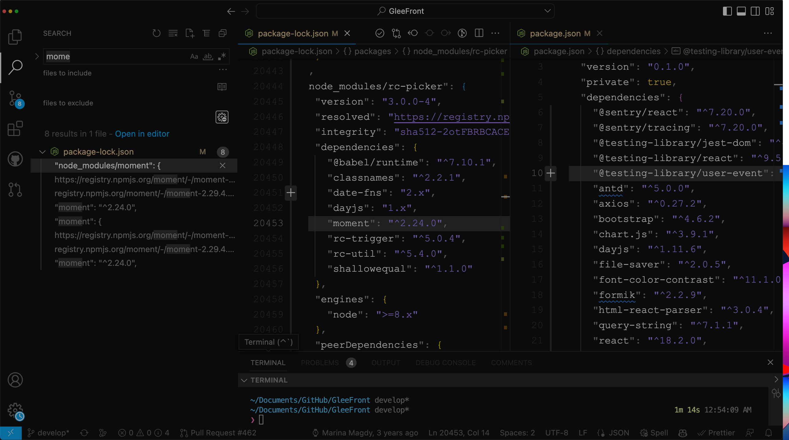
I noticed that moment dependency still exists through rc-picker, is this intentional?
PS D:\VS\accelist-nextjs-starter> npm why moment
moment@2.29.4
node_modules/moment
  moment@"^2.24.0" from rc-picker@3.0.0-4
  node_modules/rc-picker
    rc-picker@"~3.0.0-4" from antd@5.0.0
    node_modules/antd
      antd@"5.0.0" from the root project

文档没有暗黑模式的使用方法, 另外对 SSR 的兼容好吗 ,现在 nextjs 用的越来越多了
我也没有找到theme的切换方式,不知道怎么弄。官网上也没有说明。

正在直播呢, 主题切换,局部主题切换演示很棒, 文档会慢慢跟上.

codemod啥时候有呢,给个预期的使用方式也行,有部分实现的也行,看看主题那块怎么升级的

Congrats on the release, can you please check the PageHeader component from @ant-design/pro-layout, it shows a SyntaxError: Cannot use import statement outside a module

You are the best.
Soon, you will be "The world's most popular React UI framework"

I love you guys ❤️

Migration doc link in the release notes is bad.

Seems like it should be this: https://github.com/ant-design/ant-design/blob/5.0.0/docs/react/migration-v5.en-US.md


@mellis481 Fixed, thx for feedback.


🚀🚀🚀

希望官网的新组件菜单哪里显示 new 标记(这样可以很容易看到新东西)

As @ryanelian said moment js is still there in rc-picker
more context I'm really happy to drop moment and use day js only
even the bundle size increased
v4
v5
thanks for your efforts

这个在v5如果实现。
1、如果我用v5来写,如何改上面的写法。
2、升级不变的写是下面的吗?升级说明有点看不懂。

这个写法看不太懂啊。

希望官网的新组件菜单哪里显示 new 标记(这样可以很容易看到新东西)
好主意!

Has antd 5.0 ditched LESS?
antd 5.0 去掉 LESS 了吗?之前一直有问题,因为这个 LESS 好多地方都出错

this repo shows how to use antd v5 with emotion and dynamic theme change

Getting
SyntaxError: Cannot use import statement outside a module
    at Object.compileFunction (node:vm:353:18)
    at wrapSafe (node:internal/modules/cjs/loader:1040:15)
    at Module._compile (node:internal/modules/cjs/loader:1076:27)
    at Module._extensions..js (node:internal/modules/cjs/loader:1166:10)
    at Module.load (node:internal/modules/cjs/loader:988:32)
    at Module._load (node:internal/modules/cjs/loader:834:12)
    at Module.require (node:internal/modules/cjs/loader:1012:19)
    at require (node:internal/modules/cjs/helpers:102:18)
    at Object.<anonymous> (/Users/xxx/webpack.config.js:8:37)
    at Module._compile (node:internal/modules/cjs/loader:1112:14)
when trying to load compatible package in webpack.config.js
const { convertLegacyToken } = require('@ant-design/compatible');
const { theme } = require('antd');
Transforming webpack.config.js as a module with import statements is not really an option.
@ryanelian
I noticed that moment dependency still exists t...
Let me handle this : )

Why css-in-js solution for styles? 🤔 Wouldn't https://github.com/vanilla-extract-css/vanilla-extract work better?

@afc163 Trying to upgrade from v4 to v5, so happy that less can finally be removed from my project.
But I'm having some trouble with the new color tokens... The algorithm doesn't make much sense to me.
For example I want the background of a "danger" button to be #f3446c, but that seems almost impossible with this system?
If I set colorError: '#f3446c' the actual error background becomes some washed out version of the color I want.
If I set colorErrorBg: '#f3446c' that ends up as a box-shadow???
I even tried the theme editor: https://ant-design.github.io/antd-token-previewer/~demos/docs-theme-editor-simple
and that doesn't make sense either. It has this Seed Token which for error is set to a default of #ff4d4f, and by default it matches the background color of the danger button (GREAT!)
But if you change this seed color to anything else you don't get the same result... Even if you change it back to the exact same #ff4d4f as it is by default, it doesn't match that color anymore and all the colors ends up washed out...
Is this a bug, or why is it so damn hard to set one of the simples colors in the theme?

Is this a bug
it's a bug
@MarkLyck,
Error color palettes algorithm exists historical debt, it's a bug and designers is working on this. Could you help to convert to an issue instead?

Where is the timezone support for data/time pickers?
I remember in the plan, there seemed to be references to future implementation..
So @zombieJ and @afc163 with the Theme Editor, is there any plans to translate it from chinese to english?
And also, when you modify a property using the editor for a specific component, it resets the other propertys you have already changed to default, is this a know issue?
Example:
I changed borderRadius to 12, then I changed borderRadiusSM to 1, when i changed it, borderRadius was reset back to 6

I'm using this URL to get to the theme editor:
https://ant-design.github.io/antd-token-previewer/~demos/docs-theme-editor-simple
Thank you!
is there any plans to translate it from chinese to english
@MadCcc is do the token automatic collection work. Current editor is not final version. Yes, it will be done.

Awesome work!
Found a small typo btw: CSS-in-JS Dynmaic
is there any plans to translate it from chinese to english
@MadCcc is do the token automatic collection work. Current editor is not final version. Yes, it will be done.
I see, nice, i'll wait for it until i further migrate our theme to V5.

V5 is still warning Warning: findDOMNode is deprecated in StrictMode. findDOMNode was passed an instance of Trigger which is inside StrictMode.

How are you guys switching to dark mode now?
Changeing the algorithm to theme.darkAlgorithm doesn't change the theme for all components.
For example, the background of notification stays white and the text stays black.
Stuck since the V5 migration.
@ZennerBlade use notification.useNotification hooks. Static function do not consume React context.
@ZennerBlade use
notification.useNotificationhooks. Static function do not consume React context.
But even with useNotifcation hook, even if i provide style as style: { color: 'red' }, it doesn't make the notification text red. How do i customize that, any idea?
But even with useNotifcation hook, even if i provide style as
style: { color: 'red' }, it doesn't make the notification text red. How do i customize that, any idea?
This is 2 different question. style props works on the container but the style apply is on the inner content which is control by the .xx .xx-inner selector. For v5, you can easy use ConfigProvider to modify as a set:
https://codesandbox.io/s/hooks-usage-recommended-antd-5-0-2-forked-vtuz4k?file=/demo.tsx
@zombieJ Thank you so much. Works as expected.
I was using the basic usage for notification which doesn't use the useNotifcation hook. With the basic usage, ConfigProvider doesn't seem to affect notification.
The changes start only after introducing the hook.
import { notification } from 'antd';

notification.open({
	message,
	duration: 5,
	placement: 'topLeft'
});
^ConfigProvider doesn't affect this usage
Hi @ZennerBlade and @zombieJ !
So what if was using notification as a hook/helper, should i export the "api" from useNotification as a new const and use it instead of importing the notification directly from antd?
How would i rewrite a hook like this?
import { AccessDeniedError } from '@/domain/errors/access-denied-error'
import { ViolationsError } from '@/domain/errors/violations-error'
import { ProfiledMessageHandler } from '@/presentation/components/profiled-messages-handler'
import { notification } from 'antd'
import { useNavigate } from 'react-router-dom'

type CallBackType = (error: Error) => void
type ResultType = CallBackType

export const useErrorHandler = (callback: CallBackType): ResultType => {
  const navigate = useNavigate()
  return (error: Error): void => {
    if (error instanceof AccessDeniedError && (error.message === 'Acesso negado!' || error.message === 'Access denied')) {
      notification.warning({
        message: 'Aviso',
        description: 'Sua sessão expirou!',
        duration: 5
      })
      navigate('/logout')
    } else if (error instanceof ViolationsError && error.errorBody) {
      notification.info({
        message: error.errorBody.error,
        style: { width: 'max-content' },
        description: ProfiledMessageHandler({ messages: error.errorBody.violations }),
        duration: 0
      })
    } else {
      callback(error)
    }
  }
}
I need all notifications to go under theme and i cant use it easily with direct import anymore, so i was confused on what to do in this cases.
instead of importing the notification directly from antd?
That's the change I had to make. Seems the theme only applies if you went the hook way and used api and contextHandler.
It just seems useless refactor which wasn't needed before (but probably because we were touching css directly instead of going the theme provider way).
This new flow should have been mentioned in the docs - "Unless you use useNotification hook, themes won't apply"
instead of importing the notification directly from antd?
That's the change I had to make. Seems the theme only applies if you went the hook way and used api and contextHandler. It just seems useless refactor which wasn't needed before (but probably because we were touching css directly instead of going the theme provider way).
This new flow should have been mentioned in the docs - "Unless you use useNotification hook, themes won't apply"
I see, how did you export your notification API to use it in child components them? Since i need to call "api." and not "notification.", while using hooks.
Did you pass the api itself from context to your created context and consumed it in the child components?
The example from the docs only show local usage of the api, and i need it globally, i cant pass it via props either.
I see, how did you export your notification API to use it in child components them? Since i need to call "api." and not "notification.", while using hooks. Did you pass the api itself from context to your created context and consumed it in the child components?
The example from the docs only show local usage of the api, and i need it globally, i cant pass it via props either.
- Created a state variable 'api' and a setter function that sets the value for this variable and another function, let's call this NotifFunc that calls the previous notification implementation.
- In your App.tsx/jsx, use the new notification and then in your componentDidMount (useEffect[]), call the setter function with the api that you got from notification.useNotification().
- Now you can call NotifFunc the same way you were calling your previous function.
Too much work for a previous simple implementation
Also @zombieJ
Something feels wrong with the Theme editor's alias token.
For example, take the Card component
To edit the box shadow on hover, it says the alias token is boxShadowCard
But there's no property on theme token called boxShadowCard
How should we edit the box shadow on hover through ConfigProvider?
I see, how did you export your notification API to use it in child components them? Since i need to call "api." and not "notification.", while using hooks. Did you pass the api itself from context to your created context and consumed it in the child components?
The example from the docs only show local usage of the api, and i need it globally, i cant pass it via props either.
- Created a state variable 'api' and a setter function that sets the value for this variable and another function, let's call this NotifFunc that calls the previous notification implementation.
- In your App.tsx/jsx, use the new notification and then in your componentDidMount (useEffect[]), call the setter function with the api that you got from notification.useNotification().
- Now you can call NotifFunc the same way you were calling your previous function.
Too much work for a previous simple implementation
I see, seems like a good way to do it, but still not as simple as it was before.
I agree completely that it's now way to much work for something that was working really well and was simple.
I hope a new API is shipped for cases like this.
Imagine if you need to use globally notification, message, and modal, you'll need to create a context and refactor everywhere for this change. (Which is my case by the way)
Also @zombieJ Something feels wrong with the Theme editor's alias token.
For example, take the Card component To edit the box shadow on hover, it says the alias token is boxShadowCard But there's no property on theme token called boxShadowCard
How should we edit the box shadow on hover through ConfigProvider?
Any idea how to change box shadow on hover for card through ConfigProvider?

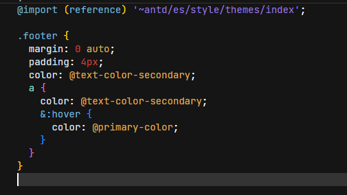
Can you guys please tell me what to do with my styling files which import variables from e.g. @import 'antd/es/style/themes/default.less';. How am I able to use the variable e.g. @screen-md-min? If I have understood correctly, no more variables are exposed. What would be the correct procedure to use such variables again? To copy the used variables from antd 4 and move them to a separate data?
Can you guys please tell me what to do with my styling files which import variables from e.g.
@import 'antd/es/style/themes/default.less';. How am I able to use the variable e.g.@screen-md-min? If I have understood correctly, no more variables are exposed. What would be the correct procedure to use such variables again? To copy the used variables from antd 4 and move them to a separate data?
https://ant.design/docs/react/migration-v5 all answered here.

The "Happy Work" thing sounds very interesting however I can't find any additional information on that - nor any mention of the mentioned press conference anywhere? Can someone point me in the right direction?
Can you guys please tell me what to do with my styling files which import variables from e.g.
@import 'antd/es/style/themes/default.less';. How am I able to use the variable e.g.@screen-md-min? If I have understood correctly, no more variables are exposed. What would be the correct procedure to use such variables again? To copy the used variables from antd 4 and move them to a separate data?https://ant.design/docs/react/migration-v5 all answered here.
Thanks. I was able to find the solution here: https://ant.design/docs/react/customize-theme#static-consume-eg-less
I configured a different primary color for my project as follows:
export const theme: ThemeConfig = {
    token: {
        colorPrimary: '#3fb984',
     }
}
Links are shown in blue. Is this intended? However, if I configure the colorLink attribute, the hover color is not configured automatically.
export const theme: ThemeConfig = {
    token: {
        colorPrimary: '#3fb984',
        colorLink: '#3fb984',
     }
}
Using this configuration, hovered links are still blue. is this the intended behaviour?

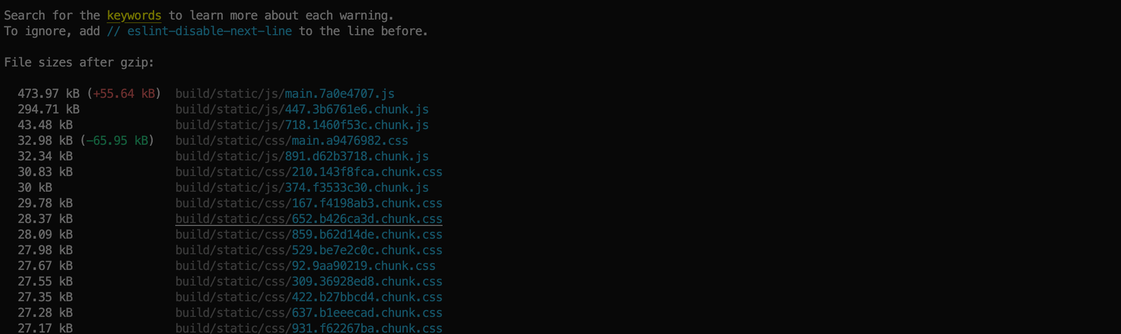
The bundle size got higher?!

Hi,
Here is my personal feedback from my upgrade, antd 4 => 5, using NextJS 13 (no server components, just old school SSR).
First of all, to me the main benefits were to be able to remove less and MomentJS. Thank you for that 🙏
However I've struggled with the (NextJS) SSR specificities, and I'm not 100% convinced with the solution I found.
At first I did nothing in particular, and everything worked fine in development mode. But in production, I had some kind of FOUC where some AntD components have their CSS, and others don't. After a gfew milliseconds, it goes back to normal. For example, <a> links didn't have any style, but the Layout component did.
I did some inspections, I found that some of the (antd) CSS <style> tags were part of the server HTML response, but others were missing and only appended during client side rendering: I don't know the internals and what it means but every <style> tags inserted with data-rc-order="prependQueue" were missing from the server response.
Then I found a tiny bit of doc about SSR in the AntD doc, but it isn't straightforward to apply with NextJS.
To achieve what's done in the AntD documentation I had to create a custom nextjs Document, overload its getInitialProps, and rewrite my own version of extractStyle which returns JSX tags instead of a HTML string. I give my complete solution below but my questions are:
- Why, without the
extractStyleSSR stuff, some components have their<style>inserted in the served response and others don't ? Is there something to be done on Antd side so they are all included in the server response ? - Did I got a (partial) FOUC because I didn't call
extractStyleat first or am I doing something wrong which causes this ? - If
extractStyleis the way to go, and given the popularity of NextJS, is there something to be done on AntD side to ease the process ? - Any chance to have an
extractStylewhich returns JSX tags ?
The solution I use, in case someone is interested:
// _document.jsx
import Document, {
    Html, Head, Main, NextScript,
} from 'next/document';
import * as React from 'react';
import { createCache, StyleProvider } from '@ant-design/cssinjs';

const ATTR_TOKEN = 'data-token-hash';
const ATTR_MARK = 'data-css-hash';

function extractStyle(cache) {
    const styleKeys = Array.from(cache.cache.keys()).filter(key => key.startsWith('style%'));

    const styleText = [];
    styleKeys.forEach((key) => {
        const [styleStr, tokenKey, styleId] = cache.cache.get(key)[1];

        styleText.push(
            <style
                key={tokenKey + styleId}
                {...{ [ATTR_TOKEN]: tokenKey, [ATTR_MARK]: styleId }}
                dangerouslySetInnerHTML={{ __html: styleStr }}
            />,
        );
    });

    return styleText;
}

export default class AppDocument extends Document {
    static async getInitialProps(ctx) {
        const originalRenderPage = ctx.renderPage;
        const antdCache = createCache();
        // eslint-disable-next-line no-param-reassign
        ctx.renderPage = () => originalRenderPage({
            enhanceApp: AppComp => props => <StyleProvider cache={antdCache}><AppComp {...props} /></StyleProvider>,
        });
        const initialProps = await Document.getInitialProps(ctx);
        initialProps.styles.push(...extractStyle(antdCache));
        return initialProps;
    }

    render() {
        return (
            <Html>
                <Head />
                <body>
                    <Main />
                    <NextScript />
                </body>
            </Html>
        );
    }
}
The "Happy Work" thing sounds very interesting however I can't find any additional information on that - nor any mention of the mentioned press conference anywhere? Can someone point me in the right direction?
any update on this?
@bost-h I have the exact same issue. It seems some of the styles require JS. If you disabled Javascript from Devtools, you will only see the styles before FOUC. Looking forward for a solution. I want to contribute but not sure where to begin to fix this issue.

So @zombieJ and @afc163 with the Theme Editor, is there any plans to translate it from chinese to english? And also, when you modify a property using the editor for a specific component, it resets the other propertys you have already changed to default, is this a know issue?
Example: I changed borderRadius to 12, then I changed borderRadiusSM to 1, when i changed it, borderRadius was reset back to 6
I'm using this URL to get to the theme editor: https://ant-design.github.io/antd-token-previewer/~demos/docs-theme-editor-simple
Thank you!
You can find the theme editor in English here https://ant.design/theme-editor
Hi Guys,
Pls feel free to create issue or discussion if you meet any problem or need feature request. Comment after release note may not well track for maintainer.
Thanks all

V5 is still warning
Warning: findDOMNode is deprecated in StrictMode. findDOMNode was passed an instance of Trigger which is inside StrictMode.
how to solve this problem?

How do I actually use the theme changer?! Cant find a single comp[ete tutorial showing whats shown here with picking any arbitary colour/etc. I am new to react and trying to learn. More indepth article would be useful.

If is about dynamic theme usage, here is Customize theme with ConfigProvider.
And for theme editor, here is Theme Editor. Pls note that read first article above to know how to use ConfigProvider for dynamic theme first.

antd5 does not work with NextJS 13 or 12. If I try to import the components via import Button from 'antd/es/button' I get SyntaxError: Cannot use import statement outside a module.
This was the biggest reason for me to upgrade. The removal of that massive CSS file and components and using CSS / components as you need.
Do you have an example of NextJS support with antd5?
Something that shows how you setup these files: package.json, next.config.js, tsconfig.json.
If there is a base case on stack blitz or codesandbox, I can use that to get started on the upgrade.
My project is fairly complex requiring support for scss, jsx, tsx.
antd5 does not work with NextJS 13 or 12.
It does work with NextJs 12 and 13 (I'm using with Next 13 as well). Seems something is wrong in your configuration.
Fire up a new next app and install and use antd5 there. It should work.
Then compare the changes between your project and a fresh one.
where will the press conference be posted? waiting for happy work theme pack info

Is there any way to convert Ant Design Design token into System UI Specification for easier using libraries in this ecosystem like styled-system, emotion?
Does anyone have problems with the new release of AntDesign's cssinjs(v1.3.1) in Next.js?
It seems the page loads without any styles and after a split second, the page loads the styles and everything is ok. But it's really annoying to see that split second of an un-styled app 😢 I still have a yarn.lock file with cssinjs v1.1.0 and I created this video to show the difference (pay attention at the reload button to see when I refresh the page):
Before (using a yarn.lock file that requires cssinjss v.1.1.0):
Screen.Recording.2022-12-28.at.17.08.37.mov
After (using the latest version of AntDesign which comes with cssinjs v.1.31):
Screen.Recording.2022-12-28.at.17.07.17.mov
In case anyone wants to test this, here is the info from the yarn.lock file that sets the version for cssinjs:
// when you want to use cssinjs v1.1.0:
"@ant-design/cssinjs@^1.0.0":
  version "1.1.0"
  resolved "https://registry.npmjs.org/@ant-design/cssinjs/-/cssinjs-1.1.0.tgz"
  integrity sha512-9kfWCnlcWZLMc184HL7zGUU3odKo/5HBMNxDxhSds2DoIzi/ojmmOU1A1butWVDSPcAbLyNQ85vxUI8mkkHrlA==
  dependencies:
    "@babel/runtime" "^7.11.1"
    "@emotion/hash" "^0.8.0"
    "@emotion/unitless" "^0.7.5"
    classnames "^2.3.1"
    csstype "^3.0.10"
    rc-util "^5.24.2"
    stylis "^4.0.13"
// when you want to use cssinjs v1.3.1:
"@ant-design/cssinjs@^1.0.0":
  version "1.3.1"
  resolved "https://registry.yarnpkg.com/@ant-design/cssinjs/-/cssinjs-1.3.1.tgz#45967a0ef93188a336532087f97ee09d30f8cf51"
  integrity sha512-lFy/DhxH/fMaYaMRTaUBLkgoQHgmD56cMeEemqjkcBfk0zzUje11elx8LsqYquJ3okTUdmQTWxDSeG6gQ+S8Lg==
  dependencies:
    "@babel/runtime" "^7.11.1"
    "@emotion/hash" "^0.8.0"
    "@emotion/unitless" "^0.7.5"
    classnames "^2.3.1"
    csstype "^3.0.10"
    rc-util "^5.24.2"
    shallowequal "^1.1.0"
    stylis "^4.0.13"

鼠标点击官网右上角的更多选项,右上角的菜单样式异常
2023-01-12.09.58.21.mov
@wanghui2021 我看看

Still not removed little OK button from time picker / datetime picker? This should be a serious consideration! A prop boolean setting if you wish to use it or not, if not then any onchange sets the date value as selected else current datetime. Many people can miss clicking it when in forms.
Still not removed little OK button from time picker / datetime picker?
DatePanel & TimePanel is 2 way for user that can not confirm which is final state, thus provide a confirm button to make sure user finish selection.

hi, i want to ask something about _tokenKey inside theme.useToken(). is this token will be different on each project or in hosting?because i see a different value for _tokenKey between default algorithm and dark algorithm, and is it save to use that value for conditioning inline style? thanks, sorry bad english

In dark theme modal confirm/info is white, need to update in next antd version


Could you take a look at this performance issue: #39746
for some heavy pages, the rendering time is almost doubled in v5.
In dark theme modal confirm/info is white, need to update in next antd version
@Khadhiri786
You should import Modal, Message and Notification from App to keep your theme options.
@balboFK
Currently using Antd-5.1.5 version, React:16.14.0
`import React from 'react';
import {App} from 'antd';
export default const Profile=()=>{
const { message } = App.useApp();
return(<button onClick={()=>{message.success('clicked')}}>Click me)
}
`
Getting error

Hmm, weird to have that error.
Maybe your React version is not suported? I'm currently running on React: "18.2.0" and it works fine with that same code.
I don't know if you can upgrade your React version, if you can't, you might need to find a workaround for it.
@balboFK Now I'm using Antd:-5.1.7 , React:-18.2.0. Still I'm getting the same error.
@Khadhiri786
I see, i would advise you to try openning a issue to request help of a maintainer, might be easier to get their atention than on this topic, pull up a codepen example and see if it happens there too just to be sure.