CSS gradients:你知道的和你不知道的
akira-cn opened this issue · comments

在现代浏览器中,渐变(gradients)是一系列比较有用的CSS属性值。
渐变又分为3种:
- 线性渐变 linear-gradient
- 径向渐变 radial-gradient
- 圆锥渐变 conic-gradient
渐变不是CSS属性,而是属性值,在浏览器渲染的时候,被解析为图形,所以它可以应用在background-image、border-image、list-style-image、mask等能够使用图片的CSS属性上。
最常用的当然是background-image。
<div class="block"></div>.block {
width: 100px;
height: 100px;
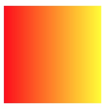
background-image: linear-gradient(to right, red, yellow);
}上面的代码创建了一个带有渐变色背景的div元素:
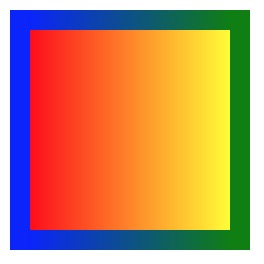
如果我们要让边框渐变,我们可以设置border-image:
.block {
  width: 100px;
  height: 100px;
  background-image: linear-gradient(to right, red, yellow);
  border: solid 10px;
  border-image: linear-gradient(to right, blue, green) 1;
}
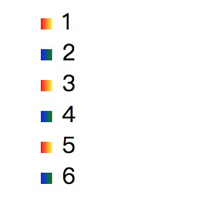
一个比较少见的用法是,渐变还可以设置list-style-image:
<ul>
  <li>1</li>
  <li>2</li>
  <li>3</li>
  <li>4</li>
  <li>5</li>
  <li>6</li>
</ul>li:nth-child(2n) {
list-style-image: linear-gradient(to right, blue, green);
}
li:nth-child(2n+1) {
list-style-image: linear-gradient(to right, red, yellow);
}
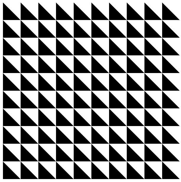
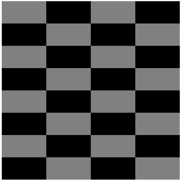
由于渐变视为图片,background-size、background-position、background-repeat对它都有效,我们就可以用它来绘制一些有趣的图案。
.block {
  width: 300px;
  height: 300px;
  background-image: linear-gradient(45deg, black 50%, transparent 0);
  background-size: 10% 10%;
}
.block {
  width: 300px;
  height: 300px;
  background-image: linear-gradient(to bottom, grey 50%, black 0),
    linear-gradient(to bottom, black 50%, grey 0),
    linear-gradient(to bottom, grey 50%, black 0),
    linear-gradient(to bottom, black 50%, grey 0);
  background-size: 25% 25%;
  background-position: 0 0, 75px 0, 150px 0, 225px 0;
  background-repeat: repeat-y;
}
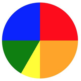
我们还可以用渐变来绘制饼图:
<div class="pie"></div>.pie {
display: inline-block;
width: 150px;
height: 150px;
border-radius: 50%;
background-image: linear-gradient(30deg, red 38%, yellow 0),
linear-gradient(-45deg, cyan 50%, blue 0),
linear-gradient(-135deg, gray 50%, green 0),
linear-gradient(135deg, black 50%, orange 0);
background-position: 0 0, 0 100%, 100% 100%, 100% 0;
background-size: 50% 50%;
background-repeat: no-repeat;
}上面的代码是用线性渐变绘制的饼图。
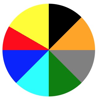
当然如果用圆锥渐变就更简单了:
.pie {
  display: inline-block;
  width: 150px;
  height: 150px;
  border-radius: 50%;
  background-image: conic-gradient(red 90deg, orange 90deg, orange 180deg, yellow 180deg, yellow 210deg, green 210deg, green 270deg, blue 270deg);
}
如果用渐变配合mask(遮罩)属性,可以用来做一些特殊的效果:
<img src="https://p1.ssl.qhimg.com/t0182f688227da11a79.jpg">img {
-webkit-mask: radial-gradient(#000, transparent 50%);
}
如果再配合动画就更有趣了:
function animate({target, prop, duration, start, end, easing, interpolate} = {}) {
  const startTime = Date.now();

  return new Promise((resolve) => {
    function update() {
      const t = Date.now() - startTime;
      const p = Math.min(t / duration, 1);

      target.style[prop] = interpolate(start, end, easing ? easing(p) : p);
      if(p < 1) {
        requestAnimationFrame(update);
      } else {
        resolve(p);
      }
    }
    update();
  });
}

const img = document.querySelector('img');

animate({
  target: img,
  prop: 'webkitMask',
  duration: 1000,
  start: 0,
  end: 100,
  interpolate(start, end, p) {
    const v = start * (1 - p) + end * p;
    return `linear-gradient(to right, #000 ${v}%, transparent 0) 0/20px`
  }
});