Circle-style checkbox component for React Native.
npm install react-native-circle-checkbox --save
import CircleCheckBox, {LABEL_POSITION} from 'react-native-circle-checkbox';

<CircleCheckBox
  checked={true}
  onToggle={(checked) => console.log('My state is: ', checked)}
  labelPosition={LABEL_POSITION.RIGHT}
  label="Checkbox example"
/>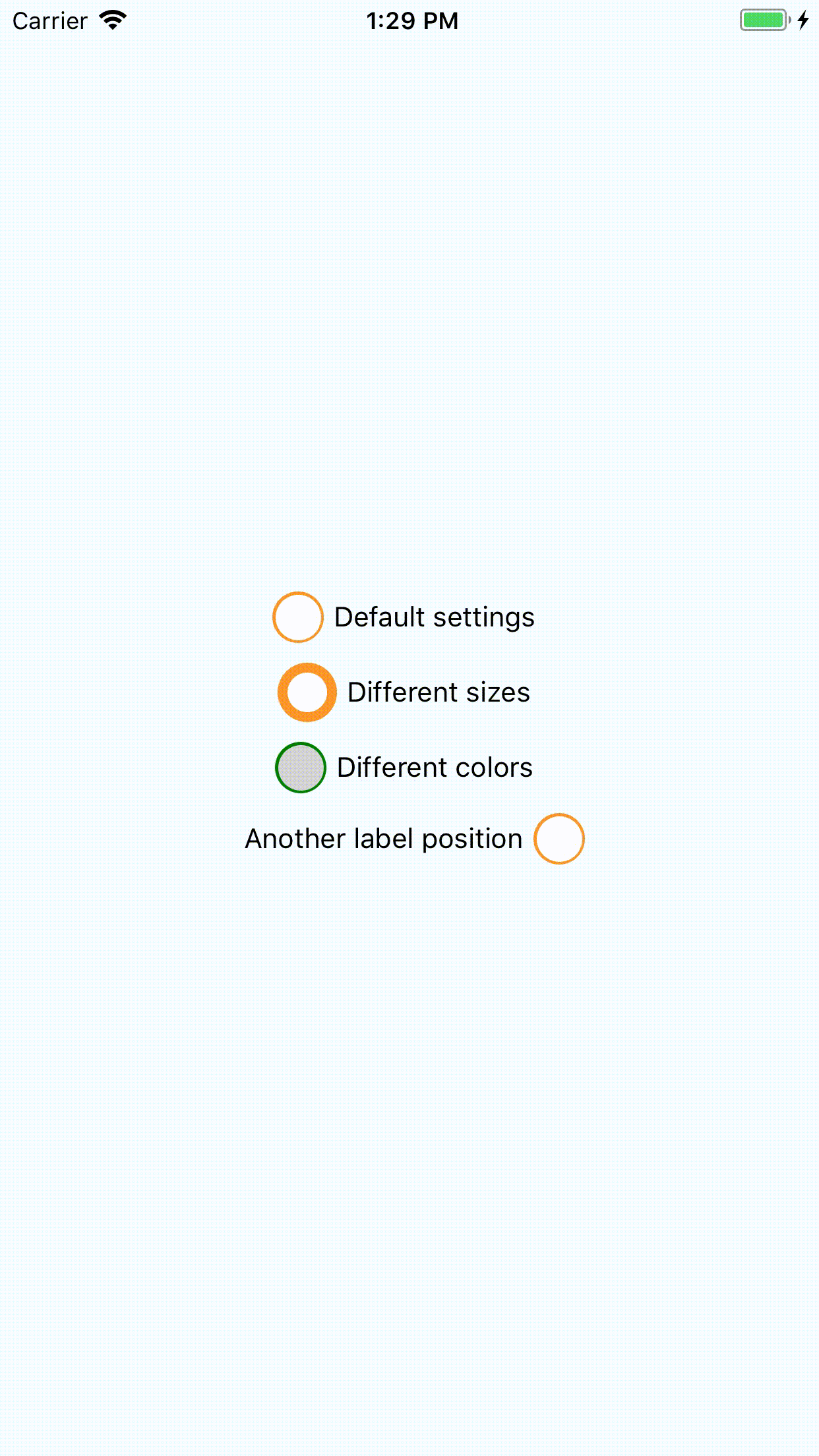
checked: initial state of checkbox. Default:falseonToggle: function that will be invoked by pressing to checkbox with checked property as argument.outerSize: Diameter of outer circle. Minimum:10, default:26filterSize: Diameter of underlayer circle. Minimum:7, default:23innerSize: Diameter of flag. Minimum:2, default:18outerColor: Color of outer circle. Default:#FC9527filterColor: Color of underlayer circle. Default:#FFFinnerColor: Color of flag. Default:#FC9527label: Checkbox label. Default: emptylabelPosition: Label rendering position. Default:right, may be 'right' or 'left'. For your convenience this package exportsLABEL_POSITIONobject with two keys -RIGHTandLEFT. You can use it forlabelPositiondefinition.styleCheckboxContainer: Styles for checkbox container.styleLabel: Styles for label.