约束布局作为目前最强大的布局(没有之一),同时随着版本的更新它增添各种各样的新功能,在此梳理总结出一个详细的教程,为大家做个全面的导航。
- ConstraintLayout 基础讲解(官方 API 文档翻译)
- ConstraintLayout 虚拟辅助类部件
- ConstraintLayout 实用小控件
- ConstraintHelper
- MotionLayout
上面已为大家分类分目录讲解,点击可以查看详情; 如果不想跳转的,可以直接往下面看,(东西较多,略繁乱)
[TOC]
本文翻译自官方文档
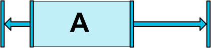
相对定位,在水平以及垂直轴线的方向上,一个控件的一边受到另一个控件的一边的约束。
比如,Button B 受到 Button A 的约束:
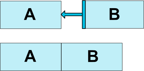
<!--将按钮B的左边限制在按钮A的右边-->
<Button android:id="@+id/buttonA" ... />
<Button android:id="@+id/buttonB" ...
    app:layout_constraintLeft_toRightOf="@+id/buttonA" />
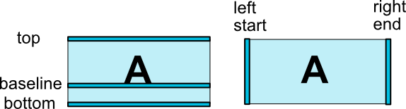
约束布局的坐标示意图:
以下是可用的约束条件列表:
- layout_constraintLeft_toLeftOf
- layout_constraintLeft_toRightOf
- layout_constraintRight_toLeftOf
- layout_constraintRight_toRightOf
- layout_constraintTop_toTopOf
- layout_constraintTop_toBottomOf
- layout_constraintBottom_toTopOf
- layout_constraintBottom_toBottomOf
- layout_constraintBaseline_toBaselineOf
- layout_constraintStart_toEndOf
- layout_constraintStart_toStartOf
- layout_constraintEnd_toStartOf
- layout_constraintEnd_toEndOf
它们都通过 id 来和其他控件或父控件建立起约束关系。
相对于父控件创建约束,如下:
<Button android:id="@+id/buttonB" ...
    app:layout_constraintLeft_toLeftOf="parent" />
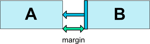
关于 margin 主要有以下几个属性:
- android:layout_marginStart
- android:layout_marginEnd
- android:layout_marginLeft
- android:layout_marginTop
- android:layout_marginRight
- android:layout_marginBottom
注意,当如果使用了
layout_constraintLeft_toRightOf = "@id/buttonB"这样的属性之后,只有layout_marginLeft这个属性才起作用,其他边,top,bottom 等等同理。 另外,在一个控件默认在左上角的时候,layout_marginLeft或者layout_marginTop这样子的属性是没有用的,原因,没有被某一个控件约束到,如果使用了layout_constraintTop_toTopOf = “parent”这样子的属性的话,layout_marginTop = "10dp"这样的属性就有用了。
当约束目标的可见性为 View.GONE 时,你还可以使用以下属性指示不同的边距值:
- layout_goneMarginStart
- layout_goneMarginEnd
- layout_goneMarginLeft
- layout_goneMarginTop
- layout_goneMarginRight
- layout_goneMarginBottom
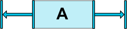
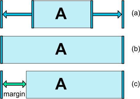
ConstraintLayout 非常有用的一个方面是对“不可能”约束的处理。
比如:
<android.support.constraint.ConstraintLayout ...>
     <Button android:id="@+id/button" ...
         android:layout_width="100dp"
         app:layout_constraintLeft_toLeftOf="parent"
         app:layout_constraintRight_toRightOf="parent/>
</>
当约束遇到这种情况时,因为控件不可能同时满足这两个约束(宽度一定时,和父布局左边对齐的同时和父布局右边也对齐),这时,约束就像相反的力量一样将控件平均分开,这样控件最终会在父布局中居中。
上面这个例子中相反约束造成的置中,只是在控件的宽度(或高度)一定时形成的效果。而如果把上面例子中的宽度改为 android:layout_width="0dp 时,这个时候,控件 button 的宽度就会因为双向约束的存在而充满父布局,相当于 android:layout_width="match_parent"
上面讲到的“相反约束”时,默认的效果是控件被居中;但是此时你也可以通过使用偏移属性来调整定位,使其偏向一边。
- layout_constraintHorizontal_bias
- layout_constraintVertical_bias
例如,将左侧的偏移值从默认的 50% 改为 30% ,这样左侧会更短,控件会更偏向左侧:
<android.support.constraint.ConstraintLayout ...>
     <Button android:id="@+id/button" ...
         app:layout_constraintHorizontal_bias="0.3"
         app:layout_constraintLeft_toLeftOf="parent"
         app:layout_constraintRight_toRightOf="parent/>
     </>
使用 bias ,可以更好的适应屏幕大小变化的用户界面。
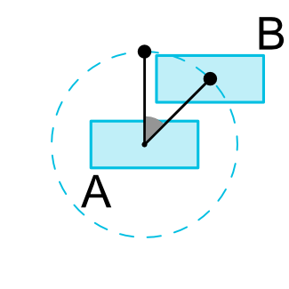
您可以以一定的角度和距离约束一个控件中心相对于另一个控件中心。这允许你将一个控件放置在一个圆圈上。
- layout_constraintCircle // 引用另一个小部件id
- layout_constraintCircleRadius // 到另一个小部件中心的距离
- layout_constraintCircleAngle //小部件应该处于哪个角度(角度,从0到360)
如图:
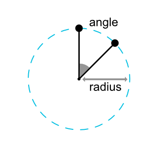
<Button android:id="@+id/buttonA" ... />
<Button android:id="@+id/buttonB" ...
  app:layout_constraintCircle="@+id/buttonA"
  app:layout_constraintCircleRadius="100dp"
  app:layout_constraintCircleAngle="45" />
可以给 ConstraintLayout 设置最大高度宽度以及最小高度宽度,什么情况下可以这样设置呢,就是当高度宽度设置为 wrap_content 的时候可以用。
属性共四个如下:
- android:minWidth
- android:minHeight
- android:maxWidth
- android:maxHeight
ConstraintLayout 下的子控件的尺寸,也就是 layout_height 和 layout_width,只能以下三种:
- 具体尺寸,比如 20dp,50dp 这样子
- wrap_content
- 0dp
如果使用 match_parent 属性,其实也是会有充满的效果的,但我们一般不提倡使用。但你可以使用 0dp 结合 反向约束,达到充满父布局的效果。
针对于 wrap_content,还有一种强制性约束,就是一般情况下 wrap_content 是无法约束它的结果尺寸的,一般情况下这样的控件的尺寸是跟着它的文字大小而进行改变。在 wrap_content 的情况下,为了限制最后它的尺寸 ConstraintLayout 提供了一下两个属性:
- app:layout_constrainedWidth = "true | false"
- app:layout_constrainedHeight = "true | false"
当使用 match_constraint 这个值的时候,默认就是将剩下可用的空间全部当成自己最后的尺寸,几个额外的属性是这样子的:
- layout_constraintWidth_min 和 layout_constraintHeight_min // 给尺寸设置最小的值
- layout_constraintWidth_max 和 layout_constraintHeight_max // 给尺寸设置最大的值
- layout_constraintWidth_percent 和 layout_constraintHeight_percent // 给尺寸设置一个父容器的百分比的值
当最大值最小值设置成一样时,那就相当于 wrap_content 的值这么大了
用百分比尺寸的话,遵循一下三个原则:
layout_height或者layout_width要设置成match_constraint(0dp)- 默认情况下应该这么设置:
app:layout_constraintWidth_default = "parent"或者app_layout_constriantHeight_default = “parent”(1.1 版本中需要这么做,后面的版本就不需要这么做了) - 最后设置百分比尺寸,也就是设置
layout_constraintWidth_percent和layout_constraintHeight_percent值,值在 0-1 之间,是小数,比如,0.2、0.8 这样子
就是控件设置自身宽与高的一种比例,想使用比例尺寸的话,必须把 width 或者 height 一个设置为 match_constriant(0dp),然后设置layout_constraintDimensionRatio 这个属性。
比如:
<Button
    android:layout_width="wrap_content"
    android:layout_height="0dp"
    app:layout_constraintDimensionRatio="1:1" />
然后,宽和高就是一样的值了,宽多少高就是多少。 关于这个比例的值的两个说明:
- 它是一个 float 值,代表宽和高的一个比例
- 1:1 是格式是 width:height
当然这是一个尺寸是设置为 0dp 的情况,那么当两个尺寸都是 0dp 了呢,系统将会最大程度地满足这样一个比例值,在一个尺寸是 0dp 的基础上并且被约束了,怎么约束另一个呢,可以用 “H” 和 “ W” 这样的字眼来进行显示,当然是宽和高的首字母了,比如 “H,16:9”,“W,9:16” 这样子的,H 或者 W 代表的是前面那一个数字的尺寸,字母和尺寸之间用逗号 “,” 来进行分隔,像下面这样子用:
<Button
    android:layout_width="0dp"
    android:layout_height="0dp"
    app:layout_constraintDimensionRatio="H,16:9"
    app:layout_constraintBottom_toBottomOf="parent"
    app:layout_constraintTop_toTopOf="parent"/>
这样子设置的话,高满屏,宽也被比例设置为满屏了。
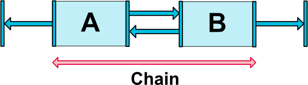
链式是指在单个方向上,为这个方向的几个不同控件链接成组,把组里的几个控件可以看成一个整体来进行约束。
创建一个链
如果一个组内不同的控件,通过双向连接链接在一起,则认为它们就是一个链。
如下图,有两个控件的最小的链:
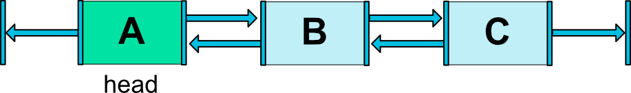
链头
在一个链组中,链中的第一个元素我们称为链头控件(对于水平链来说,头部是最左边的部件,对于垂直链来说,头部是最上面的部件)。我们可以在链头控件上设置一定属性来控制整条链。
链间隙 如果在连接中指定了边距 margins ,则会将其考虑在内。在链扩展的情况下,将从分配的空间中扣除差额。 例如,在水平链上,如果一个元素定义右边框为10dp,下一个元素定义左边框为5dp,那么这两个元素之间的结果边框为15dp。 在计算链用于定位项的剩余空间时,要将项及其边距一起考虑。剩余空格不包含边距。
链的样式
当我们在上面说的链头控件上设置属性 layout_constraintHorizontal_chainStyle 或layout_constraintVertical_chainStyle 时,整条链的展示效果将根据指定的样式值改变(默认为CHAIN_SPREAD)。
- CHAIN_SPREAD // 元素将展开(默认样式)
- 权重链——在CHAIN_SPREAD模式中,如果某些小部件被设置为MATCH_CONSTRAINT(0dp),它们将分割可用空间
- CHAIN_SPREAD_INSIDE // 类似,但是链的端点不会散开
- CHAIN_PACKED // 链中的元素将被打包在一起。子元素的水平或垂直偏差属性将会影响包装元素的位置
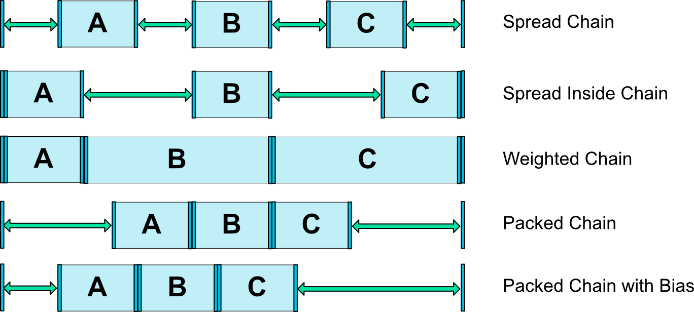
链的权重
链的默认行为是将元素平均分布在可用空间中。如果一个或多个元素使用 0dp ,它们将使用可用的空白空间(在它们之间平均分配)。
属性 layout_constraintHorizontal_weight 和 layout_constraintVertical_weight 可以控制分配的比例。
例如,在一个使用 MATCH_CONSTRAINT(0dp) 包含两个元素的链上,第一个控件的权重为2,第二个控件的权重为1,第一个控件所占的空间将是第二个控件的两倍。
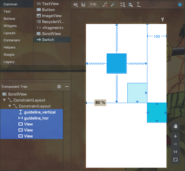
如果你熟悉 UI 设计软件你应该已经使用过参照线,并对它的作用熟悉了。参照线 guideline 提供了视觉上的参照用于 Views 的对齐,而且不会在运行的时候显示,只要你熟悉它的使用了就会发现它对你的对齐实现非常方便。
由上面的简介我们可以知道 Guideline 有以下特点:
- 种类:Guideline 引导线有:垂直引导线、水平引导线 两种;
- 作用:这些引导线用于约束视图组件位置的对应参考;
- 不可见:Guideline 引导线是不可见的,用户在界面中看不到引导线(实质上它是一个可见性一直为 View.GONE 的 View);
- 引导线自身位置定位方式:使用 dp 单位的尺寸值表示相对开始或结束的位置,或百分比值,基于布局的边缘,设定引导线的位置。
Guideline 有以下属性:
- 方向属性(纵向或横向):
android:orientation=“horizontal”; 取值horizontal /vertical; - 自身位置定位(以始端为准):
app:layout_constraintGuide_begin=“100dp”;取值 dp 尺寸值;距离 顶部 (水平),左侧 ( 垂直 ) 位置; - 自身位置定位(以尾端为准):
app:layout_constraintGuide_end=“100dp”;取值 dp 尺寸值;距离 底部 (水平),右侧 ( 垂直 ) 位置; - 百分比自身位置定位:
app:layout_constraintGuide_percent=“0.5”;取值 0 ~ 1.0 之间的小数,距始端的百分比位置。
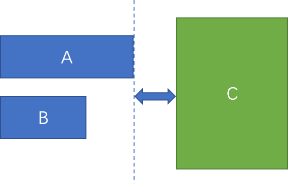
Barrier 和 Guideline 一样,都是自己不可见,只是用来定位的控件。 这个小部件不好用语言描述,这里直接通过例子介绍。
一个例子 假如我们要实现这样一种效果,控件 C 以控件 A 和 B 的最右边缘对齐。如下图:
不用 Barrier 的实现方法
因为 A 和 B 的宽度是动态变化的,所以控件 C 不能简单的依赖于具体的 A 或 B 的右边缘,只能把 A 和 B 放到一个 ViewGroup 里面,然后控件 C 依赖于这个新的 ViewGroup 的右边缘。如下图:
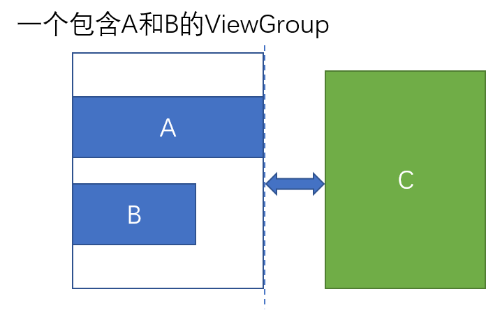
这样实现虽然可以解决问题,但是却引入了一层嵌套。而使用 Barrier 则可以不用嵌套就能实现这样的效果。
使用 Barrier 的解决方案
<!--首先,我们先定义控件 A 和 B-->
<Button
    android:id="@+id/btn_a"
    android:layout_width="wrap_content"
    android:layout_height="wrap_content"
    app:layout_constraintTop_toTopOf="parent"
    app:layout_constraintLeft_toLeftOf="parent"
    android:layout_marginTop="200dp"
    android:layout_marginLeft="30dp"
    android:text="这是控件A,我比较宽"/>
<Button
    android:id="@+id/btn_b"
    android:layout_width="wrap_content"
    android:layout_height="wrap_content"
    app:layout_constraintLeft_toLeftOf="@id/btn_a"
    app:layout_constraintTop_toBottomOf="@id/btn_a"
    android:layout_marginTop="30dp"
    android:text="这是控件B"/>
<!--其后,定义一个 Barrier-->
<android.support.constraint.Barrier
    android:id="@+id/barrier"
    android:layout_width="wrap_content"
    android:layout_height="wrap_content"
    app:barrierDirection="end"
    app:constraint_referenced_ids="btn_a,btn_b"/>
<!--最后,定义一个控件其约束依赖于 Barrier-->
<Button
    android:id="@+id/btn_c"
    android:layout_width="wrap_content"
    android:layout_height="wrap_content"
    app:layout_constraintLeft_toLeftOf="@id/barrier"
    app:layout_constraintTop_toTopOf="parent"
    android:layout_marginTop="200dp"
    android:layout_marginLeft="30dp"
    android:text="这是控件C"/>
其中,app:constraint_referenced_ids="btn_a,btn_b" 这句指定这个 Barrier 是用来控制 id 为 btn_a 和 btn_b 的两个控件。而 app:barrierDirection="end" 这句等于在这两个控件的右端设置一道 “屏障”。
最后,我们让控件 C 依赖于这个 Barrier。注意这句:app:layout_constraintLeft_toLeftOf="@id/barrier"
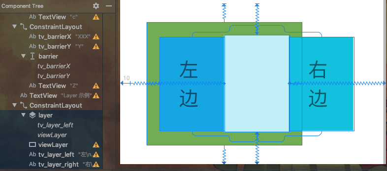
Layer 的用法很简单,它的主要作用是给 ConstraintLayout 布局下的多个 View 添加共同的背景,也可用于添加共同的动画。(另外它是 ConstraintHelper 的一个子类,以后我们会再介绍)
例如添加共同背景:
<androidx.constraintlayout.widget.ConstraintLayout>
    <androidx.constraintlayout.helper.widget.Layer
        android:id="@+id/layer"
        android:layout_marginTop="50dp"
        android:layout_width="wrap_content"
        android:layout_height="wrap_content"
        android:background="@color/colorPrimary"
        app:constraint_referenced_ids="ivImage,tvName"
        app:layout_constraintLeft_toLeftOf="@id/ivImage"
        app:layout_constraintRight_toRightOf="parent"
        android:padding="10dp"
        app:layout_constraintTop_toTopOf="parent" />

    <ImageView
        android:id="@+id/ivImage"
        ...
        app:layout_constraintTop_toBottomOf="@id/layer" />

    <TextView
        android:id="@+id/tvName"
        ...
        app:layout_constraintTop_toBottomOf="@id/ivImage" />

</androidx.constraintlayout.widget.ConstraintLayout>
如果你想实现共同的动画,只需要将动画作用到 Layer 上就行了,这样它绑定的多个 View 就会有共同的动画效果。
Flow 是 VirtualLayout 同样也是实现于 ContraintHelper,和其他子类一样,通过 constraint_referenced_ids 来引用 ConstraintLayout 下的子控件。可以水平或垂直定位引用的控件,类似于链。
通过 flow_wrapMode 可以指定具体的排列方式,有三种模式(后面还会详解):
- wrap none : 简单地把 constraint_referenced_ids 里面的元素组成 chain, 即使空间不够
- wrap chain : 根据空间的大小和元素的大小组成一条或者多条 chain
- wrap aligned : wrap chain 类似,但是会对齐
VirtualLayout 是 ConstraintHelper 的实现,它也是普通的视图 View,所以你可以像其他 View 一样使用它。比如在它上面设置约束、给它设置 View 的一些属性(背景、padding 等)。 VirtualLayout 和其他 ViewGroup 之间的主要区别有:
- VirtualLayout 能够保持当前视图层次,不会添加嵌套
- 因为上面的特征,VirtualLayout 和它引用的控件是同一视图层,这样它自身和它引用的控件都可以被其他控件用于约束、引用等
- VirtualLayout 允许动态修改行为属性(比如 Flow,调整方向)
flow_wrapMode = "none"
将引用的多个控件创建一个水平/垂直的链,它是 Flow 默认的展示模式,有以下属性:
- flow_horizontalStyle = "spread | spread_inside | packed"
- flow_verticalStyle = "spread | spread_inside | packed"
- flow_horizontalBias = "float"
- flow_verticalBias = "float"
- flow_horizontalGap = "dimension"
- flow_verticalGap = "dimension"
- flow_horizontalAlign = "start | end | center"
- flow_verticalAlign = "top | bottom | center | baseline
虽然引用的控件按照定义的方向以链的形式展示,但在其他方向维度上的布局展示方式由 flow_horizontalAlign 和 flow_verticalAlign 控制。
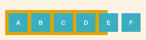
flow_wrapMode = "chain"
创建的链和默认 wrap:none 模式相似,只是当引用的控件较多,一行/列 的空间不够展示时,后面的控件就会新添 一行/列 来展示,效果如前面简介中的图。
它具有的属性和 wrap:none 中的相同。另外还添加了一些特有的属性来为第一个链指定链的样式和链的偏差,这样就可以为 第一个链 相比于 最终创建的其他链 指定一些不同的链行为。
- flow_firstHorizontalStyle = "spread|spread_inside|packed"
- flow_firstVerticalStyle = "spread|spread_inside|packed"
- flow_firstHorizontalBias = "float"
- flow_firstVerticalBias = "float"
最后一个重要的属性是 flow_maxElementsWrap,它指定一行/列控件的最大数量。
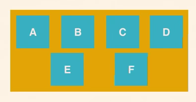
flow_wrapMode = "aligned"
它与 WRAP_CHAIN 相同的 XML 属性,不同之处在于引用的控件将以一组行和列而不是链来布局。因此,它没有指定链样式和偏差的属性。
- Android ConstraintLayout 进阶:Barrier 的使用及实例
- ConstraintLayout 引导线 Guideline 约束 (简介 | 可视化操作 | 属性 | 水平引导线 | 垂直引导线 | 开始结束尺寸 | 百分比位置 | 约束组件)
- Constraintlayout 2.0:你们要的更新
其实通过上面的教程,大家应该很熟悉 ConstraintHelper 了,至少对它的使用形式很熟悉了。通过 app:constraint_referenced_ids 来指定要反映特定效果的控件集合,用逗号分隔的 ID 来指定。
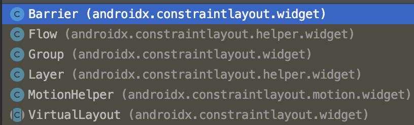
官方已提供实现的类有以下几个,基本上前面都已经介绍过了:
ConstraintLayout2.0 除了提供以上几个已经实现的 ConstraintHelper 外,现在也支持自定义 ConstraintHelper 的方式。
为什么需要自定义:
- 保持 View 的层级不变,不会像 ViewGroup 会增加 view 的层级;
- 封装一些特定的行为,方便使用
- 同一个 View 可以被多个 Helper 引用,可以很方便组合出一些复杂的效果
如何自定义
- Helper 继承了 View,所以它本身也是 View;
- Helper 持有绑定的 View 的引用,所以可以获取到 View(getViews) 然后操作 view;
- 提供了 onLayout 前后的方法回调
Helper 主要的方法如下,基本上看名字就知道干嘛的,可以根据自己的需要来实现对应方法,不必全部:
public abstract class ConstraintHelper extends View {
    // 初始化方法,可以通过 attrs 获取属性的内容
    protected void init(AttributeSet attrs)
    public void onDraw(Canvas canvas)
    public void validateParams()
    // 执行于 onMeasure 开始的时候
    public void updatePreLayout(ConstraintLayout container)
    // onLayout 被调用的时候执行
    public void updatePostLayout(ConstraintLayout container)
    // onMeasure 每次调用都会执行
    public void updatePostMeasure(ConstraintLayout container)
    // 每当有变化时都会调用
    public void updatePostConstraints(ConstraintLayout constainer)
}
我们来实现一个简单的 Helper,当图片展示的时候,我们使它有揭露动画的效果:
CircularReveal 的效果我们使用 ViewAnimationUtils 提供的 createCircularReveal 方法:
public static Animator createCircularReveal(View view,
            int centerX,  int centerY, float startRadius, float endRadius)
下面来看自定义 Helper 的具体代码,很简单:
class CircularRevealHelper @JvmOverloads constructor(
    context: Context, attrs: AttributeSet? = null, defStyleAttr: Int = 0
) : ConstraintHelper(context, attrs, defStyleAttr) {
    override fun updatePostLayout(container: ConstraintLayout) {
        super.updatePostLayout(container)
        if (Build.VERSION.SDK_INT >= Build.VERSION_CODES.LOLLIPOP) {
            val views = getViews(container)
            for (view in views) {
                val anim = ViewAnimationUtils.createCircularReveal(
                    view, view.width / 2,
                    view.height / 2, 0f,
                    // Math 的方法
                    hypot((view.height / 2).toDouble(), (view.width / 2).toDouble()).toFloat()
                )
                anim.duration = 3000
                anim.start()
            }
        }
    }
}
我们也可以通过自定义属性,来控制动画执行的时间:
<?xml version="1.0" encoding="utf-8"?>
<resources>
    <declare-styleable name="CircularRevealHelper">
        <attr name="duration" format="integer" />
    </declare-styleable>
</resources>
在 Helper 获取属性:
// 同时修改上面 updatePostLayout 方法,将 mDuration 赋值给 anim.duration
var mDuration = 3000L
override fun init(attrs: AttributeSet?) {
    super.init(attrs)
    val typedArray =
        context.obtainStyledAttributes(attrs, R.styleable.CircularRevealHelper)
    mDuration = typedArray.getInt(R.styleable.CircularRevealHelper_duration, 3000).toLong()
    typedArray.recycle()
}
最后,直接在布局中使用就行了:
<?xml version="1.0" encoding="utf-8"?>
<androidx.constraintlayout.widget.ConstraintLayout xmlns:android="http://schemas.android.com/apk/res/android"
    xmlns:app="http://schemas.android.com/apk/res-auto"
    xmlns:tools="http://schemas.android.com/tools"
    android:layout_width="match_parent"
    android:layout_height="match_parent"
    tools:context=".constraint_helper.ConstraintHelperActivity">

    <ImageView
        android:id="@+id/iv1"
        android:layout_width="0dp"
        android:layout_height="0dp"
        android:scaleType="centerCrop"
        android:src="@drawable/ocnyang"
        app:layout_constraintBottom_toTopOf="@+id/iv2"
        app:layout_constraintHeight_percent="0.2"
        app:layout_constraintLeft_toLeftOf="parent"
        app:layout_constraintRight_toRightOf="parent"
        app:layout_constraintTop_toTopOf="parent" />

    <ImageView
        android:id="@+id/iv2"
        android:layout_width="0dp"
        android:layout_height="0dp"
        android:scaleType="centerCrop"
        android:src="@drawable/ocnyang"
        app:layout_constraintBottom_toBottomOf="parent"
        app:layout_constraintHeight_percent="0.5"
        app:layout_constraintLeft_toLeftOf="parent"
        app:layout_constraintRight_toRightOf="parent"
        app:layout_constraintTop_toBottomOf="@+id/iv1" />

    <com.ocnyang.constraintlayout_guide.constraint_helper.CircularRevealHelper
        android:layout_width="0dp"
        android:layout_height="0dp"
        app:constraint_referenced_ids="iv1,iv2"
        app:layout_constraintBottom_toBottomOf="parent"
        app:layout_constraintLeft_toLeftOf="parent" />

</androidx.constraintlayout.widget.ConstraintLayout>