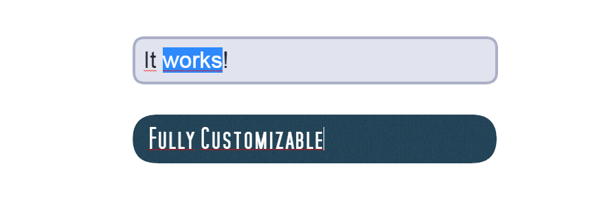
This plugin for pixi.js provides a convenient way of adding text inputs to the pixijs-stage.
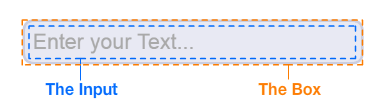
The input itself is a HTML <input> element, which is positioned above the stage according to the transformation given by the PIXI-DisplayObject. The box is drawn on the PIXI-stage. Additionally, you can choose whether the plugin should substitute the <input> with a native pixi-Text when the textfield has no focus.
Demo with default box generator
Demo with custom box generator
Include thedist/PIXI.TextInput.min.js in your html document after pixi.js or install the npm package via: npm install pixi-text-input
The TextInput behaves just like any other PIXI-DisplayObject. It inherits from PIXI.Container and has all the associated properties like width, height, rotation, scale ,alpha, etc.
new PIXI.TextInput( { input: {...}, box: {...} } )
input : object
The css style attributes for the HTML input tag.
box : object | function
Either an object describing the style of the box using the default box generator, or a function which returns your own custom generated box.
You can apply any CSS styles. You have to use the camcelCase property names, though.
new PIXI.TextInput({
    input: {
        fontSize: '25pt',
        padding: '14px',
        width: '500px',
        color: '#26272E'
    },
    box: {...}
})
If you plan to use more advanced properties like text-shadow, you will have to disable substituteText, as their translation to the pixi-Text style is not supported, yet.
The input can have 3 different states: DEFAULT, FOCUSED and DISABLED.
For each state you can apply a different style to the input-box. When passing the following object to the second parameter of the constructor...
new PIXI.TextInput({
    input: {...},
    box: {
        default: {fill: 0xE8E9F3, rounded: 16, stroke: {color: 0xCBCEE0, width: 4}},
        focused: {fill: 0xE1E3EE, rounded: 16, stroke: {color: 0xABAFC6, width: 4}},
        disabled: {fill: 0xDBDBDB, rounded: 16}
    }
})
...you will get a box-style as shown in this demo.
If you don't want a different style for each state, you can just pass:
new PIXI.TextInput({
    input: {...},
    box: {fill: 0xE8E9F3, rounded: 16, stroke: {color: 0xCBCEE0, width: 4}}
})
and have the same style for all 3 states.
| Possible attributes | |
|---|---|
fill |
The fill color of the box |
rounded |
The border-radius |
stroke.color |
the color of the stroke |
stroke.width |
the width of the stroke |
stroke.alpha |
the alpha of the stroke |
Write your own function to generate the box.
function generateCustomBox(width, height, state){
    var box = new PIXI.Graphics()

    // draw the box based on width, height and the state (DEFAULT, FOCUSED or DISABLED)

    return box
}
then use it as follows
new PIXI.TextInput({ input: {...}, box: generateCustomBox })
See this demo.
All described members & methods are accessible through an instance of the TextInput.
var input = new PIXI.TextInput({
    input: {fontSize: '25px'},
    box: {fill: 0xEEEEEE}
})
input.x = 100
input.y = 100
input.placeholder = 'Enter your Text...'
stage.addChild(input)
input.focus()
substituteText : boolean
Whether the plugin should substitute the html input tag with a pixi-Text DisplayObject when there's no focus.
The plugin tries its best to mimic the exact look of the html input element, however with certain fonts/styles there might be some discrepancies.
Set this to false in order to have the html input element visible at all times. Drawback: You cannot have overlays over the input field.
placeholder : string
The placeholder text applied to the html input element or the substituted pixi-Text.
placeholderColor : int
The color of the placeholder (has no effect when
substituteTextis set to false; Use CSS to set the placeholder color).
text : string
The text (value) of the html input element.
maxLength : int
The maximum length of the text.
restrict : RegExp | string
Restricts the text input to a specified character set. Either pass a string containing all possible characters or a regular expression, which will be matched against the whole input string.
htmlInput : HTMLInputElement
Direct access to the native HTML input. Who knows what you're planning to do.
disabled : boolean
Set to true to disable the input.
focus() : void
Focus the input.
select() : void
Focus the input and have the text in selection.
blur() : void
Remove the focus of the input.
setInputStyle( key : string, value : string ) : void
Change a css style attribute of the input element. For example, to change the font size, use:
input.setInputStyle('fontSize', '21px')
All events are dispatched via the default pixi EventEmitter.
input.on('keydown', keycode => {
    console.log('key pressed:', keycode)
})
keydown -> keycode : int
Dispatched when a key is pressed along with its keycode.
keyup -> keycode : int
Dispatched when a key is released along with its keycode.
input -> text : string
Dispatched when the input's text has been changed along with the current text of the input.
focus
Dispatched when the input has been focused.
blur
Dispatched when the focus to the input has been lost.
Feel free to add features or suggest improvements.