Time Series analysis of Immigration to Canada from 1980 to 2013.
The Dataset: Immigration to Canada from 1980 to 2013
Dataset Source: International migration flows to and from selected countries - The 2015 revision https://www.un.org/development/desa/pd/data/international-migration-flows
The dataset contains annual data on the flows of international immigrants as recorded by the countries of destination. The data presents both inflows and outflows according to the place of birth, citizenship or place of previous / next residence both for foreigners and nationals. The current version presents data pertaining to 45 countries.
This Analysis focuses on the Canadian immigration data.
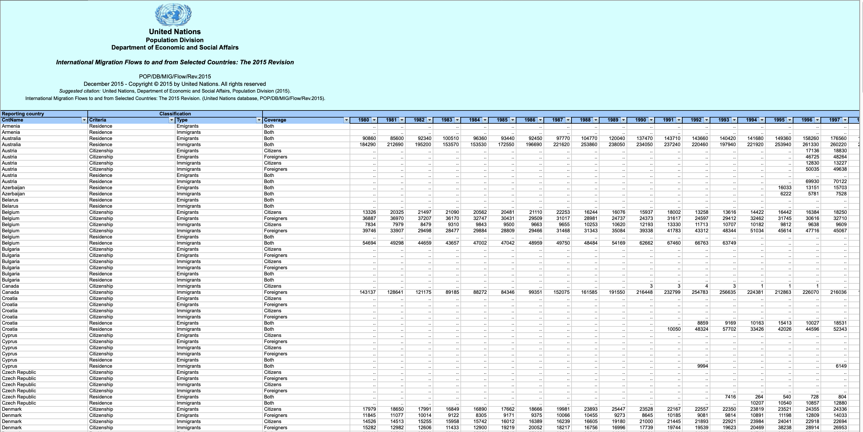
The Canada Immigration dataset can be fetched from here.
[Exploring Datasets with pandas]
- download and import our primary Canadian Immigration dataset using pandas's
read_excel()method. - view the top 5 rows of the dataset using the
head()function. - use the
info()method to get a short summary of the dataframe. - clean the data set to remove a few unnecessary columns. We can use pandas
drop()method - rename the columns so that they make sense. We can use
rename()method by passing in a dictionary of old and new names - add a 'Total' column that sums up the total immigrants by country over the entire period 1980 - 2013
- check to see how many null objects we have in the dataset
[Visualizing Data using Matplotlib]
- [Matplotlib: Standard Python Visualization Library]
- [Line Plots]
**Case study:**
In 2010, Haiti suffered a catastrophic magnitude 7.0 earthquake. The quake caused widespread devastation and loss of life and about three million people were affected by this natural disaster. As part of Canada's humanitarian effort, the Government of Canada stepped up its effort in accepting refugees from Haiti. We can quickly visualize this effort using a Line plot:
Question: Plot a line graph of immigration from Haiti using df.plot().

We can clearly notice how number of immigrants from Haiti spiked up from 2010 as Canada stepped up its efforts to accept refugees from Haiti.
Question: Let's compare the number of immigrants from India and China from 1980 to 2013.

China and India have very similar immigration trends through the years.
Question: Compare the trend of top 5 countries that contributed the most to immigration to Canada.

Graph shows the spike of immigration from Philippines to Canada in 2010 surpassed India.
- United Nations. (n.d.). International migration flows. Retrieved from https://www.un.org/development/desa/pd/data/international-migration-flows