Highly customizable SVG Radar chart with animations.
http://fallingpix.com/resume/blog/radar_chart.php
Requires Raphael.js. Can be used along with jQuery and Bootstrap, but doesn't require them. Grid can be circular or a polygon spider-web. The starting point of the grid can be rotated at any angle for reading convinience. Labels can have individual color for each axes. They pulse on mouse over. It's also possible to use the callback function to update some information "on click" or to create a custom tooltip.
Screenshots
The Chart
My chart is loosely based on https://github.com/natural-affinity/Raphael-Radar. I had to change the core math function and grid, and also add colors and animation for my purposes. But some functionality is still grandfathered from the natural-affinity github. In case you would like to add something else or report a problem, please, do so via github "issues". Demo Pge has editable inputs for your convinience.
##data.readonly By default the natural-affinity chart points can be dragged if there is only one data series. This option exists to prevent default behavior.
##data.min/max Both values are calculated automatically if not provided. But they are not always aestetically pleasing with default values, so this option exists to correct the appearence.
##data.scoresColored Data points can share the same color and only change it to a specific axis/label color when highlighted or selected.
##data.selectedAxis Takes the index of the point in series. Thus, "1" will take the second point ( "0" - first ).
##data.scores/labels/colors By default the natural-affinity chart can take multiple series for a single chart. I haven't touched this part(yet). I assume that the labels and colors are the same for each series (meaning that each series is supposed to have same number of points)
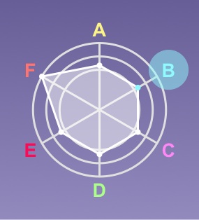
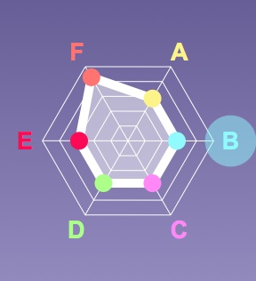
##grid.type Two options: polygon(more common) and circle.
##grid.increment How frequently you want to draw the grid lines from outermost circle. The number should be a ratio less than 1, 0.1 , 0.2 , etc.
##grid.steps How many grid lines you want. This option lets you reduce visual clutter. For example, if all of your values are on the 3 outer rings, you don't need the rest of the lines and can remove this distraction.
##size.pointR The radius of the data points.
##size.labelDistancePercent How far you want the center of the label to be from the outer ring of the chart. In fractions of the radius, so your input x will put a label at a (1+x)*radius distance from the chart center.
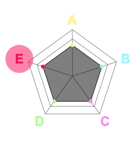
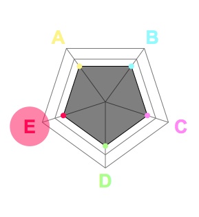
#size.highligtRpercent In fractions of chart radius. It defines the radius of pusling highlight around the label.
##size.startingAngle In PI's. Sometimes you want the poligon to stand on its tip or to stand on its side. Perhaps you want the labels to begin from the top. In this case startingAngle will help you to rotate the whole chart.
##all style All these styles are going to be directly dumped into respective SVG objects by Raphael.js ( in Raphale.js notation ). Note: I made a tiny change to the original Raphael.js to enable gradients in browsers which have problems with "location.origin".
##selectCallback When the user clicks on a pie slice where a particular axis located, this axis gets selected and you can add some custom effects on the event. For example, you can change the text with explanations or you can update the tooltip/legend etc.
##chart This is just the place to save new a Raphael object for further reference.