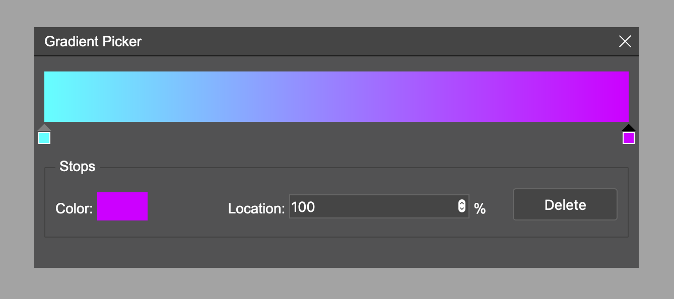
Simple gradient picker, with no dependencies.
Install npm i ab-gradient-picker
    const gp = createGradientPicker({
            initColors: [
                {
                    color: '#000000',
                    position: 0
                },
                {
                    color: '#ffffff',
                    position: 100
                }
            ]
    });

    // Do stuff on change of the gradient
    gp.on('change', colors => {
        console.log(colors);
})initColors- array of colors and positions (default:
[
    {
        color: '#ffffff',
        position: 0,
    },
    {
        color: '#000000',
        position: 100,
    }
]
)
zIndex- zIndex of popup (default: 999)isCustomColorPicker- if custom color picker is to be used; by default native browser one is used (default: false)
ab-gradient-picker color picker is independent and uses the browser's native one by default, just to make it more accessible, but you can easily switch it with one of your choices (recommended as not all browsers support properly input[type=color]).
In the example below we use a-color-picker just as the proof of concept
import {createGradientPicker, IGradientPickerConfig} from 'ab-gradient-picker';
import * as AColorPicker from 'a-color-picker';

const config: IGradientPickerConfig = {
    initColors: [
        {
            color: '#000000',
            position: 0,
        },
        {
            color: '#ffffff',
            position: 100,
        }
    ],
    zIndex: 1001,
    isCustomColorPicker: true
}

const gp = createGradientPicker(config);
gp.on('change', v => console.log('change', v));
gp.on('drag:start', v => console.log('drag:start', v));
gp.on('drag:end', v => console.log('drag:end', v));
const colorInput = gp.getInputElement();
colorInput.addEventListener('click', (e) => {
    const picker = AColorPicker.createPicker(colorInput, {color: gp.getActiveColor()});
    picker.on('change', (p: AColorPicker.ACPController, color) => {
        gp.setActiveColor(color);
    });
    picker.element.addEventListener('click', e => e.stopPropagation());

    document.addEventListener('click', (e) => {
        if (e.target !== colorInput && picker.element?.parentNode) {
            picker.element.parentNode.removeChild(picker.element);
        }
    });
    e.preventDefault();
})
Available events
change- gradient is changeddrag:start- started dragging the handlerdrag:end- stopped dragging the handler
Methods
setActiveColor(color: string)- change active colorgetInputElement():HTMLElement | null- get color input element to override its behaviour. If isCustomColorPicker set to true there is just div with background color.getActiveColor():string- get color of active stopshow()- show pickerhide()- hide picker
MIT